Scatter Plots and Bivariate Data
TLDRThe video script introduces the concept of bivariate data, which involves numerical information about two different variables, and explains how it can be displayed in tables or scatter plots. It uses the example of the cost of attending the Orange County Fair to illustrate bivariate data and its relationship with variables. The script then discusses scatter plots, using children's height and weight measurements to demonstrate how data can be arranged and how outliers can be identified. It concludes by explaining the concept of correlation, differentiating between positive and negative correlations, and encourages viewers to consider other variables that might exhibit such relationships.
Takeaways
- 📊 Bivariate data refers to numerical information concerning two different variables, such as height and weight or age and grade level.
- 🎟️ An example of bivariate data is the cost of attending the Orange County Fair, which depends on the number of tickets purchased and the entrance fee.
- 📈 Bivariate data can be displayed in a table with the dependent variable on one axis and the independent variable on the other, or on a graph.
- 🏆 The Orange County Fair example illustrates a linear relationship where the cost increases with the number of tickets bought.
- 🥇 Bivariate data does not always have to be linear; it can also represent relationships that are scattered, as in the case of temperature changes over time.
- 📊 Scatter plots are used to visualize bivariate data where the variables do not necessarily follow a linear pattern, such as the heights and weights of children.
- 📈 The purpose of a scatter plot is to provide a visual representation of how data is arranged, which can reveal trends or patterns.
- 🔍 An outlier in a scatter plot is a data point that does not follow the general trend of the rest of the data, lying outside the norm.
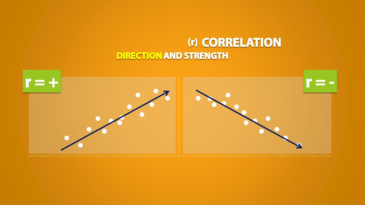
- 🔗 Correlation, or association, refers to the relationship between two variables, such as height and weight, where a positive correlation indicates that both variables increase together.
- 🚀 Positive correlation can be seen in various real-life examples, like the relationship between the number of bacon cheeseburgers eaten and cholesterol levels.
- 📉 Negative correlation, although not explicitly discussed, would imply that as one variable increases, the other decreases.
Q & A
What does the word 'data' mean in the context of the script?
-In the context of the script, 'data' refers to numerical information, specifically information presented in the form of numbers. It is used to represent variables and their relationships.
What is bivariate data, and provide two examples of variables that could be part of bivariate data?
-Bivariate data is numerical information concerning two different variables. Two examples of variables that could be part of bivariate data are height and weight, and age and grade level.
How is the cost of going to the Orange County Fair an example of bivariate data?
-The cost of going to the Orange County Fair is an example of bivariate data because it involves two variables: the cost of entering the fair and the cost of tickets for rides. The total cost depends on the number of tickets purchased, making it a bivariate situation where one variable (total cost) is dependent on the other (number of tickets).
What are the two ways bivariate data can be displayed according to the script?
-Bivariate data can be displayed in a table, with the dependent variable on one side and the independent variable on the other, or it can be displayed on a graph, such as a scatter plot.
How does a scatter plot help in understanding bivariate data?
-A scatter plot helps in understanding bivariate data by visually representing the relationship between the two variables. It shows the pattern of the data points on a graph, which can reveal trends, correlations, or outliers, thus providing insights into how the variables are related.
What is an outlier in the context of a scatter plot?
-An outlier in the context of a scatter plot is a data point that does not follow the general trend of the rest of the data. It lies outside of the norm, indicating that it is abnormal compared to the other data points.
What is correlation, and what does positive correlation mean?
-Correlation, or association, refers to the relationship between two variables. Positive correlation means that as one variable increases, the other also increases. It is often represented by an upward trend in a scatter plot, indicating that the variables are related in a way that their values tend to rise or fall together.
Provide an example of positive correlation from the script other than height and weight.
-An example of positive correlation from the script is the relationship between the number of bacon cheeseburgers eaten and cholesterol level. As the consumption of bacon cheeseburgers increases, the cholesterol level also tends to increase.
What would be an example of negative correlation?
-An example of negative correlation could be the relationship between the number of hours spent studying and the amount of sleep one gets. As the hours spent studying increase, the amount of sleep tends to decrease, showing an inverse relationship between the two variables.
How can the pattern of dots on a scatter plot provide insights into the data?
-The pattern of dots on a scatter plot can show trends in the data, such as whether the variables are positively or negatively correlated. It can also highlight outliers and help identify any unusual patterns or relationships that might not be immediately apparent from looking at the raw data.
Why is it important to study bivariate data and its representation through scatter plots?
-Studying bivariate data and its representation through scatter plots is important because it allows us to visualize and analyze the relationships between different variables. This can help in making predictions, understanding cause-and-effect relationships, and identifying areas for further investigation or action.
Outlines
📊 Introduction to Bivariate Data and Scatter Plots
This paragraph introduces the concept of bivariate data, which involves numerical information about two different variables. It explains that these variables could be anything from height and weight to time and distance. The example of the Orange County Fair is used to illustrate how bivariate data can be dependent on multiple factors, such as the cost of tickets and entry fees. The paragraph further explains that bivariate data can be displayed in tables or on graphs, with the latter being the focus on scatter plots. The main point is to understand how two variables relate to each other through their numerical values and how this relationship can be visually represented.
📈 Understanding Scatter Plots and Correlation
This paragraph delves into the specifics of scatter plots, using the example of children's height and weight measurements to demonstrate how data can be displayed and analyzed. It explains that scatter plots show the relationship between two variables, with the pattern of the plotted points indicating a trend. The concept of outliers is introduced, describing them as data points that do not follow the general trend. The paragraph also discusses the idea of correlation, highlighting positive correlation as a relationship where both variables increase or decrease together. Examples of positive correlation are provided, and the concept is reinforced by encouraging the viewer to think of other variables that might have a positive correlation.
Mindmap
Keywords
💡Bivariate Data
💡Scatter Plot
💡Correlation
💡Outlier
💡Data
💡Variables
💡Graph
💡Linear
💡Positive Association
💡Negative Association
💡Trend
Highlights
Bivariate data is numerical information concerning two different variables.
Examples of bivariate data include height and weight, age and grade level, distance and time, and temperature.
Bivariate data can be displayed in a table with the dependent variable and the independent variable.
Bivariate data can also be displayed on a graph, such as a scatter plot.
An example of bivariate data is the cost of going to the Orange County Fair, which depends on the number of tickets purchased.
Scatter plots are used to visualize bivariate data and help understand the relationship between two variables.
In a scatter plot, the first kid measured was 30 inches tall and weighed 40 pounds.
Scatter plots can reveal patterns in the data, such as an upward trend indicating that as children grow taller, they also gain weight.
Outliers in a scatter plot are data points that do not follow the general trend of the rest of the data.
Correlation refers to the relationship between two variables, and can be positive or negative.
Positive correlation means that as one variable increases, the other also increases.
An example of positive correlation is the relationship between the number of bacon cheeseburgers eaten and cholesterol level.
The number of inappropriate tweets and the number of restraining orders might also represent a positive correlation.
Negative correlation would be a scenario where as one variable increases, the other decreases.
The lecture emphasizes the importance of understanding bivariate data and its display methods, such as tables and scatter plots.
The concept of outliers and their significance in data analysis is discussed, highlighting the need to recognize and treat them appropriately.
The lecture concludes by encouraging the audience to think of other variables that might have positive correlation, promoting active engagement and critical thinking.
Transcripts
Browse More Related Video
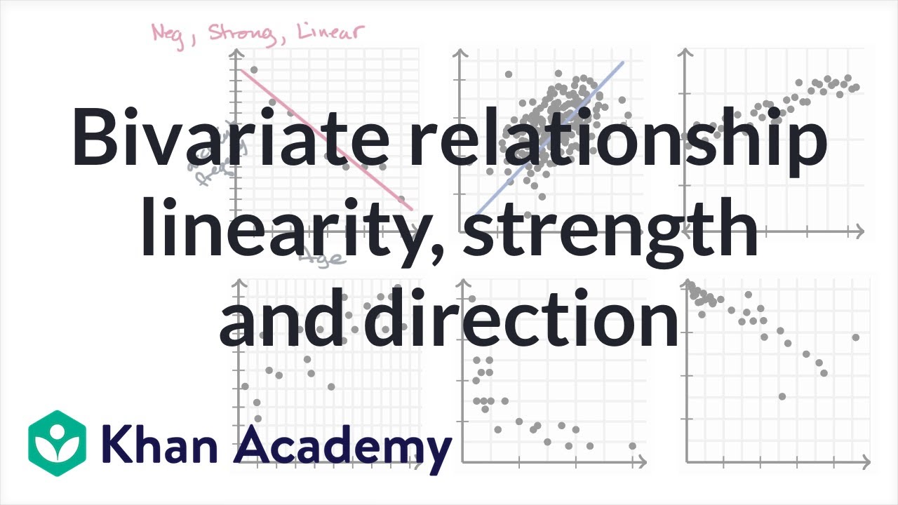
Bivariate relationship linearity, strength and direction | AP Statistics | Khan Academy

Elementary Stats Lesson #5
Correlation Doesn't Equal Causation: Crash Course Statistics #8
Correlation Coefficient
Explanatory and Response Variables, Correlation (2.1)
10.1.1 Correlation - Linear, Nonlinear, Positive Linear, and Negative Linear Correlation Defined
5.0 / 5 (0 votes)
Thanks for rating: