Correlation Doesn't Equal Causation: Crash Course Statistics #8
TLDRThis video explains relationships between variables in statistics. It discusses using scatter plots and correlation to measure and visualize linear relationships, explaining concepts like positive/negative correlation, regression lines, Pearson's analysis of father-son heights, and spurious correlations. It emphasizes that while correlation shows how variables move together, it does not prove causation. The video aims to provide viewers a better understanding of using correlation to describe data relationships.
Takeaways
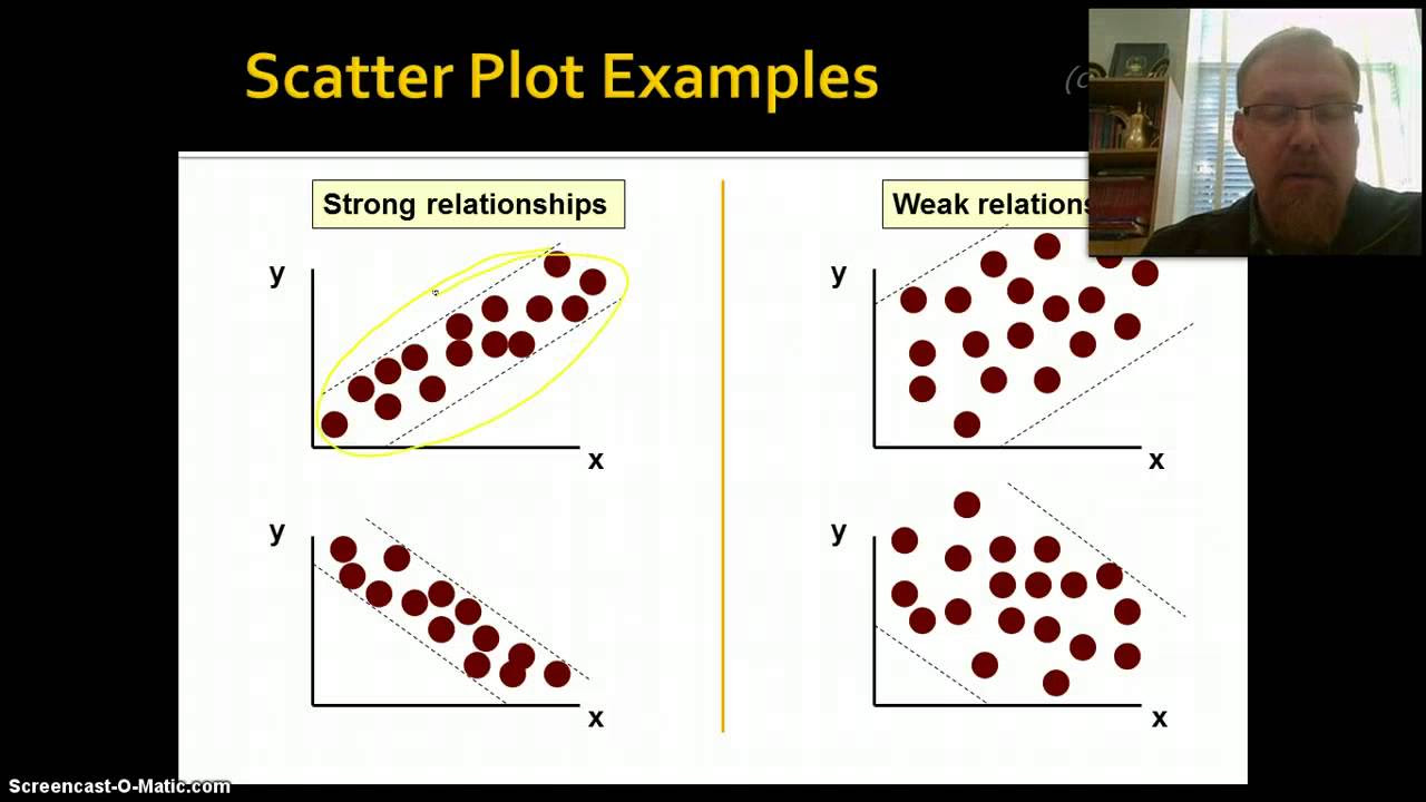
- 😀 Scatterplots are useful for visualizing relationships between two continuous variables
- 😃 Linear relationships can be described using a regression line and correlation coefficient
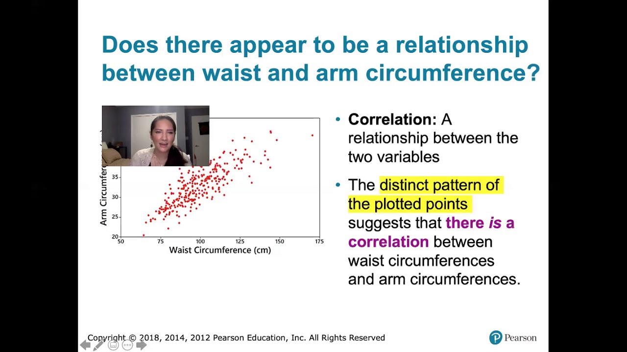
- 😄 Correlation measures the direction and closeness of the relationship between two variables
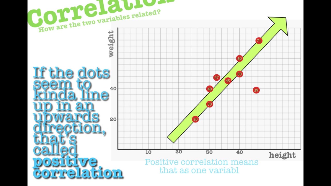
- 😎 Positive correlation means two variables move in the same direction
- 😕 Negative correlation means two variables move in opposite directions
- 🤓 R-squared tells you how much variance in one variable can be predicted from the other variable
- 😮 Correlation does not imply causation - just because two things are correlated does not mean one causes the other
- 🤔 Spurious correlations can occur just by chance with no causal relationship
- 😀 Looking at a scatterplot gives more insight into the relationship than just the correlation value
- 💡 Understanding relationships between variables helps predict future events and reflect on past occurrences
Q & A
What are scatter plots useful for visualizing?
-Scatter plots are useful for visualizing relationships between two continuous variables, also called bivariate data. They allow you to see the shape and spread of data in two dimensions.
How does a regression line help describe the relationship between two variables?
-A regression line is a straight line that best fits the data points on a scatter plot. It allows you to make predictions about one variable based on the value of the other variable using the line's formula y=mx+b.
What does the slope (m) of a regression line tell you?
-The slope (m) of a regression line tells you how much y changes for every 1 unit increase in x. It describes how strongly the two variables are related.
What does correlation measure?
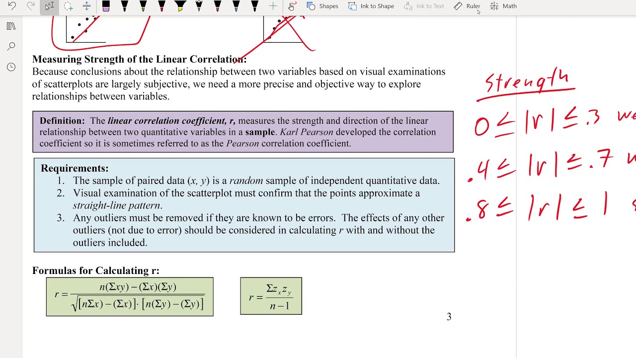
-Correlation measures how closely two variables move together, considering both the direction and closeness of their movement. It is represented by the correlation coefficient r.
How is the correlation coefficient r interpreted?
-The sign of r (positive or negative) indicates whether the variables move in the same or opposite directions. The magnitude of r (closer to 1 or 0) indicates the strength of the linear relationship.
What does R-squared (R^2) represent?
-R-squared (R^2) represents the proportion of variance in one variable that can be predicted from the other variable. It is between 0 and 1, with higher values indicating a better fit.
What is the difference between correlation and causation?
-Correlation does not imply causation. Just because two variables are correlated does not mean that one causes the other. The relationship may be due to chance or a third confounding variable.
How can you identify spurious correlations?
-Spurious correlations between very specific variables that seem unrelated are likely coincidental. Examining correlation together with causation and scatter plots helps avoid drawing false conclusions.
Why is it important to visualize data beyond just correlation?
-Correlation statistics alone do not show the full picture. Scatter plots of the same correlated data can show very different relationships. Visualizing the data provides more insight.
What are some applications of understanding data relationships?
-Understanding relationships allows us to predict events, reflect on why things occurred, see connections between human behaviors, make conclusions about causes, and more.
Outlines
👨👦 Introduction to Scatter Plots and Correlations between Variables
This paragraph introduces scatter plots as a useful way to visualize relationships between two continuous variables. It describes how to make a scatter plot and interpret the patterns and clusters. It then transitions to discussing linear relationships and correlations.
📈 Understanding Correlation Strength and Direction
This paragraph explains positive and negative correlation in more detail. It discusses how the strength of the correlation depends on how closely the two variables move together, and explains the correlation coefficient r, which measures the direction and strength of the linear relationship.
🤔 Correlation Does Not Imply Causation
This paragraph cautions that just because two variables are correlated does not mean that one causes the other. It gives examples of spurious correlations and explains how a third variable may actually be causing the observed correlation.
Mindmap
Keywords
💡Data Relationships
💡Scatter Plot
💡Linear Relationships
💡Regression Line
💡Correlation
💡Correlation Coefficient (r)
💡R-Squared (R²)
💡Causation
💡Spurious Correlations
💡Standard Deviation
Highlights
The speaker discusses how climate change is impacting agriculture, mentioning specific effects like changing rainfall patterns, rising temperatures, and drought.
There is a comparison of traditional farming practices versus modern precision agriculture and how technology like GPS, sensors, and data analytics can optimize crop yields.
The speaker highlights a few examples of farms using technology like self-driving tractors, drone imagery, and AI to become more efficient, sustainable, and productive.
Some key challenges facing the agricultural industry today include soil degradation, water scarcity, and the need for sustainability amidst population growth.
There is an analysis of how consumers are demanding more organic, local food, and how farms are adapting through renewable energy, waste reduction, and regenerative techniques.
The speaker emphasizes the importance of government policies, public-private partnerships, and farmer education to promote climate-smart agriculture.
A few innovative solutions mentioned include vertical indoor farms, hydroponics, aquaponics, and urban agriculture to produce more food using fewer resources.
There is a discussion of some promising technologies like GMOs, gene editing, and synthetic biology to develop crops with higher yields, better nutrition, and resilience to climate change.
The speaker stresses the need for more sustainable food systems, mentioning reducing food waste, shifting diets, and making agriculture carbon-neutral as crucial goals.
The conclusion focuses on agriculture adapting to climate change through technology, innovation, and a collaborative approach between farmers, governments, and consumers.
There is emphasis on agriculture playing a key role in both mitigating and adapting to climate change in the coming decades.
The speaker urges more funding and support for research and technology to build resilience and transform farming for a hotter, drier future.
Some interesting statistics are shared on the carbon footprint and water usage of different foods and how dietary choices impact sustainability.
There is a powerful call to action for policymakers, investors, and consumers to address climate change through agriculture reform and innovation.
The talk ends on an uplifting note about agriculture's critical role in feeding a growing population sustainably amidst climate change through shared ingenuity and purpose.
Transcripts
Browse More Related Video
10.1.1 Correlation - Linear, Nonlinear, Positive Linear, and Negative Linear Correlation Defined
Elementary Statistics - Chapter 10 Correlation and Regression
10.1.4 Correlation - Three Common Errors Involving Correlation
Introduction to Correlation & Regression, Part 1
Scatter Plots and Bivariate Data
Math 119 Chapter 10 Part 1
5.0 / 5 (0 votes)
Thanks for rating: