Histograms and Density Plots for Numeric Variables | Statistics Tutorial | MarinStatsLectures
TLDRThis script introduces histograms and kernel density plots as tools for visualizing the distribution of a numeric or continuous variable, using a sample of ages as an example. It explains the process of creating a frequency table, dividing data into bins, and then plotting the data with either frequency or proportion on the y-axis. The script also touches on the importance of consistency in binning and the impact of bin size on the resulting plot. It briefly mentions box plots as another summary tool and discusses the smoothing effect of kernel density plots over histograms to estimate the probability distribution more accurately.
Takeaways
- 📊 Histograms and kernel density plots are tools used to visualize the distribution of a sample for numerical or continuous variables.
- 🔢 The first step in creating these plots is to organize data into a frequency table, dividing it into bins or categories and counting occurrences in each.
- 📈 Bins can be chosen arbitrarily, and different choices can lead to slightly different frequency distributions.
- 🎨 When plotting, the bins are represented on the x-axis, with the frequency, proportion, or percentage of occurrences on the y-axis.
- 🚼 Borderline cases, such as an age of 20, can be placed in any adjacent bin as long as the decision is consistent.
- 📊 Histogram bars should be of equal width and touch each other, indicating no space between categories.
- 📈 A histogram provides a visual representation of the distribution's center, spread, and shape, such as symmetry or skewness.
- 📊 Changing the number of bins can alter the appearance of the histogram and its distribution.
- 📊 A kernel density plot is a smoothed version of a histogram, aiming to reduce the sensitivity to bin selection.
- 📊 Kernel density plots provide an estimate of the probability distribution of the data.
- 📚 Other plots like box plots also summarize numeric variables, offering a different way to understand the data distribution.
Q & A
What is the primary purpose of histograms and kernel density plots?
-Histograms and kernel density plots are used to visualize the distribution of a sample, particularly for numerical or continuous variables. They help in understanding the central tendency, spread, and shape of the data.
How does a frequency table relate to the creation of a histogram?
-A frequency table is the foundation for creating a histogram. It involves dividing the data into bins or categories and counting how many data points fall into each bin. These counts are then represented visually in a histogram.
What is the significance of bins in creating a histogram?
-Bins are intervals or categories into which the data is divided. The choice of bin sizes can affect the appearance of the histogram and the interpretation of the data distribution. Different bin sizes can lead to different insights about the data.
How does the choice of bin sizes affect the histogram?
-The choice of bin sizes determines the granularity of the histogram. Larger bins can smooth out the data, while smaller bins provide more detail. However, too many bins can lead to a cluttered histogram, and too few can oversimplify the data distribution.
What is the role of software in creating histograms and density plots?
-Software automates the process of creating histograms and density plots. It calculates the bins, counts the frequencies, and generates the visual representation. It also allows for adjustments in bin sizes and other parameters to refine the visualization.
What is the difference between a histogram and a kernel density plot?
-A histogram is a bar chart representation of the distribution of data across different bins. A kernel density plot, on the other hand, is a smooth curve that estimates the underlying probability density function of the data. It provides a smoother visual representation of the data distribution.
Why is it important to consider the edges of bins when creating a histogram?
-Data points at the edges of bins, such as a person with an age of 20, can be placed in either adjacent bin. The choice of where to place these points should be consistent across the data set to avoid bias. Software often has default settings for handling such cases.
How do you interpret the shape of a histogram or kernel density plot?
-The shape of a histogram or kernel density plot can reveal if the data is symmetric or skewed. A symmetric distribution indicates a balance around the center, while a skewed distribution shows a tailing off to one side, indicating more variability in that direction.
What is the relationship between a histogram and the concept of a probability distribution?
-A histogram provides a visual estimate of the probability distribution of a dataset. It shows how likely it is for a value to fall within a certain range, helping to understand the relative frequencies of different outcomes.
What is the difference between a histogram and a bar chart?
-A histogram is used to represent the distribution of continuous data, with bars that touch each other to indicate the continuous nature of the variable. A bar chart, on the other hand, is used for categorical data and has spaces between the bars to indicate separate categories.
What is a box plot and how does it relate to a histogram?
-A box plot is another way to summarize the distribution of a numeric variable. It displays the median, quartiles, and potential outliers, providing a different perspective on the data compared to a histogram. Both are useful for understanding the central tendency, spread, and shape of data.
Outlines
📊 Introduction to Histograms and Kernel Density Plots
This paragraph introduces histograms and kernel density plots, explaining their purpose and utility in visualizing the distribution of a sample for a continuous variable, such as age. It begins with a hypothetical example of 50 individuals and their recorded ages, detailing the process of creating a frequency table by dividing the data into bins and counting the occurrences in each bin. The paragraph discusses the conversion of frequencies to proportions or percentages and the decision-making process for handling data points on bin borders. It emphasizes the importance of consistency in bin selection and the potential variability in frequency distribution based on bin size. The paragraph concludes with a brief mention of software's role in automating this process and the default settings that can be adjusted for bin selection.
🎨 Visual Representation: Histograms and Bar Charts
The second paragraph delves into the visual representation of data through histograms and bar charts. It explains how to create a histogram from the frequency table, with the x-axis representing the bins and the y-axis showing the frequency. The paragraph highlights the touching bars of the histogram, signifying the continuous nature of the variable. It discusses the impact of bin size on the shape of the histogram and the importance of this visual tool in understanding the distribution's center, spread, and symmetry. The paragraph also introduces the concept of a box plot as another method for summarizing numeric variables. Finally, it touches on kernel density as a smoothing technique for histograms, aiming to provide a more stable estimate of the probability distribution, regardless of bin size adjustments.
Mindmap
Keywords
💡Histograms
💡Kernel Density Plots
💡Frequency Table
💡Bins or Buckets
💡Proportions or Percentages
💡Distribution
💡Continuous Variable
💡Border Observations
💡Bar Chart
💡Center and Spread
💡Box Plot
Highlights
Histograms and kernel density plots are useful for visualizing the distribution of a sample.
The example used is a sample of size 50 with recorded ages of individuals.
Histograms and density plots are typically created by software, but the process can be done by hand for educational purposes.
Frequency tables are used to count how many people fall into each bin or category.
Bins or categories can be chosen differently, affecting the resulting distribution.
The distribution shows how people are spread among the different bins or categories.
Observations that fall on the border of bins can be placed in either adjacent bin, as long as it's consistent.
Software will choose the bins and their number, but these can be modified by the user.
A histogram is a visual representation of the frequency table.
The x-axis of a histogram represents the variable, and the y-axis represents the frequency or proportion.
Bars in a histogram should be of equal width and touch each other, indicating no space between categories.
Changing the bins can slightly alter the shape of the histogram.
Histograms help visualize the center, spread, and shape of a distribution.
A box plot is another plot for summarizing the distribution of a numeric variable.
Kernel density is a smoothing technique applied to histograms to provide a smoother estimate of the distribution.
Kernel density plots are less sensitive to the choice of bin size compared to histograms.
Both histograms and kernel density plots are useful for summarizing the distribution of a sample for numeric or continuous variables.
These plots provide an estimate of what the probability distribution might look like.
Transcripts
Browse More Related Video
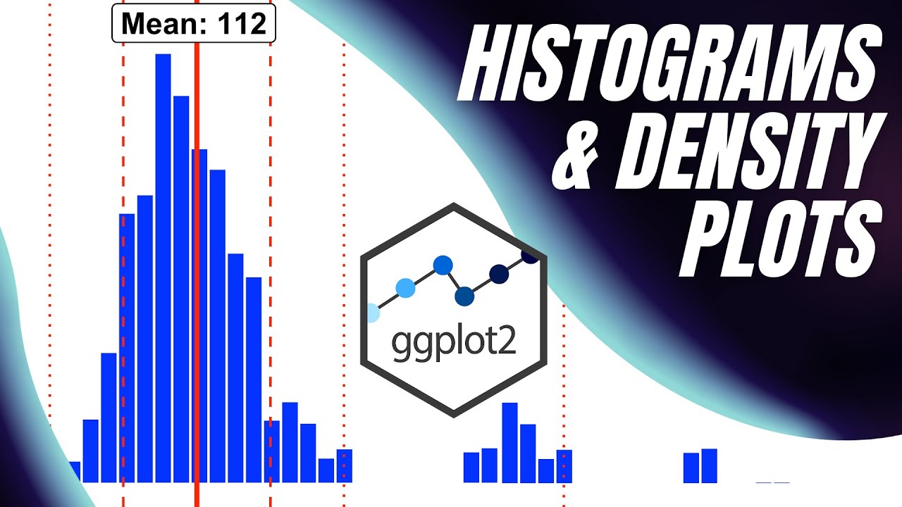
Histograms and Density Plots with {ggplot2}

Histograms in R | R Tutorial 2.4 | MarinStatsLectures

Elementary Statistics - Chapter 2 - Exploring Data with Tables & Graphs
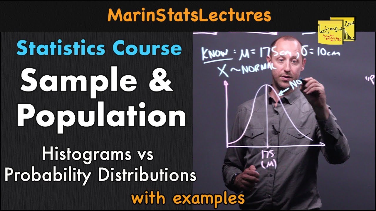
Sample and Population in Statistics | Statistics Tutorial | MarinStatsLectures

Plots for Two Variables | Statistics Tutorial | MarinStatsLectures
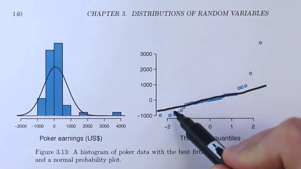
Normal Probability Plots Explained (OpenIntro textbook supplement)
5.0 / 5 (0 votes)
Thanks for rating: