Elementary Statistics - Chapter 2 - Exploring Data with Tables & Graphs
TLDRThis script offers a comprehensive guide on creating a frequency distribution table for large datasets. It explains the importance of class intervals, class width, and frequency, and demonstrates how to calculate these for a given data set. The tutorial walks through the process of tallying data, finding midpoints, relative frequencies, and cumulative frequencies, highlighting the use of histograms, stem-and-leaf plots, dot plots, time series graphs, and pie charts for data visualization. It's a practical resource for anyone looking to organize and summarize data effectively.
Takeaways
- 📊 A frequency distribution table is a useful tool for organizing and summarizing large datasets, showing the number of entries in each class or interval.
- 📏 The class width is the distance between the lower limits of consecutive classes and should be consistent throughout the frequency distribution.
- 🔢 To construct a frequency distribution, decide on the number of classes, usually between 5 and 20, and calculate the class width using the maximum and minimum values of the dataset.
- 📉 The class limits are determined by starting with the smallest data entry and adding the class width to find subsequent lower and upper limits.
- 📝 Tallying data involves marking each data entry in its appropriate class interval and then counting these to find the total frequency for each class.
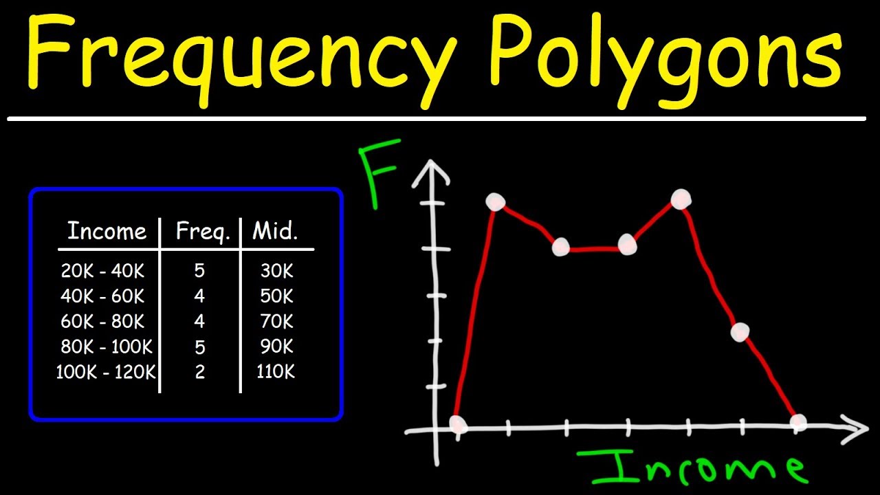
- 🔄 To find the midpoint of a class, add the lower and upper limits and divide by two, which helps in understanding the distribution's shape.
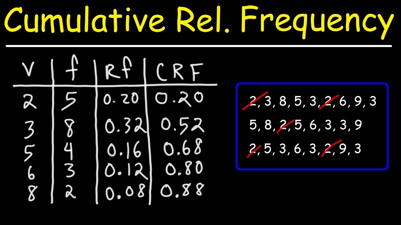
- 📈 Relative frequency is calculated by dividing the frequency of a class by the total number of data entries, giving a percentage of the data in that class.
- 🌐 Cumulative frequency distribution is the running total of frequencies for the class and all previous classes, showing the accumulation of data points.
- 📈 Histograms are bar graphs representing frequency distributions, useful for visually displaying the shape, center, spread, and outliers of data.
- 🌿 Stem-and-leaf plots display the shape of data distribution and contain the original data values, with the stem as the first part and the leaf as the end value of the data.
- 📈 Time series graphs show trends over time for quantitative data collected at different points, revealing patterns and changes in data.
Q & A
What is a frequency distribution table used for?
-A frequency distribution table is used for organizing and summarizing data from large datasets. It helps to understand the nature of the data distribution by showing the number of data entries within specified intervals or classes.
What are the key components of a frequency distribution table?
-The key components of a frequency distribution table include classes or intervals of the data, the lower class limit, the upper class limit, the class width, and the frequency, which is the count of data entries in each class.
How is the class width determined in a frequency distribution table?
-The class width is determined by subtracting the minimum value from the maximum value in the dataset and then dividing by the number of classes. The result is rounded up to ensure that intervals are correctly spaced.
What is the purpose of having a consistent class width throughout the frequency distribution table?
-A consistent class width ensures that the intervals are equally spaced and that the data is uniformly distributed across the classes, allowing for a fair comparison and analysis of the data distribution.
How do you decide the number of classes for a frequency distribution table?
-The number of classes is typically chosen to be between 5 and 20, depending on the dataset and the level of detail required for the analysis. The choice can affect the granularity of the frequency distribution.
What does the frequency (F) in a frequency distribution table represent?
-The frequency (F) represents the number of data entries that fall within a specific interval or class in the frequency distribution table.
How do you construct the class limits for a frequency distribution table?
-To construct the class limits, start with the smallest data entry as the lower limit of the first class. Then, add the class width to find the lower limits for subsequent classes. The first upper limit is one less than the second class's lower limit, and the upper limits for the remaining classes are found by adding the class width to the previous upper limit.
What is the process of tallying data in a frequency distribution table?
-Tallying data involves making a mark for each data entry in the row of the appropriate class. After all data entries are marked, count the tally marks to find the total frequency for each class.
How do you verify that all data pieces have been accounted for in a frequency distribution table?
-To verify that all data pieces have been accounted for, add up the frequencies of all classes. This total should match the total number of data pieces in the dataset.
What is the difference between a frequency distribution and a relative frequency distribution?
-A frequency distribution shows the number of data entries in each class, while a relative frequency distribution shows the proportion or percentage of the total data that falls into each class, providing a normalized view of the data distribution.
How is a cumulative frequency distribution constructed?
-A cumulative frequency distribution is constructed by adding the frequency of each class to the sum of the frequencies of all previous classes. It shows the total number of data entries up to and including each class.
What are some common types of graphs used to represent data distributions?
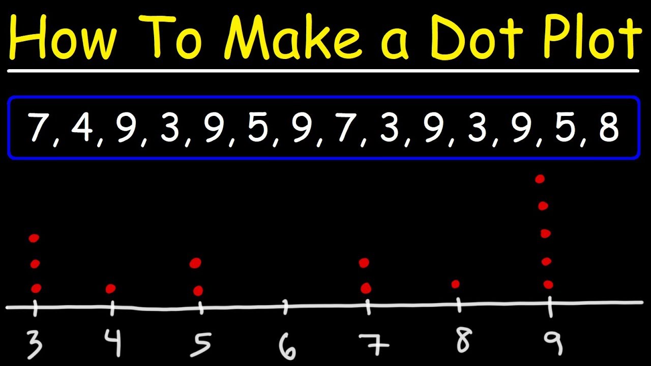
-Some common types of graphs used to represent data distributions include frequency histograms, stem-and-leaf plots, dot plots, time series graphs, and pie charts.
Outlines
📊 Understanding Frequency Distributions
The first paragraph introduces the concept of frequency distributions for organizing and summarizing large datasets. It explains the structure of a frequency distribution table, which includes classes or intervals with counts of data entries. The lower and upper class limits, class width, and frequency (F) are defined. The process of constructing a frequency distribution is outlined, starting with determining the number of classes (usually between 5 and 20) and calculating the class width using the maximum and minimum values from the dataset. An example using the prices of GPS devices is provided to illustrate the steps of finding class limits and tallying data to create the distribution table.
📏 Constructing Class Limits and Tallying Data
This paragraph delves into the specifics of constructing class limits for a frequency distribution without overlap. It explains how to find the first class's upper limit by subtracting one from the second class's lower limit and then using the class width to find subsequent upper limits. The process of tallying data entries into their respective classes is described, emphasizing the importance of ensuring all data pieces are accounted for by summing the frequencies. The paragraph also introduces the concept of midpoints for classes, which are calculated by averaging the lower and upper limits.
📈 Calculating Relative Frequencies and Cumulative Frequencies
The third paragraph focuses on calculating relative frequencies and cumulative frequencies. Relative frequency is the proportion of data falling into a specific class, found by dividing the frequency of the class by the total sample size. The cumulative frequency distribution is explained as the sum of frequencies for a class and all previous classes. The importance of ensuring that the relative frequencies add up to one (or 100% when converted to percentages) is highlighted. An example using the GPS data is used to demonstrate the calculation of midpoints, relative frequencies, and cumulative frequencies.
📈📉 Exploring Different Data Visualization Techniques
The final paragraph discusses various methods of data visualization, including histograms, stem-and-leaf plots, dot plots, time series graphs, and pie charts. Each type of graph is briefly explained in terms of its purpose and how it represents data. Histograms display the shape of data distribution, stem-and-leaf plots show the spread and original data values, dot plots illustrate the distribution shape, time series graphs reveal trends over time, and pie charts display categorical data distribution. The paragraph emphasizes the utility of these visualizations in statistics and business for trend analysis and data representation.
Mindmap
Keywords
💡Frequency Distribution
💡Class Width
💡Lower Class Limit
💡Upper Class Limit
💡Frequency
💡Relative Frequency
💡Cumulative Frequency
💡Midpoint
💡Histogram
💡Stem-and-Leaf Plot
💡Time Series Graph
💡Pie Chart
Highlights
A frequency distribution table is a useful tool for organizing and summarizing large datasets.
The table shows intervals of data with the count of entries in each class, aiding in understanding the data's distribution.
Each class in the table has a lower and upper limit, with consistent class width throughout the table.
The class width is calculated as the difference between the first and second intervals and remains consistent across the table.
Frequency, denoted by 'F', represents the number of data entries within a specific interval.
When constructing a frequency distribution, the first step is to decide on the number of classes, typically between 5 and 20.
The class width is found by dividing the range of the dataset (max - min) by the number of classes and rounding up.
An example is given using prices of GPS devices, illustrating the process of creating a frequency distribution with seven classes.
The class limits are determined by starting with the smallest data entry and adding the class width for subsequent classes.
Tallying data involves marking entries in the appropriate class and then counting to find the total frequency for each class.
The total frequency should equal the total number of data pieces when all entries are accounted for.
The midpoint of each class is calculated by averaging the lower and upper limits.
Relative frequency is the percentage of data falling into a particular class, found by dividing the frequency by the sample size.
Cumulative frequency distribution sums the frequencies of a class and all previous classes.
Histograms visually display the shape, center, spread, and potential outliers of a data distribution.
Stem-and-leaf plots and dot plots are alternative methods to display data distribution, with the former preserving original data values.
Time series graphs are used to analyze trends over time, such as law-enforcement fatalities from 1985 to 2010.
Pie charts are utilized for displaying the distribution of categorical data, such as types of stolen boats.
Transcripts
Browse More Related Video


5.0 / 5 (0 votes)
Thanks for rating: