Normal Probability Plots Explained (OpenIntro textbook supplement)
TLDRThis video script introduces two visual methods for assessing the normality of a dataset: histograms and normal probability plots (QQ plots). It explains that while no dataset is perfectly normal, observing how closely data points align with a straight line on the QQ plot can indicate near-normal distribution. The video uses various datasets with differing sample sizes to demonstrate these concepts and highlights how certain patterns, such as deviations and discretization, can suggest non-normal distributions, including left and right skewness.
Takeaways
- 📊 Understanding normal distribution is crucial for data analysis, and two visual methods are histograms and normal probability plots (QQ plots).
- 🔍 A histogram visually represents the distribution of a dataset, showing the frequency of observations across different value ranges.
- 📈 A normal probability plot compares a dataset to a theoretical normal distribution, with data points ideally falling along a straight line.
- 🧐 The closer the data points in a QQ plot follow the line, the more normally distributed the dataset is considered to be.
- 📉 Deviations from the line in a QQ plot indicate that the data may not be normally distributed, with larger deviations suggesting a greater departure from normality.
- 📊 The number of observations in a dataset can affect the accuracy of the visual methods; more observations generally lead to a clearer indication of normal distribution.
- 🏀 The example of NBA player heights from the 2008-2009 season showed deviations from the line in the QQ plot, suggesting a non-normal distribution due to discrete height measurements.
- 🎲 The poker winnings dataset exhibited outliers and deviations from the line in the QQ plot, indicating a non-normal distribution with significant skewness.
- 🔄 In a normal probability plot, upward curvature suggests a right-skewed distribution, while downward curvature indicates a left-skewed distribution.
- 📝 When interpreting QQ plots, consider the balance between the number of observations and the degree of deviation from the line to assess normality.
- 👍 The video encourages viewers to practice reading normal probability plots to improve their ability to assess data distribution over time.
Q & A
What are the two visual methods discussed in the video for checking the normal distribution of a dataset?
-The two visual methods discussed are the histogram and the normal probability plot, also known as the QQ plot or normal quantile plot.
What is the significance of a normal probability plot in assessing the normality of a dataset?
-A normal probability plot is used to compare a dataset to a theoretical normal distribution, helping to determine how closely the dataset follows a normal distribution. If the data points fall along a straight line, it suggests that the dataset is normally distributed.
How does the size of a dataset affect its normal distribution?
-As the size of a dataset increases, the distribution of the sample data tends to more closely resemble the actual distribution of the data, making it more likely to follow a normal distribution. Larger datasets generally show data points closer to the line in a normal probability plot.
What are the main components of a normal probability plot?
-The main components of a normal probability plot are the horizontal axis, which represents a perfectly normally distributed dataset, and the data points from the actual dataset plotted on the y-axis, which are compared to the theoretical normal distribution.
What is the expected pattern of data points in a histogram for a normally distributed dataset?
-For a normally distributed dataset, the histogram would typically show a symmetrical distribution with a peak in the middle, thinning out towards the tails.
How can deviations from the line in a normal probability plot indicate the presence of skewness in the dataset?
-Curvature in a normal probability plot can indicate skewness. An upward curvature suggests a right-skewed dataset, while a downward curvature indicates a left-skewed dataset. The position of the data points along the y-axis in relation to the line can help determine the type of skewness.
What are some limitations of using a normal probability plot to assess normality?
-A normal probability plot may not perfectly align for any observed dataset due to natural variations. Additionally, certain types of data, such as discrete or categorical data, may not be appropriately assessed using a normal probability plot.
What is the importance of understanding normal distribution in data analysis?
-Understanding normal distribution is crucial because many statistical tests and machine learning algorithms assume that the data is normally distributed. Knowing whether a dataset is normally distributed can help in making informed decisions about appropriate analytical methods and models.
How can the number of observations influence the interpretation of a normal probability plot?
-The number of observations affects the reliability of the normal probability plot. With fewer observations, there may be more variability and less precision in the plot. As the number of observations increases, the plot becomes more reliable and the data points tend to align more closely with the line, providing a clearer indication of normality.
What are some examples of real-world datasets presented in the video that show deviations from normal distribution?
-The video presents NBA player heights from the 2008-2009 season and poker earnings over 50 days as examples of real-world datasets. The NBA height data shows discretization and some deviation from the line, indicating it's not normally distributed. The poker earnings data has outliers and shows significant deviations from the line, suggesting a non-normal distribution.
How can one determine if a dataset is left-skewed or right-skewed by looking at a normal probability plot?
-In a normal probability plot, a left-skewed dataset will have fewer observations on the lower end and more as values increase, showing a downward curvature. Conversely, a right-skewed dataset will have more observations near the lower end and fewer as values increase, exhibiting an upward curvature.
Outlines
📊 Introduction to Normal Distribution Analysis
This paragraph introduces two visual methods for assessing the normal distribution of a dataset: the histogram and the normal probability plot, also known as the QQ plot or normal quantile plot. It explains that the first example dataset is ideal, with 40 observations closely following a normal distribution. The normal probability plot is described as having a horizontal direction, with a peak in the middle and thinning tails that are symmetric. The paragraph emphasizes that while no dataset will be perfectly normally distributed, a normally distributed dataset will have observations that closely follow a straight line on the plot. The histogram for the first dataset shows a gap and lack of symmetry, but the normal probability plot indicates that most observations fall along the line, with some deviation in the tails. The paragraph concludes by encouraging the viewer to examine several examples to better understand the concept.
📈 Observations and Deviations in Normal Distribution
This paragraph delves into the analysis of different datasets with varying numbers of observations, ranging from 40 to 400. It explains that as the number of observations increases, the data points on the normal probability plot tend to get closer to the line, indicating a more accurate representation of the normal distribution. The paragraph highlights that while there will always be some deviations, these are expected and can be attributed to chance alone. It also discusses the analysis of actual datasets, such as the heights of NBA players from the 2008-2009 season and the poker earnings over 50 days for a professional poker player. The paragraph points out that the deviations observed in these real-world datasets are different from those seen in the simulated examples, suggesting that these datasets may not be normally distributed. The paragraph concludes by explaining how the curvature in the normal probability plot can indicate the presence of skewness in the data, either to the left or right.
👁️🗨️ Interpreting Normal Probability Plots and Identifying Data Distribution
The final paragraph focuses on the interpretation of normal probability plots to identify the distribution of data. It emphasizes that if observations fall close to the line throughout the plot, it is a good sign that the data is normally distributed. However, if there are observations that fall far from the line, it indicates that the data is likely not normally distributed. The paragraph also notes that the threshold for what is considered 'too far' from the line depends on the number of observations and that experience in reading these plots will improve one's ability to discern normal distribution. The video concludes with a prompt for viewers to engage with the content by liking, subscribing, or visiting the channel for more videos.
Mindmap
Keywords
💡Normal Distribution
💡Histogram
💡Normal Probability Plot
💡Deviation
💡Outliers
💡Skewness
💡Quantile
💡Data Points
💡Observations
💡Symmetry
💡Dataset
Highlights
The video discusses two visual methods for assessing the normality of a dataset: histograms and normal probability plots (also known as QQ plots or normal quantile plots).
A histogram is a familiar tool for visualizing data distribution, while a normal probability plot is a newer method introduced in the video.
In the first example, the dataset of 40 observations is symmetric and closely follows a normal distribution, which is ideal.
The normal probability plot has a horizontal direction, representing a perfectly normally distributed dataset, with higher density in the middle and thinning out in the tails.
A perfectly normally distributed dataset will have points falling along a straight line when compared to the normal probability plot.
Real-world datasets will not be perfectly normally distributed, but observations should follow a line closely if the data is normally distributed.
As the number of observations increases, the distribution tends to look more normal, and the points on the normal probability plot fall closer to the line.
With 100 observations, the data points tend to fall closer to the line, but there may be some deviations, especially at the lower end.
With 400 observations, the data points are expected to be even closer to the line, with only minor deviations, indicating a more normal distribution.
The video presents NBA player heights from the 2008-2009 season as an example of data that is not normally distributed, with noticeable deviations from the line in the normal probability plot.
The poker greens dataset for 50 days shows strong deviations and outliers in the normal probability plot, suggesting it is not normally distributed.
The normal probability plot can help identify the presence of skewness in a dataset, with upward curvature indicating right skewness and downward curvature indicating left skewness.
The video emphasizes that while the video's topic may not be extremely clear, viewers should be able to understand the basics of reading a normal probability plot and assessing normality.
The video provides practical insights into visual data analysis techniques, which are valuable for those working with statistical data.
Understanding the normality of a dataset is crucial for statistical analysis and the appropriate application of statistical tests.
The video's approach to explaining normal probability plots and histograms is accessible, making complex concepts easier to grasp for viewers.
Transcripts
Browse More Related Video
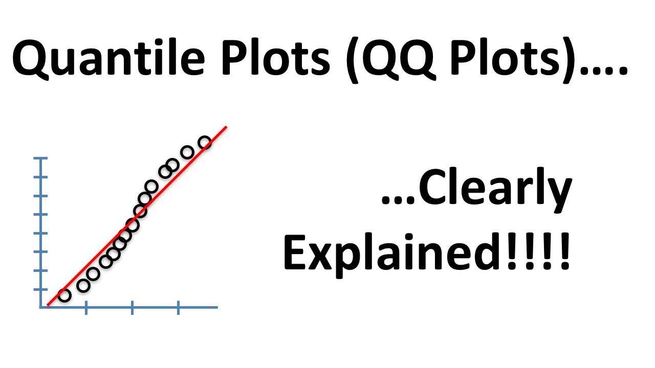
Quantile-Quantile Plots (QQ plots), Clearly Explained!!!

Elementary Stats Lesson #12
Sample and Population in Statistics | Statistics Tutorial | MarinStatsLectures
Introduction to the Central Limit Theorem
10.2.6 Regression - Residual Plots and Their Interpretation
Sampling distribution of the sample mean | Probability and Statistics | Khan Academy
5.0 / 5 (0 votes)
Thanks for rating: