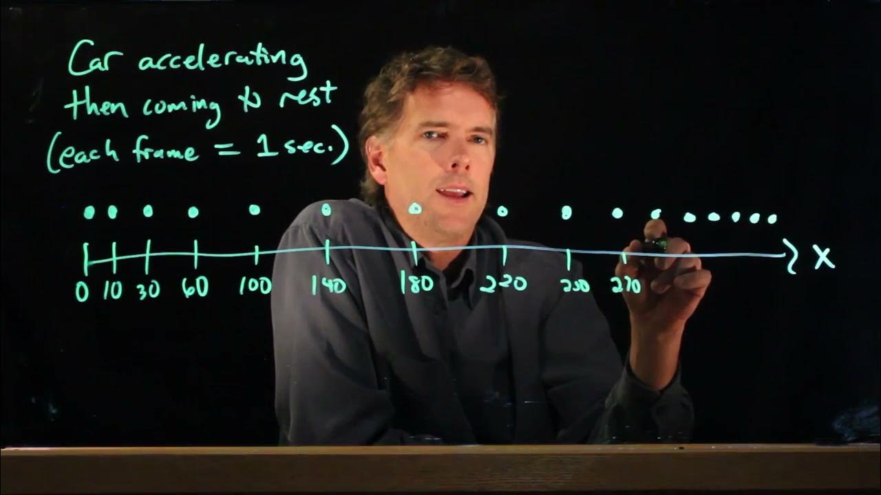
Motion Diagram Accelerating Car
TLDRIn this educational segment, Professor Anderson illustrates the concept of motion diagrams using the example of a car accelerating from a stop and then coming to rest. He explains that each dot represents a second of time and demonstrates how the car's position changes from small intervals at the start to larger intervals as it accelerates, and then back to smaller intervals as it decelerates. The professor provides a step-by-step guide on how to plot these movements on a graph, emphasizing the visual representation of acceleration and deceleration, and invites students to seek clarification during office hours if needed.
Takeaways
- 🚗 The example discusses a car's motion, accelerating from a stop and then coming to rest.
- 📈 Motion diagrams are used to visualize an object's movement over time, represented by a series of dots.
- ⏱ Each dot or frame in the motion diagram corresponds to 1 second of time.
- 📊 The car's position increases as it accelerates, then the intervals between positions decrease as it slows down.
- 📝 The script provides a step-by-step process for plotting the car's motion on a graph.
- 🏁 The car starts at position 1 (x=0), accelerates through positions 2-5 (x=10m, 30m, 60m, 100m), and then slows down at positions 6-11 (x=140m, 180m, 220m, 250m, 270m, 280m, 288m, 289m, 290m).
- 📉 The graph initially has steep increments in position, which is then adjusted to a more gradual slope to fit on the graph.
- 🎯 The motion diagram helps in understanding the car's acceleration, constant speed, and deceleration phases.
- 👨🏫 Professor Anderson encourages students to approach him during office hours if they have any questions.
- 🤔 Motion diagrams are a useful tool for visualizing and analyzing the dynamics of moving objects in physics.
Q & A
What is the main topic of the lecture?
-The main topic of the lecture is the visualization of a car's acceleration and deceleration using motion diagrams.
How does the professor describe the initial state of the car?
-The professor describes the initial state of the car as being at rest, starting from a stop.
What does each dot or frame in the motion diagram represent?
-Each dot or frame in the motion diagram represents 1 second of time.
How does the position of the car change as it accelerates?
-As the car accelerates, its position increases, with the displacement between each segment (dot) getting larger.
What happens to the displacement as the car begins to decelerate?
-As the car decelerates, the displacement in each time interval gets smaller and smaller.
What is the first position value mentioned in the example?
-The first position value mentioned is at x equals zero.
What is the final position value given in the example?
-The final position value given is 290 meters.
How does the graph of the motion diagram change as the car slows down?
-As the car slows down, the graph becomes less steep, indicating a decrease in the rate of change of position.
What is the purpose of the motion diagram in physics?
-The purpose of the motion diagram is to help visualize and understand the motion of an object, including its acceleration and deceleration, by plotting position as a function of time.
What does the professor suggest if the motion diagram is not clear?
-The professor suggests visiting during office hours for further clarification if the motion diagram is not clear.
What is the significance of the numbers on the x-axis in the motion diagram?
-The numbers on the x-axis represent the position of the car in meters at 1-second intervals, starting from zero.
How does the professor adjust the graph to fit the data points?
-The professor adjusts the graph by making it more shallow to accommodate all the data points without running out of room on the graph.
Outlines
🚗 Car Acceleration and Motion Diagrams
Professor Anderson introduces the concept of motion diagrams to visualize the movement of a car from rest to acceleration and back to rest. The motion diagram is explained as a series of dots, with each dot representing one second of time. The professor describes a scenario where a car accelerates after a traffic light turns green, moves for a while, and then slows down to a stop at the next stoplight. The motion diagram's position increases with acceleration and decreases as the car slows down. The professor then provides an example with real numbers, plotting the car's position at different intervals, showing the car's acceleration and deceleration phases. The goal is to plot x as a function of time, with each interval representing one second, and the challenge is to fit the data points on a graph without it becoming too steep.
📈 Plotting Motion Data on a Graph
The professor continues the discussion on motion diagrams by attempting to plot the car's motion data on a graph. The initial attempt results in a graph that is too steep, indicating the need for a more gradual approach. The professor then revises the graph, plotting the car's position at various points (10, 30, 60, 100, 140, 180, 220, 250, 270, 280, 288, 289, 290 meters) to represent the car's acceleration, constant speed, and deceleration. The motion diagram, represented by a series of points, can be connected by a line to illustrate the car's motion. The professor emphasizes the usefulness of motion diagrams for visualizing and graphing motion scenarios, and invites students to seek clarification during office hours if needed.
Mindmap
Keywords
💡Accelerating
💡Decelerating
💡Motion Diagrams
💡Displacement
💡Position
💡Time Intervals
💡Delta X
💡Stoplight
💡Graph
💡Office Hours
💡Visualizing
Highlights
Professor Anderson introduces the concept of motion diagrams for visualizing car acceleration and deceleration.
The car accelerates from a stop and then comes to rest, simulating a real-world driving scenario.
Each dot or frame in the motion diagram represents 1 second of time.
The car's position increases as it accelerates, with the displacement between dots getting larger.
As the car decelerates, the interval between positions gets smaller, showing a decrease in speed.
The motion diagram starts with the car at position 1, and the first 1-second interval moves it to position 10 meters.
The car's position increases in 10-meter increments, reaching 100 meters before starting to slow down.
The deceleration phase is characterized by a reduction in the distance covered in each subsequent 1-second interval.
The motion diagram's final position is set at 290 meters, representing the car coming to a complete stop.
The process of plotting x as a function of time is demonstrated with the given data points.
The initial attempt at plotting the motion diagram results in a graph that is too steep, indicating the need for adjustment.
An adjusted motion diagram is created with a more gradual slope, allowing for a better representation of the car's motion.
The motion diagram illustrates the phases of acceleration, constant speed, and deceleration in a clear and visual manner.
Motion diagrams are a valuable tool for understanding and visualizing the physics of motion.
Office hours are offered for further clarification on the motion diagram concept.
Transcripts
Browse More Related Video
Motion Diagram for an Accelerating Car | Physics with Professor Matt Anderson | M2-02
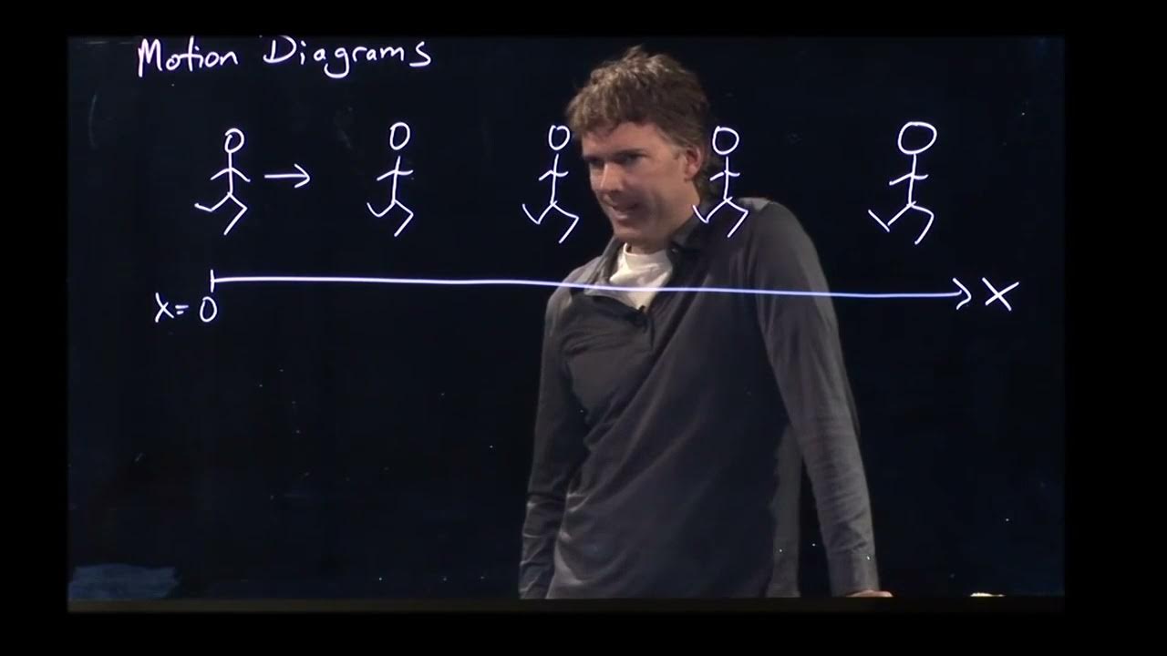
Motion diagrams | Physics with Professor Matt Anderson | M2-01

AP Physics Workbook 1.H Relationship between Position,Velocity and Acceleration
Angular Momentum of a Spinning Wheel | Physics with Professor Matt Anderson | M12-16
Angular momentum and cross product

Motion diagrams
5.0 / 5 (0 votes)
Thanks for rating: