Histograms and Density Plots with {ggplot2}
TLDRThis video script explores the importance of histograms in visualizing the distribution of continuous numeric data, highlighting how different shapes like symmetric, skewed, unimodal, or multimodal can guide the choice of statistical tests. It demonstrates creating histograms using R packages 'ggplot2' and 'islr' with the wage dataset, adjusting bin sizes for clarity. The script also discusses adding mean or median lines for better understanding, identifying outliers, and comparing distributions across groups. Furthermore, it introduces density plots as a smooth alternative to histograms, less sensitive to outliers, and concludes by emphasizing the practical applications of these visualizations in statistical analysis and decision-making.
Takeaways
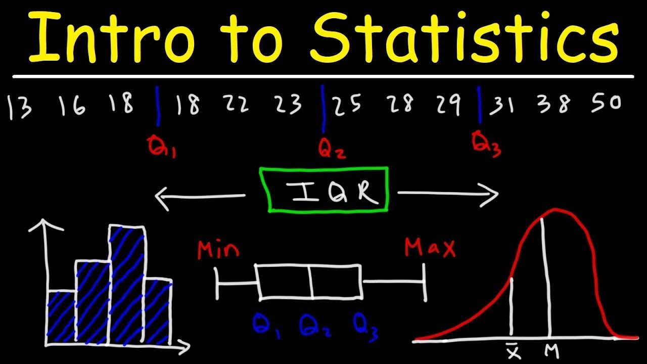
- 📊 Histograms are used to visualize the distribution of continuous numeric data, showing if it's symmetrical, skewed, unimodal, or multimodal.
- 🔍 Knowing the shape of the data distribution helps in choosing the appropriate statistical tests, like t-tests or linear regression for symmetrical distributions, and non-parametric tests for skewed data.
- 📈 When data has multiple peaks, it may require transformation before analysis to avoid misrepresentation when calculating central tendencies like the average.
- 👷♂️ Histograms assist in identifying outliers, which is crucial for data cleaning.
- 📚 To create a histogram in R, the 'ggplot2' and 'islr' packages are used, with the 'geom_histogram' function to generate the histogram itself.
- 🔢 Bins in a histogram represent ranges of numeric values, and their width is adjustable to provide more detail or a broader overview of the data distribution.
- 📉 Adding central tendency lines like mean or median to a histogram can provide additional insights into the data's distribution characteristics.
- 📋 Outliers can be spotted on a histogram, which can be useful for further data analysis or cleaning.
- 📊 Histograms can also be used to compare distributions across different groups, using different colors, subplots, or overlaying density curves.
- 📈 Density plots provide a smooth representation of the data distribution and are less sensitive to outliers than histograms.
- 📊 Converting histogram frequency counts to relative frequencies allows for the overlaying of density curves, which can enhance the visualization of data distribution.
Q & A
What do histograms represent in the context of data analysis?
-Histograms represent the distribution of continuous numeric data, showing the frequency of data points within specified ranges or bins.
What are the different shapes of data distribution that histograms can reveal?
-Histograms can reveal symmetric, skewed, unimodal, or multimodal distributions of data.
Why is knowing the shape of the data distribution important?
-Knowing the shape of the data distribution helps in deciding which statistical test is appropriate for analysis, such as t-tests or linear regression for symmetric distributions, and non-parametric tests for skewed distributions.
What is the purpose of transforming data when it has several peaks?
-Transforming data with several peaks can make it easier to analyze and interpret, as it may help to normalize the distribution or reduce the impact of outliers.
How do histograms help in identifying outliers in a dataset?
-Histograms help in identifying outliers by showing data points that fall outside the main body of the distribution, which can be useful for cleaning the data.
What is the significance of the number of bins in a histogram?
-The number of bins is significant as it affects the level of detail and the ability to discern patterns or trends in the data. Too many bins can make it hard to distinguish signal from noise, while too few can lack detail.
How can central tendency lines, such as the mean or median, be added to a histogram?
-Central tendency lines can be added to a histogram using functions like geom_vline in ggplot2, which allows for the inclusion of mean or median lines to provide a reference point for the distribution.
What is the purpose of adding standard deviation or quantile lines to a histogram?
-Adding standard deviation or quantile lines helps to visualize where the majority of the data falls within the distribution, providing a better understanding of the spread and concentration of data points.
How can histograms be used to compare distributions of different groups?
-Histograms can compare distributions of different groups by displaying them on the same plot with different colors using the fill argument, or on different subplots using facet_wrap or facet_grid functions.
What is a density plot and how does it differ from a histogram?
-A density plot is a smooth curve that represents the distribution of data. Unlike histograms, which use bars to show frequency counts, density plots provide a more accurate and less sensitive visualization to outliers.
How can the appearance of a histogram be enhanced in ggplot2?
-The appearance of a histogram can be enhanced in ggplot2 by filling the bars with color, outlining them, adjusting the line properties, and using functions like labs for titles and captions, and theme for text formatting and legend placement.
Outlines
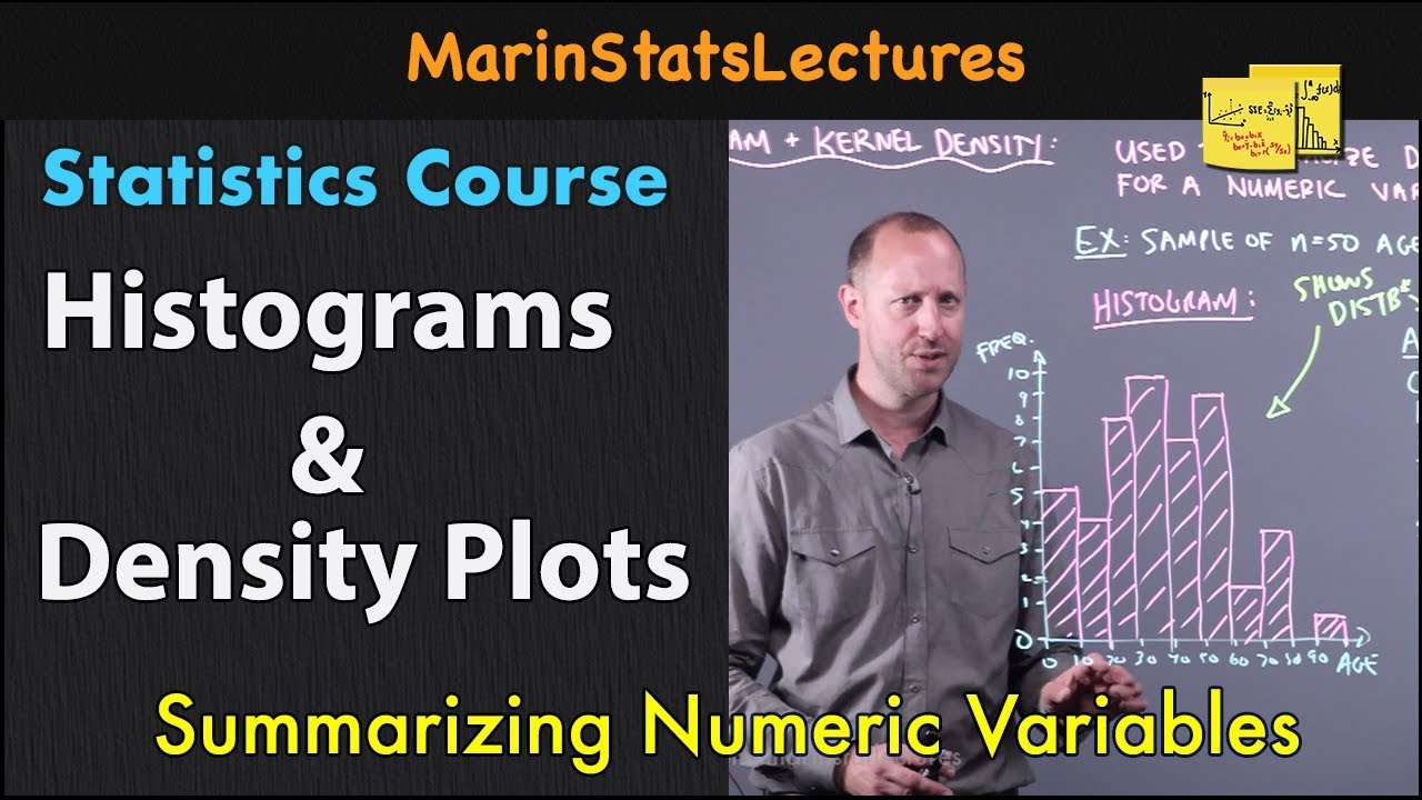
📊 Understanding Data Distribution with Histograms
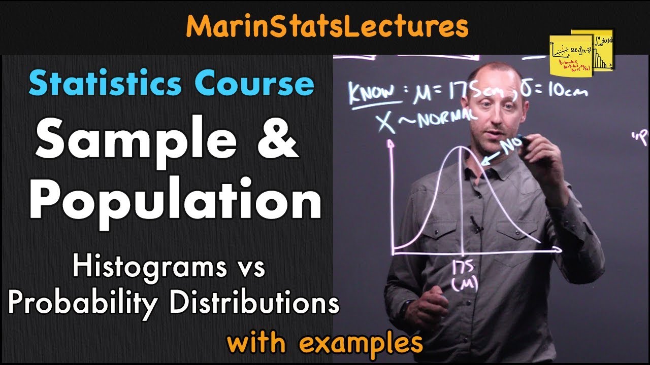
This paragraph discusses the importance of histograms in analyzing the distribution of continuous numeric data. Histograms can reveal whether data is symmetrical, skewed, unimodal, or multimodal. Knowing the data's shape helps in selecting the right statistical test, such as a t-test or linear regression for symmetrical distributions, or non-parametric alternatives for skewed data. The paragraph also explains how histograms can identify outliers and the significance of central tendencies like mean and median in data representation. It details the process of creating a histogram using R's ggplot2 package, emphasizing the role of bins and bin width in defining the histogram's detail level. The inclusion of mean and median lines in histograms is highlighted as a way to visually assess data distribution and skewness.
📈 Enhancing Histograms with Density Plots and Annotations
The second paragraph expands on the use of histograms by introducing density plots and annotations for a more detailed data analysis. Density plots provide a smooth representation of data distribution and are less sensitive to outliers. The paragraph explains how to convert histogram frequency counts into relative frequencies to create a density plot using ggplot2. It also covers how to calculate and display standard deviations and percentiles to better understand where the majority of data lies within the distribution. The use of annotations to label these statistical lines is discussed, along with techniques to compare distributions across multiple groups using fill arguments, facet wrap, or facet grid functions. The paragraph concludes with tips on enhancing plot appearance and readability through titles, captions, labels, and theme adjustments.
Mindmap
Keywords
💡Histograms
💡Distribution
💡Skewed Distribution
💡Central Tendency
💡Outliers
💡Bins
💡Density Plots
💡Standard Deviation
💡Quantiles
💡ggplot2
Highlights
Histograms display the shape of the distribution of continuous numeric data.
Distribution can be symmetric, skewed, unimodal, or multimodal.
Knowing the distribution shape helps in choosing the appropriate statistical test.
Symmetric distribution allows the use of t-test or linear regression.
Skewed distribution requires non-parametric tests like Mann-Whitney U test or median regression.
Data with multiple peaks may need transformation before analysis.
Histograms help identify outliers for data cleaning.
Creating a histogram involves loading the 'ggplot2' and 'islr' packages in R.
Histograms divide numeric variables into bars, with each bar representing a range of values called a bin.
The number of bins affects the level of detail in the histogram.
Central tendency lines like mean or median can be added to histograms for better understanding.
Histograms can identify outliers and signal the need for closer examination.
Adding vertical lines for standard deviations or quantiles helps visualize data distribution.
Density plots provide a smooth curve representation of data distribution.
Density plots are less sensitive to outliers compared to histograms.
Histograms and density plots can be used to compare distributions of multiple groups.
Histograms with density curves and central tendencies are useful for data analysis and decision-making.
Transcripts
Browse More Related Video
Introduction to Statistics
Histograms and Density Plots for Numeric Variables | Statistics Tutorial | MarinStatsLectures

Histograms in R | R Tutorial 2.4 | MarinStatsLectures

Elementary Stats Lesson 2

Elementary Stats Lesson #3 A
Sample and Population in Statistics | Statistics Tutorial | MarinStatsLectures
5.0 / 5 (0 votes)
Thanks for rating: