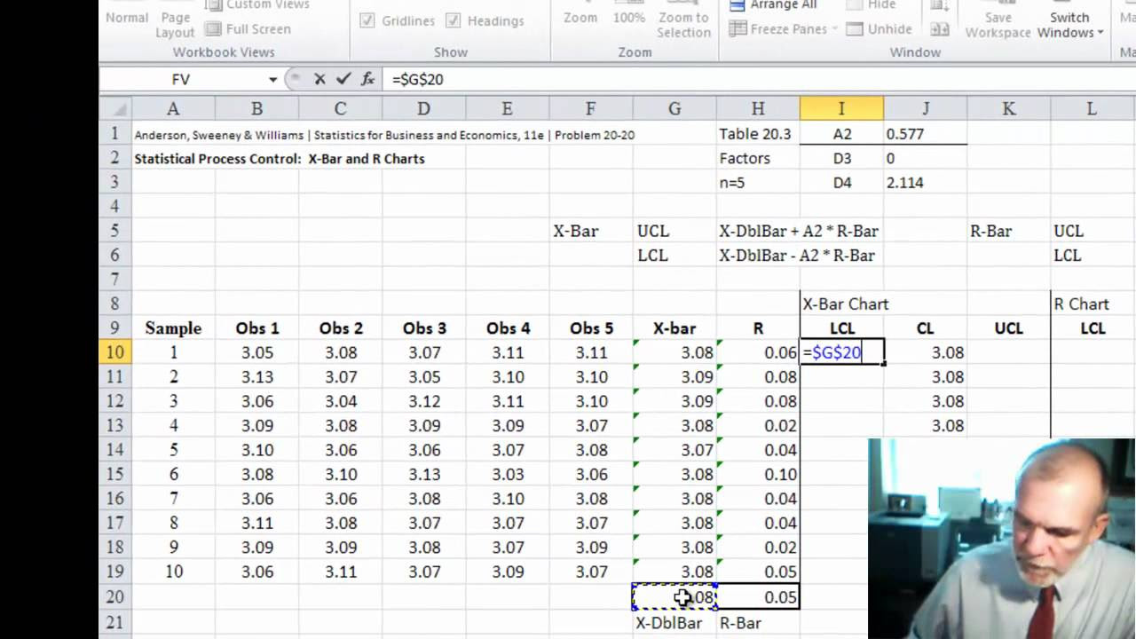
Statistical Process Control | Chart for Means (x-bar chart)
TLDRThis tutorial introduces constructing an x-bar control chart to determine if a process is in statistical control. It explains calculating the centerline and control limits using sample means, ranges, and R-bar, along with the A2 factor from a control chart factors table. The process data involves 10 days of samples, each of size 5. The chart reveals the process is out of control on day 5, suggesting a need for investigation and corrective actions.
Takeaways
- 📊 The tutorial is about constructing an x-bar control chart to determine if a process is in statistical control.
- 📈 A control chart includes a centerline, upper control limit (UCL), and lower control limit (LCL).
- 🧩 The centerline of the x-bar chart is represented by the mean of the sample means, denoted as x-double bar.
- 🔢 The control limits are calculated using the range of the process, with the UCL being x-double bar plus A2 times R-bar, and the LCL being x-double bar minus A2 times R-bar.
- 📐 R-bar is the average of the sample ranges, which is calculated by summing all ranges and dividing by the number of samples.
- 🔍 A2 is a control chart factor found in a control chart factors table, specific to the sample size.
- 🗓️ The process data used in the tutorial consists of samples of size 5 collected daily for 10 days.
- 📝 The range for each sample is the difference between the largest and smallest values, and the mean is calculated by summing and dividing by the sample size.
- 🔑 To find A2, refer to the control chart factors table for the corresponding value based on the sample size.
- 📉 The x-bar chart is completed by plotting the sample points, drawing the control limits, and creating a run chart.
- 🚫 If a sample mean falls outside the control limits, such as below the LCL, it indicates the process is out of control and requires investigation.
Q & A
What is the purpose of a control chart for x-bar?
-The purpose of a control chart for x-bar is to construct a chart from process data to determine if the process mean is in statistical control.
What are the three components of a control chart?
-The three components of a control chart are the centerline, the lower control limit (LCL), and the upper control limit (UCL).
What does the centerline of an x-bar chart represent?
-The centerline of an x-bar chart represents the mean of the sample means, denoted as x-double bar.
If the standard deviation of the process is known, what formula is used to calculate the control limits?
-If the standard deviation of the process is known, a specific formula is used to calculate the control limits, but in the provided script, the range is used instead.
What is the formula for calculating the upper control limit (UCL) of an x-bar chart when using the range?
-The formula for calculating the UCL when using the range is UCL = x-double bar + A2 * R-bar.
What is R-bar and how is it calculated?
-R-bar is the average of the sample ranges. It is calculated by summing all the ranges and dividing by the number of samples.
What is A2 and where can it be found?
-A2 is a control chart factor used in calculating the control limits. It can be found in the control chart factors table corresponding to the sample size.
How is the sample range calculated?
-The sample range is calculated by subtracting the smallest value in the sample from the largest value.
What does it mean if a sample mean falls outside the control limits?
-If a sample mean falls outside the control limits, it indicates that the process mean is not in statistical control, or is out of control.
What action is recommended when the process is found to be out of control?
-When the process is found to be out of control, it is recommended to investigate the activities of the day when the out-of-control condition occurred to determine the special cause of variation and to take necessary corrective actions.
How can the control chart help in identifying special causes of variation?
-The control chart helps in identifying special causes of variation by showing when the process mean falls outside the control limits, signaling a potential non-random variation that requires investigation.
Outlines
📊 Introduction to x-bar Control Chart
This paragraph introduces the concept of the x-bar control chart, a statistical tool used to determine if a process is in statistical control. It explains the components of the chart, including the centerline, upper control limit (UCL), and lower control limit (LCL), and mentions the use of the sample mean (x-double bar) and range in calculating these limits. The video script outlines the process of constructing an x-bar chart using process data collected over 10 days with sample sizes of 5, aiming to assess whether the process mean is stable and predictable.
Mindmap
Keywords
💡Control chart
💡x-bar chart
💡Statistical control
💡Centerline
💡Upper control limit (UCL)
💡Lower control limit (LCL)
💡Sample size
💡Range
💡R-bar
💡x-double bar
💡A2
💡Special cause
Highlights
Introduction to constructing an x-bar chart for statistical process control.
Explanation of the components of a control chart: centerline, upper control limit (UCL), and lower control limit (LCL).
The centerline of the x-bar chart is the mean of the sample means (x-double bar).
Use of the range to calculate control limits when the process standard deviation is unknown.
Formula for calculating UCL and LCL using x-double bar, A2, and R-bar.
R-bar is the average of the sample ranges.
A2 value is obtained from the control chart factors table based on sample size.
Process data consists of samples of size 5 collected daily for 10 days.
Objective to determine if the process mean is in statistical control.
Method for obtaining sample ranges and means.
Calculation of R-bar and x-double bar from the sum of ranges and means.
Determination of A2 value for a sample size of 5 from the control chart factors table.
Calculation of UCL and LCL using the determined values of A2, x-double bar, and R-bar.
Construction of the x-bar chart with sample points, control limits, and a run chart.
Identification of a process out of statistical control due to a sample mean below the LCL.
Recommendation to investigate the activities of day 5 for special causes of variation.
Conclusion and summary of the x-bar chart process.
Transcripts
Browse More Related Video
CONTROL CHART BASICS and the X-BAR AND R CHART +++++ EXAMPLE
XBar-R Control Charts

Create a Basic Control Chart
Statistical Process Control | SPC Control charts (IMR ) using Minitab 17 |
Making a Control Chart in Excel (with dynamic control lines!)

Attribute Data Control Chart Examples!! How to select/create the P, NP, C and U Charts
5.0 / 5 (0 votes)
Thanks for rating: