Create a Basic Control Chart
TLDRThis instructional video demonstrates the creation of a control chart, known as a Shewart chart, using Excel. It explains the basic components, including measured data, mean, and upper and lower control limits (UCL and LCL), which are set at three standard deviations from the mean. The tutorial guides viewers through the process of calculating the mean and standard deviation, setting up the chart, and dynamically adjusting labels that reference specific values like '3 Sigma'. It concludes with tips on adding symbols and emphasizes the chart's utility in measuring progress over time in statistical quality control.
Takeaways
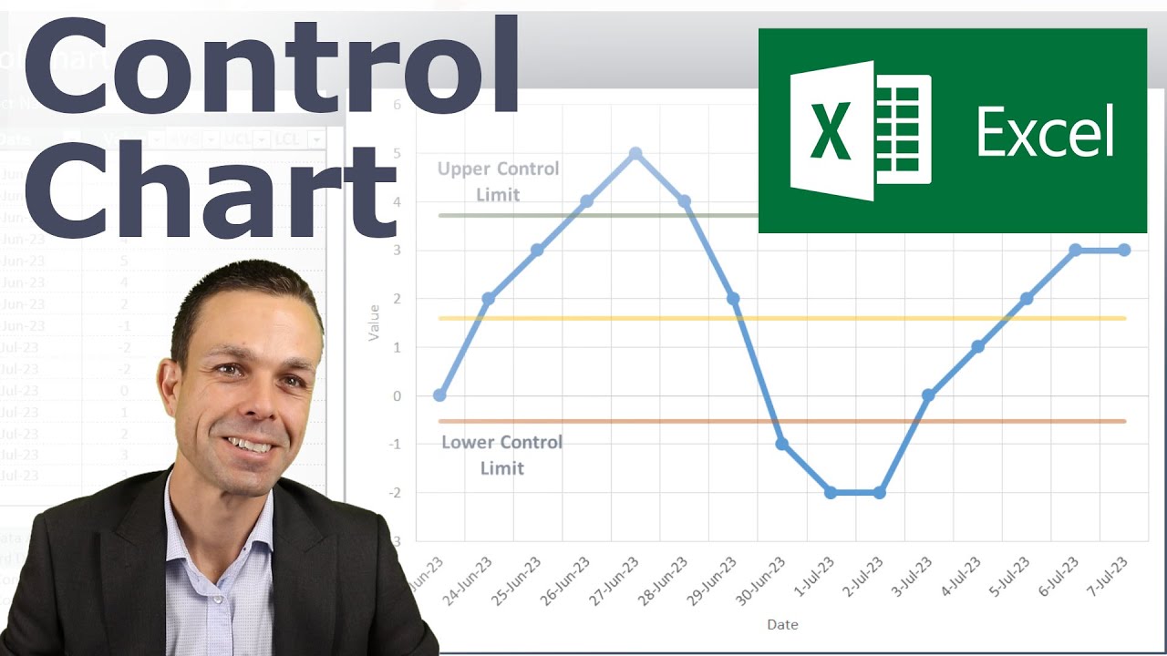
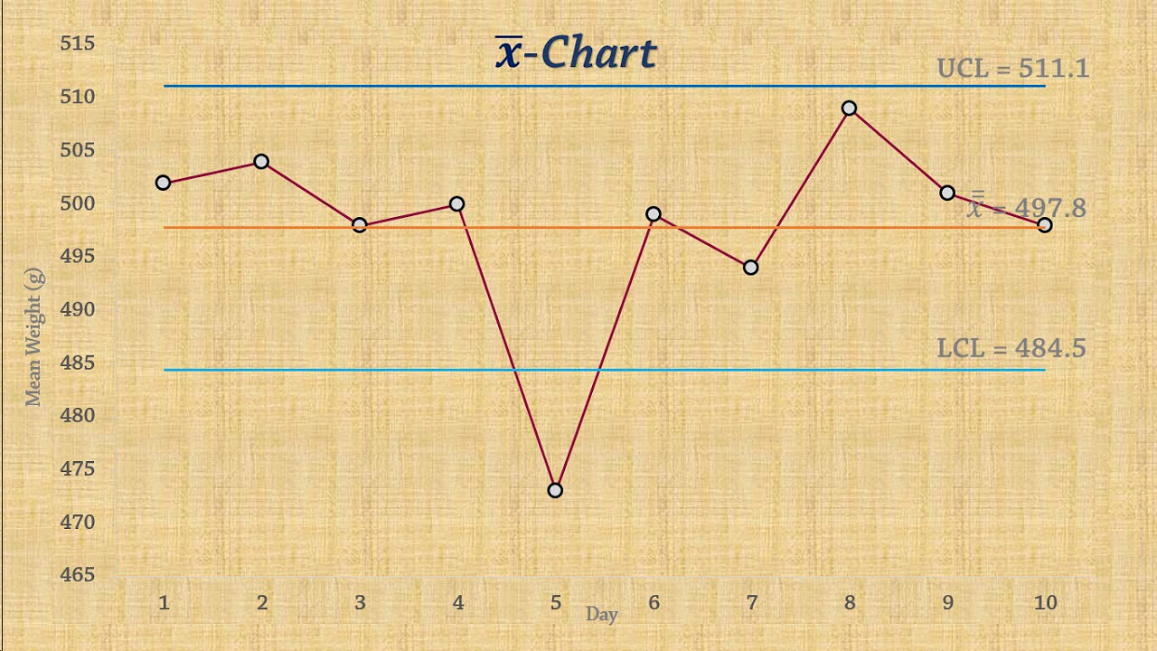
- 📊 Control charts, also known as Shewhart charts, were created by Walter Shewhart for statistical quality control.
- 🔍 Control charts measure progress over time with key components: measured data, mean, upper control limit (UCL), and lower control limit (LCL).
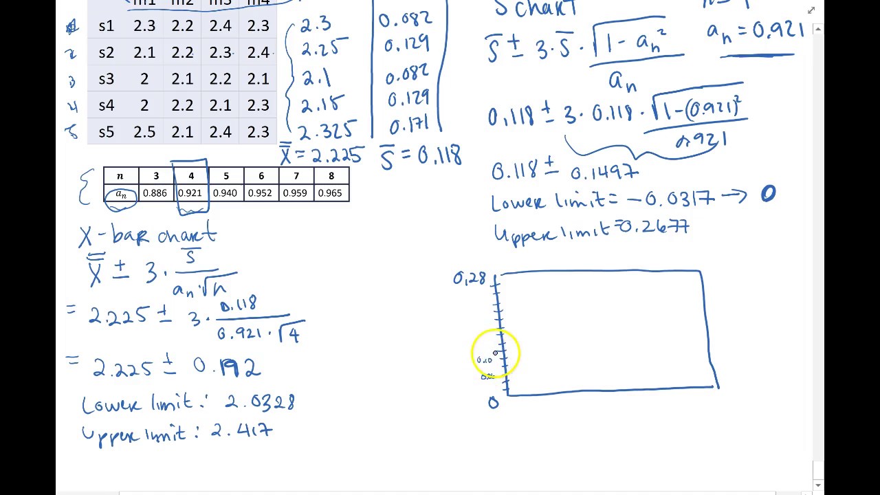
- 📈 The UCL and LCL are set at three times the standard deviation away from the mean.
- 📑 To create a control chart in Excel, start by selecting and copying the data range for measured data.
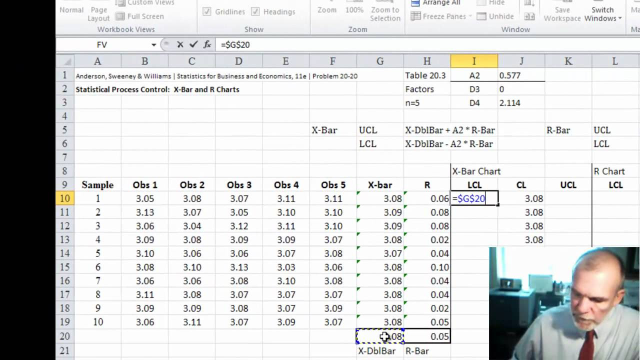
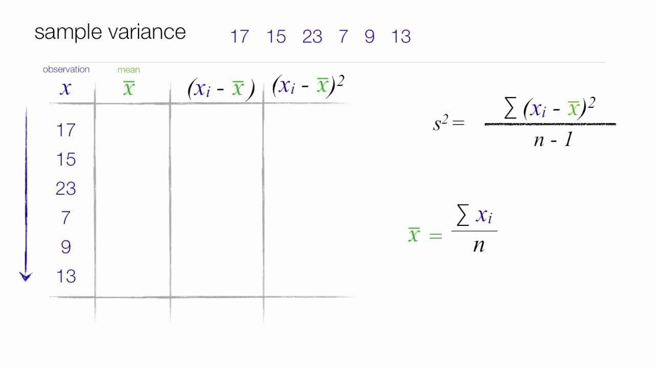
- 📉 Calculate the mean using the AVERAGE function in Excel.
- 📐 Calculate the standard deviation using the STDEV.S function for a sample.
- 🔗 Create columns for the mean, UCL, and LCL, and use formulas to keep these values consistent across all rows.
- 🧮 The UCL is calculated as the mean plus three times the standard deviation, and the LCL is the mean minus three times the standard deviation.
- 📋 Insert a line chart in Excel using the selected data range to visualize the control chart.
- 🔄 Add dynamic labels to the chart for UCL, LCL, and mean by referencing the appropriate cells, ensuring they update automatically with data changes.
Q & A
What is a control chart?
-A control chart is a statistical tool used to measure and monitor the performance of a process over time, helping to determine whether a process is in a state of statistical control.
Who created the control chart?
-The control chart was created by Walter A. Shewhart, an American physicist and statistician.
What are the basic components of a control chart?
-The basic components of a control chart include measured data, the mean or average, and upper and lower control limits (UCL and LCL).
What do the UCL and LCL represent in a control chart?
-The UCL (Upper Control Limit) and LCL (Lower Control Limit) represent the upper and lower bounds of a control chart, which are typically set at three standard deviations away from the mean.
How are the UCL and LCL calculated in the context of this script?
-In the script, the UCL and LCL are calculated as the mean plus or minus three times the standard deviation of the data set.
What is the purpose of calculating the mean and standard deviation in a control chart?
-Calculating the mean and standard deviation helps to establish the central tendency and variability of the data, which are essential for determining the control limits on the chart.
How does the script describe the process of creating a control chart in Excel?
-The script describes the process of creating a control chart in Excel by first calculating the mean and standard deviation, then setting up the UCL and LCL, and finally plotting the data on a line chart with dynamic labels.
What is the significance of dynamic labels in a control chart?
-Dynamic labels adjust automatically to changes in the data, ensuring that the chart remains accurate and up-to-date without manual adjustments.
Why is the symbol 'Σ' (Sigma) used in the context of control charts?
-The symbol 'Σ' (Sigma) is used to represent the standard deviation in control charts, as it is a common statistical notation for the measure of dispersion in a set of data.
How does the script demonstrate adding a symbol to a data label in Excel?
-The script demonstrates adding a symbol to a data label in Excel by inserting the symbol from the 'Symbol' dialog box and then referencing the cell containing the symbol in the data label's formula bar.
What is the final step in creating a control chart as described in the script?
-The final step in creating a control chart as described in the script is to format the chart, add dynamic labels, and ensure that all elements such as gridlines and the legend are adjusted or removed as needed.
Outlines
📊 Introduction to Control Charts
This paragraph introduces the concept of control charts, specifically the Shewhart control chart, named after American physicist and statistician Walter Shewhart. It is used in statistical quality control to monitor progress over time. The basic components of a control chart include measured data, the mean or average, and upper and lower control limits (UCL and LCL), which are set at three standard deviations from the mean. The video will demonstrate how to create these labels dynamically, adjusting them as the data changes, and will guide through the process of creating a control chart using Excel.
🔍 Creating a Control Chart in Excel
The second paragraph details the step-by-step process of creating a control chart in Excel. It begins with selecting the necessary data and pasting it into a new table. The mean is calculated using the AVERAGE function, and the standard deviation is determined using the STDEVA function, which is appropriate for a sample. The mean is then used to create a constant line across the chart, while the UCL and LCL are calculated using formulas that involve the mean plus or minus three times the standard deviation. The paragraph also covers how to insert a line chart, adjust its size and position, and remove unnecessary elements like gridlines and the legend. Finally, it explains how to create dynamic labels for the UCL, LCL, and mean that adjust with the chart, and how to insert the Sigma symbol into the labels.
Mindmap
Keywords
💡Control Chart
💡Walter Shewhart
💡Quality Control
💡Measured Data
💡Mean
💡Standard Deviation
💡Upper Control Limit (UCL)
💡Lower Control Limit (LCL)
💡Excel
💡Data Labels
💡Sigma Symbol (Σ)
Highlights
Introduction to the control chart, a tool created by Walter Shewhart for measuring progress over time in statistical quality control.
Explanation of the basic components of a control chart including measured data, mean, and upper and lower control limits (UCL and LCL).
Description of how the UCL and LCL are set at three standard deviations away from the mean.
Demonstration of creating a control chart using Excel, starting with selecting and pasting the required data.
Use of the AVERAGE function in Excel to calculate the mean of the data set.
Differentiation between STDEV and STDEVA functions in Excel, with the former being used for a sample standard deviation.
Method to populate the chart with columns for the mean, UCL, and LCL using Excel formulas.
Technique to lock cell references using F4 for consistent data references when copying down the formula.
Process of creating a line chart in Excel by selecting the appropriate data range and choosing the chart type.
Adjusting the chart's size and position for better visualization and removing unnecessary gridlines.
Removal of the chart legend to make room for dynamic data labels.
Dynamic labeling of the UCL, LCL, and mean on the chart by referencing specific cells in the Excel worksheet.
Adding the Sigma symbol to the labels by using the Symbol feature in Excel.
Finalization of the control chart with proper formatting and dynamic labels that adjust with the chart.
Undoing a mistake and correcting the chart by deleting unnecessary elements like the '3 Sigma' label.
Inclusion of the Sigma symbol in the labels to represent the standard deviation accurately.
Completion of the control chart creation with a summary of the steps and a thank you note to the viewers.
Transcripts
Browse More Related Video
5.0 / 5 (0 votes)
Thanks for rating: