AP Stats 3.1 - Scatterplots & Correlation
TLDRThe video script discusses the analysis of food access through scatter plots and correlation, focusing on the relationship between neighborhood income levels and the availability of healthy foods in grocery stores. It uses the example of HEB, a major grocery chain in Texas, to explore how the number of organic food products offered varies with the average income of the area. The video introduces the concepts of explanatory and response variables, positive and negative correlations, and the least square regression line. It emphasizes the importance of understanding the strength and direction of correlations and the distinction between correlation and causation.
Takeaways
- 📊 The lesson focuses on analyzing food access through scatter plots and correlation to understand how neighborhood characteristics, such as income level, might influence access to healthy foods.
- 🥦 The case study examines the variety of organic food products offered at different HEB grocery store locations in San Antonio, correlating it with the average income of the areas they serve.
- 📈 Scatter plots are used to visualize bivariate data, where each data point represents a store, with the x-coordinate showing the average income and the y-coordinate showing the number of organic items.
- 🔍 The explanatory variable in this analysis is the average household income in the zip code, represented as 'X', and the response variable is the number of organic vegetables offered in the store, represented as 'Y'.
- 💡 A positive correlation is indicated when 'X' increases, and 'Y' also increases. In this case, as the average income in the area increases, so does the number of organic food products offered at the store.
- 📏 The strength of the correlation is described as moderate, suggesting that while income is a predictor of organic food offerings, it is not an extremely strong one.
- 🤔 The lesson introduces the concept of the least square regression line, a straight line that best fits the data points, used to model the relationship between two variables.
- 📝 Describing scatter plots involves considering context, direction, outliers, form, and strength of the relationship between variables.
- 🔢 The correlation coefficient (R) is a numerical value between -1 and 1 that quantifies the strength and direction of the correlation, with values closer to 1 or -1 indicating a strong correlation and values closer to 0 indicating a weaker one.
- 🏖️ An example is given about the potential misunderstanding of correlation and causation with data collected on average temperature, ice cream sales, and drownings at a beach, highlighting the importance of not assuming causation from correlation.
- 🎓 The lesson emphasizes the importance of understanding the relationship between variables and the implications of these relationships in real-world scenarios, such as food access and public health.
Q & A
What is the main focus of the video script?
-The main focus of the video script is to analyze the relationship between neighborhood income levels and access to healthy foods, specifically the availability of organic food products in grocery stores.
What type of data is being analyzed in the script?
-The script is analyzing bivariate data, which involves two quantitative variables measuring numeric quantities, visualized in a scatter plot.
What is the role of explanatory and response variables in the analysis?
-The explanatory variable, in this case, is the average household income in the zip code where the grocery store is located, and the response variable is the number of organic vegetables offered in the store.
How does the script describe the relationship between the explanatory and response variables?
-The script describes the relationship as having a positive direction, meaning as the average household income increases, the number of organic food products offered at the store also increases.
What is the significance of scatter plots in this analysis?
-Scatter plots are significant in this analysis as they visually represent the relationship between the two variables, allowing for the observation of trends, correlations, and potential outliers.
How does the script define a strong correlation?
-A strong correlation is defined by the script as a situation where data points are very close to the least square regression line, indicating that the linear model is a good fit for the data.
What is the role of the least square regression line in scatter plots?
-The least square regression line is a straight line that roughly divides the data points, with half above and half below it. It is used to model the relationship between the variables and make predictions for new data.
What is the correlation coefficient (R value) and how is it used in the analysis?
-The correlation coefficient (R value) is a number between -1 and 1 that quantifies the strength and direction of the correlation between two variables. It provides a numerical measure to describe how closely the data points follow a linear pattern.
What was the R value for the scatter plot analyzed in the script?
-The R value for the scatter plot analyzed in the script was 0.79, indicating a moderately strong positive correlation between average household income and the number of organic vegetables offered at grocery stores.
What is the difference between correlation and causation as discussed in the script?
-Correlation refers to the statistical relationship between two variables, while causation implies that one variable is causing the changes in the other. The script emphasizes that just because there is a correlation, it does not necessarily mean that there is a causation.
How does the script illustrate the difference between correlation and causation using the example of ice cream sales and drownings?
-The script uses the example to show that while there might be a correlation between ice cream sales and drownings (as both might increase with higher temperatures), it does not mean that ice cream sales cause drownings. This example highlights the importance of not assuming causation from correlation alone.
Outlines
📊 Introduction to Scatter Plots and Correlation
This paragraph introduces the topic of scatter plots and correlation in the context of analyzing food access. It sets the stage for a detailed exploration of how neighborhood income levels might influence the availability of healthy foods in local stores. The key question addressed is whether the neighborhood determines access to healthy foods. The paragraph outlines the plan to examine the relationship between two quantitative variables using scatter plots and discusses the importance of identifying explanatory and response variables. It uses the example of HEB, a major grocery store chain in Texas, to illustrate how the availability of organic vegetables varies across different store locations based on the average income of the surrounding areas.
🔍 Describing Correlations in Scatter Plots
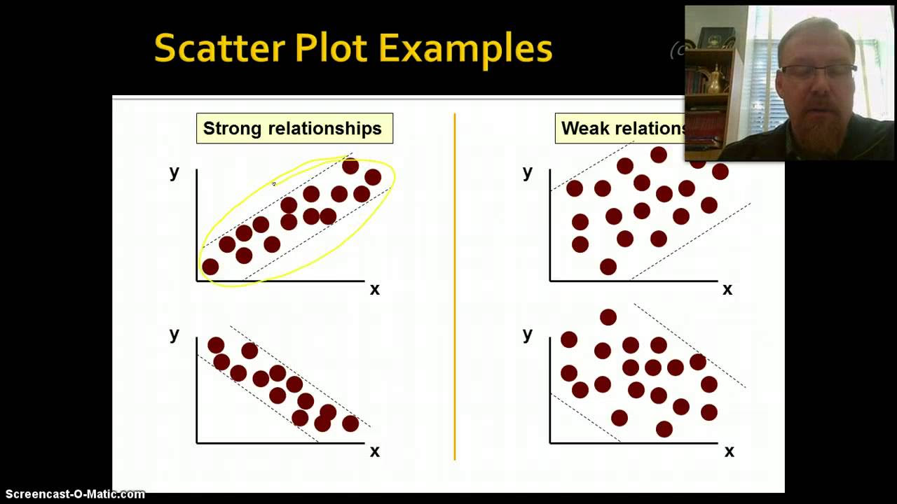
This paragraph delves into the description of correlations within scatter plots, explaining how positive and negative correlations are represented. It introduces the concept of the least square regression line, which is used to model the data and provide a visual representation of the relationship between two variables. The paragraph also discusses the strength of correlations, distinguishing between strong, moderate, and weak correlations. It uses the example of the relationship between household income and the number of organic food products offered at HEB stores to illustrate a moderately strong positive correlation. The concept of outliers and linear form in scatter plots is also touched upon, providing a foundation for understanding how to interpret and analyze scatter plots effectively.
📈 Quantifying Correlation with the Correlation Coefficient
This paragraph focuses on the quantification of correlation through the correlation coefficient (R). It explains that the R value, which ranges from -1 to 1, provides a numerical measure of both the strength and direction of the correlation between two variables. The paragraph clarifies that a close to 1 or -1 indicates a strong correlation, while a value close to 0 indicates a weak correlation. Positive R values represent positive correlations, and negative R values represent negative correlations. The example of the relationship between average household income and the number of organic vegetables offered at HEB stores is used to demonstrate a moderately strong correlation with an R value of 0.79. The paragraph also introduces the concept of correlation versus causation, using the example of ice cream sales, temperature, and drownings to illustrate the importance of understanding that correlation does not necessarily imply causation.
Mindmap
Keywords
💡scatter plots
💡correlation
💡explanatory variable
💡response variable
💡least square regression line
💡correlation coefficient (R)
💡strength of correlation
💡outliers
💡causation
💡data analysis
Highlights
The lesson focuses on analyzing food access through scatter plots and correlation.
The key analysis question is whether neighborhood determines access to healthy foods.
The study involves examining differences in food offerings at grocery stores in various neighborhoods.
HEB, a large grocery chain in Texas, is used as a case study for the analysis.
A significant observation is that different HEB stores offer varying amounts of organic food products.
A dataset of 37 HEB locations in San Antonio with average income and organic vegetable offerings is collected.
Explanatory and response variables are defined, with household income as the explanatory variable and organic food offerings as the response.
A scatter plot is visualized with the x-coordinate representing average income and y-coordinate the amount of organic items.
Correlation measures how two variables are related, with positive and negative correlations described.
The least square regression line is introduced as a model to roughly fit the data.
The strength of correlation is discussed, with strong correlations having data points close to the regression line.
The relationship between average household income and the number of organic vegetables offered is found to be positively correlated with moderate strength.
The correlation coefficient (R) is explained as a measure of the strength and direction of the correlation.
The R value for the given scatterplot is 0.79, indicating a moderately strong positive correlation.
The lesson introduces the concept of correlation versus causation, using ice cream sales and temperature as an example.
A discussion on the relationship between ice cream sales and drownings raises questions about interpreting correlation data.
Transcripts
Browse More Related Video
Correlation Doesn't Equal Causation: Crash Course Statistics #8

Elementary Stats Lesson #5
Math 119 Chapter 10 Part 1
10.1.1 Correlation - Linear, Nonlinear, Positive Linear, and Negative Linear Correlation Defined
Explanatory and Response Variables, Correlation (2.1)
Introduction to Correlation & Regression, Part 1
5.0 / 5 (0 votes)
Thanks for rating: