Making a Control Chart in Excel (with dynamic control lines!)
TLDRThis video tutorial showcases the creation of a dynamic control chart in Excel, a valuable tool for tracking and analyzing business processes over time. The presenter guides viewers through setting up the chart, calculating averages and control limits, and formatting for clarity. The script emphasizes the chart's ability to identify trends and deviations, crucial for quality control and business strategy. With step-by-step instructions, viewers learn to create a visually appealing and informative chart that can impress executives and customers alike.
Takeaways
- 📊 The script introduces a control chart template for Excel to visualize process tracking over time, such as sales or other business metrics.
- 🔍 The control chart helps in identifying trends and determining if the process is within control limits, which are crucial for quality control.
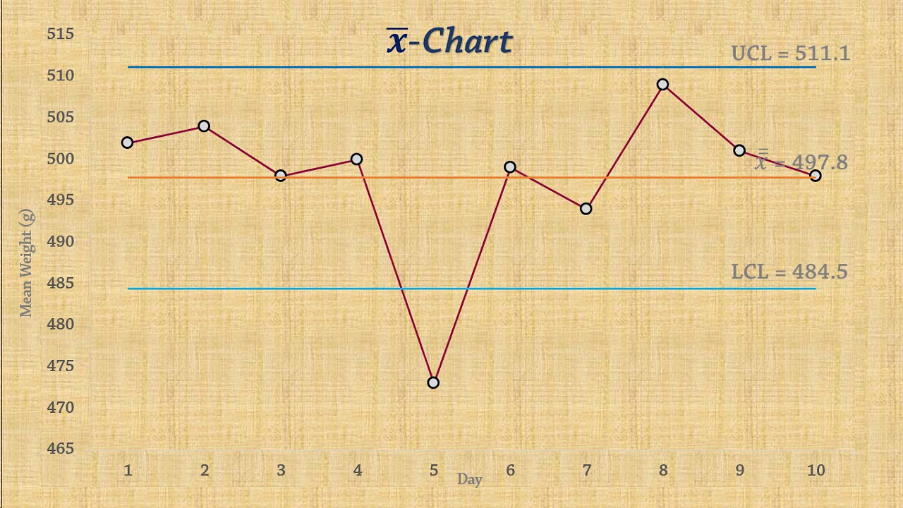
- 📈 The chart includes an upper control limit (UCL) and a lower control limit (LCL) to monitor if the process is out of control, indicating potential issues.
- 🛠️ Customization is possible within the spreadsheet to adjust control limits based on the standard deviation of the process, making it adaptable to various needs.
- 🎨 The template starts with general color and framing setup to make the spreadsheet visually appealing and easy to understand.
- 📐 The script demonstrates how to create a table with borders and formatting to organize data effectively within the spreadsheet.
- 🗓️ It explains how to format date columns to display dates in a user-friendly way, which is essential for time-series data representation.
- 📝 Dummy data is used initially for demonstration, allowing users to see how the control chart would look with sample data.
- 🧮 The script covers the calculation of the average and standard deviation, which are fundamental for setting the control limits.
- 📈 The creation of the control chart involves selecting date and value sections and inserting a line chart, which is then customized.
- 📑 The final step includes adding dynamic labels to the chart, linking them to specific cells for an interactive and informative visualization.
- 🌟 The control chart is dynamic, meaning it updates automatically when new data is added, making it a valuable tool for ongoing process monitoring.
Q & A
What is the main purpose of a control chart according to the video script?
-The main purpose of a control chart is to visually represent a process over time, allowing users to identify trends and determine if the process is within or outside of certain control limits, which can indicate if there are too many defects or if the process has deviated significantly from the norm.
What are the three key components of a control chart mentioned in the script?
-The three key components of a control chart are the upper control limit (UCL), the lower control limit (LCL), and the average or mean of the process data.
How can the control limits on a control chart be adjusted according to the script?
-The control limits on a control chart can be adjusted by modifying the standard deviation of the process. Changes in the standard deviation will dynamically alter the control limits on the chart.
What is the significance of the standard deviation in calculating control limits?
-The standard deviation is a measure of the amount of variation in the process data. It is used in calculating the control limits by being added to or subtracted from the average to determine the UCL and LCL, respectively.
How does the script suggest formatting the date column in the control chart?
-The script suggests formatting the date column to display dates in a more readable format, such as showing months and years instead of just numbers, by changing the cell format to a date format.
What is the recommended approach for handling the data labels on the control chart according to the script?
-The script recommends using data labels that are linked to the cells containing the control limit values. This way, if the control limits change, the labels will update dynamically to reflect those changes.
How can the visibility of the control limits in the data table be managed?
-The visibility of the control limits in the data table can be managed by adjusting the cell colors or by hiding the cells containing the control limit values if they are not needed for the visual representation.
What is the suggested method for creating a dynamic title for the control chart?
-The suggested method is to use a formula in the title bar that references a cell containing the desired title text. When the text in the cell changes, the title of the chart will update automatically.
What is the script's recommendation for the line style of the control limits on the chart?
-The script recommends using a less prominent line style for the control limits, such as a thinner line and possibly a different color, to distinguish them from the main data series on the chart.
How does the script describe the process of adding markers to the control chart?
-The script describes adding markers by selecting the data series, going to the marker options, and choosing a built-in marker style. The markers can be made larger for better visibility and can be removed if not needed by setting the marker option to 'none'.
What is the script's advice on showcasing the control chart to executives or customers?
-The script advises ensuring that the control chart has clear labels for the average, UCL, and LCL, and that it is visually appealing and easy to understand, as it will be presented to executives, customers, and other stakeholders.
Outlines
📊 Introduction to Control Charts and Templates
The creator introduces themselves as someone who makes Excel and PowerPoint templates to help people in their careers and businesses. This video focuses on creating a control chart, which is useful for tracking processes over time, such as sales or other business metrics. The control chart helps determine trends and identify when metrics are outside control limits. The video promises a detailed walkthrough of creating and customizing a control chart in Excel.
🖌️ Setting Up the Spreadsheet
The first step in creating the control chart involves setting up the spreadsheet's general colors and framing. The video shows how to adjust cell colors and borders to create a clear and organized layout. The presenter emphasizes the importance of formatting to make the spreadsheet user-friendly and visually appealing. This section includes tips on centering text, increasing indents, and setting up initial table borders.
📅 Entering Data and Formatting Dates
Next, the video covers entering dates and various measurements into the spreadsheet. The presenter explains how to format date cells to display in different ways, such as using month abbreviations. Dummy data is used to demonstrate how measurements can be entered and formatted. The video highlights the flexibility Excel offers in customizing date formats to suit different preferences and business needs.
📈 Calculating Averages and Control Limits
The video then demonstrates how to calculate the average and standard deviation of the data, which are crucial for determining the upper and lower control limits. The presenter explains the formulas used in Excel for these calculations and how to format the results. Tips are provided on reducing decimal places for cleaner presentation. The section emphasizes the importance of these calculations in creating an accurate control chart.
📊 Creating the Control Chart
With the data and calculations in place, the video guides viewers through creating the control chart itself. This involves selecting data ranges and inserting a line chart. The presenter addresses common issues, such as formatting the date axis correctly, and shows how to add markers to data points for better visualization. This section provides a step-by-step approach to setting up the basic structure of the control chart.
🖍️ Customizing the Chart Appearance
Further customization of the chart is discussed, including adjusting the axis labels and titles. The presenter demonstrates how to link the chart title and axis titles to specific cells for dynamic updates. This ensures that the chart remains informative and automatically updates when underlying data changes. The video highlights the importance of these customizations for creating a professional and functional control chart.
📏 Adding Control Limits to the Chart
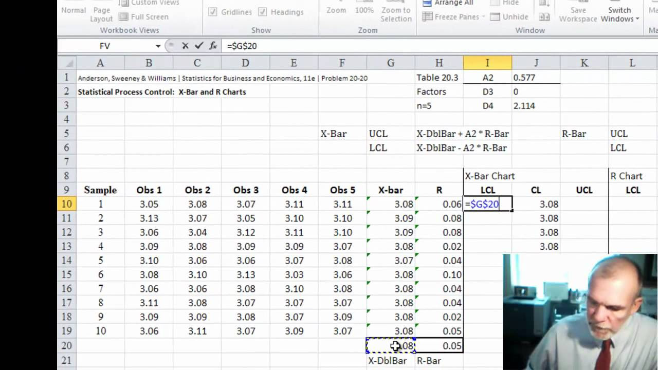
The video explains how to add the calculated average, upper control limit, and lower control limit to the chart. This involves using specific cell references and ensuring these references are fixed to avoid errors when copying formulas. The presenter shows how to format these lines to be less prominent but still visible. This section emphasizes the importance of visual clarity in presenting control limits on the chart.
🔖 Labeling the Control Limits
To enhance the chart's readability, the video covers adding labels to the control limits. The presenter explains how to add dynamic labels linked to specific cells, ensuring that labels update automatically with any changes. This section includes tips on positioning labels and customizing their appearance. The goal is to make the chart as informative and easy to understand as possible for viewers.
✅ Finalizing the Dynamic Control Chart
In the final section, the presenter reviews the completed control chart, highlighting its dynamic features. Any changes to the data automatically update the control limits and labels, making the chart a powerful tool for continuous monitoring. The video concludes with encouragement to use and share the template, emphasizing its value for business presentations and decision-making. The presenter invites viewers to join future videos for more templates and tips.
Mindmap
Keywords
💡Excel
💡Control Chart
💡Trends
💡Control Limits
💡Standard Deviation
💡Templates
💡Business Metrics
💡Formatting
💡Dynamic
💡Dummy Data
💡Executives
Highlights
Introduction of a control chart template for tracking processes and metrics over time.
Use of control charts to identify trends and determine if data is within control limits.
Explanation of upper control limit (UCL) and lower control limit (LCL) in a control chart.
Modification of control limits based on the standard deviation of the process.
Customization of the spreadsheet's colors and framing to make it visually appealing.
Creating a table with borders to organize data for the control chart.
Formatting date columns to display dates in a more readable format.
Inputting dummy data to represent measurements for the control chart.
Calculating the average of the data values using Excel functions.
Determining the standard deviation of the data set for control limit calculations.
Setting up the upper and lower control limits based on the average and standard deviation.
Creating a line chart to visualize the control chart with dates and values.
Adjusting the date axis format to correctly display dates in the chart.
Adding markers to the chart for better visualization of data points.
Dynamic updating of chart elements like titles and axis labels using cell references.
Incorporating average, UCL, and LCL lines into the chart with adjustable formatting.
Adding data labels to the control limits for clear identification on the chart.
The control chart is dynamic, updating control limits and labels as new data is added.
The control chart is a valuable tool for executives, customers, and company stakeholders.
Transcripts
Browse More Related Video

5.0 / 5 (0 votes)
Thanks for rating: