XBar-R Control Charts
TLDRThis tutorial demonstrates how to create x-bar control charts in Excel using data from coffee can filling weights. It covers calculating the average (x-bar) and range (R), determining control limits with constants from a table indexed by sample size, and plotting the data with upper and lower control limits. The video guides through the process of setting up the charts, emphasizing the importance of using the correct constants and formulas for accurate statistical process control.
Takeaways
- 📊 The script is a tutorial on using Excel to develop x-bar and R control charts.
- 🔢 The example data represents filling weights of coffee cans and is from problem 20-20.
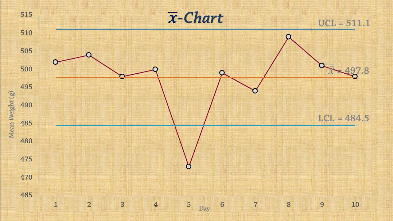
- 📈 The center line for the x-bar chart is calculated as the average of the x-bars (X double bar).
- 📉 The center line for the R chart is the average of the ranges (R bar).
- 🧾 The script instructs to calculate the average of the x-bars and the average of the ranges.
- 🔍 The script mentions using the F4 key to create fixed references in Excel formulas.
- 📝 Constants for control limits are found from a table indexed by sample size.
- 🔢 The lower and upper control limits for the x-bar chart are calculated using the constant A2 and the average of the x-bars.
- 📏 The lower and upper control limits for the R chart are calculated using constants D3 and D4.
- 📋 The script describes how to create the control charts by inserting the calculated values into Excel.
- 💻 The tutorial concludes with the visualization of the x-bar and R control charts in Excel.
Q & A
What is the purpose of the video script?
-The purpose of the video script is to demonstrate how to use Excel to develop x-bar and R control charts using a set of data representing filling weights of coffee cans.
What does the data in the example represent?
-The data in the example represents the filling weights of coffee cans, which will be used to develop control charts.
What are the formulas for the center lines of the x-bar and R charts?
-The center line for the x-bar chart is the average of the x-bars (X-bar), and the center line for the R chart is the average of the ranges (R-bar).
How is the average range (R-bar) calculated?
-The average range (R-bar) is calculated by finding the maximum minus the minimum of the same set of observations.
What is the term used for the average of the x-bars in control charts?
-The term used for the average of the x-bars in control charts is X double bar (X-bar).
How do you create the lower and upper control limits for the x-bar chart in Excel?
-The lower and upper control limits for the x-bar chart are created by adding or subtracting a constant 'a' from the X double bar, which is found from a control chart constants table based on the sample size.
What is the constant 'a2' used for in the x-bar control chart?
-The constant 'a2' is used to calculate the control limits for the x-bar chart. It is a value from the control chart constants table that corresponds to the sample size.
What are the constants used to calculate the control limits for the R chart?
-The constants used to calculate the control limits for the R chart are 'd3' for the lower control limit and 'd4' for the upper control limit, which are also found from the control chart constants table based on the sample size.
How do you insert a control chart in Excel?
-You can insert a control chart in Excel by highlighting the relevant data and control limit ranges, then using the 'Insert' function to create the chart.
What does the x-bar control chart indicate?
-The x-bar control chart indicates the central tendency of the process over time, showing whether the process is in control and if there are any trends or shifts in the data.
How does the R chart relate to the x-bar chart?
-The R chart is used in conjunction with the x-bar chart to assess the variability of the process. It helps to determine if the spread of the data points is consistent over time.
Outlines
📊 Developing X-bar Control Charts in Excel
This paragraph introduces the process of creating X-bar control charts using Excel. It explains the data set from problem 20-20, which consists of filling weights of coffee cans. The speaker demonstrates how to calculate the average (X-bar) and range (R) for the data set, which are essential for constructing the control charts. The X-bar chart's center line is represented by the average of the X-bars, and the R chart's center line is the average of the ranges. The speaker guides through the calculation of these averages and how to apply them to create the control charts, including setting up the control limits using constants from a table based on the sample size.
📈 Creating X-bar and Range Charts in Excel
The second paragraph continues the tutorial on Excel, focusing on the actual creation of the X-bar and range control charts. The speaker explains how to insert the control limits into the chart, showing the process of plotting the data and setting the upper, center, and lower control limits. The X-bar chart is used to monitor the process mean, while the range chart is used to monitor the process variability. The paragraph concludes with the speaker summarizing the steps taken to create these charts in Excel, providing a clear method for visualizing process control.
Mindmap
Keywords
💡Excel
💡Control Charts
💡x-bar Chart
💡Range Chart
💡Average
💡Subgroup
💡Center Line
💡Control Limits
💡Constants
💡Sample Size
💡Coffee Cans
Highlights
Using Excel to develop x-bar control charts for quality control in manufacturing processes.
Data represents filling weights of coffee cans, an example for control chart development.
Calculating the average of x-bars (X-bar) for the centerline of the control chart.
Using the range (R) as a measure of variability for the control chart.
Finding the average of x-bars (X double bar) and range (R bar) for control chart calculations.
Using constants from a table indexed by sample size to calculate control limits.
Setting up the x-bar control chart with centerline, upper, and lower control limits.
Using Excel functions to automate the calculation of control limits.
Creating horizontal lines for control limits in the control chart.
Inserting and customizing the x-bar control chart in Excel.
Plotting the x-bar chart to visualize process control.
Developing a range chart alongside the x-bar chart for comprehensive process analysis.
Using Excel to automate and streamline the process of creating control charts.
The importance of understanding control charts for quality control in manufacturing.
Practical application of control charts in analyzing and improving process performance.
Excel as a tool for statistical process control in various industries.
Transcripts
Browse More Related Video
CONTROL CHART BASICS and the X-BAR AND R CHART +++++ EXAMPLE
Statistical Process Control | Chart for Means (x-bar chart)
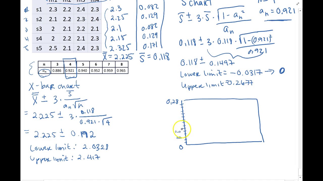
SPC - xbar and s chart Example by Hand
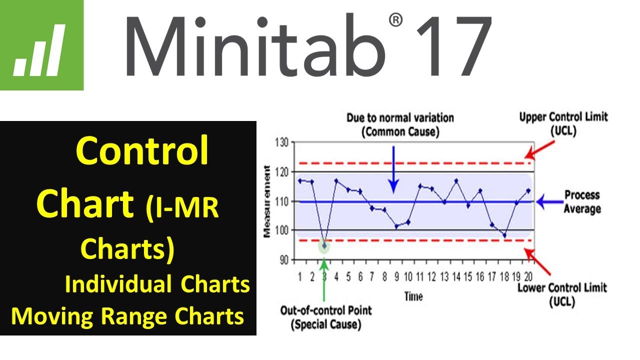
Statistical Process Control | SPC Control charts (IMR ) using Minitab 17 |
Introduction to Statistical Process Control Charts (Lean Six Sigma)

Create a Basic Control Chart
5.0 / 5 (0 votes)
Thanks for rating: