CONTROL CHART BASICS and the X-BAR AND R CHART +++++ EXAMPLE
TLDRIn this instructional video, Andy Robertson from CQE Academy introduces the fundamental concepts of control charts, focusing on the popular x-bar and r chart. He explains the importance of distinguishing between common cause and special cause variations in processes, emphasizing the role of control charts in identifying these variations through upper and lower control limits. The video covers key elements of control charts, rational subgrouping, and the equations for calculating control limits. Robertson also demonstrates how to create an x-bar and r chart with an example, guiding viewers through the process of calculating the grand average, center lines, and control limits, ultimately helping them understand if a process is in control.
Takeaways
- 📊 Control charts are used to distinguish between special and common cause variation in a process.
- 🔍 Common cause variation is the inherent, normal random variation that occurs when a process is in control.
- 🛠 Special cause variation is caused by identifiable, non-random factors that are not part of the normal process.
- 📈 Control charts use upper and lower control limits to identify when a process may be experiencing special cause variation.
- 👷 Rational subgrouping is essential for accurate control charting; it involves grouping data produced under the same conditions.
- 📚 Understanding the key elements of control charts helps in distinguishing between normal and special cause variations.
- 🧮 The x-bar and R chart equations are crucial for calculating the center line and control limits for monitoring process mean and variation.
- 🔢 Constants (like a2, d3, and d4) are necessary for calculating control limits and must be looked up based on subgroup sample size.
- 📉 The R chart monitors the variation within a process, complementing the x-bar chart which monitors the mean.
- 📝 An example is provided to demonstrate the step-by-step process of creating an x-bar and R chart, including calculating averages and control limits.
- 📈 Control charts are a valuable tool for quality engineers and continuous improvement experts to monitor and improve processes.
Q & A
What are the two types of variation mentioned in the script?
-The two types of variation are common cause variation and special cause variation. Common cause variation is the inherent, normal random variation associated with a process when it's in control. Special cause variation occurs when there is an unusual event or influence not inherent to the process, such as equipment wear, non-conforming material, or an operator's new method.
Why are control charts used in quality control?
-Control charts are used to distinguish between special and common cause variation. They help in monitoring processes to ensure they are only experiencing common cause variation, and if special cause variation is detected, it prompts an investigation to uncover and eliminate the root causes.
What are the key elements of a control chart that help distinguish between normal and special cause variation?
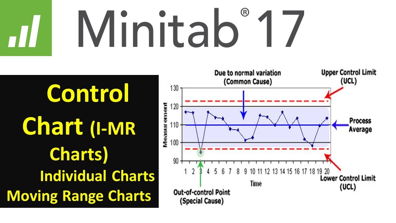
-The key elements of a control chart include the upper and lower control limits, which create boundaries to differentiate between common and special cause variations. Data points falling outside these limits suggest the presence of special cause variation.
What is rational subgrouping in the context of control charts?
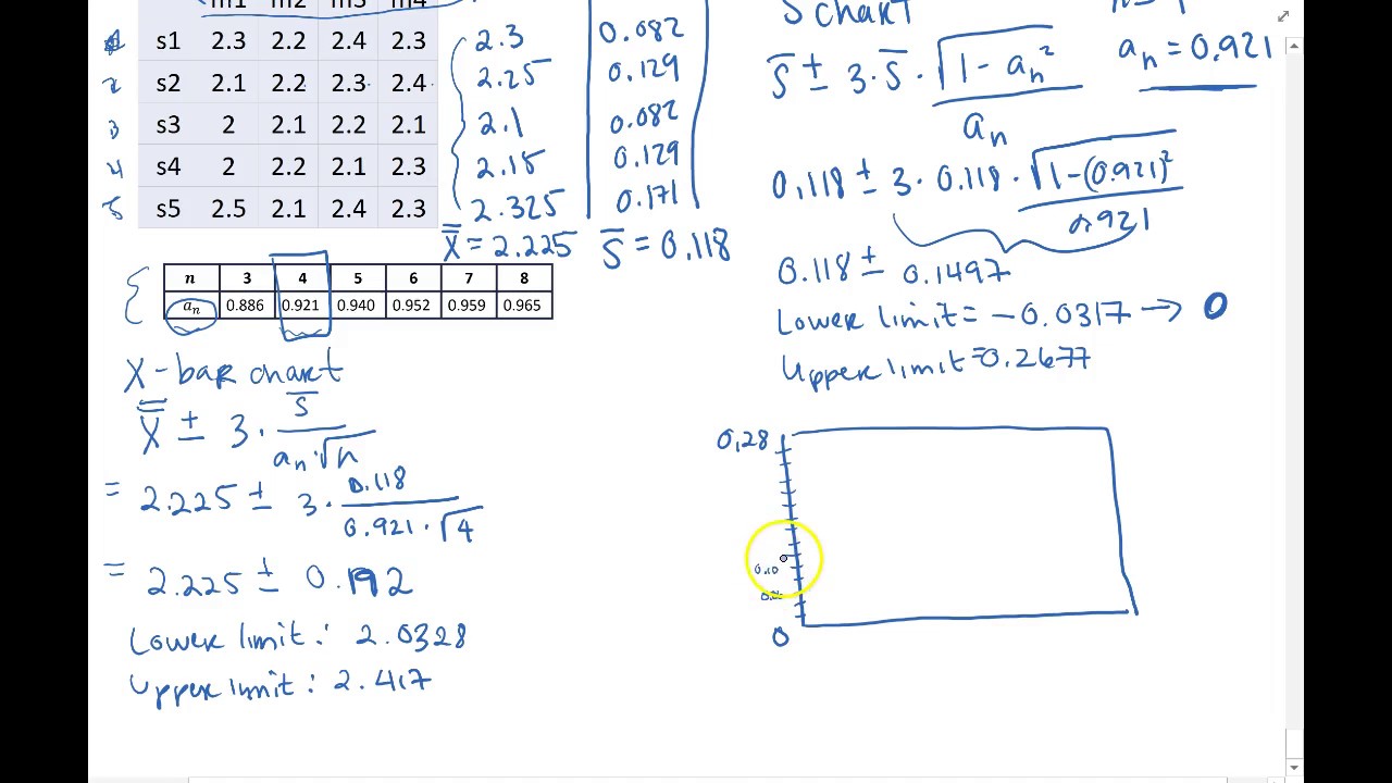
-Rational subgrouping is a concept where a subgroup is a collection of units all produced under the same conditions. It's important because the control limits for an x-bar chart include the average range, and subgroups should represent only the normal inherent process variation to accurately detect special cause variation.
What are the equations used to calculate the center line and control limits for an x-bar chart?
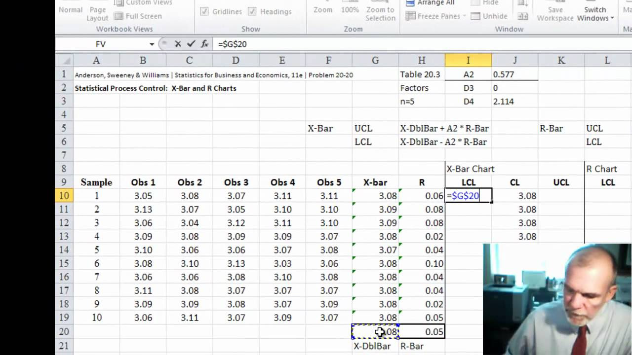
-The center line, or x-double-bar, is the grand average of all subgroup averages. The upper control limit for the x-bar chart is calculated as the grand average plus (a2 factor times the average range, or r-bar). The lower control limit is the grand average minus (a2 factor times r-bar).
How are the constants a2, d3, and d4 used in the calculation of control limits for x-bar and r charts?
-The a2 constant is used to calculate the control limits for the x-bar chart, where the upper and lower limits are the grand average plus or minus (a2 times r-bar). For the r chart, the d4 factor is used to calculate the upper control limit (d4 times r-bar), and the d3 factor for the lower control limit (d3 times r-bar).
What is the purpose of estimating the population standard deviation from the r-bar value?
-Estimating the population standard deviation from the r-bar value allows for a deeper understanding of the process variation. It can be used in further statistical analysis, such as process capability studies.
How is the grand average, or x-double-bar, calculated in the script's example?
-The grand average, or x-double-bar, is calculated by taking the average of all the subgroup averages. In the example, after calculating the average for each of the 10 subgroups, these averages are then averaged to find x-double-bar.
What does the script suggest about the process being in control based on the control charts?
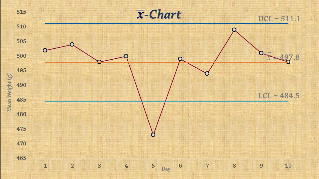
-The script suggests that the process is in control if all data points fall within the upper and lower control limits on both the x-bar and r charts, indicating no presence of special cause variation.
What is the significance of overlaying control limits on the data in control charts?
-Overlaying control limits on the data helps in visually assessing whether the process is in control. If all plotted data points stay within the control limits, it indicates that the process variation is within acceptable bounds and is likely due to common causes.
How can the audience benefit from the timestamps provided in the script?
-The timestamps allow the audience to easily navigate to specific sections of the lecture if they are already familiar with certain concepts. They can jump ahead to the part of the video that interests them the most or where they need clarification.
Outlines
📊 Introduction to Control Charts and Variation Types
Andy Robertson from CQE Academy introduces the fundamental concepts of control charts, focusing on the distinction between special and common cause variations. He outlines the agenda for the lecture, which includes discussing the two types of variation, key elements of control charts, rational subgrouping, and the equations for calculating the center line and control limits for x-bar and r charts. He also mentions the importance of using constants in these calculations and provides timestamps for viewers to navigate through the video based on their prior knowledge.
🔍 Understanding Variation and Control Limits
The paragraph delves into the specifics of common and special cause variations in processes. Common cause variation is described as the inherent, normal random variation within a process when it is in control, whereas special cause variation is attributed to external factors like equipment wear, non-conforming materials, or operator differences. Robertson explains how control charts use upper and lower control limits to differentiate between these two types of variations. Any data point falling outside these limits is indicative of special cause variation, prompting an investigation to uncover and eliminate the root causes.
📚 Rational Subgrouping and Chart Equations
Robertson emphasizes the importance of rational subgrouping, which is about collecting data under consistent conditions to ensure the control limits accurately reflect the process's inherent variation. He then presents the equations for calculating the center line and control limits for both x-bar and r charts, explaining the significance of constants like a2, d3, and d4, which are dependent on the subgroup sample size. The paragraph also touches on how to estimate the population standard deviation using the range chart's r-bar value and the d2 factor.
📈 Practical Example of Creating an X-Bar and R Chart
In this paragraph, Robertson provides a step-by-step example of creating an x-bar and r chart using data from 10 subgroups, each with three samples. He demonstrates how to calculate the average and range for each subgroup, determine the grand average (x-double-bar), and plot the data points for both the x-bar and r charts. After calculating the control limits using the relevant constants, he overlays these limits on the charts to visually assess whether the process is in control, concluding that in this example, the process appears to be stable with no data points outside the control limits.
Mindmap
Keywords
💡Control Chart
💡Variation
💡Special Cause Variation
💡Common Cause Variation
💡Rational Subgrouping
💡X Bar Chart
💡R Chart
💡Control Limits
💡Constants
💡Grand Average
💡Population Standard Deviation
Highlights
Introduction to fundamental concepts of control charts and the x-bar and r chart.
Explanation of two types of variation: common cause and special cause variation.
The importance of distinguishing between special and common cause variation for quality control.
Key elements of control charts that help identify normal and special cause variation.
Discussion on rational subgrouping and its significance in control charts.
Explanation of the x-bar and r chart equations for calculating the center line and control limits.
How to use constants in x-bar and r chart calculations with examples of where to find them.
Demonstration of creating an x-bar and r chart with a step-by-step example.
The process of calculating the grand average (x-double bar) from subgroup averages.
How to plot the x-bar and r charts with calculated averages and ranges.
Calculation of control limits using constants a2, d3, and d4 for x-bar and r charts.
Overlaying control limits on plotted data to assess process control.
The role of control charts in identifying when a process is experiencing special cause variation.
How to estimate the population standard deviation using the range chart's r-bar value.
Importance of monitoring both mean value and variation within a process to detect special cause variation.
The practical application of control charts in various types of processes including manufacturing and healthcare.
Final remarks encouraging viewers to engage with the content and continue their journey to become a CQE.
Transcripts
Browse More Related Video
XBar-R Control Charts

Attribute Data Control Chart Examples!! How to select/create the P, NP, C and U Charts
Introduction to Statistical Process Control Charts (Lean Six Sigma)
Statistical Process Control | Chart for Means (x-bar chart)
SPC - xbar and s chart Example by Hand
Statistical Process Control | SPC Control charts (IMR ) using Minitab 17 |
5.0 / 5 (0 votes)
Thanks for rating: