SPC - xbar and s chart Example by Hand
TLDRThis instructional video demonstrates the manual creation of x-bar and s-charts using a small dataset. It guides viewers through calculating subgroup means and standard deviations, plotting these values, and determining control limits. The presenter emphasizes the utility of software for such calculations but also provides a step-by-step walkthrough to reveal the processes behind the software, ensuring viewers understand the foundational concepts of statistical process control.
Takeaways
- 📊 The video demonstrates how to manually create an x-bar chart and an S chart using a small data set.
- 🔢 It emphasizes the importance of calculating subgroup means and standard deviations as the first step.
- 📝 The script provides a step-by-step guide on how to calculate the averages for each subgroup.
- ⚖️ It explains the process of calculating standard deviations for each subgroup by squaring the differences from the mean and taking the square root.
- 📈 The video introduces the concept of x-bar bar (the average of subgroup means) and s bar (the average of subgroup standard deviations).
- 📉 The process for calculating the control limits for both the x-bar and S charts is detailed, including the use of a factor to ensure unbiased estimates.
- 📚 A table for 'a sub n' values is recommended for ease in calculating control limits, especially for the S chart.
- 🚫 The video points out that a negative lower limit for standard deviation doesn't make sense and should be set to zero.
- 📉 For the x-bar chart, control limits are calculated using the overall mean (x-bar bar), s bar, and subgroup sample sizes.
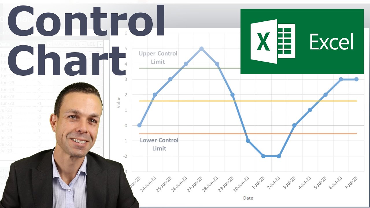
- 📝 The importance of plotting the data points and control limits on a chart is highlighted to visually assess process control.
- 🛠️ The video concludes by recommending the use of software for these calculations due to their complexity and potential for error when done manually.
Q & A
What are the two types of control charts demonstrated in the video?
-The video demonstrates how to create an X-bar chart and an S chart by hand using a small dataset.
Why does the video suggest using software for creating control charts?
-The video suggests using software because the process can become tedious when done by hand, and software can automate the calculations and plotting.
How many subgroups are used in the example dataset provided in the video?
-There are 5 subgroups in the example dataset, with each subgroup containing 4 measurements.
What is the formula for calculating the standard deviation of a subgroup?
-The standard deviation for each subgroup is calculated by taking the square root of the sum of the squared differences between each observation and its mean, divided by (n-1), where n is the number of observations in the subgroup.
What is the purpose of calculating the grand average (x-bar bar)?
-The grand average (x-bar bar) is the average of all subgroup means and is used to calculate the control limits for the X-bar chart.
What is the formula for calculating the control limits for the S chart?
-The control limits for the S chart are calculated as s-bar ± 3 * s-bar * the square root of (1 - a_sub_n) / a_sub_n, where s-bar is the average of the subgroup standard deviations and a_sub_n is an unbiasedness factor.
Why is it not appropriate to have a negative lower control limit for the S chart?
-A negative lower control limit for the S chart does not make sense because standard deviations cannot be negative, so the lower limit is set to zero.
How are the control limits for the X-bar chart calculated?
-The control limits for the X-bar chart are calculated as x-bar bar ± 3 * s-bar / sqrt(n) * a_sub_n, where x-bar bar is the grand average, s-bar is the average of the subgroup standard deviations, and a_sub_n is the unbiasedness factor.
What is the purpose of the a_sub_n factor in control limit calculations?
-The a_sub_n factor is used to ensure that the estimates for the control limits are unbiased, adjusting for the number of observations in each subgroup.
How does the video recommend plotting the control charts?
-The video recommends plotting the control charts by first marking the control limits and the central line (s-bar for the S chart and x-bar bar for the X-bar chart), then plotting the individual subgroup values and connecting them with lines.
What does it mean if all the points on the control charts are within the control limits?
-If all the points on the control charts are within the control limits, it indicates that the process is in control and there are no significant variations or outliers that would suggest a special cause for the process variability.
Outlines
📊 Creating X-Bar and S Charts Manually
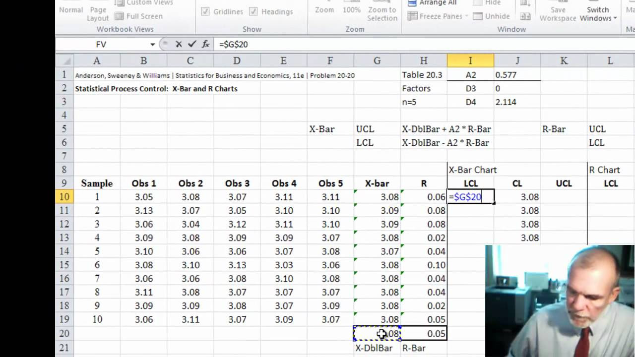
This paragraph outlines the process of manually creating an X-Bar and an S Chart using a small dataset. The speaker emphasizes the typical use of software for such tasks due to their complexity but proceeds to demonstrate the manual method for educational purposes. The process involves calculating subgroup means and standard deviations, plotting these means, and determining the control limits for both charts. The example provided includes five subgroups with varying numbers of measurements, and the calculations for the means and standard deviations are detailed step by step.
📈 Calculating Control Limits for X-Bar and S Charts
The second paragraph delves into the specifics of calculating the control limits for both the X-Bar and S Charts. It explains the formula for calculating the average of subgroup means (X-Bar Bar) and the average of subgroup standard deviations (S Bar). The paragraph also covers the calculation of the lower and upper control limits for the S Chart, taking into account the unbiased estimate factor 'a sub n'. It addresses the issue of negative lower limits for standard deviations and adjusts the limit to zero. The process for calculating the X-Bar Chart's control limits is also described, including the use of the 'a sub n' factor and the square root of subgroup sample sizes.
📋 Plotting and Analyzing X-Bar and S Charts
The final paragraph focuses on the plotting of the X-Bar and S Charts and the analysis of the data points within these charts. It describes how to plot the control limits and data points on a graph, ensuring that the charts are constructed accurately to reflect the calculated values. The speaker discusses the importance of ensuring all standard deviations and subgroup means fall within the control limits, indicating that the process is correct and the charts are in control. The paragraph concludes with a recommendation to use software for such tasks in practice but emphasizes the value of understanding the underlying calculations.
Mindmap
Keywords
💡x-bar chart
💡S chart
💡subgroup means
💡standard deviations
💡control limits
💡grand average
💡s-bar
💡a sub n
💡statistical control
💡software
Highlights
The video demonstrates creating an x-bar and S chart manually using a small data set.
Calculating subgroup means and standard deviations is the initial step in constructing the charts.
The process involves tedious manual calculations, suggesting the use of software for efficiency.
Subgroup averages are calculated by averaging the elements within each subgroup.
Subgroup standard deviations are derived from the squared differences between each observation and its mean.
The overall mean, or grand average, is calculated by averaging all subgroup means.
The average of subgroup standard deviations is denoted as s-bar.
Control limits for the x-bar and S charts are calculated using s-bar and the average of subgroup means.
An unbiased estimate for s-bar is achieved using a factor related to the subgroup size.
The lower control limit for the S chart should not be negative, and is adjusted to zero if calculated as such.
The upper and lower control limits for the x-bar chart are determined using the overall mean and s-bar.
The video provides a step-by-step guide on plotting the x-bar and S charts with calculated limits and subgroup data.
The control charts are assessed for being in control by ensuring all plotted points fall within the limits.
The video emphasizes the importance of understanding the calculations behind software for quality control charts.
A table for calculating the 'a sub n' factor is recommended for accurate control limit calculations.
The video concludes with a recommendation to use software for these calculations but provides insight into the manual process.
Transcripts

5.0 / 5 (0 votes)
Thanks for rating: