Elementary Statistics - Chapter 10 Correlation and Regression
TLDRThis script delves into the concept of correlation, emphasizing it does not imply causation. It explains how to use scatter plots to visualize relationships between variables and calculate the correlation coefficient, R, to measure the strength and direction of a linear relationship. The script guides through creating scatter plots and finding the line of best fit using calculators, interpreting R values, and conducting hypothesis testing to determine the significance of the correlation coefficient at a given level of significance.
Takeaways
- 📊 Correlation is a statistical method to determine if a linear relationship exists between two variables, represented by X (independent) and Y (dependent), but it does not imply causation.
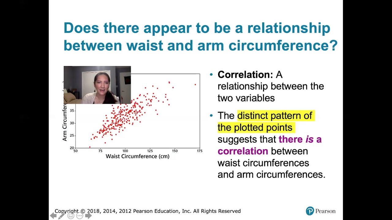
- 📈 A scatter plot visually represents the relationship between two variables, showing the correlation through the direction and distribution of plotted points.
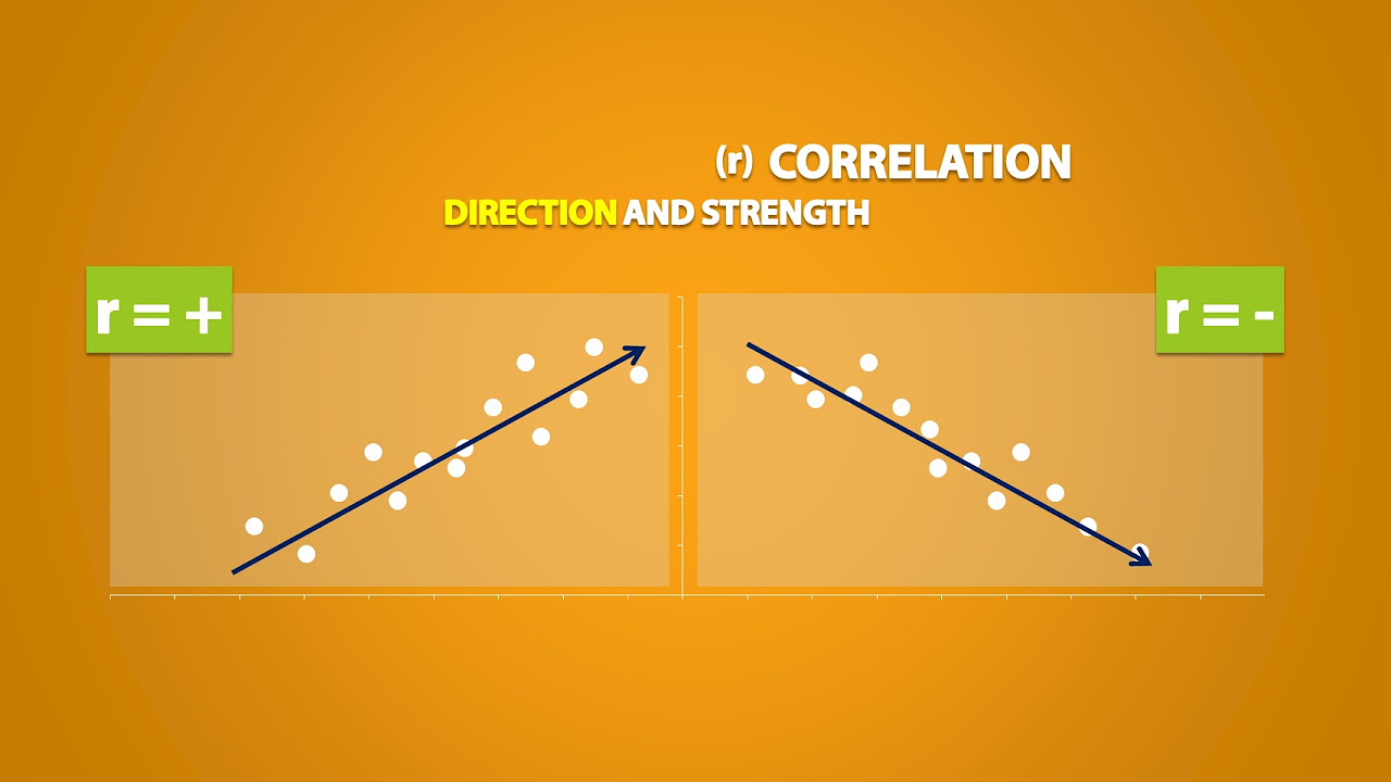
- ➡️ Positive linear correlation means as X increases, Y tends to increase as well, while negative linear correlation indicates Y decreases as X increases.
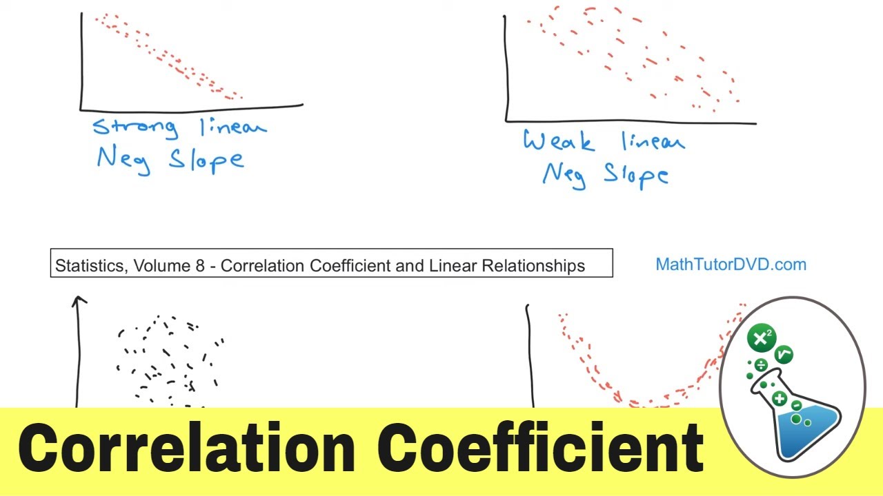
- 🔍 The strength of the correlation is categorized as perfect, high, or low, based on how closely the points are gathered around the trend line in the scatter plot.
- 📉 Nonlinear correlation occurs when the scatter plot forms a curved shape rather than a straight line, indicating a more complex relationship between variables.
- 📝 To create a scatter plot using a calculator, input the X and Y values into lists, and then use the statistical plotting function to visualize the data.
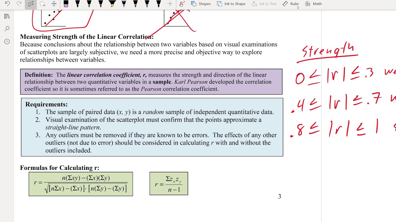
- 🔢 The correlation coefficient, also known as Pearson's coefficient, measures the nature and strength of the linear relationship between variables and ranges from -1 to 1.
- 📉 The correlation coefficient's sign indicates the direction of the relationship (positive or negative), and its magnitude indicates the strength of the relationship.
- 📊 The correlation coefficient can be calculated manually using a formula or found using a calculator's built-in functions.
- 🔑 The regression line, or line of best fit, is used to model the relationship between variables and can be used to predict Y values for given X values.
- ✂️ Hypothesis testing for the population correlation coefficient uses a t-test to determine if the sample correlation is significant, with the p-value compared to a level of significance (alpha).
Q & A
What does the term 'correlation' signify in statistics?
-In statistics, 'correlation' refers to a method used to determine if a linear relationship exists between two variables. It measures the extent to which two variables move in relation to each other but does not imply causation.
What are the two types of variables in a correlation study?
-The two types of variables are the independent variable (X), which is the explanatory variable, and the dependent variable (Y), which is the response variable.
What is a scatterplot and how does it relate to correlation?
-A scatterplot is a graphical representation of the relationship between two variables in a two-dimensional space. It shows the correlation between variables by plotting the data points and can indicate the strength and direction of the correlation.
What are the different types of correlation that can be observed in a scatterplot?
-The types of correlation include positive linear correlation (as X increases, Y tends to increase), negative linear correlation (as X increases, Y tends to decrease), no correlation (points are scattered randomly), and nonlinear correlation (points form a curved pattern).
What is a perfect positive correlation and how is it represented on a graph?
-A perfect positive correlation occurs when all the data points lie exactly on a straight line, indicating a very strong relationship between the variables. On a graph, it is represented by points closely gathered together in an upward direction.
How can one create a scatter plot using a calculator?
-To create a scatter plot using a calculator, one must first enter the data into the calculator's lists (list 1 for X values and list 2 for Y values). Then, using the calculator's statistical plot feature, select the scatter plot type and ensure the correct lists are chosen for X and Y data.
What is the correlation coefficient and what does it measure?
-The correlation coefficient, also known as the Pearson coefficient, measures the nature and strength of the linear relationship between two variables in a sample. It is represented by the symbol 'R' and ranges between -1 and 1, with values closer to -1 or 1 indicating a stronger relationship.
How is the correlation coefficient calculated manually?
-The correlation coefficient is calculated using a formula that involves summing the products of the standardized values of X and Y, dividing by the number of observations, and then subtracting the product of the means of the standardized X and Y values.
What is the purpose of the regression line or line of best fit?
-The regression line, or line of best fit, is used to model the relationship between two variables. It can be used to predict the value of the dependent variable (Y) for a given value of the independent variable (X) based on the linear relationship observed in the data.
How can one interpret the correlation coefficient R in terms of variance?
-The correlation coefficient R indicates the proportion of the variance in one variable that can be explained by the variance in the other variable. A value close to 1 or -1 suggests a strong linear relationship, while a value close to 0 indicates little to no linear relationship.
What is the process of hypothesis testing for the population correlation coefficient?
-Hypothesis testing for the population correlation coefficient involves stating a null hypothesis (usually that there is no correlation, Rho = 0) and an alternative hypothesis (that there is a significant correlation, Rho ≠ 0). Then, using a t-test or p-value, one determines whether the sample correlation coefficient is significant at a chosen level of significance (alpha). If the p-value is less than or equal to alpha, the null hypothesis is rejected, indicating significant correlation.
Outlines
📊 Understanding Correlation and Scatter Plots
This paragraph introduces the concept of correlation as a statistical method to determine the linear relationship between two variables. It explains the terms 'correlation' and 'causation', highlighting that correlation does not imply causation. The paragraph also describes the scatter plot as a graphical representation of the relationship between two variables, with examples of positive and negative linear correlations, and how to interpret different types of scatter plots, including perfect, high, low, and no correlations. It concludes with instructions on how to create a scatter plot using a calculator, specifically mentioning the 83 or 84 models, and the importance of turning on the diagnostic feature before proceeding with data entry and plotting.
📈 Correlation Coefficient and Its Interpretation
The second paragraph delves into the concept of the correlation coefficient, also known as the Pearson coefficient, which measures the strength and nature of the relationship between two quantitative variables. It explains the range of the correlation coefficient from -1 to 1, with positive and negative values indicating the direction of the relationship. The paragraph provides a formula for calculating the correlation coefficient manually and discusses how to use calculators to find this value. It also explains the significance of the correlation coefficient in hypothesis testing, including the population correlation coefficient represented by Rho, and how to interpret different R values in terms of the strength of the correlation, using visual examples to illustrate strong, weak, and no correlations.
🔍 Calculating and Interpreting Linear Regression
This paragraph focuses on the process of calculating the linear regression equation, which models the best fit line for a set of data. It explains the steps to enter data into a calculator, calculate the linear regression, and interpret the results, including the slope and y-intercept of the line. The paragraph also discusses the significance of the correlation coefficient in determining the strength of the linear relationship. It provides an example of predicting values using the regression equation, such as estimating calories based on fat grams in fast food, and includes a detailed explanation of how to use the calculator to find the regression equation, store it, and use it for predictions.
📉 Hypothesis Testing for Population Correlation
The fourth paragraph discusses hypothesis testing for the population correlation coefficient, Rho. It explains the process of setting up null and alternative hypotheses, identifying the level of significance (alpha), and using the calculator to find the p-value and test statistic. The paragraph outlines how to interpret these results to determine if there is significant evidence of a linear correlation. It provides an example using data on family size and weekly food expenditure, demonstrating how to perform the test, interpret the p-value in relation to alpha, and make a conclusion about the presence of a significant correlation.
📚 Hypothesis Testing Example and Conclusion
The final paragraph provides an example of hypothesis testing for a population correlation coefficient, using data on the amount spent on food and family size. It walks through the process of stating the null and alternative hypotheses, identifying the significance level, and using a calculator to perform the linear regression t-test. The example concludes with an interpretation of the test statistic and p-value, illustrating how to determine whether to reject or fail to reject the null hypothesis based on the p-value's relation to the alpha level. The paragraph reinforces the concept that rejecting the null hypothesis supports the claim of a linear correlation, while failing to reject it does not provide evidence for such a claim.
Mindmap
Keywords
💡Correlation
💡Linear Relationship
💡Scatterplot
💡Positive Correlation
💡Negative Correlation
💡Nonlinear Correlation
💡Correlation Coefficient
💡Regression Line
💡Hypothesis Testing
💡Significance Level (Alpha)
💡T-test
Highlights
Correlation is a statistical method to determine the existence of a linear relationship between two variables.
Correlation does not imply causation; a correlation between variables does not mean one causes the other.
A scatter plot visually represents the relationship between two variables in a two-dimensional space.
Positive linear correlation indicates that as one variable increases, the other tends to increase as well.
Negative linear correlation means that as one variable increases, the other tends to decrease.
A scatter plot with no clear pattern indicates no linear correlation between the variables.
Nonlinear correlation is represented by a scatter plot that forms a curved shape rather than a straight line.
Perfect positive correlation is depicted by a straight line in a positive direction with closely gathered points.
High positive correlation is shown by a positive direction with points closely gathered but slightly scattered.
Low positive correlation is characterized by an upward direction with more scattered points.
Perfect negative correlation is shown by a straight line in a negative direction with closely gathered points.
High negative correlation is indicated by a downward direction with points closely gathered but slightly scattered.
Low negative correlation is shown by a downward direction with scattered points forming a weak correlation.
Creating a scatter plot involves entering data into a calculator and using specific functions to visualize the relationship.
The correlation coefficient, or Pearson coefficient, measures the strength and direction of the linear relationship.
The correlation coefficient ranges from -1 to 1, with values close to -1 or 1 indicating a strong relationship.
A value of 0 for the correlation coefficient indicates no linear correlation between the variables.
The process of finding the correlation coefficient manually involves a specific formula using X and Y values.
Calculators can be used to calculate the correlation coefficient and perform hypothesis testing for the population correlation coefficient.
Hypothesis testing for the population correlation coefficient involves comparing the p-value to a significance level alpha.
If the p-value is less than or equal to alpha, the null hypothesis is rejected, supporting the claim of a significant linear correlation.
If the p-value is greater than alpha, the null hypothesis is not rejected, indicating insufficient evidence for a linear correlation.
Transcripts
Browse More Related Video
Math 119 Chapter 10 Part 1
10.1.1 Correlation - Linear, Nonlinear, Positive Linear, and Negative Linear Correlation Defined

Elementary Stats Lesson #5
Explanatory and Response Variables, Correlation (2.1)
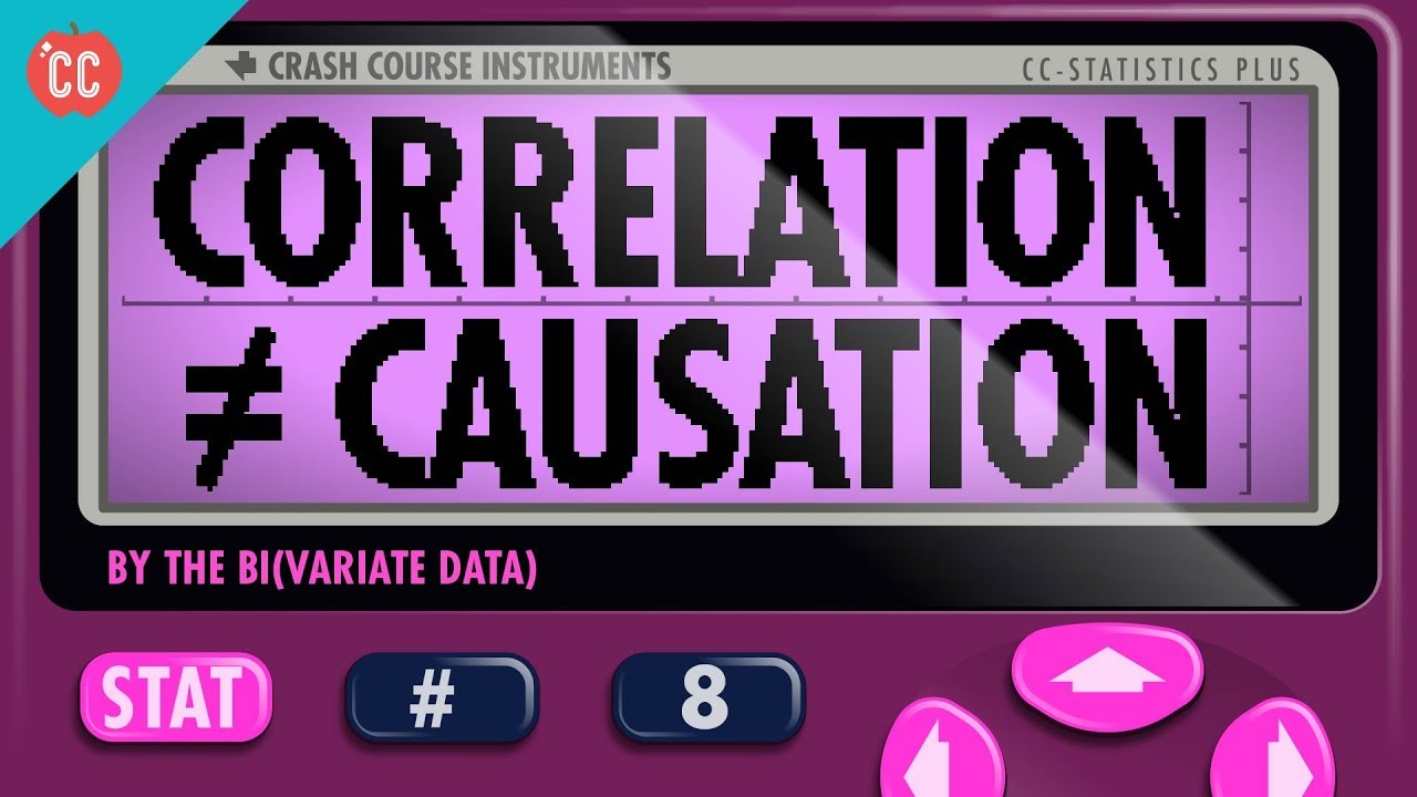
Correlation Doesn't Equal Causation: Crash Course Statistics #8
What is the Correlation Coefficient in Statistics?
5.0 / 5 (0 votes)
Thanks for rating: