What is the Correlation Coefficient in Statistics?
TLDRThe transcript discusses scatter plots and the concept of linear relationships between two variables, emphasizing the strength and direction of these relationships. It introduces the Pearson correlation coefficient as a measure of the degree of linear relationship, ranging from -1 to 1, with 0 indicating no linear relationship, positive values indicating a positive slope, and negative values indicating a negative slope. The importance of understanding the interpretation of the correlation coefficient is highlighted over its calculation, which will be covered in a subsequent section.
Takeaways
- 📊 Scatter plots are graphical representations used to visualize the relationship between two variables.
- 🔼 A strong positive linear relationship is indicated when data points closely follow an upward sloping line, signifying that as one variable increases, the other also increases.
- 🔼 A weak positive linear relationship is present when data points generally follow an upward trend but are more dispersed from the line of best fit.
- 🔽 A strong negative linear relationship is observed when data points tightly pack around a line that slopes downward, meaning that as one variable increases, the other decreases.
- 🔽 A weak negative linear relationship occurs when data points loosely follow a downward trend, being farther from the line of best fit.
- 🔄 No linear relationship exists when data points are randomly scattered without any discernible pattern or trend.
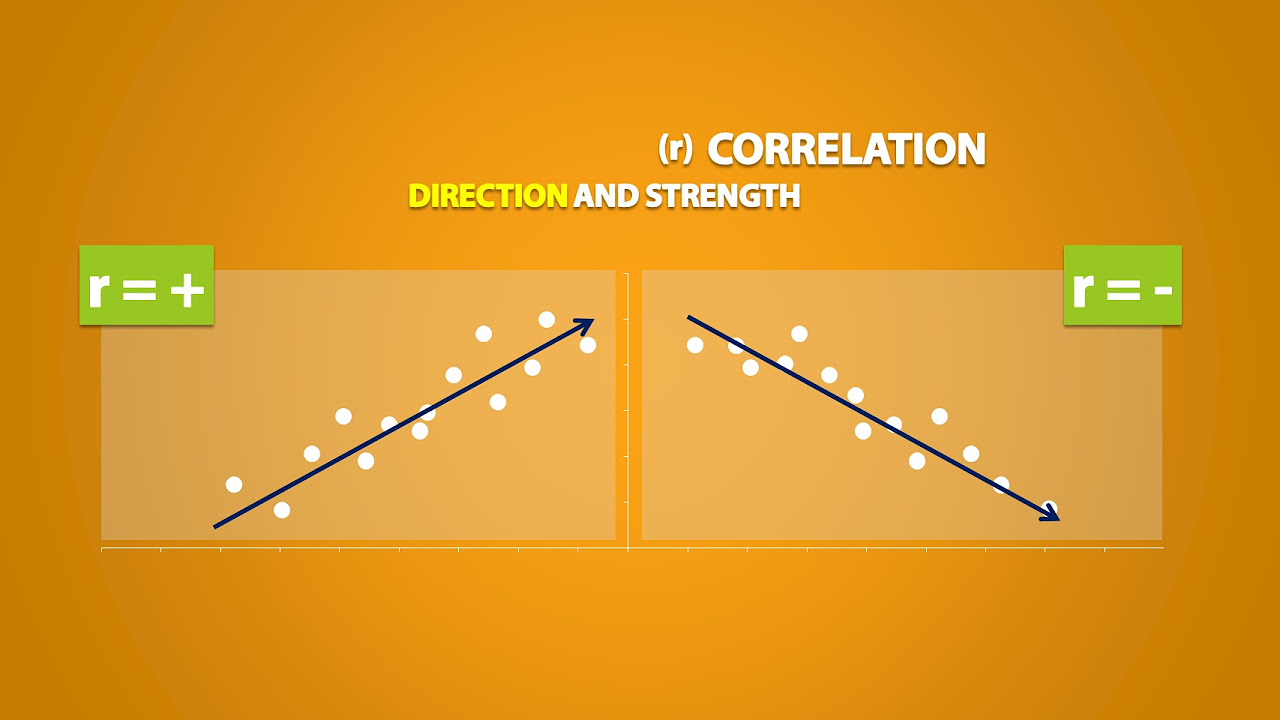
- 💡 The correlation coefficient, denoted as 'R', measures the strength and direction of the linear relationship between two variables, ranging from -1 to 1.
- 🔢 A correlation coefficient of 0 indicates no linear relationship between variables, while values closer to 1 or -1 denote stronger linear relationships.
- 🌟 A perfect positive linear relationship (R=1) means all data points fall exactly on an upward sloping line, while a perfect negative linear relationship (R=-1) means all points fall exactly on a downward sloping line.
- ⚠️ A correlation coefficient does not imply causation; it only indicates that there is a relationship between the variables, which could be influenced by other factors.
- 📚 Understanding the interpretation of the correlation coefficient is more crucial than the calculation itself, as it provides insight into the nature of the relationship between variables.
Q & A
What is the significance of a linear relationship in scatter plots?
-A linear relationship in scatter plots indicates a direct and predictable connection between two variables. It suggests that as one variable changes, the other changes in a consistent manner, which can be represented by a straight line. The strength and direction (positive or negative slope) of this relationship can be quantified using the correlation coefficient.
What does a positive slope in a scatter plot represent?
-A positive slope in a scatter plot represents a situation where, as one variable increases, the other variable also increases. This indicates a direct, linear relationship between the two variables, where the data points generally follow an upward trend from left to right.
What is a strong linear relationship in the context of scatter plots?
-A strong linear relationship in scatter plots is characterized by data points that are closely packed around a straight line. This suggests that there is a high degree of predictability and consistency in the relationship between the two variables, with little deviation from the line.
How can a weak linear relationship be identified in scatter plots?
-A weak linear relationship can be identified when data points roughly follow a linear trend but are more spread out and farther away from the line. This indicates that while there is some correlation between the variables, the relationship is not as predictable or consistent as in a strong linear relationship.
What does a negative slope in a scatter plot signify?
-A negative slope in a scatter plot signifies an inverse relationship between two variables, where an increase in one variable corresponds to a decrease in the other variable. The data points generally follow a downward trend from left to right.
What is the correlation coefficient and how does it quantify the relationship between variables?
-The correlation coefficient, often denoted as 'R', is a statistical measure that quantifies the strength and direction of the linear relationship between two variables. It ranges from -1 to 1, where -1 indicates a perfect negative linear relationship, 0 indicates no linear relationship, and 1 indicates a perfect positive linear relationship. The closer the coefficient is to either -1 or 1, the stronger the linear relationship.
What does a correlation coefficient of 0 indicate?
-A correlation coefficient of 0 indicates that there is no linear relationship between the two variables. The data points are randomly distributed and do not follow any consistent pattern or trend, meaning that changes in one variable do not predictably affect the other variable.
How is the Pearson correlation coefficient related to the concept of causation?
-While the Pearson correlation coefficient can indicate a relationship between two variables, it does not imply causation. A correlation suggests that variables are related in some way, but it does not necessarily mean that one variable causes the changes in the other. There may be other factors at play or a third variable influencing both.
What is the difference between the population correlation coefficient (rho) and the sample correlation coefficient (R)?
-The population correlation coefficient, denoted as 'rho' (ρ), represents the exact correlation for the entire population, whereas the sample correlation coefficient (R) is an estimate based on a sample of the population. In practice, we usually deal with samples, so R is the version we calculate and interpret.
What does a scatter plot with no discernible linear relationship look like?
-A scatter plot with no discernible linear relationship appears as a random distribution of data points with no apparent pattern or trend. There is no consistent increase or decrease in one variable as the other variable changes, and no line can be drawn to accurately represent the relationship between the variables.
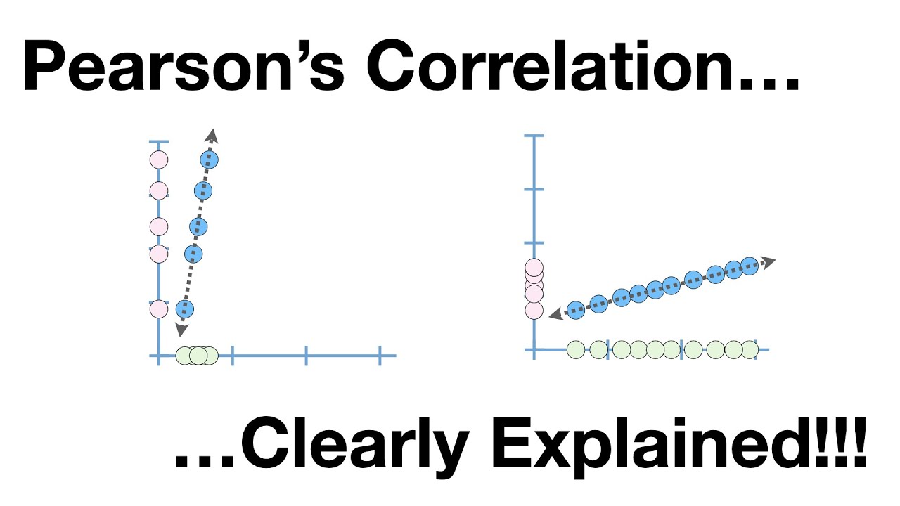
How can non-linear relationships be identified in scatter plots?
-Non-linear relationships can be identified by observing patterns in the scatter plot that do not follow a straight line. These patterns may include curves, clusters, or other complex shapes that indicate a relationship that cannot be described by a simple linear equation.
Outlines
📊 Understanding Linear Relationships in Scatter Plots
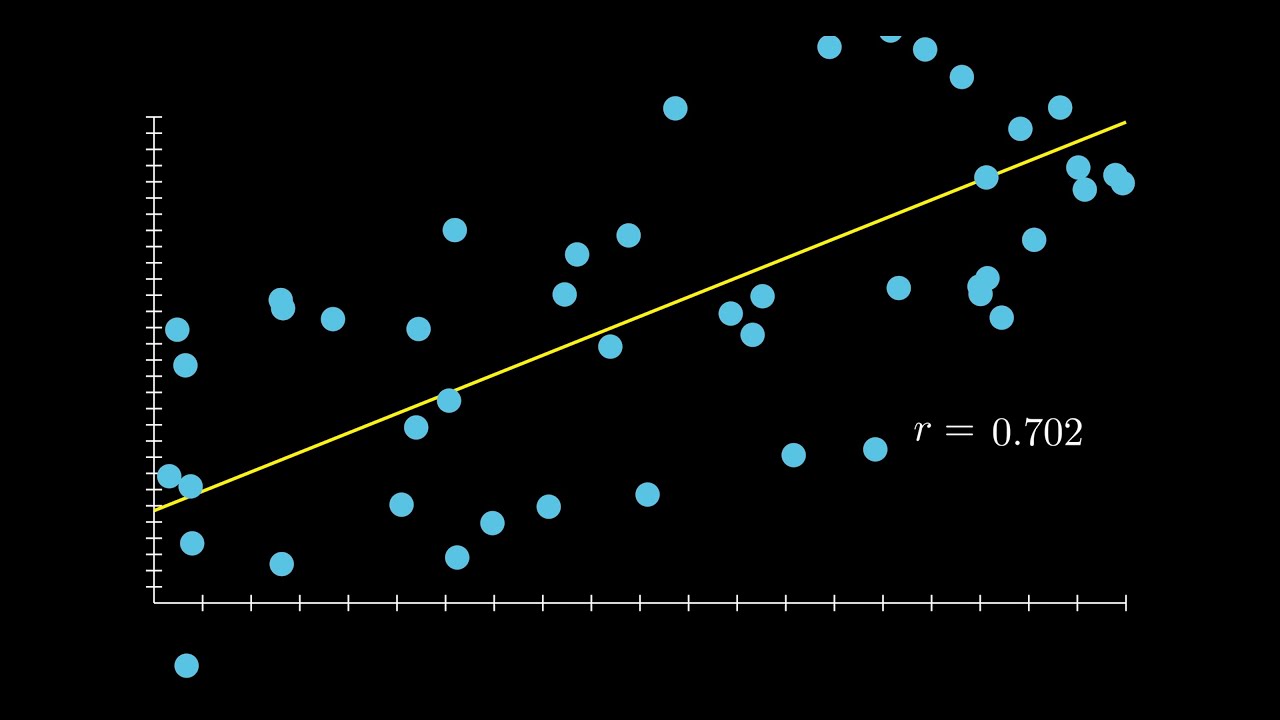
This paragraph discusses the concept of linear relationships in scatter plots. It begins by describing a strong positive linear relationship, where data points closely follow an upward sloping line, indicating a positive slope. The explanation then moves to a weak linear relationship, characterized by data points that generally follow an upward trend but are more dispersed from the line. The paragraph further explains negative linear relationships, both strong and weak, where data points slope downward. The speaker emphasizes that while we can identify linear relationships visually, the strength of these relationships can vary.
🔢 Correlation Coefficient and Its Implications
The second paragraph delves into the concept of correlation coefficient, which quantifies the strength and direction of the linear relationship between two variables. The speaker clarifies that correlation does not imply causation, and it can be influenced by third variables. The paragraph distinguishes between positive and negative correlations, explaining that a positive correlation coefficient indicates an upward trend in the relationship, while a negative coefficient indicates a downward trend. The speaker also introduces the terms 'population' and 'sample' correlation coefficients, noting that in practice, we often deal with sample data.
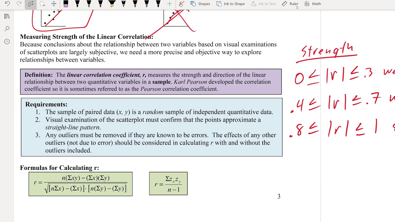
📈 Range and Interpretation of Correlation Coefficient (R)
This paragraph focuses on the range of the correlation coefficient, R, which varies between -1 and 1, inclusive. The speaker explains that an R value of 0 indicates no linear relationship, while values closer to 1 or -1 indicate a stronger linear relationship. A positive R value signifies a positive slope in the relationship, and as R approaches 1, the data points fall exactly on a positively sloped line. Conversely, a negative R value indicates a negative slope, and perfect negative correlation is achieved when R equals -1, with all data points falling on a negatively sloped line. The speaker emphasizes understanding the meaning of different R values as crucial for interpreting statistical relationships.
🤔 Visualizing Correlation Coefficients in Scatter Plots
The final paragraph reinforces the visual representation of correlation coefficients. It describes how varying values of R, from 0 to 1 and -1, correspond to different scatter plot configurations. An R of 0 represents a complete lack of linear correlation, while values approaching 1 or -1 indicate increasingly stronger linear relationships, with data points getting closer to a perfectly straight line. The speaker also prompts the audience to consider what would happen with R values between 0 and 1 or -1, highlighting that these values would show data points following a line with either a positive or negative slope, but not all points would lie exactly on the line. The paragraph concludes by stressing the importance of interpreting the correlation coefficient to understand the nature of the relationship between variables.
Mindmap
Keywords
💡Scatter Plots
💡Linear Relationship
💡Positive Slope
💡Negative Slope
💡Correlation Coefficient
💡Pearson Correlation Coefficient
💡Causation
💡Non-linear Relationship
💡Sample vs Population
💡Data Points
💡Variance
Highlights
The introduction of scatter plots as a method to visualize the relationship between two variables.
Explanation of a strong linear relationship with a positive slope, where data points closely align with an upward-sloping line.
Discussion of a weak linear relationship, characterized by data points that loosely follow an upward-sloping line with more dispersion.
Illustration of a strong linear relationship with a negative slope, where data points tightly pack around a downward-sloping line.
Description of a weak linear relationship with a negative slope, where data points are more dispersed but still generally follow a downward-sloping line.
Explanation of no linear relationship, where data points are randomly distributed without any discernible pattern or direction.
Introduction of non-linear relationships, such as data points forming a boundary or a curve, like a smiley face, which do not follow a linear path.
Emphasis on the importance of understanding that correlation does not imply causation, and that third variables may influence the observed relationships.
Definition and explanation of the Pearson correlation coefficient as a measure of the linear relationship between two variables.
Differentiation between the population correlation coefficient (rho) and the sample correlation coefficient (R).
The range of the correlation coefficient, which varies between -1 and 1, inclusive, representing the strength and direction of the linear relationship.
A correlation coefficient of 0 indicating no linear relationship between variables, with data points appearing as random noise.
A correlation coefficient of +1 indicating a perfect positive linear relationship, with all data points falling exactly on the line.
A correlation coefficient of -1 indicating a perfect negative linear relationship, with all data points falling exactly on the line in the negative slope direction.
Explanation of how intermediate values of the correlation coefficient (e.g., 0.5, 0.3, 0.7) represent varying degrees of linear relationship strength.
The importance of interpreting the correlation coefficient value over the actual calculation, which is described as messy but not difficult.
Promise of the next section to cover the calculation of the correlation coefficient, preparing the reader for a deeper understanding.
Transcripts

5.0 / 5 (0 votes)
Thanks for rating: