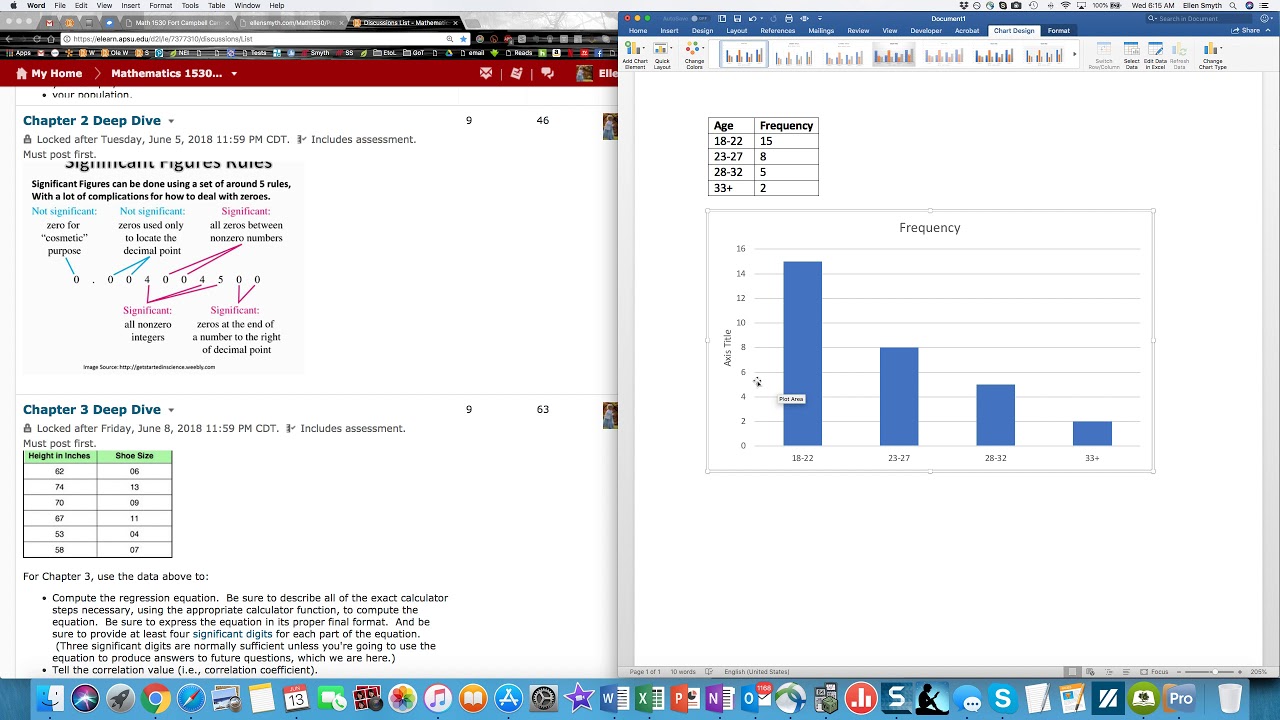
How To Make a Histogram Using a Frequency Distribution Table
TLDRThis video tutorial guides viewers through the process of creating a histogram using test scores data. It begins with constructing a frequency distribution table, categorizing scores into ranges of 10, and noting the frequency of scores within each range. The video explains how to plot these frequencies on a histogram, where bars are adjacent to each other, illustrating the distribution of student grades. It also discusses how to interpret the histogram, identifying the data's skewness and the mode. Further, it challenges viewers with questions to answer using the histogram, enhancing understanding of data representation and analysis. This educational content empowers students to effectively visualize and analyze data distributions.
Takeaways
- 😀 The video explains how to create a histogram from a dataset using a frequency distribution table
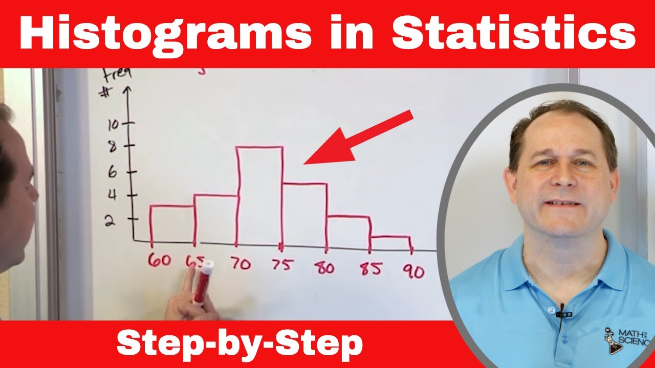
- 📊 A histogram visually represents data using bars - the bars are attached to each other with no spaces between them
- 📈 The independent variable (test scores) are on the x-axis and the dependent variable (frequencies) are on the y-axis
- 📉 The data in the example is skewed left, with a long tail on the left side
- 🔢 The mode is the range with the highest frequency (80-89 in this case)
- i️ You can answer questions about data just using the histogram with no other information
- ❓ Examples of questions are: number of students scoring below/above a threshold
- ❓ Number of students in a given score range
- 📊 The frequency distribution table summarizes the data ranges and frequencies
- 📈 You can construct a histogram once the frequency distribution table is created
Q & A
What are the two columns in a frequency distribution table?
-The two columns in a frequency distribution table are the grades/score ranges and the frequencies. The grade/score ranges are the independent variables and the frequencies are the dependent variables.
How do you determine the class width for grouping scores in a frequency distribution?
-For test scores, it is common to group them into ranges of 10. So the class width would be 10 points.
What are some typical grade ranges used in the U.S. education system?
-60-69 is usually a D, 70-79 a C, 80-89 a B, and 90-100 an A. Below 60 is an F.
What are the steps to construct a histogram from a frequency distribution table?
-Plot the score ranges on the x-axis and the frequencies on the y-axis. Then draw rectangular bars with widths equal to the class width and heights equal to the frequencies.
How can you identify if data is symmetric, skewed left, or skewed right from a histogram?
-If the histogram is symmetrical and bell-shaped, the data is symmetric. If there is a long tail on the left side, it is skewed left. If there is a long tail on the right side, it is skewed right.
What is the mode of a data set represented in a histogram?
-The mode is the score range with the highest frequency. It corresponds to the tallest bar in the histogram.
How do you interpret the phrase 'at most' in a question about histogram data?
-'At most' means the maximum allowed value. So for a score 'at most 69', the score must be less than or equal to 69.
How do you interpret the phrase 'at least' in a question about histogram data?
-'At least' means the minimum required value. So for a score 'at least 80', the score must be greater than or equal to 80.
What does 'inclusive' mean when specifying a score range for a histogram question?
-When a range is 'inclusive', it means to include the end points. So 'between 60 and 90, inclusive' means to include scores of 60 and scores of 90 in the range.
What are the main benefits of using histograms over other data visualizations?
-Histograms are useful for visualizing the distribution and frequency of numeric data. They show overall patterns and skewness not visible in raw data. They are also easy to construct from frequency tables.
Outlines
😃 Constructing a Frequency Distribution Table and Histogram
This paragraph explains how to construct a frequency distribution table and histogram using test score data. It discusses setting up a table with grade ranges and frequencies, determining the frequency or number of students that scored within each range, and then using the table to plot the histogram with grades on the x-axis and frequencies on the y-axis.
😊 Analyzing the Shape and Mode of the Histogram
This paragraph analyzes the shape and mode of the constructed histogram. It identifies that the histogram is skewed left or has a negative skew based on the long tail on the left side. It also determines that the mode or most frequent grade range is 80-89.
📝 Answering Questions Using the Histogram
This paragraph demonstrates how to answer questions using the histogram data only. It goes through examples of questions involving determining the number of students scoring at most, at least, or within a certain grade range on the exam. It explains how to analyze the histogram to find the frequencies within the relevant ranges to answer the questions.
Mindmap
Keywords
💡histogram
💡frequency distribution
💡class width
💡x-axis
💡y-axis
💡skewness
💡mode
💡inclusive
💡dependent variable
💡independent variable
Highlights
The study found a significant increase in life satisfaction for participants after the mindfulness training program.
MRI scans showed changes in brain structure and activity associated with compassion following the training.
Volunteers who went through mindfulness training were more likely to engage in altruistic behaviors compared to the control group.
The research highlights the potential of mindfulness practices to increase empathy, compassion, and concern for others' welfare.
Study limitations include a small sample size and lack of long-term follow-up to assess sustainability of observed changes.
The authors call for more rigorous, large-scale studies on the effects of mindfulness on compassion and altruism.
Mindfulness meditation could be a low-cost approach to increase mental health and social connection in communities.
Training programs adapted for schools, workplaces, and correctional facilities could benefit both individuals and wider social groups.
Mindfulness should be studied further as a potential therapeutic intervention to treat depression, anxiety, and other common disorders.
The researchers propose compassion and altruism should be measured objectively in future studies rather than via self-report.
More research is needed, but findings suggest mindfulness could have profound societal impacts by increasing empathy and care for others.
Mindfulness practices may foster social cohesion by enhancing interpersonal attitudes, emotions, and behaviors that create community.
Limitations of self-report measures could be addressed in future work by assessing real-world altruistic actions objectively.
The study provides initial evidence that mindfulness training may be an efficient means to increase compassion and generosity.
Authors acknowledge more research is needed to understand neural mechanisms of how mindfulness promotes care for others' welfare.
Transcripts
Browse More Related Video
5.0 / 5 (0 votes)
Thanks for rating: