Density Curves | Modeling data distributions | AP Statistics | Khan Academy
TLDRThis video script explores the visualization and analysis of data distributions through histograms and density curves. It begins with a simple example of students' daily water intake, illustrating how to create a frequency histogram and transition to a relative frequency histogram for percentage analysis. As data points increase, the instructor discusses the concept of granular categories and the eventual formation of a density curve when categories become infinitely thin. The script clarifies that density curves represent all data points with a total area under the curve of 100% and never dip below zero. It also emphasizes the importance of interpreting the area under the curve rather than the curve's height for precise data analysis, debunking the misconception of using the curve's height to determine the percentage of data at an exact value.
Takeaways
- 📊 The video discusses the process of visualizing data distributions and analyzing them through various types of histograms and density curves.
- 🔍 The example of students' water consumption is used to illustrate the concept of data visualization and the creation of frequency histograms.
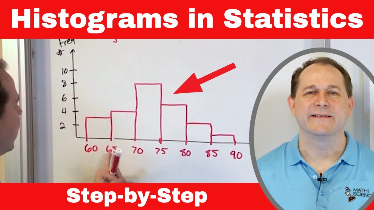
- 📈 A frequency histogram is introduced as a way to categorize data points and visualize the distribution by counting the number of data points in each category.
- 📊 The concept of relative frequency is explained, which involves displaying the percentage of data points in each category instead of the absolute number.
- 🔑 The importance of using percentages in histograms is highlighted, especially when dealing with large datasets, as it provides a more useful representation of the data distribution.
- 🌟 The idea of making histogram categories more granular is presented, which can lead to a smoother representation of the data distribution as the number of categories increases.
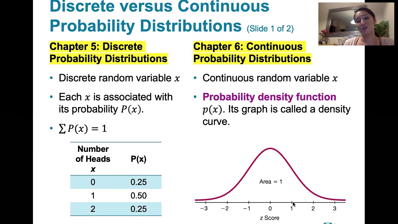
- 📉 The video introduces the concept of a density curve, which is a continuous curve that represents the distribution of data points when the number of categories approaches infinity.
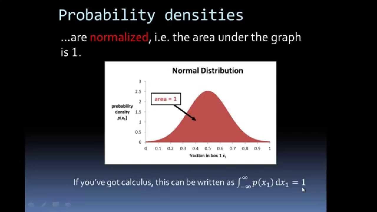
- 🌀 The area under a density curve represents the proportion of data points within a given interval, with the entire area under the curve summing up to 100%.
- 🚫 The video clarifies a common misconception about density curves, emphasizing that the height of the curve at a specific point does not represent the percentage of data at that exact value.
- 📝 The script mentions that statisticians often use tables, computer programs, or automated tools to calculate the exact areas under a density curve for precise data analysis.
- 📉 The practical application of density curves is demonstrated, showing how to estimate the percentage of data within a specific range by looking at the area under the curve.
Q & A
What is the main topic of the video?
-The main topic of the video is visualizing distributions of data and analyzing those visualizations, eventually leading to the concept of a density curve.
What is an example used in the video to illustrate data distribution?
-The example used in the video is asking 16 students to measure the average number of glasses of water they drink per day over the last 30 days.
What is a frequency histogram and how is it used in the video?
-A frequency histogram is a graphical representation of the distribution of data, where data points are grouped into categories and the frequency of each category is represented by the height of the bars. In the video, it is used to visualize the distribution of the number of glasses of water students drink per day.
Why might one prefer a relative frequency histogram over a frequency histogram?
-A relative frequency histogram is preferred when dealing with a large number of data points because it represents the percentage of data points within each category, making it more useful for understanding the distribution as a whole rather than just the absolute numbers.
What is the significance of making categories more granular in a histogram?
-Making categories more granular provides a clearer picture of the data distribution, allowing for more detailed analysis and understanding of the data, especially when dealing with a large dataset.
What is a density curve and how does it differ from a histogram?
-A density curve is a type of graph that represents the distribution of a continuous variable, where the data points can take on any value within a range. Unlike a histogram, which uses discrete categories, a density curve is created by connecting the tops of the bars in a histogram with an infinite number of infinitely thin categories, resulting in a smooth curve.
Why is the area under a density curve always 100%?
-The area under a density curve is always 100% because it represents the entire distribution of the data points, ensuring that all possible values are accounted for within the range of the curve.
How can one interpret the percentage of data falling within a specific interval using a density curve?
-To interpret the percentage of data falling within a specific interval, one would look at the area under the density curve within that interval. This area represents the proportion of the total data that falls within the specified range.
What is a common misconception about density curves mentioned in the video?
-A common misconception is that the height of the density curve at a specific point represents the percentage of data at that exact value. However, the correct interpretation is that the area under the curve within an interval represents the percentage of data within that range.
How can statisticians find precise areas under a density curve in real-world applications?
-In real-world applications, statisticians often use tables, computer programs, or automated tools that can provide precise measurements of the areas under a density curve, allowing for accurate analysis of data distributions.
What is the importance of understanding the difference between an interval and a precise value when using a density curve?
-Understanding the difference between an interval and a precise value is crucial because a density curve represents the distribution of continuous data. Therefore, it is not possible to have an exact percentage for a single value; instead, one must consider intervals to determine the proportion of data within a certain range.
Outlines
📊 Introduction to Data Visualization and Density Curves
The video begins by introducing the concept of visualizing data distributions and analyzing them through density curves. The instructor uses a simple example involving 16 students and their average daily water consumption measured over 30 days. The data is visualized through a frequency histogram, which categorizes the water intake into ranges and displays the number of students falling into each category. The instructor then explains the concept of relative frequency by converting the histogram into one that shows the percentage of students in each category. The discussion progresses towards the idea of a density curve, which emerges when the histogram categories become infinitely thin, allowing for a continuous representation of the data distribution. The value of a density curve is emphasized as it provides a visualization where data points can take on any value within a continuum, unlike the discrete buckets of a histogram.
📈 Understanding and Utilizing Density Curves
This paragraph delves into the practical application of density curves. The instructor explains how to interpret the area under the curve to determine the percentage of data that falls within a specific range, such as between two and four glasses of water per day. It is highlighted that while estimations can be made by visual inspection, statisticians often use tables or computer programs for precise measurements. The instructor also addresses a common misconception regarding density curves: the height of the curve at a specific point does not represent the percentage of data at that exact value. Instead, the area under the curve over an interval is what matters. The example clarifies that the probability of finding the exact value (e.g., exactly three glasses of water per day) is essentially zero because it corresponds to a vertical line with no width. The correct approach is to consider an interval around the value of interest, calculate the area under the curve for that interval, and use that to estimate the percentage of data within that range.
Mindmap
Keywords
💡Data Visualization
💡Frequency Histogram
💡Relative Frequency Histogram
💡Density Curve
💡Data Distribution
💡Continuous Data
💡Area Under the Curve
💡Estimation
💡Bell Curve
💡Misconception
Highlights
Introduction to visualizing distributions of data and analyzing them to understand density curves.
Review of concepts through an example of measuring daily water intake among students.
Explanation of how to create a frequency histogram to visualize data distribution.
Use of categories in a histogram to represent data points within specific ranges.
Importance of understanding the percentage of data in each category for large datasets.
Introduction to relative frequency histograms for representing data as percentages.
Demonstration of how to calculate the relative frequency of data points in a category.
Discussion on the utility of histograms for both small and large datasets.
Concept of making histogram categories more granular for better data visualization.
The idea of approaching infinite categories for a smoother representation of data.
Introduction to density curves as a visualization tool for continuous data distributions.
Explanation of how density curves represent data points on a continuum without discrete buckets.
Understanding that the area under a density curve represents the totality of data points.
Clarification that density curves never take on negative values.
Practical application of density curves to estimate the percentage of data within a specific interval.
Misunderstandings about interpreting density curves, particularly regarding exact data points.
Instruction on how to correctly interpret the percentage of data for an exact value using intervals.
Approximation techniques for estimating areas under a density curve using rectangles.
The importance of using intervals instead of single points when analyzing density curves.
Transcripts
Browse More Related Video
Density Curves and their Properties (5.1)
Probability Density Functions from Histograms
Mastering Statistics: Understand & Draw Histograms of Data

Estimating areas using trapezoidal rule [IB Maths AI SL/HL]
How To Make a Histogram Using a Frequency Distribution Table
6.1.1 The Standard Normal Distribution - Discrete and Continuous Probability Distributions
5.0 / 5 (0 votes)
Thanks for rating: