Mastering Statistics: Understand & Draw Histograms of Data
TLDRThis educational script introduces histograms as graphical representations of frequency distributions. The explanation begins with a practical example of measuring the heights of trees in a field and categorizing them into frequency classes. It then describes how to create a histogram by plotting these classes on a bar chart, ensuring the bars touch to indicate the shared boundaries between classes. The script also discusses relative frequency histograms, which depict percentages rather than raw counts, and provides an example using children's walking age. Finally, it guides viewers through constructing a histogram by hand, emphasizing the importance of using class boundaries to avoid gaps between bars. The lesson aims to clarify the concept of histograms and their significance in data visualization.
Takeaways
- 📊 A histogram is a graphical representation of a frequency distribution, typically displayed as a bar chart.
- 🌳 To create a histogram, one must first gather and measure data, then categorize it into classes or 'buckets'.
- 📐 The x-axis of a histogram represents the class intervals, and the y-axis represents the frequency or count of data points within each interval.
- 🔢 The bars in a histogram touch each other, indicating that the class intervals are continuous and share boundaries.
- 📈 Histograms can also represent relative frequencies, showing percentages rather than raw counts, which can be useful for comparing distributions.
- 📚 The script provides examples of histograms for tree heights and children learning to walk, illustrating how histograms can quickly convey the most common values in a dataset.
- 🚗 Another example given is the braking time of cars, demonstrating how to construct a histogram from raw data and the importance of using class boundaries to ensure bars touch.
- 📉 When drawing a histogram, it's crucial to calculate the class boundaries correctly to avoid gaps between bars, which can distort the visual representation.
- 📝 The script emphasizes the importance of understanding histograms and frequency distributions as foundational concepts in statistics.
- 🛠️ Tools like calculators and computer programs can automate the process of creating histograms, but it's beneficial to understand the manual process behind it.
- 📈 Histograms are a valuable tool for data analysis, allowing for quick visual comparisons and insights into the distribution of data.
Q & A
What is a histogram?
-A histogram is a graphical representation of the distribution of a set of data, typically represented by bars, where the area of each bar represents the frequency of data within a given range or 'class'.
How is a histogram different from a regular bar chart?
-In a histogram, the bars touch each other, indicating that the class intervals are continuous and there is no gap between them. In a regular bar chart, there is usually a gap between the bars.
What is the purpose of creating a frequency distribution table before drawing a histogram?
-A frequency distribution table organizes data into classes and counts how many data points fall into each class. This simplifies the process of drawing a histogram by providing a clear overview of data distribution.
Can you use meters instead of feet when creating a histogram for tree heights?
-Yes, you can use any unit of measurement for the vertical axis of a histogram, such as meters, as long as it is consistent and clearly labeled.
What is a relative frequency histogram?
-A relative frequency histogram is a type of histogram that represents the proportion of the total data that falls within each class interval, typically shown as percentages.
Why is it important to calculate class boundaries when drawing a histogram?
-Class boundaries are important because they ensure that the bars in the histogram touch each other, correctly representing the continuous nature of the data classes.
How do you find the class boundaries for a histogram?
-Class boundaries are found by calculating the midpoint between the endpoints of each class interval. This midpoint is used as the starting and ending point for each bar in the histogram.
What does the height of the bars in a histogram represent?
-The height of the bars in a histogram represents the frequency or relative frequency of data points within each class interval.
Can a histogram be used to represent the breaking time of cars?
-Yes, a histogram can be used to represent the breaking time of cars, where the class intervals could represent different ranges of breaking times, and the height of the bars would indicate the frequency of cars within those ranges.
Why are uniform widths important for the bars in a histogram?
-Uniform widths for the bars in a histogram are important because they allow for easy comparison of the frequency or relative frequency across different class intervals.
Outlines
📊 Understanding Histograms and Frequency Distributions
This paragraph explains the concept of a histogram as a graphical representation of a frequency distribution. It uses the example of measuring the heights of trees in a field and organizing the data into classes or 'buckets'. The speaker describes how to create a histogram by plotting the frequency of trees within each height range, emphasizing that histograms are a useful way to visualize data at a glance. Key points include the touching bars of histograms, which differ from typical bar charts, and the uniform width of these bars, reflecting the class boundaries shared between adjacent categories.
📈 Constructing Relative Frequency Histograms
The second paragraph delves into the creation of relative frequency histograms, which display data as percentages rather than raw counts. Using the example of children learning to walk at different ages, the speaker illustrates how to construct a histogram that shows the percentage of children within certain age ranges who have learned to walk. The emphasis is on how relative frequencies can provide insights into the most common occurrences within a dataset, such as the peak age for children learning to walk. The process involves calculating the relative frequency for each class and then graphing these as percentages on a histogram.
🚗 Creating a Histogram by Hand with Car Braking Data
In this paragraph, the speaker guides the audience through the process of manually constructing a histogram using raw data on car braking times. The data is presented in classes with corresponding frequencies, and the speaker explains the importance of using class boundaries rather than endpoints when drawing the histogram to ensure that the bars touch and there are no gaps. The example demonstrates how to calculate the midpoints between class intervals to create a histogram that accurately represents the distribution of braking times for cars.
🛠️ The Technicalities of Histogram Construction
The final paragraph focuses on the technical aspects of creating histograms, emphasizing the importance of understanding the underlying concepts. The speaker mentions the use of calculators and computer programs that can automate the process of creating histograms, but also stresses the value of learning the manual method to grasp the fundamentals. The paragraph concludes by highlighting the importance of histograms in data analysis and encourages learners to move on to the next topic, the stem and leaf diagram, which is another method for representing raw data and statistics.
Mindmap
Keywords
💡Histogram
💡Frequency Distribution
💡Class
💡Relative Frequency
💡Bar Chart
💡Class Boundaries
💡Breaking Time
💡Stem and Leaf Diagram
💡Frequency
💡Data Points
Highlights
A histogram is a graphical representation of a frequency distribution, showing the frequency of data points within certain ranges or 'buckets'.
To create a histogram of tree heights, measure the height of all trees in a given area and organize the data into frequency distribution tables.
In a histogram, bars represent the number of occurrences within each range and should touch each other, unlike in a typical bar chart.
The width of the classes in a histogram is uniform, ensuring consistency and ease of comparison between different ranges.
A relative frequency histogram displays the percentage of occurrences within each range, offering a perspective on the proportion of data points.
Relative frequency is calculated by dividing the frequency of a class by the total number of data points and multiplying by 100.
Histograms can quickly illustrate the range with the highest frequency of data points, providing a visual summary of the data distribution.
When constructing a histogram by hand, it's important to use class boundaries (the midpoints between class endpoints) to ensure bars touch and there are no gaps.
The class boundaries are crucial for creating a histogram because they ensure the bars represent the correct ranges and touch each other.
In the example of car braking times, a histogram can show the distribution of stopping times, with shorter times indicating better performance.
When graphing a histogram, the bars' heights correspond to the frequency or relative frequency of the data points within each class.
Modern calculators and computer programs can automate the process of creating histograms, including finding class boundaries and plotting the bars.
Histograms are an essential tool in data analysis, providing a clear visual representation of data distribution and frequency.
Understanding histograms and frequency distributions is fundamental to grasping more advanced statistical concepts and data visualization techniques.
The transcript provides a detailed step-by-step guide on how to manually construct a histogram, which is beneficial for learning the underlying principles.
The next section will introduce stem and leaf diagrams as an alternative method for representing raw data and statistics.
Transcripts
Browse More Related Video
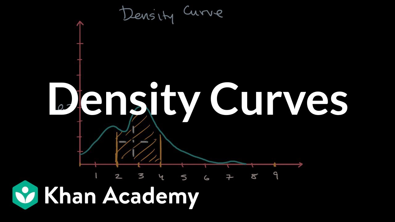
Density Curves | Modeling data distributions | AP Statistics | Khan Academy
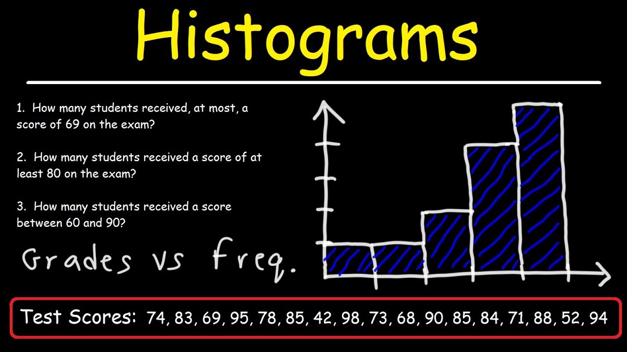
How To Make a Histogram Using a Frequency Distribution Table
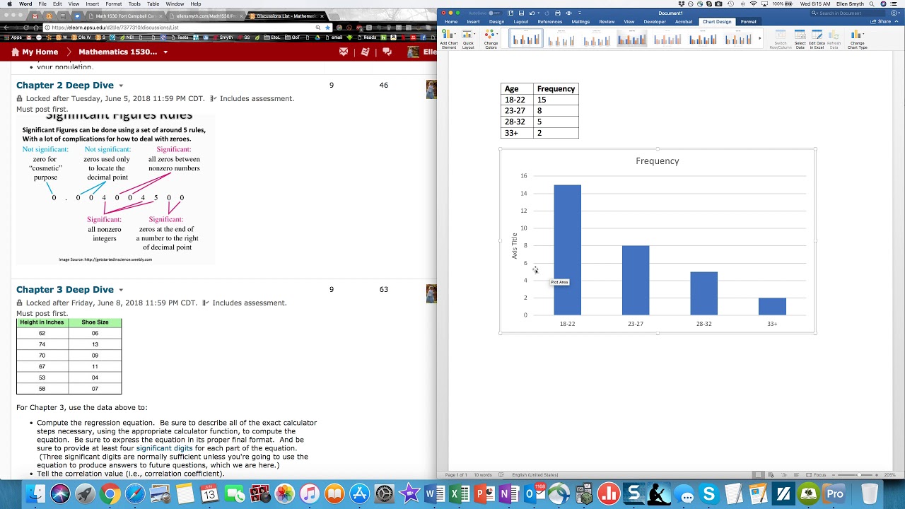
Creating Histograms in MS Word
The Main Ideas behind Probability Distributions

Elementary Stats Lesson 2
Histograms and Density Plots for Numeric Variables | Statistics Tutorial | MarinStatsLectures
5.0 / 5 (0 votes)
Thanks for rating: