Creating Histograms in MS Word
TLDRThe video script demonstrates how to create a histogram from a frequency table in Word. It covers copying the table, inserting a chart, selecting the right layout, pasting data, adjusting the y-axis to show frequency, renaming axes, and formatting the bars to eliminate gaps, ultimately transforming a bar chart into a histogram.
Takeaways
- 📊 The process begins with having a frequency table ready for creating a histogram.
- 🖥️ Highlight and copy the frequency table data to be used in the histogram.
- 📈 Insert a new chart by clicking on the 'Insert' tab and selecting 'Chart'.
- 📊 By default, a bar chart is created, but it can be transformed into a histogram by adjusting the settings.
- 🔗 Understand that a histogram and a bar chart are similar, except a bar chart has spaces between the bars.
- 👉 Choose 'Clustered' for the chart type, as it's suitable for a single set of data.
- 📋 Paste the copied frequency table data into the chart by using 'Paste' or keyboard shortcuts (Ctrl+V on PC, Command+V on Mac).
- 🗑️ Delete any unnecessary data or columns in the chart to keep it clean.
- ✍️ Customize the chart by changing the axis titles to reflect the data accurately, such as 'Frequency' for the y-axis and 'Ages' for the x-axis.
- 🔧 Adjust the appearance of the histogram by removing spaces between bars through the 'Format Data Series' option, setting the gap width to zero.
- ♻️ Use 'Undo' (Ctrl+Z on PC, Command+Z on Mac) to correct any mistakes made during the process.
Q & A
What is the purpose of creating a histogram from a frequency table?
-A histogram is created from a frequency table to visually represent the distribution of data. It helps in understanding the frequency of different categories or ranges in the dataset.
How do you start creating a histogram in a document?
-You start by highlighting the frequency table, copying it, and then inserting a chart in the document. You choose the chart type that best represents the data.
Why is it important to change the default bar chart to a histogram?
-A bar chart has spaces between the bars, whereas a histogram does not. By making the bars touch each other, you ensure that the visual representation accurately reflects the continuous nature of the data distribution.
What is the default chart type that Word creates when you insert a chart?
-By default, Word creates a bar chart when you insert a chart. You can then customize it to look like a histogram by adjusting the settings.
How do you change the data in a chart in Word?
-You can change the data in a chart by selecting the chart, going to the 'Design' tab, and then pasting the copied data into the chart area.
What is the significance of adjusting the y-axis in a histogram?
-Adjusting the y-axis to display frequency helps in understanding the scale of the data distribution. It shows how many times each category or range occurs in the dataset.
Why might you want to remove the axis title that shows only one category?
-Removing the axis title that shows only one category can prevent confusion and make the histogram clearer, as it avoids misleading the viewer about the nature of the data distribution.
How do you rename the axis titles in a histogram in Word?
-You can rename the axis titles by clicking on the title, selecting the text, and then typing in the new title name.
What is the purpose of adjusting the gap width between bars in a histogram?
-Adjusting the gap width to zero is crucial in making the histogram look continuous and not like a bar chart. It helps in accurately representing the data distribution without any breaks.
What is the best way to undo changes in Word if you make a mistake?
-You can use the 'Undo' command, which can be accessed by pressing 'Ctrl + Z' on a PC or 'Command + Z' on a Mac. This allows you to revert back to the previous state of the document.
How can you ensure that the histogram accurately represents the data without any visual distractions?
-By adjusting the gap width between bars to zero and ensuring the axis titles are clear and relevant, you can make the histogram a clean and accurate representation of the data.
Outlines
📊 Creating a Histogram from Frequency Table
This paragraph explains the process of creating a histogram using a frequency table. The speaker begins by highlighting and copying the frequency table, then proceeds to insert a chart by selecting the 'Chart' option from the 'Insert' tab. The default chart type is a bar chart, but the speaker emphasizes the need to adjust it to resemble a histogram by eliminating spaces between the bars. The speaker also discusses the importance of adjusting the y-axis to represent frequency and provides instructions for modifying the chart's layout and axis titles. Finally, the speaker explains how to format the data series to remove gaps between the bars, effectively transforming the bar chart into a histogram.
🔄 Undoing Mistakes in Chart Creation
In this paragraph, the speaker focuses on the importance of the 'Undo' function when creating a histogram or any other chart. They mention that the 'Undo' command can be accessed using 'Control Z' on a PC or 'Command Z' on a Mac, and it is typically found under the 'Edit' menu. The speaker reassures the viewer that if any mistakes are made during the chart creation process, they can easily be corrected using this function. The paragraph concludes with a brief mention of the need to see the cursor in the video to follow along with the instructions.
Mindmap
Keywords
💡Frequency Table
💡Histogram
💡Chart
💡Bar Chart
💡Data Series
💡Insert Tab
💡Axis Titles
💡Gap Width
💡Copy and Paste
💡Undo
Highlights
Creating a histogram from a frequency table.
Highlighting and copying the frequency table.
Inserting a chart to create a histogram.
Choosing the chart type as a bar chart initially.
Converting a bar chart to a histogram by adjusting the spacing.
Selecting the 'Clustered' option for single data sets.
Pasting the copied frequency data into the chart.
Deleting unnecessary data from the chart.
Adjusting the y-axis to display frequency values.
Choosing a simple chart layout for clarity.
Removing unnecessary axis titles for clarity.
Setting the axis title to 'Frequency'.
Naming the x-axis 'Ages' for context.
Eliminating gaps between bars to make it a true histogram.
Using 'Format Data Series' to adjust the gap width.
Setting the gap width to zero for a seamless histogram.
Utilizing undo functionality for corrections.
Finalizing the histogram with the correct settings.
Transcripts
Browse More Related Video
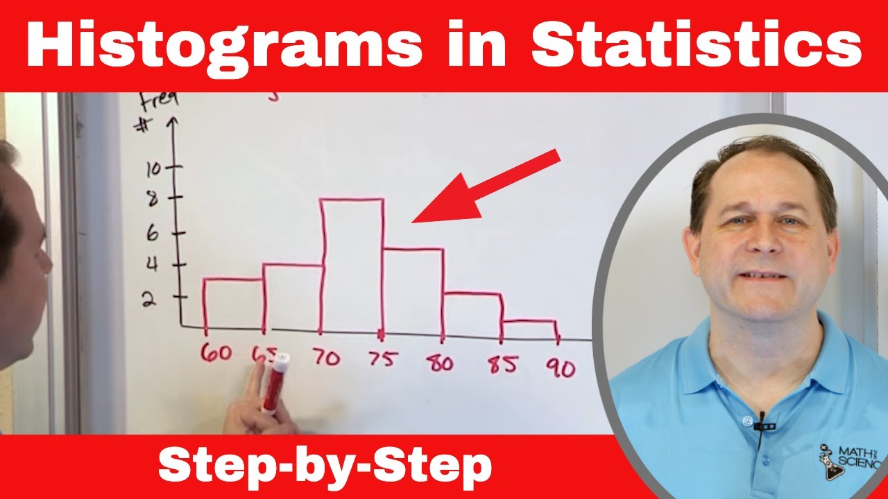
Mastering Statistics: Understand & Draw Histograms of Data
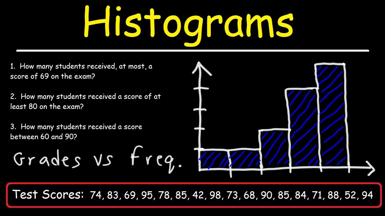
How To Make a Histogram Using a Frequency Distribution Table
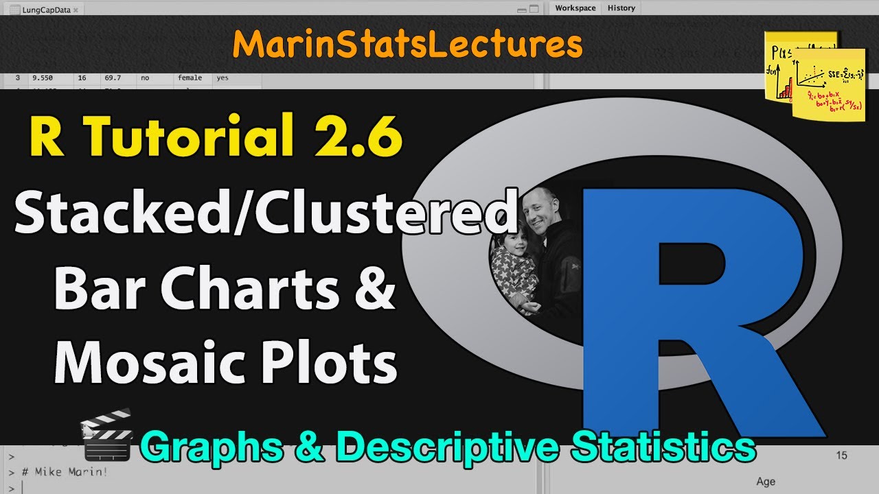
Stacked and Grouped Bar Charts and Mosaic Plots in R |R Tutorial 2.6| MarinStatsLectures
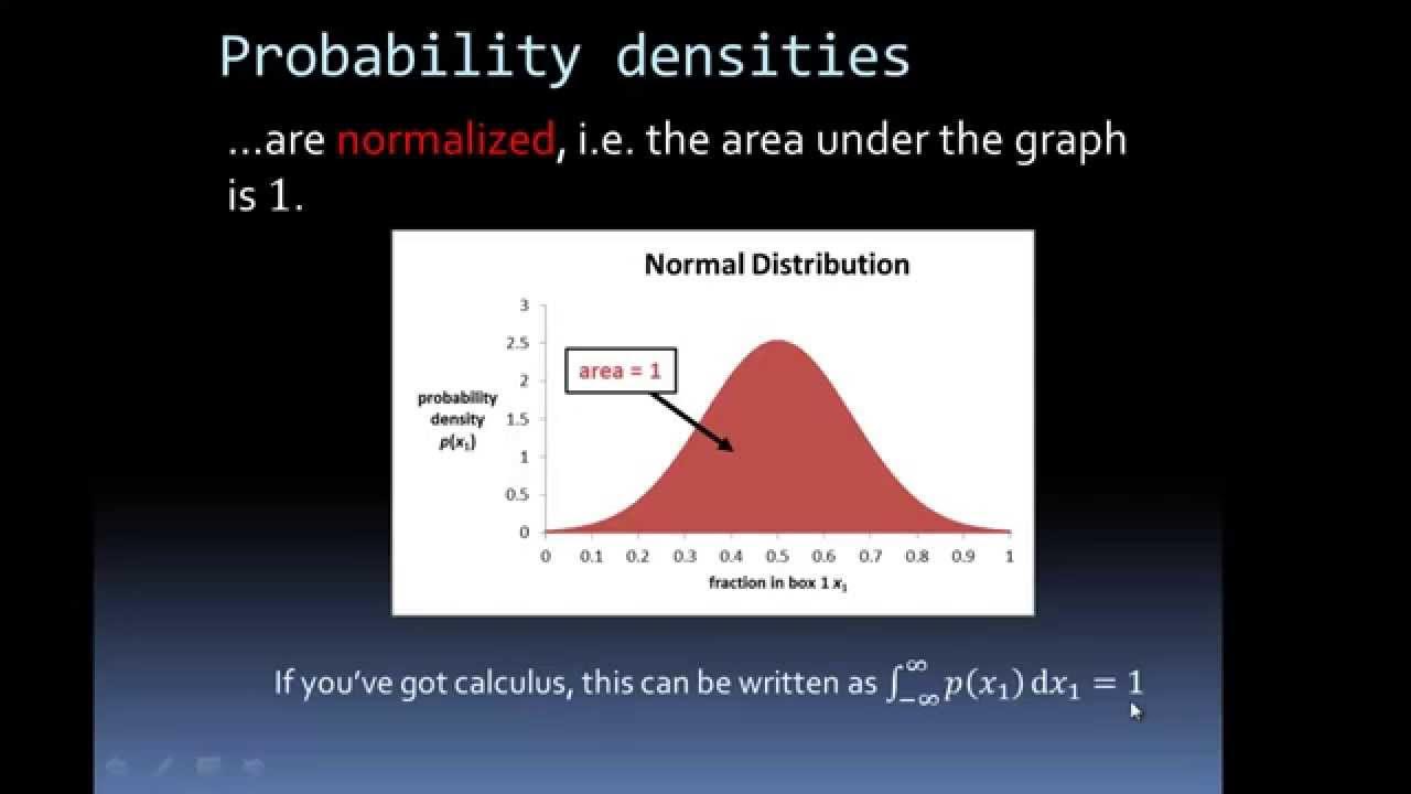
Probability Density Functions from Histograms

How to make a FTIR spectra in excel from a CSV file
Density Curves | Modeling data distributions | AP Statistics | Khan Academy
5.0 / 5 (0 votes)
Thanks for rating: