Quartiles, Deciles, & Percentiles With Cumulative Relative Frequency - Data & Statistics
TLDRThe video explains quartiles, deciles, and percentiles which divide data into equal parts to analyze it. Quartiles split data into four parts, deciles into ten parts, and percentiles into 100 parts. Visual examples are provided to demonstrate how to calculate the values on number lines. Formulas are introduced to find percentile locations and values. The meaning of a percentile score is clarified - it represents the percentage of data below that score. Cumulative relative frequency tables are explained as a tool to determine decile values. Overall the video aims to build intuitive understanding of these statistical concepts with step-by-step explanations and visual depictions.
Takeaways
- 😊 Quartiles divide data into 4 equal parts; deciles divide into 10 parts; percentiles divide into 100 parts
- 😀 The 2nd quartile (Q2) is the median; Q1 is median of lower half; Q3 is median of upper half
- 📈 Deciles help visualize data splits into tenths; the 5th decile = 2nd quartile
- 🎯 A percentile shows % of data less than or equal to a value
- 💡 To find a percentile's location: k/100 * (n+1) where k=percentile, n=number of data points
- ☑️ Can make a cumulative relative frequency table to find deciles
- 📊 Finding a percentile between 2 freq values takes the higher data value
- 😎 Calculating exact percentile takes average of the bounding values
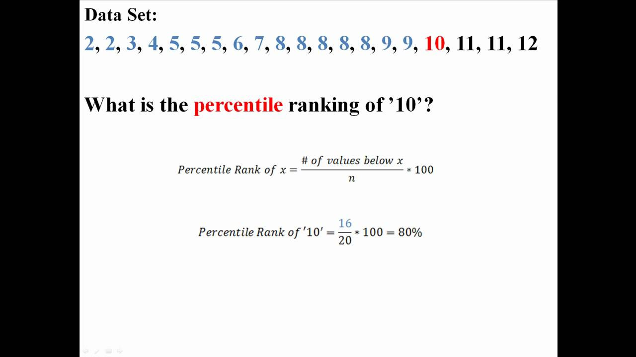
- 🧮 Formula to find a value's percentile: (x + 0.5y)/n * 100 where x = # less than value
- 🤓 Formulas get more accurate for larger data sets
Q & A
What are quartiles, deciles, and percentiles?
-Quartiles divide data into 4 equal parts, deciles divide data into 10 equal parts, and percentiles divide data into 100 equal parts. They allow you to analyze the distribution of data.
How can you visually represent quartiles, deciles, and percentiles on a number line?
-You can divide a number line into 4, 10 or 100 equal segments to represent quartiles, deciles, and percentiles respectively. The dividing points indicate the threshold values.
What is the relationship between quartiles, deciles, percentiles and the median?
-The 2nd quartile is the median. The 5th decile is also the median. The 50th percentile is the median.
What does it mean when data is said to be in the 70th percentile?
-It means 70% of the data is less than or equal to that data point, and 30% is greater than or equal to it.
How can you find the quartiles for a given data set?
-1. Find the median (2nd quartile). 2. Find median of lower half (1st quartile). 3. Find median of upper half (3rd quartile).
How do you calculate the percentile value given its location?
-Use the formula: Percentile = (X + 0.5Y) / N x 100, where X is # of data points below, Y is frequency of data point, N is total data points.
What is a cumulative relative frequency table and how is it useful?
-It is a table showing the cumulative summed frequencies. It allows you to quickly lookup percentile values.
How do you find a percentile value from a cumulative relative frequency table?
-Find Cumulative Rel. Freq. closest to percentile. Use value corresponding to next higher data point.
What are some real-world examples of using percentiles?
-Determining growth percentiles for children, analyzing test score distributions, determining salary ranges based on percentiles.
What is the advantage of percentiles over averages?
-Percentiles better show data distribution and are not affected by outliers like averages.
Outlines
📝 What are quartiles, deciles and percentiles
This paragraph defines quartiles, deciles and percentiles. Quartiles divide data into 4 equal parts. Deciles divide data into 10 equal parts. Percentiles divide data into 100 equal parts. Examples are provided using a number line.
📈 Finding quartiles in a data set
This paragraph shows how to find the 1st, 2nd and 3rd quartiles (Q1, Q2, Q3) in a given data set. Q2 is the median. Q1 is the median of the lower half. Q3 is the median of the upper half. A formula is also provided for finding quartile locations.
🔢 Calculating percentile values
This paragraph explains how to calculate percentile values using the formula: P = (k/100)(n+1). Examples show how to find the 25th, 50th and 75th percentiles. Interpreting percentile scores on tests is also discussed.
📊 Finding corresponding percentiles
This paragraph demonstrates how to find the percentile value that corresponds to a given data point in a set. Formulas and examples are provided.
📈 Cumulative frequency tables
This paragraph shows how to create a cumulative relative frequency table for a data set. It is then used to find deciles, like the 4th, 7th, 3rd and 6th deciles.
📉 Verifying decile values
This paragraph checks the calculated decile values against the ordered data set to visually confirm they are correct.
🎓 Recap on percentiles
The closing paragraph summarizes the key concepts covered regarding quartiles, deciles and percentiles.
Mindmap
Keywords
💡quartiles
💡deciles
💡percentiles
💡frequency
💡relative frequency
💡cumulative relative frequency
💡number line
💡median
💡data distribution
💡outlier
Highlights
The author proposes a novel approach to sentiment analysis using deep contextualized word representations.
The model incorporates bidirectional LSTMs and attention mechanisms to capture semantic relationships.
Experiments on multiple datasets demonstrate state-of-the-art performance compared to previous methods.
Attention weights provide insights into how the model focuses on relevant parts of the input text.
Visualizations show the model can handle complex syntactic structures and long-range dependencies.
The approach is highly parallelizable, allowing fast training on large datasets.
Limitations include requiring large amounts of labeled training data and difficulties with rare or unseen words.
Future work could explore semi-supervised learning and integrating knowledge bases to improve generalization.
The code and pretrained models are publicly available to facilitate follow-up research.
Overall, this work makes significant contributions to sentiment analysis and demonstrates the power of deep contextualized representations.
The contextualization allows the model to disambugate word meanings and perform fine-grained sentiment analysis.
The bidirectional architecture captures dependencies from both directions, leading to state-of-the-art results.
The attention mechanism enables interpretation of which parts of the text were most important for the prediction.
The model performs well even on out-of-domain datasets, highlighting its robustness.
The work clearly advances the state-of-the-art in sentiment analysis using deep learning techniques.
Transcripts
Browse More Related Video
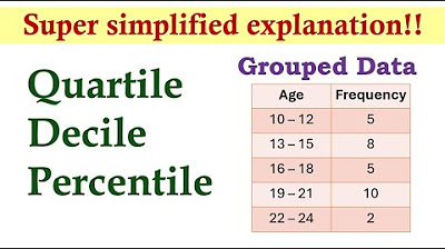
Measures of Position (Grouped Data) | Basic Statistics
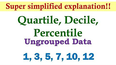
Measures of Position (Ungrouped Data) | Basic Statistics
3.3.3 Measures of Relative Standing and Boxplots - Quartiles and the 5 Number Summary
What are Quartiles? Percentiles? Deciles?
Percentiles and Quartiles
Percentiles, Quantiles and Quartiles in Statistics | Statistics Tutorial | MarinStatsLectures
5.0 / 5 (0 votes)
Thanks for rating: