How To Make a Frequency Polygon
TLDRThe video explains how to construct a frequency polygon for a statistics class. It first walks through creating a frequency distribution table by determining income ranges and tallying the frequencies for each range. It then calculates the midpoints for each income range to plot on the x-axis. Finally, it introduces an additional low and high midpoint, plots the frequencies on the y-axis, connects the points, and explains the importance of starting and ending the line on the x-axis when graphing a frequency polygon.
Takeaways
- 😀 The first step is to construct a frequency distribution table with income ranges and corresponding frequencies
- 😊 To find the midpoint of an income range, add the lower and upper bounds then divide by 2
- 😏 Introduce a midpoint below the lowest actual midpoint and one above the highest midpoint
- 🤓 On the y-axis plot the frequencies, on the x-axis plot the midpoint values
- 😮 Give the extra midpoint values frequencies of 0 since they start from the x-axis
- 👍 Draw a straight line connecting all the plotted points
- 📈 Other statistical plots that may be covered include stem, leaf, dot, histograms and quantiles
- 🧐 Additional video topics beyond statistics like chemistry, physics, algebra and calculus
- 🔍 Videos are organized into playlists by subject for easy search
- 👋 Thanks for watching and subscribing for more stats video content
Q & A
What is a frequency polygon and its purpose in statistics?
-A frequency polygon is a graphical representation used in statistics to show the distribution of a dataset. It is created by plotting the frequencies of data points against their corresponding midpoints and then connecting these points with straight lines. Its purpose is to provide a visual understanding of the distribution's shape and to identify patterns, trends, or outliers within the data.
How do you define the intervals for a frequency polygon?
-Intervals for a frequency polygon are defined based on the range of data. In the provided script, intervals are set with a width of 20,000 (20k), starting from 20k since there's no income below 20k. Each interval includes the lower bound but not the upper bound, so a value exactly at the interval's upper limit falls into the next interval.
Why are midpoints calculated for constructing a frequency polygon?
-Midpoints are calculated for constructing a frequency polygon to accurately represent the center of each interval on the graph. They are used as the x-axis values where the corresponding frequencies (y-axis values) are plotted. This approach helps in visualizing the distribution's trends and patterns more clearly.
How is the midpoint of an interval calculated?
-The midpoint of an interval is calculated by adding the lower bound and upper bound of the interval and then dividing by two. This calculation finds the central value of the interval, which is used as the x-coordinate for plotting the frequency of that interval in a frequency polygon.
Why are additional points added at the beginning and end of a frequency polygon?
-Additional points are added at the beginning and end of a frequency polygon, with frequencies set to zero, to visually ground the polygon to the x-axis. These points are calculated by extending the midpoint sequence beyond the actual data range. This practice ensures that the polygon starts and ends on the x-axis, making the distribution's shape clearer and more comprehensive.
How do you handle values that fall exactly on the boundary of an interval range?
-Values that fall exactly on the boundary of an interval range are included in the upper interval. For instance, if an interval is from 20k to 40k (not including 40k), and the next is from 40k to 60k, a value of 40k would fall into the second interval. This convention ensures that each data point is uniquely assigned to a single interval without overlap.
What is the significance of plotting frequency values on the y-axis and midpoint values on the x-axis?
-Plotting frequency values on the y-axis and midpoint values on the x-axis is significant because it allows for a clear representation of how frequently data points occur within each interval across the distribution. This graphical representation helps in visualizing the data's distribution pattern, making it easier to analyze and interpret statistical information.
How do you interpret the peaks and valleys in a frequency polygon?
-Peaks in a frequency polygon represent intervals with higher frequencies, indicating a higher concentration of data points within those ranges. Valleys, on the other hand, represent intervals with lower frequencies, indicating fewer data points. Interpreting these peaks and valleys helps identify the most and least common data ranges, showing the distribution's central tendency and variability.
What additional resources does the video creator suggest for viewers interested in statistics?
-The video creator suggests that viewers interested in furthering their statistics knowledge explore their channel for additional videos on topics such as stem-and-leaf plots, dot plots, histograms, percentiles, quartiles, and calculating the interquartile range. They also mention offering videos on related subjects like general and organic chemistry, physics, and various mathematics topics.
Why is it recommended to subscribe and turn on notifications for the video channel?
-It is recommended to subscribe and turn on notifications for the video channel to stay updated on new video posts related to statistics and other educational content. This ensures viewers do not miss out on future videos that could help them with their studies or interests in statistics and other academic subjects.
Outlines
📊 Constructing a Frequency Table
The first step is to construct a frequency distribution table. The table has two columns - one for income ranges and one for frequency values. The ranges start at 20k and increase by 20k up to 120k. The frequencies are counted based on how many data values fall within each range.
📈 Calculating Midpoints and Plotting the Polygon
The next step is to calculate the midpoint for each income range by averaging the lower and upper bounds. Two additional midpoints below the lowest and above the highest are added. The frequencies are plotted on the y-axis and midpoints on the x-axis. Finally, the points are connected with straight lines to create the frequency polygon.
💡Tips for Creating More Stats Videos
The narrator recommends subscribing and enabling notifications to see more stats videos in the future. Other video topics like stem plots, histograms, quartiles etc. are mentioned. Videos on chemistry, physics, math are also available.
Mindmap
Keywords
💡frequency polygon
💡income distribution
💡frequency
💡interval
💡class width
💡midpoint
💡statistics
💡histogram
💡interquartile range
💡dot plot
Highlights
First significant highlight text
Second notable highlight text
Third innovative method introduced
Fourth theoretical contribution detailed
Fifth impact of research discussed
Transcripts
Browse More Related Video

Elementary Statistics - Chapter 2 - Exploring Data with Tables & Graphs
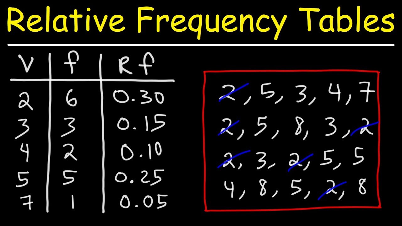
How To Make a Relative Frequency Distribution Table
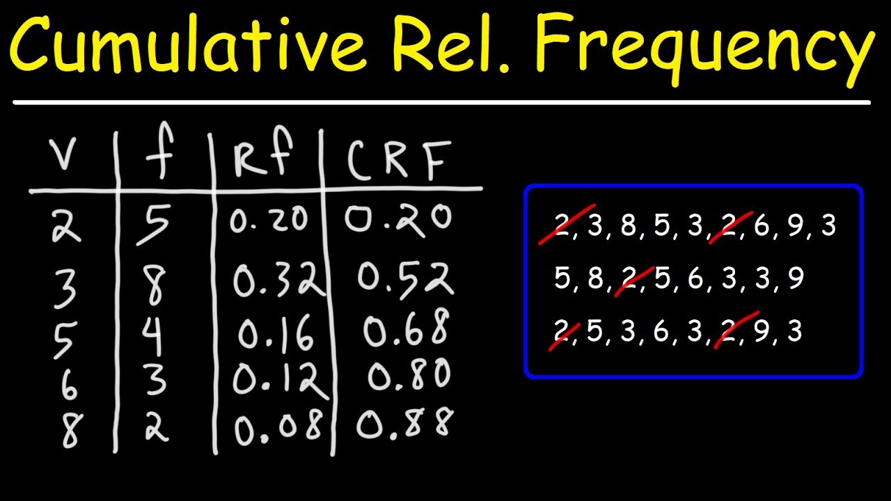
How To Make a Cumulative Relative Frequency Table
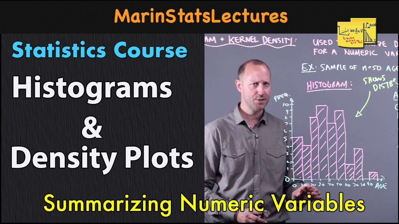
Histograms and Density Plots for Numeric Variables | Statistics Tutorial | MarinStatsLectures

Mean, Median, and Mode of Grouped Data & Frequency Distribution Tables Statistics
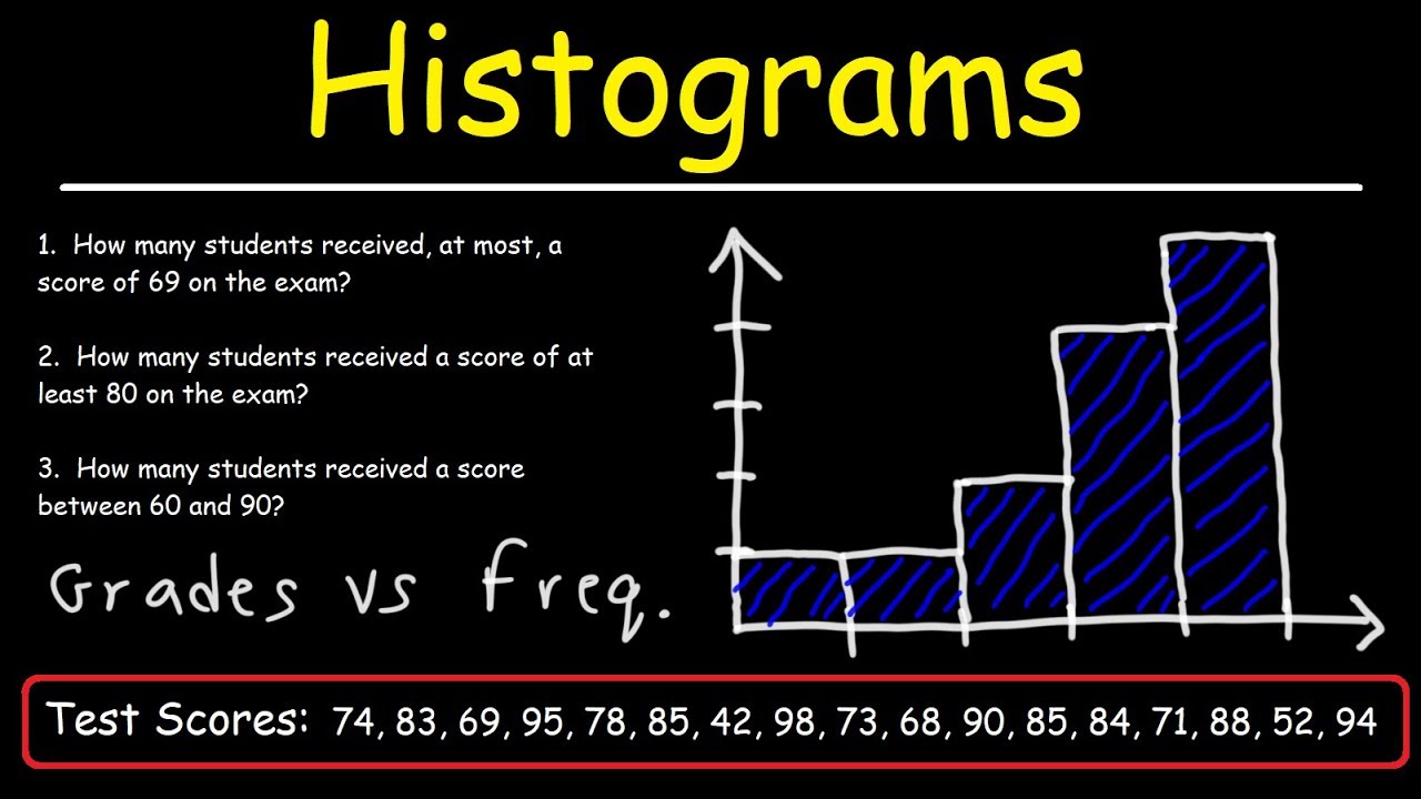
How To Make a Histogram Using a Frequency Distribution Table
5.0 / 5 (0 votes)
Thanks for rating: