Quantile-Quantile Plots (QQ plots), Clearly Explained!!!
TLDRIn this Stat Quest video, host Josh Starmer explains the concept and application of quantile plots, or QQ plots, in a clear and accessible manner. The video begins by defining quantiles and their relevance, then demonstrates how to use QQ plots to assess the distribution of a dataset. Through a step-by-step process, Josh compares the dataset to both a normal and a uniform distribution, illustrating how the plots can reveal the best fit. The video also addresses comparing two datasets using quartiles. The engaging explanation and practical examples make this an informative guide for understanding QQ plots and their utility in data analysis.
Takeaways
- 📊 QQ plots (quantile-quantile plots) are used to determine if a data set follows a specific distribution.
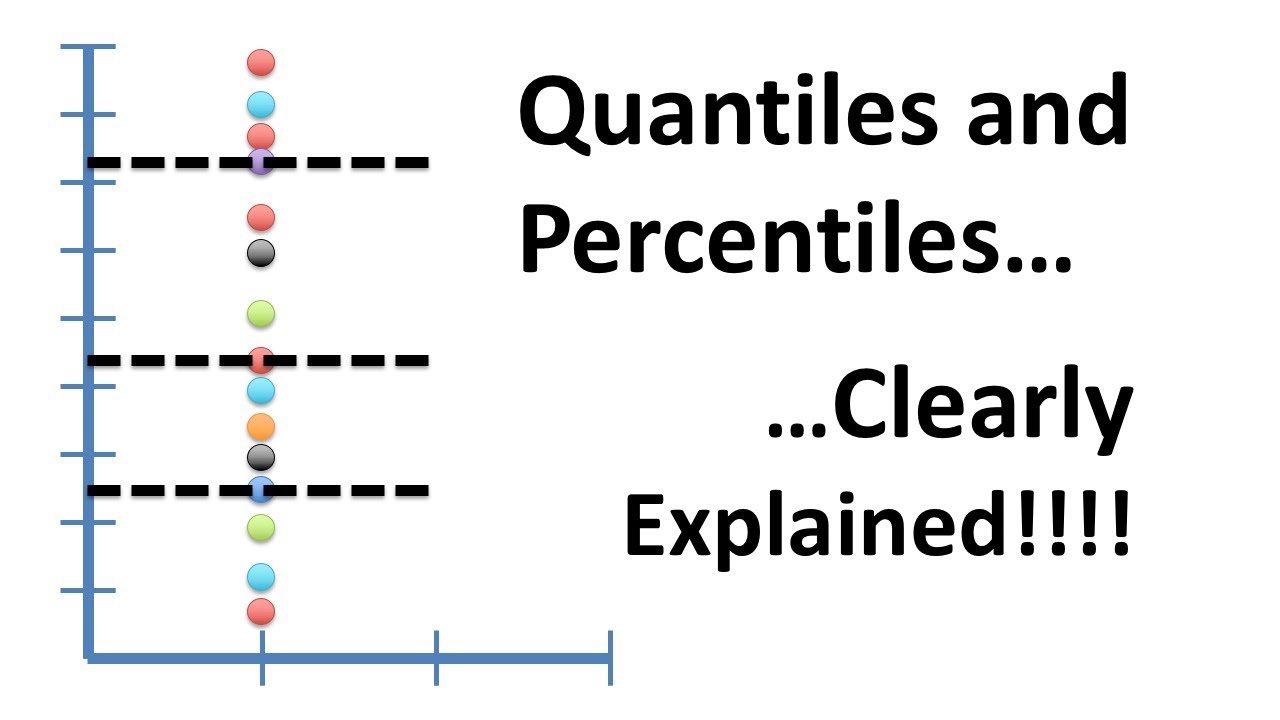
- 🧐 The script assumes prior knowledge of quantiles; for beginners, a separate Stat Quest episode on quantiles and percentiles is recommended.
- 📈 To begin with, the data set should have its own quantiles calculated based on the number of data points.
- 🔍 A normal curve is used as a reference, and it should be divided into the same number of quantiles as the data set.
- 🟫 The QQ plot has two axes: one for the data set's quantiles and one for the chosen distribution's quantiles.
- 📌 Points are plotted on the QQ graph where the data set's quantiles intersect with the normal distribution's quantiles.
- 🔗 If the data is normally distributed, the plotted points on the QQ graph should approximately fall on a straight line.
- 🔄 The process can be repeated with different distributions to find the best fit for the data set.
- 🔄 Comparing two data sets can be done by plotting their quantiles against each other on a QQ graph.
- 📊 A straight line on the QQ plot indicates a high degree of similarity between the distributions of the two data sets.
- 🚀 More data points result in a more accurate representation of the data's distribution on the QQ plot.
Q & A
What is the main topic of the video?
-The main topic of the video is about quantiles and quantile plots, also known as QQ plots.
What is a quantile?
-A quantile is a statistical concept that divides a set of data into equal parts, each part representing a certain percentage of the total data.
What does a QQ plot help to determine?
-A QQ plot helps to determine if a set of data is normally distributed or to compare it with another distribution.
How many data points are used in the example data set?
-There are 15 data points used in the example data set.
What is the first step in creating a QQ plot?
-The first step in creating a QQ plot is to assign each data point its own quantile.
What type of curve is used as a reference in the video for comparison?
-A normal curve is used as a reference for comparison in the video.
How many lines are used to divide the normal curve into equal-sized groups in the QQ plot?
-There are 15 lines dividing the normal curve into equal-sized groups, corresponding to the 15 data points.
What does the video suggest if the data points on the QQ plot do not fit a straight line well?
-If the data points do not fit a straight line well on the QQ plot, it suggests that the data is not well-represented by the normal distribution, and another distribution should be considered.
How does the video demonstrate comparing two data sets using a QQ plot?
-The video demonstrates comparing two data sets by plotting their quantiles on the same QQ graph and observing how closely the points align with a straight line.
What is the significance of the quantiles in the context of comparing data sets?
-The significance of the quantiles in comparing data sets is that they allow us to assess how similar or different the distributions of the two data sets are by observing the pattern of the points on the QQ plot.
What is the alternative distribution considered in the video for comparison with the data?
-The alternative distribution considered in the video for comparison with the data is the uniform distribution.
What does the video suggest about the relationship between the number of data points and the clarity of the QQ plot?
-The video suggests that having more data points results in more quantiles, which in turn provides a clearer and more reliable representation of the distribution on the QQ plot.
Outlines
📊 Introduction to QQ Plots and Data Distribution
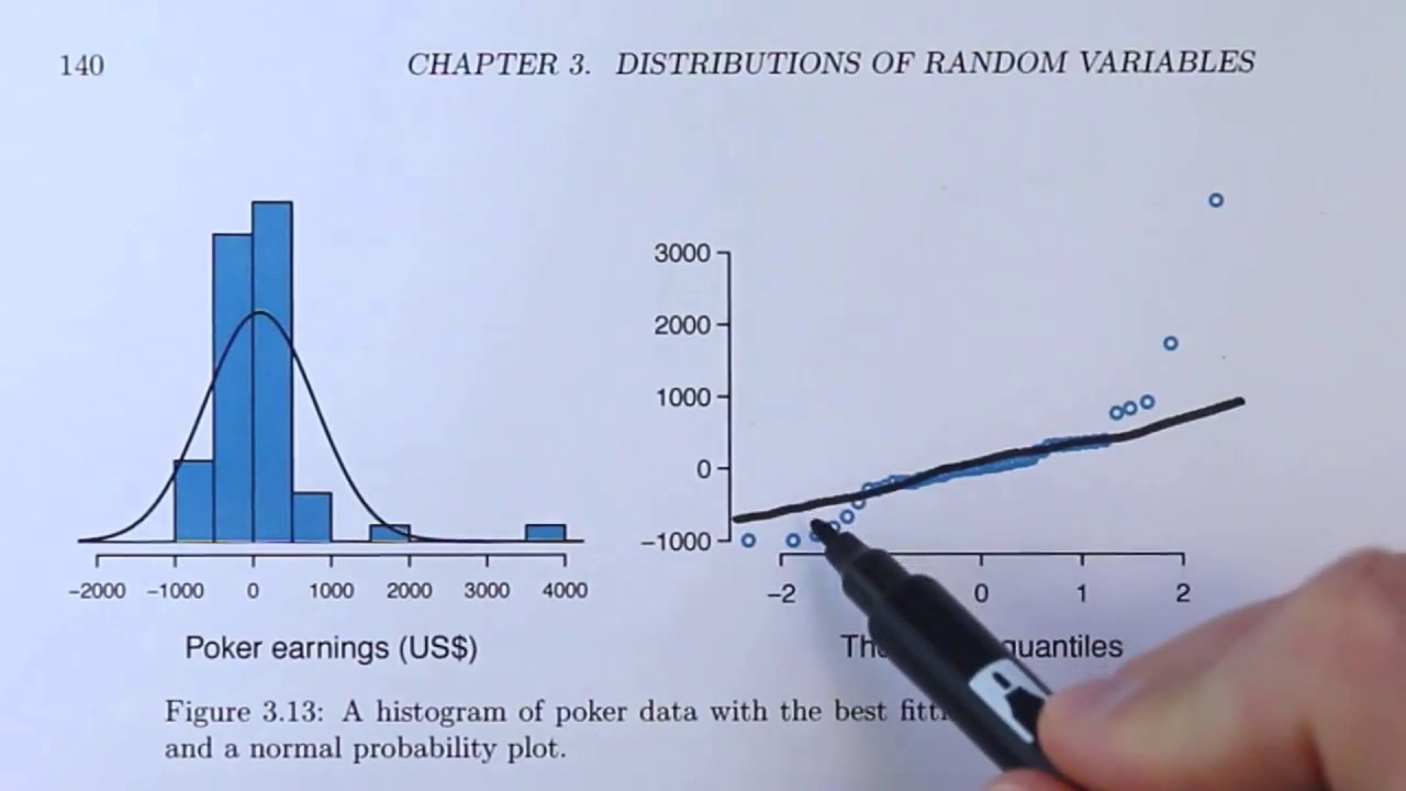
This paragraph introduces the concept of QQ plots, also known as quantile-quantile plots, which are used to assess whether a data set is normally distributed. The host, Josh, explains that the video will cover the creation and interpretation of QQ plots, assuming prior knowledge of quantiles and percentiles. A data set with 15 measurements is presented, and the viewer is guided through the steps of creating a QQ plot: assigning quantiles to each data point, overlaying a normal curve with corresponding quantiles, and plotting the points where the data set's quantiles intersect with the normal curve's quantiles. The goal is to see if the plotted points fall approximately on a straight line, indicating a good fit to the normal distribution. The paragraph concludes with a comparison of the data to a uniform distribution, showing a better fit for the uniform distribution.
🔍 Comparing Data Sets with QQ Plots
This paragraph delves into the process of using QQ plots to compare two different data sets. The host explains how to determine quartiles (quantiles with four divisions) for both the original data set with 15 measurements and a new, smaller data set with only four quartiles. The method involves plotting the quantiles from both data sets on a QQ graph, with horizontal and vertical lines representing the quartiles and dots at the intersection points. The paragraph emphasizes the importance of having more data and quantiles for a more accurate comparison of distributions. The video ends with a call to action for viewers to subscribe for more content and to leave suggestions for future topics.
Mindmap
Keywords
💡Quantile
💡QQ Plot
💡Normal Distribution
💡Uniform Distribution
💡Data Comparison
💡Statistical Analysis
💡Probability
💡Data Set
💡Distribution Fit
💡Data Quantiles
💡Plotting
Highlights
Introduction to quantile (QQ) plots and their use in assessing data distribution.
Assumption that viewers have prior knowledge of quantiles; reference to a previous video for clarification.
Explanation of the normal distribution's role in QQ plots for assessing data normality.
Step-by-step process of creating a QQ plot, starting with assigning quantiles to data points.
Use of a normal curve with equal-sized groups based on probability distribution.
Description of plotting the first data point on the QQ graph by intersecting the smallest quantile lines.
Continuation of the QQ plot by adding dots for each quantile intersection.
Interpretation of QQ plot results, with a straight line indicating normal distribution fit.
Comparison of data to a uniform distribution using the same QQ plot method.
Observation that points closer to the line on a QQ plot indicate a better fit to the uniform distribution.
Process of comparing two data sets of different sizes using quartiles and QQ plots.
Explanation of determining quartiles for the original data set for comparison.
Method of plotting and comparing data sets on a QQ graph by intersecting quantile lines.
Discussion on the difficulty of determining distribution similarity with few quantiles.
Encouragement for viewers to subscribe for more Stat Quest videos.
Call to action for viewers to suggest future topics for Stat Quest.
Transcripts
Browse More Related Video
Normal Probability Plots Explained (OpenIntro textbook supplement)
Quantiles and Percentiles, Clearly Explained!!!
10.2.6 Regression - Residual Plots and Their Interpretation
StatQuest: Principal Component Analysis (PCA), Step-by-Step
Box and Whisker Plots Explained | Understanding Box and Whisker Plots (Box Plots) | Math with Mr. J
StatQuest: Random Forests Part 2: Missing data and clustering
5.0 / 5 (0 votes)
Thanks for rating: