Plots, Outliers, and Justin Timberlake: Data Visualization Part 2: Crash Course Statistics #6
TLDRThe script covers different types of data visualizations like histograms, dot plots, stem and leaf plots, and box plots. It explains how each allows you to understand data distributions and outliers. The narrator stresses being critical of graphics, ensuring they provide useful information. She coins 'DFTBAQ' - Don't Forget To Be Asking Questions when interpreting charts. Overall the video teaches how to read graphs and recognize effective vs ineffective data visualization.
Takeaways
- 😀 There are many types of data visualizations we see daily, like charts and histograms, that allow us to understand data visually.
- 📊 Stem and leaf plots organize data by splitting values into stems (leftmost digits) and leaves (remaining digits) to show distribution.
- 📉 Dot plots and histograms visualize data distribution, but don't show actual values like stem and leaf plots.
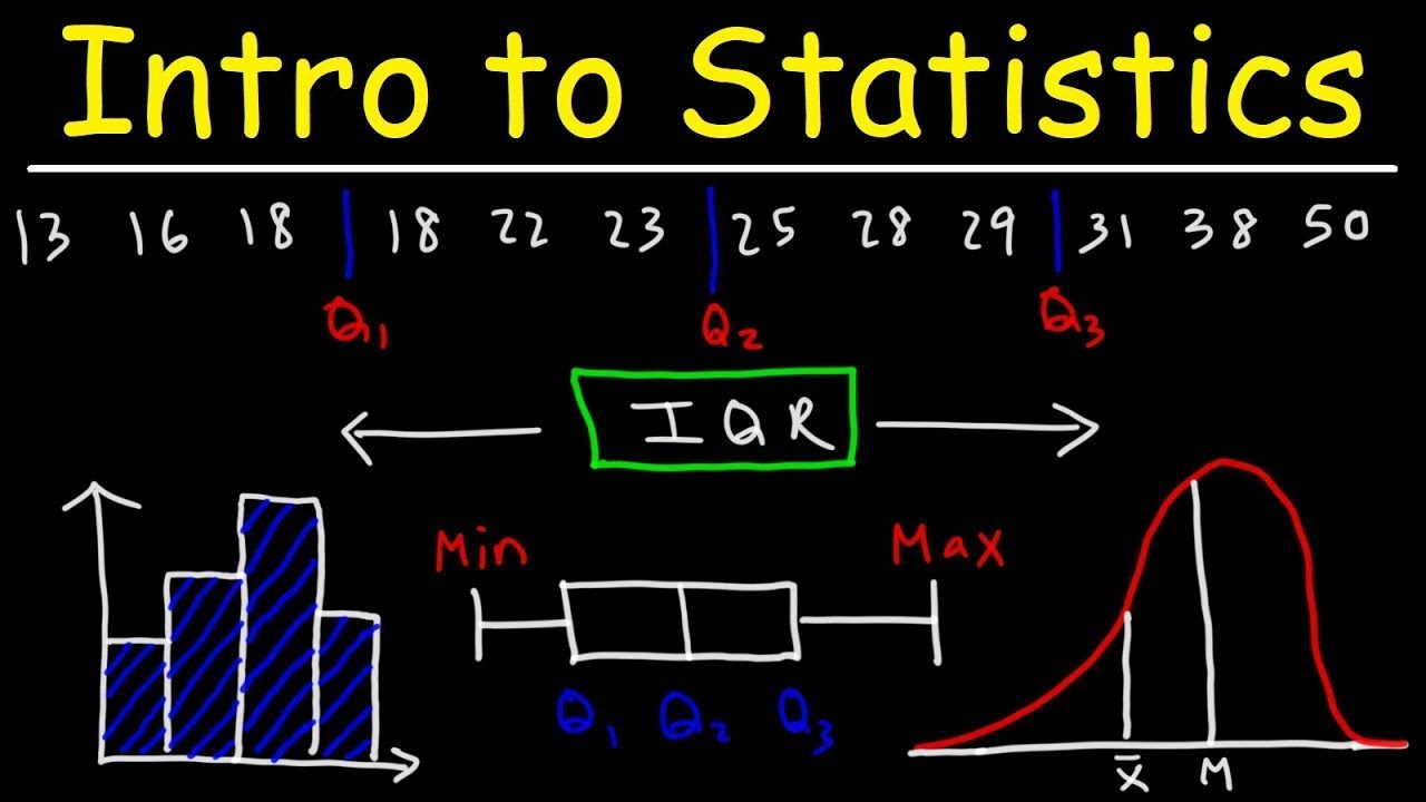
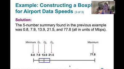
- 📈 Box plots use quartiles and whiskers to show data distribution, central tendency and outliers.
- 😮 Outliers are data points outside expected values - they may be valid rare values or errors to exclude.
- 🔎 Always view data visualizations critically - they should provide clear information, not mislead.
- 🤔 Identify and question misleading or confusing data visualizations.
- 📕 Cumulative frequency plots show total accumulated frequencies up to a given data point.
- 🎤 The median number of unique words in Justin Timberlake songs increased after going solo.
- 📊 JT songs showed wider distribution of unique words compared to NSYNC songs.
Q & A
What are some common places we see data visualizations in everyday life?
-We see data visualizations on the subway showing the prevalence of heart disease, on Buzzfeed showing how often people use Lyft, and in health apps.
How do dot plots and histograms visually represent data differently?
-Dot plots use dots to represent each data point, while histograms use the height of bars to show frequency.
What are the two main components of a stem and leaf plot?
-The stem, which represents the leading digit(s), and the leaf, which represents the remaining digits.
How does a boxplot show the spread of data?
-The box shows the interquartile range, the line inside shows the median, and the length of the box shows the spread.
What are some ways outliers are identified in boxplots?
-Data points outside the fences, which are 1.5 times the interquartile range from the median, are considered outliers.
What is the difference between a histogram and a cumulative frequency plot?
-A histogram shows the frequency within each bin, while a cumulative frequency plot shows the accumulated frequencies up to that point.
How did going solo affect Justin Timberlake's lyrics compared to his NSYNC days?
-His solo songs tend to have more unique words per song compared to his NSYNC songs.
What should you do if you encounter a data visualization that is unclear or uninformative?
-Ask questions and be skeptical - don't just accept a bad visualization without questioning it.
What is an advantage of using a cumulative frequency plot over a histogram?
-It can easily show how many data points are less than or equal to a certain value.
How can boxplots help compare data between two samples?
-The position and shape of the boxes and whiskers allow you to visually compare center, spread, and outliers.
Outlines
📊 Deep Dive into Data Visualization
Adriene Hill introduces the topic of data visualization, emphasizing its importance in everyday life through examples like subway charts and Buzzfeed histograms. She announces the exploration of various graph types to understand data visually, including extreme cases like excessive Netflix viewing. The video covers histograms and their conversion into dot plots, showcasing how each dot represents a data point for clarity in data frequency. The segment transitions into discussing stem and leaf plots, a variation of dot plots that incorporate actual data values instead of dots, providing a more detailed view of data distribution. The explanation includes how to construct these plots by dividing data into 'stems' and 'leaves,' thereby offering insights into individual data values and their spread within categories.
📈 Understanding Boxplots and Outliers
This section introduces boxplots as a method for visually representing data through measures of central tendency and spread. Adriene explains the components of a boxplot, including the box, which spans the interquartile range, and the whiskers, which indicate the data's range within 1.5 times the interquartile range from the median. The discussion highlights the significance of outliers, emphasizing they are not necessarily errors but rare values that could be crucial. The narrative includes an example involving local rent values to illustrate how excluding outliers might mislead interpretations. The segment also explores real-world applications, like analyzing the lyrical diversity in Justin Timberlake's solo versus *N’SYNC songs through boxplots, and the practicality of recognizing valid but rare data points.
🎶 Applying Data Visualization in Real Scenarios
The final segment stresses the practical application of data visualization techniques in real-life scenarios, using cumulative frequency plots as an example. These plots are shown to be useful for understanding cumulative data distributions, such as the number of Justin Timberlake songs with a certain number of unique words. Adriene Hill uses this opportunity to reiterate the importance of good data visualizations in conveying information effectively, whether in health apps, company meetings, or everyday life. She encourages skepticism and inquiry when encountering data visualizations, coining the acronym DFTBAQ - Don't Forget To Be Asking Questions, emphasizing the role of critical thinking in interpreting data. The playful ending ties back to pop culture references, underscoring the ubiquity of data in our lives and the need for effective communication tools.
Mindmap
Keywords
💡data visualization
💡histogram
💡dot plot
💡stem and leaf plot
💡boxplot
💡outlier
💡median
💡interquartile range
💡cumulative frequency plot
💡data-driven decision making
Highlights
The speaker discusses the challenges of modeling complex real-world systems with many variables.
A key contribution is the development of new deep learning techniques to handle sparse, irregular data.
The method shows improved accuracy over previous approaches on benchmark datasets.
The speaker explains how the techniques can be applied to personalized medicine and patient risk modeling.
They present results on predicting patient outcomes using clinical time series data.
A limitation is the black-box nature of neural networks which reduces interpretability.
The speaker proposes ideas for future work such as incorporating causal reasoning.
The method has the potential to improve prognostic modeling and support clinical decision making.
The speaker emphasizes the need for rigorous validation of such models before real-world deployment.
Overall, the work makes advances in handling sparse irregular data with deep learning.
It has promising applications but interpretability and clinical validity remain open challenges.
The speaker highlights open problems in evaluatiing model fairness, robustness, and security.
They encourage collaboration between machine learning experts and healthcare professionals.
The talk concludes with a thoughtful discussion of responsible AI practices for healthcare.
The speaker argues new methods should empower, not replace clinicians, and prioritize patient well-being.
Transcripts
Browse More Related Video
Introduction to Statistics

Elementary Statistics - Chapter 2 - Exploring Data with Tables & Graphs

Understanding Statistical Graphs and when to use them
Math 119 Chapter 2 Part 2
3.3.4 Measures of Relative Standing - Boxplots and Modified Boxplots
Descriptive statistics and data visualisation. An introduction to statistics and working with data
5.0 / 5 (0 votes)
Thanks for rating: