Box and Whisker Plots Explained | Understanding Box and Whisker Plots (Box Plots) | Math with Mr. J
TLDRIn this educational video, Mr. J demystifies box and whisker plots, illustrating how to interpret these visual representations of data distribution. He explains the five key components: minimum, maximum, median, first and third quartiles, using an example of teachers' years of experience. The video clarifies that box plots show data spread, quartiles divide the data into parts, and the interquartile range represents the middle 50% of the data. Mr. J's clear explanation aims to help viewers understand and analyze box plots effectively.
Takeaways
- 📊 Box and whisker plots, also known as box plots, are a method to visually represent the distribution of data.
- 🔍 These plots can initially seem complex, but understanding their components simplifies their interpretation.
- 📈 They provide a five-number summary of a data set, which includes the minimum, first quartile, median, third quartile, and maximum.
- 📉 The minimum and maximum values are the smallest and largest numbers in the data set, respectively.
- 📝 The median, or the second quartile, is the middle value of the data set, representing the 50th percentile.
- 📌 To find the median in an even number of data points, take the average of the two central numbers.
- 📊 The first quartile, or lower quartile, is the median of the lower half of the data, representing the 25th percentile.
- 📈 The third quartile, or upper quartile, is the median of the upper half of the data, representing the 75th percentile.
- 📐 The box within the box plot represents the interquartile range (IQR), which is the middle 50% of the data.
- 📊 Whiskers extend from the box to the minimum and maximum, representing the bottom and top 25% of the data, respectively.
- 📚 Understanding box and whisker plots helps in analyzing data spread and identifying statistical measures within a dataset.
Q & A
What is the main topic of the video?
-The main topic of the video is how to read, interpret, and understand box and whisker plots, also known as box plots.
What is the purpose of box and whisker plots?
-Box and whisker plots are used to display data and the spread of that data, providing a visual representation of the data set.
What are the five key parts of a box and whisker plot?
-The five key parts of a box and whisker plot are the minimum, the first quartile, the median, the third quartile, and the maximum.
What does the box in a box and whisker plot represent?
-The box in a box and whisker plot represents the interquartile range, which is the middle 50% of the data.
What is the minimum number of years of teaching experience in the given example?
-The minimum number of years of teaching experience in the example is 3 years.
What is the maximum number of years of teaching experience in the given example?
-The maximum number of years of teaching experience in the example is 18 years.
How is the median calculated in the example with 10 numbers?
-The median is calculated by taking the average of the two middle numbers when the data set is ordered from least to greatest. In this case, it is the average of 8 and 10, which is 9.
What does the first quartile represent in the context of the example data?
-The first quartile represents the median of the lower half of the data, which is the 25th percentile or the 1/4 mark within the data set.
What does the third quartile represent in the context of the example data?
-The third quartile represents the median of the upper half of the data, which is the 75th percentile or the 3/4 mark within the data set.
What is the interquartile range in the context of a box and whisker plot?
-The interquartile range is the difference between the third quartile and the first quartile, representing the spread of the middle 50% of the data.
How does the video script help in understanding the concept of quartiles?
-The video script provides a clear explanation of quartiles by demonstrating how to find the first and third quartiles using the example of years of teaching experience.
Outlines
📊 Introduction to Box and Whisker Plots
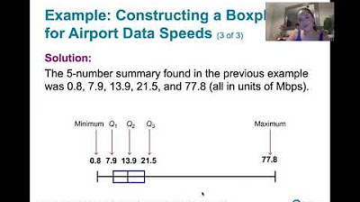
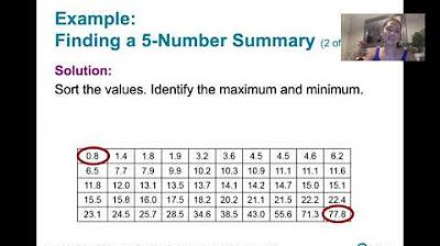
In the first paragraph, Mr. J introduces the topic of box and whisker plots, also known as box plots, emphasizing their utility in visually representing data distribution. He assures viewers that despite their initial complexity, understanding these plots is straightforward once the key components are recognized. The paragraph sets the stage for an example using the years of teaching experience of 10 teachers, illustrating the five-number summary: minimum, first quartile, median, third quartile, and maximum. Specifically, the minimum and maximum values are identified as 3 and 18 years, respectively, providing the bounds of the plot.
📈 Understanding the Components of a Box and Whisker Plot
The second paragraph delves deeper into the components of a box and whisker plot, explaining the significance of each part. The median, calculated as the average of the two middle numbers in an ordered set, is identified as the 50th percentile, splitting the data set into halves. The first quartile, or lower quartile, represents the median of the lower half of the data, marking the 25th percentile. Similarly, the third quartile, or upper quartile, signifies the 75th percentile. Mr. J clarifies these concepts by identifying the first quartile as 7 and the third quartile as 12 in the example data. He also explains the interquartile range represented by the box and the whiskers extending to the minimum and maximum values, illustrating the spread of the data. The paragraph concludes with a recap of the box and whisker plot components, reinforcing the understanding of the plot's structure and the distribution of data it represents.
Mindmap
Keywords
💡Box and Whisker Plots
💡Five Number Summary
💡Minimum
💡Maximum
💡Median
💡Quartiles
💡Interquartile Range (IQR)
💡Whiskers
💡Data Distribution
💡Percentiles
Highlights
Box and whisker plots, also known as box plots, are a method to visually display data and its spread.
Initially, box plots may seem complex, but understanding their components makes interpretation straightforward.
A box plot represents a five number summary: minimum, first quartile, median, third quartile, and maximum.
The minimum and maximum values are the smallest and largest numbers in the dataset.
The median, or second quartile, is the middle point of the data, representing the 50th percentile.
For datasets with an even number of observations, the median is the average of the two central numbers.
The first quartile, or lower quartile, is the median of the lower half of the data, representing the 25th percentile.
The third quartile, or upper quartile, is the median of the upper half of the data, representing the 75th percentile.
The box within a box plot represents the interquartile range, which is the middle 50% of the data.
Whiskers extend from the box to show the minimum and maximum values, representing the bottom and top 25% of the data.
Box plots are useful for comparing data distributions and identifying outliers.
Understanding quartiles helps in analyzing the spread and skewness of a dataset.
The example used in the video demonstrates how to read a box plot with years of teaching experience.
The video provides a step-by-step guide to identifying each part of a box plot from a given dataset.
The importance of the median in dividing the dataset into two equal halves is emphasized.
Quartiles are key to understanding the distribution of data within a box plot.
A clear box plot without annotations allows for better focus on the data distribution.
The video concludes with a recap of the box plot components for easy understanding.
Transcripts
Browse More Related Video

How To Make Box and Whisker Plots
3.3.4 Measures of Relative Standing - Boxplots and Modified Boxplots
Box and whisker plot | Descriptive statistics | Probability and Statistics | Khan Academy
3.3.3 Measures of Relative Standing and Boxplots - Quartiles and the 5 Number Summary
Percentiles, Quantiles and Quartiles in Statistics | Statistics Tutorial | MarinStatsLectures
Math 119 Chapter 3 part 3
5.0 / 5 (0 votes)
Thanks for rating: