What is Descriptive Statistics? A Beginner's Guide to Descriptive Statistics!
TLDRThis video script delves into the importance of descriptive statistics, illustrating how they summarize and describe data without making inferences about larger populations. It covers key components like measures of central tendency (mean, median, mode) and dispersion (variance, standard deviation, range, interquartile range), explaining their significance and calculation. The script also discusses the use of frequency tables and contingency tables for data organization, and introduces various charts for visual data representation, emphasizing their role in understanding data distribution and relationships.
Takeaways
- 📊 Descriptive statistics is crucial for summarizing and describing datasets in a meaningful way, but it doesn't make inferences about larger populations.
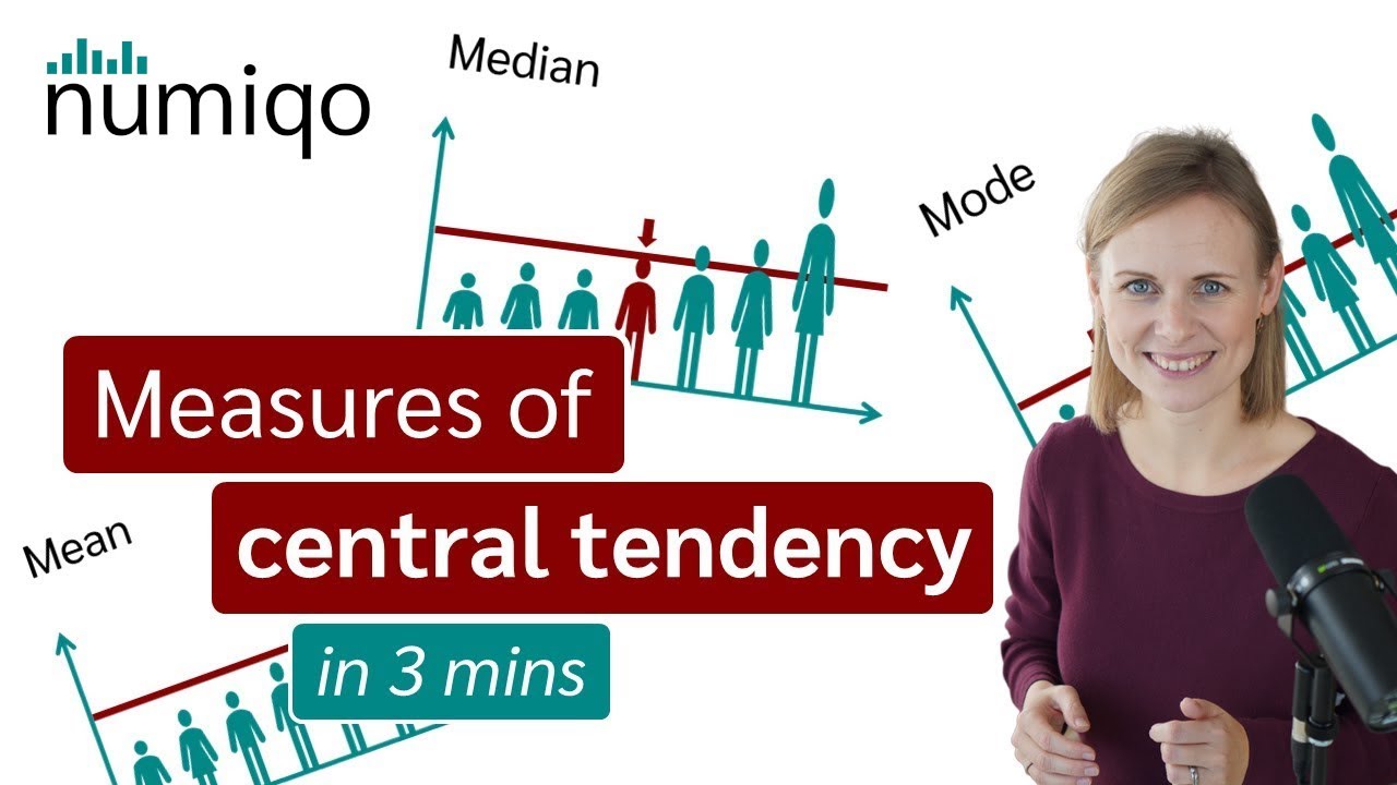
- 🔢 Measures of central tendency, including mean, median, and mode, provide different perspectives on the 'center' of a dataset.
- 📈 The mean is calculated by dividing the sum of all observations by the number of observations and can be influenced by outliers.
- 🏔 The median is the middle value in a dataset when arranged in order and is less affected by extreme values.
- 🚗 The mode is the most frequently occurring value in a dataset, indicating the most common category or value.
- 📉 Measures of dispersion, such as variance, standard deviation, range, and interquartile range, describe how spread out the data points are in a dataset.
- 📊 Standard deviation is the average distance of data points from the mean, indicating the spread of the dataset around the central value.
- 📚 Contingency tables, also known as cross tabs, are used to analyze and compare relationships between two categorical variables.
- 📋 Frequency tables summarize how often each distinct value appears in a dataset, providing a clear overview of the data.
- 📊 Charts and graphs, such as bar charts, pie charts, histograms, box plots, and violin plots, visually represent data and can help in understanding patterns and trends.
- 🌐 Data visualization tools like data.net can be used to create different types of charts and tables to represent data effectively.
Q & A
Why is descriptive statistics important for a company?
-Descriptive statistics is important for a company because it helps to describe and summarize data in a meaningful way, such as understanding how employees travel to work, without making conclusions about a larger population.
What is the main difference between descriptive and inferential statistics?
-Descriptive statistics describe and summarize a dataset, while inferential statistics draw conclusions about a larger population based on the data collected.
What are the three measures of central tendency mentioned in the script?
-The three measures of central tendency mentioned are the mean, the median, and the mode.
How is the arithmetic mean calculated?
-The arithmetic mean is calculated by summing all observations and dividing by the number of observations.
Why is the median considered resistant to extreme values or outliers?
-The median is resistant to extreme values or outliers because it is the middle value in a dataset when arranged in ascending order, and it does not change with the addition of extreme values.
What does the mode represent in a dataset?
-The mode represents the value or values that appear most frequently in a dataset.
What are some measures of dispersion mentioned in the script?
-Some measures of dispersion mentioned are variance, standard deviation, range, and interquartile range.
How does standard deviation indicate the spread of data points in a dataset?
-Standard deviation indicates the average distance between each data point and the mean, showing how much the data points deviate from the mean value on average.
What is the difference between standard deviation and variance?
-The standard deviation is the quadratic mean of the distance from the mean, while the variance is the squared standard deviation.
What is the purpose of a frequency table in data analysis?
-A frequency table displays how often each distinct value appears in a dataset, providing a clear and concise summary of the data.
How does a contingency table help in analyzing data with two categorical variables?
-A contingency table, also known as a cross tab, provides a way to analyze and compare the relationship between two categorical variables by showing the number of observations that fall into each category combination.
What types of charts can be used to visualize data from a frequency table or a contingency table?
-Types of charts that can be used include bar charts, pie charts, grouped bar charts, histograms, box plots, violin plots, and rainbow plots.
Outlines
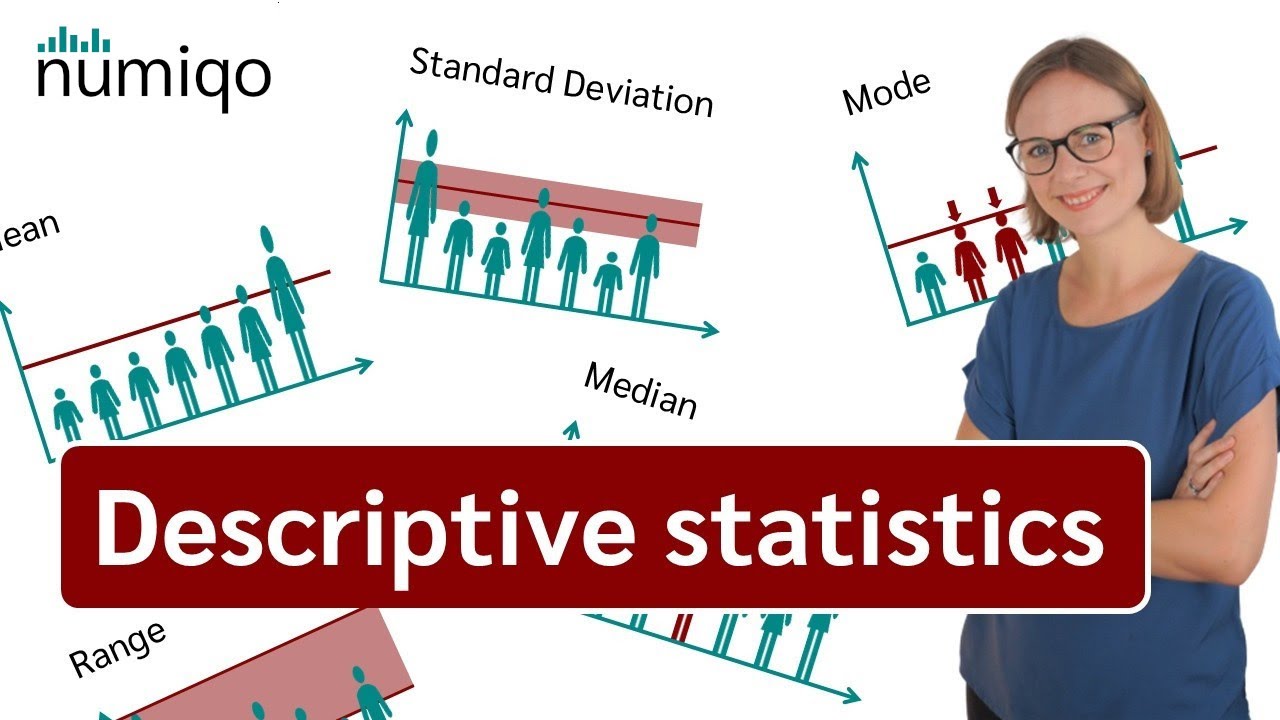
📊 Descriptive Statistics: Understanding and Summarizing Data
This paragraph introduces the concept of descriptive statistics, emphasizing its importance in analyzing data sets such as a company's survey on employee commuting methods. Descriptive statistics are used to summarize and describe data in a meaningful way, but they do not make inferences about larger populations, which is the domain of inferential statistics. The paragraph outlines four key components of descriptive statistics: measures of central tendency (mean, median, and mode), measures of dispersion (variance, standard deviation, range, and interquartile range), frequency tables, and charts. It explains how these measures work, using examples like students' test scores for the mean and the impact of outliers on the median and mean. The standard deviation is described as the average distance from the mean, with a formula provided for its calculation. The variance is introduced as the squared standard deviation. The paragraph concludes with a discussion on range and interquartile range, explaining how they represent the spread of data values.
📈 Data Representation: Measures, Tables, and Charts
The second paragraph delves into the comparison between measures of central tendency and measures of dispersion, using the example of blood pressure measurements to illustrate how these measures provide a central value and indicate the spread of data points, respectively. It then introduces the use of tables, specifically frequency tables and contingency tables, to organize and summarize categorical data, such as a company's survey results on employee commuting methods and workplace locations. The paragraph also discusses the use of charts for visual data representation, mentioning the creation of frequency tables, bar charts, pie charts, cross tables, and grouped bar charts using an online tool like data.net. It explains how to adjust settings for these charts to display either frequencies or percentages and to choose between vertical or horizontal bars. The paragraph concludes by mentioning other types of plots such as histograms, box plots, violin plots, and rainbow plots, suggesting viewers watch additional videos for more information on these chart types.
Mindmap
Keywords
💡Descriptive Statistics
💡Measures of Central Tendency
💡Mean
💡Median
💡Mode
💡Measures of Dispersion
💡Standard Deviation
💡Variance
💡Frequency Table
💡Contingency Table
Highlights
Descriptive statistics is essential for summarizing and describing datasets without making inferences about larger populations.
Descriptive statistics involves four key components: measures of central tendency, measures of dispersion, frequency tables, and charts.
Measures of central tendency include mean, median, and mode, which provide a single value representing a dataset.
The mean is calculated by dividing the sum of all observations by the number of observations.
The median is the middle value in a dataset, resistant to extreme values or outliers.
The mode is the most frequently occurring value in a dataset.
Measures of dispersion, such as variance and standard deviation, describe how spread out the values in a dataset are.
Standard deviation indicates the average distance between each data point and the mean.
Variance is the squared standard deviation, providing a measure of data spread.
Range and interquartile range are additional measures of dispersion, representing the difference between maximum and minimum values and the middle 50% of data, respectively.
Frequency tables display the frequency of each distinct value in a dataset, providing a clear summary.
Contingency tables, also known as cross tabs, analyze the relationship between two categorical variables.
Charts and tables, such as bar charts and pie charts, visually represent data, aiding in understanding and interpretation.
Data visualization tools like data.net can help create various charts and tables for better data analysis.
Histograms, box plots, violin plots, and rainbow plots are additional visualization techniques for understanding data distribution.
Descriptive statistics is crucial for companies to understand patterns and trends in employee behavior, such as travel to work.
The video provides a comprehensive overview of descriptive statistics, including practical examples and applications.
Transcripts
Browse More Related Video
Descriptive Statistics [Simply explained]
Descriptive Statistics: FULL Tutorial - Mean, Median, Mode, Variance & SD (With Examples)

Introduction to Descriptive Statistics

Measures of Variability (Range, Standard Deviation, Variance)

Live Day 2- Basic To Intermediate Statistics
Mean, Median and Mode - Measures of Central Tendency
5.0 / 5 (0 votes)
Thanks for rating: