Introduction to Statistical Process Control Charts (Lean Six Sigma)
TLDRThis video provides an in-depth introduction to process control charts and their role in monitoring process stability and effectiveness. It explains key concepts such as control limits, specification limits, and the distinction between special cause and common cause variation. The video also outlines various types of control charts, including those for continuous data (e.g., IMR, X-bar R) and attribute data (e.g., C, U, NP, P charts). Practical examples and real-world applications, such as monitoring website load times and medication errors, are discussed. The video concludes with an overview of SPC rules for detecting special cause variation.
Takeaways
- 📈 A process control chart is a tool used to determine if a process is stable over time or if a change was effective.
- 📊 The y-axis of a control chart typically represents a Critical to Quality (CTQ) measurement, which is monitored over time on the x-axis to assess stability or the effectiveness of improvements.
- 🔴 The control limits, often set at plus or minus three sigma from the mean, indicate when a process is out of control, suggesting a special cause variation.
- 📚 Understanding the difference between control limits (statistical) and specification limits (based on customer requirements) is crucial for effective process monitoring.
- 🚦 Control limits can be likened to warning tracks in a baseball field, signaling when to be cautious of potential issues.
- 🚗 The script uses the analogy of driving to the office to explain special cause and common cause variations, highlighting the importance of addressing the former to improve process stability.
- 📝 There are several types of control charts, including IMR, Xbar-R, Xbar-S for continuous data, and C, U, NP, P for attribute data, each suited to different data characteristics and sample sizes.
- 🔍 Walter Shewhart, known as the father of Statistical Process Control (SPC), developed rules and tests to detect process control issues, which have evolved and are used to identify special cause variations.
- 🛑 SPC can indicate when a process is out of control but does not explain why, necessitating further investigation to understand the underlying causes.
- 🛠 Minitab can be used to prepare control charts and offers options to select and customize tests for detecting special cause variations.
- 💡 The script provides practical examples, such as monitoring website load times for an e-commerce site and medication errors in a hospital, to illustrate the application of control charts in real-world scenarios.
Q & A
What is a process control chart?
-A process control chart is a tool used to determine if a process is stable over time or if a change was effective. It helps in monitoring a critical to quality (CTQ) measurement over time.
What does the y-axis and x-axis represent in a control chart?
-In a control chart, the y-axis represents a CTQ measurement, which is something being measured to meet customer expectations, while the x-axis represents time.
What are control limits in a control chart?
-Control limits are statistical boundaries set at plus or minus three standard deviations from the mean, indicating the expected range of variation. Points outside these limits indicate an out-of-control process or special cause variation.
What is the difference between control limits and specification limits?
-Control limits are statistically determined based on process variation, while specification limits are set based on customer requirements. Specification limits can be narrower or wider than control limits.
What is the difference between special cause variation and common cause variation?
-Special cause variation is sporadic and unpredictable, often easier to correct, while common cause variation is more frequent and systemic, making it harder to address.
What is an I-MR chart and when is it used?
-An I-MR chart, or Individual Moving Range chart, is used for low-volume production processes. It shows individual data points and the range between consecutive measurements, ideal for monitoring continuous data.
What is the significance of using X-bar R and X-bar S charts?
-X-bar R and X-bar S charts are used for higher volume production. The X-bar R chart shows the average and range of subgroups, while the X-bar S chart shows the average and standard deviation, helping in monitoring process stability.
How do C and U charts differ in monitoring defects?
-C charts track the number of defects per subgroup with a constant sample size, while U charts monitor defects per unit with variable sample sizes.
What are NP and P charts used for?
-NP and P charts track defective units. NP charts count defective units per subgroup with a constant sample size, while P charts measure the percentage of defectives when the sample size is variable.
What is the purpose of SPC tests in control charts?
-SPC tests, such as those developed by Walter Shewhart, are used to detect special cause variation in control charts. They indicate when a process is out of control but require further investigation to determine the cause.
Outlines
📈 Introduction to Process Control Charts
This paragraph introduces the concept of process control charts, which are tools used to determine if a process is stable over time or if a change has been effective. It explains that these charts have a y-axis representing a critical to quality (CTQ) measurement, which is monitored over time on the x-axis to assess stability or improvement. Examples of CTQ measurements are given, such as flight distance for paper airplanes, battery life for phone batteries, page load time for websites, and delivery time for packages. The paragraph also describes the elements of a control chart, including control limits, process mean, and data points, and distinguishes between control limits and specification limits. It further explains the difference between special cause and common cause variations in a process.
📊 Types of Control Charts for Continuous and Attribute Data
The second paragraph delves into the different types of control charts used for continuous data, such as the Individual Moving Range (IMR) chart, which is suitable for low-volume production, and the X bar R and X bar S charts for higher volume production. The R chart represents the range of a subgroup, while the S chart uses standard deviation. For attribute data, the paragraph discusses four common types of charts: C for constant sample size defects per subgroup, U for variable sample size defects per unit, and NP and P charts for tracking defective units with constant or variable sample sizes, respectively. The paragraph also provides mnemonic devices to remember the types of charts and their applications.
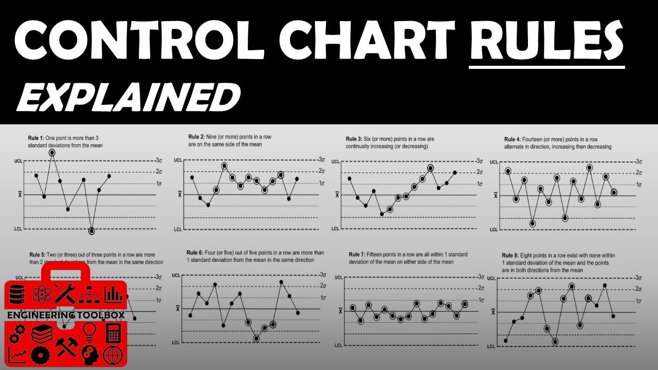
🔍 Detecting Special Cause Variation with Control Chart Tests
This paragraph discusses the use of tests to detect special cause variation in control charts. It mentions Walter Shewhart, known as the father of Statistical Process Control (SPC), who developed these tests. The paragraph outlines eight common tests used for this purpose, each with specific criteria for identifying out-of-control points or trends in the data. These tests include checks for points beyond three standard deviations from the mean, sequences of points on one side of the centerline, trends in increasing or decreasing points, and patterns of points within one sigma of the mean. The paragraph emphasizes that while SPC can indicate when a process is out of control, it does not explain why, necessitating further investigation.
🛒 Application of Control Charts in E-commerce Website Performance
The fourth paragraph applies the concept of control charts to the real-world scenario of an e-commerce website's loading times. It highlights the importance of fast loading times for customer retention and sales, citing statistics on user expectations and the impact of slow load times. The paragraph describes a hypothetical scenario where load times are measured over 15 days, with the data suggesting the use of an X bar R or X bar S chart due to the high volume of measurements. It also discusses the use of Minitab software to generate control charts and the importance of understanding when a process is out of control, as indicated by the tests, to investigate and improve website performance.
💊 Control Charts for Monitoring Medication Errors in Hospitals
The final paragraph explores the use of control charts to track medication errors in a hospital setting, focusing on defects per unit, or errors per patient. It underscores the significance of reducing medication errors for patient safety and cost reduction. The paragraph presents a scenario where errors are monitored over 25 weeks with variable sample sizes, suggesting the use of a U chart for attribute data with variable sample sizes. It also discusses the process of creating a U chart in Minitab, selecting appropriate tests, and interpreting the results to identify and address points above the control limit, aiming to improve the hospital's error rate over time.
Mindmap
Keywords
💡Process Control Charts
💡CTQ Measurement
💡Control Limits
💡Special Cause Variation
💡Common Cause Variation
💡Individuals Moving Range (IMR) Chart
💡X-bar R Chart
💡X-bar S Chart
💡Attribute Data
💡Walter Shewhart
💡E-Commerce Website Loading Times
💡Medication Errors
Highlights
Introduction to process control charts for determining process stability over time or the effectiveness of changes.
Explanation of control charts with CTQ (Critical to Quality) measurements on the y-axis and time on the x-axis.
Examples of CTQ measurements such as flight distance, battery life, page load time, and delivery time.
Description of control limits as plus or minus three sigma from the mean, indicating out of control points.
Differentiation between control limits and specification limits based on customer requirements.
Illustration of common cause and special cause variation with examples like car accidents and traffic.
Overview of six or seven common types of control charts for continuous and attribute data.
Details on the Individual Moving Range (IMR) chart for low-volume production with continuous data.
Explanation of the X bar R and X bar S charts for higher volume production with continuous data.
Introduction to attribute data control charts such as C, U, NP, and P charts for defects and defectives.
Memory aid for remembering attribute data control charts: 'See you later defects' for C and U, 'Detective NPP' for NP and P.
Example of an IMR chart monitoring pH levels in liquid detergent production.
Example of an X bar R chart monitoring camshaft length in car part production.
Example of an X bar S chart monitoring the weight of canned food production.
Introduction to Walter Shewhart, the father of SPC, and his rules and tests for detecting process control issues.
Eight common tests for control charts to detect special cause variation.
Discussion on the limitations of SPC in indicating the cause of process out of control, necessitating further investigation.
Practical example of using a control chart for an e-commerce website's loading times and its impact on customer retention and sales.
Importance of loading times for e-commerce websites, with statistics on customer expectations and abandonment rates.
Application of control charts in a hospital setting to track medication errors and improve patient safety.
Statistics on the cost and impact of medication errors in the United States, emphasizing the need for control charts in healthcare.
Use of a U chart for attribute data with variable sample sizes to monitor medication errors per patient.
Transcripts
Browse More Related Video
CONTROL CHART BASICS and the X-BAR AND R CHART +++++ EXAMPLE

Attribute Data Control Chart Examples!! How to select/create the P, NP, C and U Charts
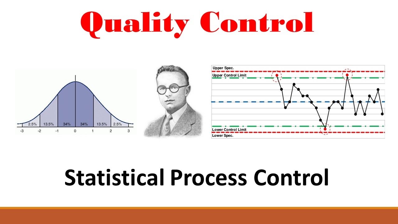
Quality (Part 1: Statistical Process Control)
Statistical Process Control | SPC Control charts (IMR ) using Minitab 17 |
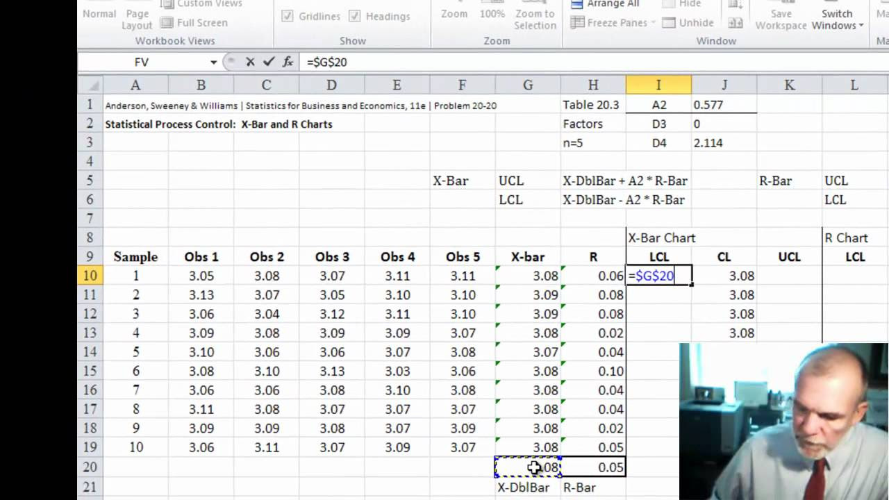
XBar-R Control Charts
SPC Control Charting Rules
5.0 / 5 (0 votes)
Thanks for rating: