Statistics - Making a scatter plot using the Ti-89 calculator
TLDRThis video tutorial demonstrates how to create a scatterplot using a TI-89 graphing calculator. It guides viewers through entering data into the data matrix editor, setting up the plot with appropriate markers, and adjusting the window for optimal viewing. The process is illustrated using a sample data set comparing hours of study to exam scores, with the final visualization checked for accuracy against a hand-drawn graph. The video also offers tips on using the trace function and managing other equations on the graphing calculator.
Takeaways
- 📈 The video provides a tutorial on creating a scatterplot using a TI-89 graphing calculator.
- 📋 Start by accessing the Data Matrix Editor from the home screen and selecting 'New' to store data.
- 📐 Assign variables to the data, such as 'H' for hours of study, and input the data points into the calculator.
- 🎨 Choose the type of plot (scatter plot in this case) and the style of marks for the data points.
- 📐 Define the plot by specifying the data columns (c1 and c2) for the x and y coordinates.
- 🖼️ Set up the plot view using the Plot Setup menu, adjusting the scale and range to fit the data.
- 🔍 Use the trace function (F3) to examine individual data points and their coordinates on the graph.
- 🚫 Be cautious of other equations or functions that might interfere with the scatter plot, and manage them through the 'Y=' menu.
- 📊 The scatter plot visualizes the relationship between hours of study and exam scores, with data points accurately represented.
- 🔗 For more tutorials, the video refers viewers to the website mysecretmathtutor.com.
Q & A
What is the main purpose of the video?
-The main purpose of the video is to demonstrate how to create a scatter plot using a TI-89 graphing calculator.
Why is the TI-89 graphing calculator considered useful for creating scatter plots?
-The TI-89 graphing calculator is considered useful for creating scatter plots because it has extensive functionality, including various menus and options that allow for detailed data analysis and graphical representation.
What are the first steps to input data into the TI-89 calculator for a scatter plot?
-The first steps involve accessing the Data Matrix Editor from the apps menu, selecting 'New' to store a new table of data, and inputting the data points into columns C1 and C2.
How do you name your data variable in the TI-89 calculator, and are there any restrictions?
-You can name your data variable anything as long as it doesn't use reserved names like X or Y. The example given uses 'H' for hours, indicating flexibility in naming as long as it avoids reserved identifiers.
What kind of data was used in the example for creating a scatter plot?
-The data used for creating the scatter plot compared hours of study to exam scores, providing a practical example of how scatter plots can visualize the relationship between two variables.
How do you configure the plot settings on the TI-89 for a scatter plot?
-To configure the plot settings, you access the 'Plot Setup' menu using the F2 button, define a new plot with F1, choose the scatter plot option, select the data columns for X and Y values (C1 and C2), and customize the appearance of data points.
What should you do if your scatter plot is cluttered with other graphs or equations?
-If other graphs or equations clutter the scatter plot, you should access the Y= menu to disable or remove any unrelated equations from the graph view, ensuring only the scatter plot is visible.
How can you view individual data points and their values on the scatter plot?
-You can view individual data points and their values on the scatter plot by using the trace function (F3 button), which allows you to navigate through the points and see their exact X and Y values.
Why might you need to adjust the window settings when creating a scatter plot?
-Adjusting the window settings is necessary to ensure that all data points are visible within the graph's viewable area. This involves setting appropriate minimum and maximum values for both the X and Y axes.
What additional resources does the video creator offer for learning about scatter plots or other mathematical concepts?
-The video creator encourages viewers to visit MySecretMathTutor.com for more videos and resources on scatter plots and other mathematical concepts, indicating additional support available beyond the video tutorial.
Outlines
📊 Creating a Scatterplot with TI-89 Calculator
The paragraph introduces the process of creating a scatterplot using a TI-89 graphing calculator. It emphasizes the complexity of the calculator's menus and provides a step-by-step guide on how to input data and generate a scatterplot. The example used compares hours of study to exam scores, and the video creator shares a previous example to visualize the expected outcome. The instructions include accessing the data matrix editor, naming the data table, and entering the hours and exam scores into the calculator. The video also explains how to set up the plot using the correct options and how to adjust the window settings to view all data points. The importance of checking for any additional equations or functions that might interfere with the graph is highlighted.
🔍 Analyzing and Interacting with the Scatterplot
This paragraph delves into the analysis and interaction with the scatterplot created on the TI-89 calculator. It explains how to use the graph function to display the data points and how to compare the graph with a previous visualization for accuracy. The video creator demonstrates how to use the trace function to inspect individual data points and their corresponding X&Y values. Additionally, the paragraph addresses the issue of unwanted equations or graphs appearing on the scatterplot and provides instructions on how to remove or disable them using the Y= menu. The goal is to ensure that the scatterplot is clean and accurately represents the relationship between the hours of study and exam scores, allowing for a clear understanding of the data's distribution and trends.
Mindmap
Keywords
💡Scatterplot
💡TI-89 Graphing Calculator
💡Data Matrix Editor
💡Variables
💡Plot Setup
💡Columns (C1, C2)
💡Window Settings
💡Plotting Data Points
💡Trace Function
💡Graphical Analysis
Highlights
Introduction to creating a scatterplot on the TI-89 graphing calculator
Using a previous example for data points in the scatterplot
Navigating to the Data Matrix Editor from the home screen
Creating a new data table in the calculator
Naming the data variable related to hours of study
Entering study hours and exam scores into columns C1 and C2
Setting up the plot for display, including selecting scatter plot type
Choosing symbols for data points in the scatter plot
Linking the data columns C1 and C2 to the X and Y axes of the scatter plot
Adjusting the window settings to properly view the scatterplot
Defining the scale and range for both the X and Y axes
Viewing the completed scatterplot on the calculator
Comparing the calculator's scatterplot accuracy to manual plotting
Using the trace function to review individual data points
Avoiding and correcting issues with unwanted functions on the plot
Final review of the scatterplot and troubleshooting tips
Transcripts
Browse More Related Video
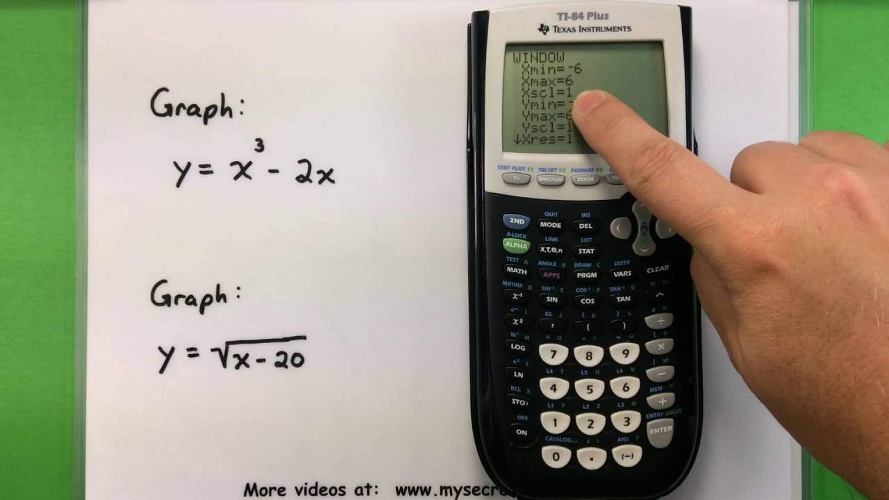
Basic Math - Graphing with a Ti-83 or Ti-84 Calculator
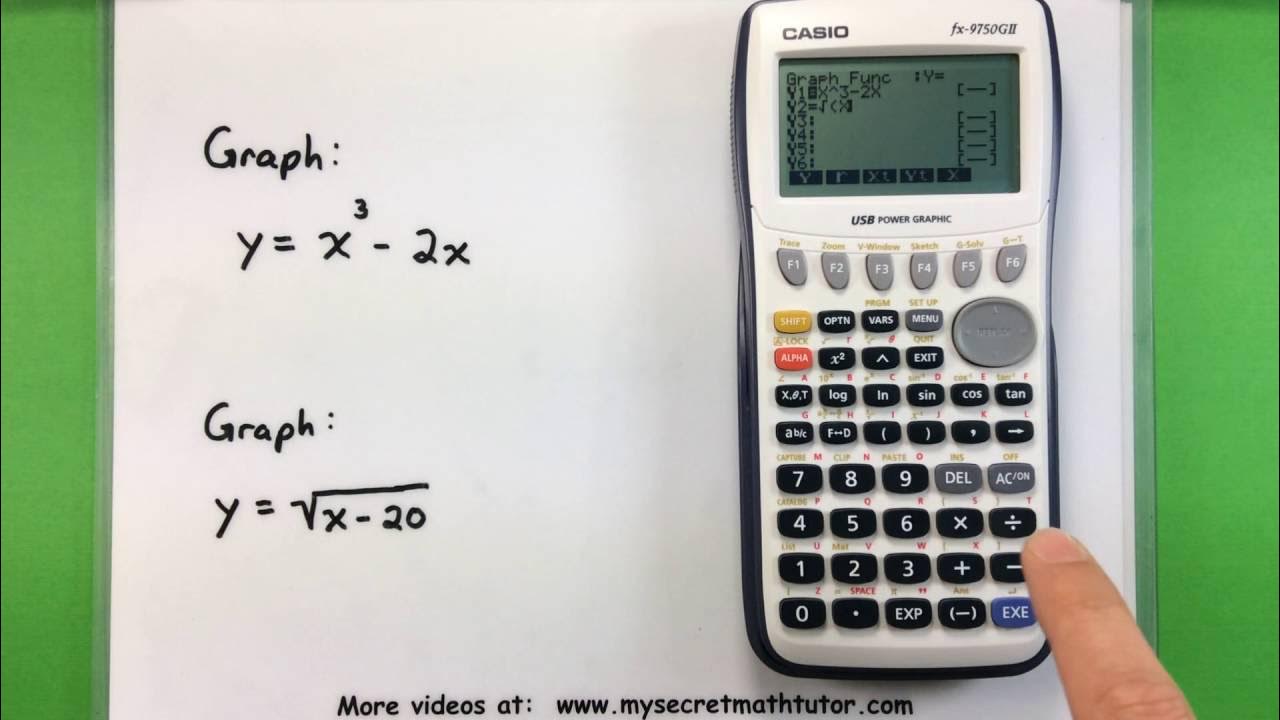
Basic Math - Graphing with a Casio fx-9750GII Calculator
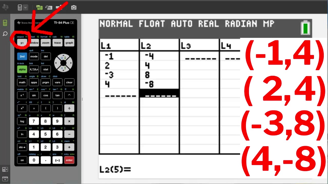
TI84 Plus CE Plotting and Graphing Points
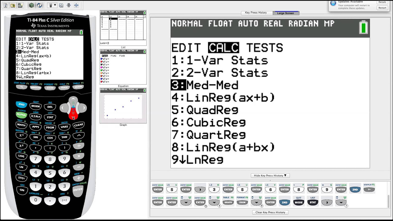
TI-84 Plus Graphing Calculator Guide: Statistics
Solving Linear Equations Using the TI 83 or TI 84 Series Calculator
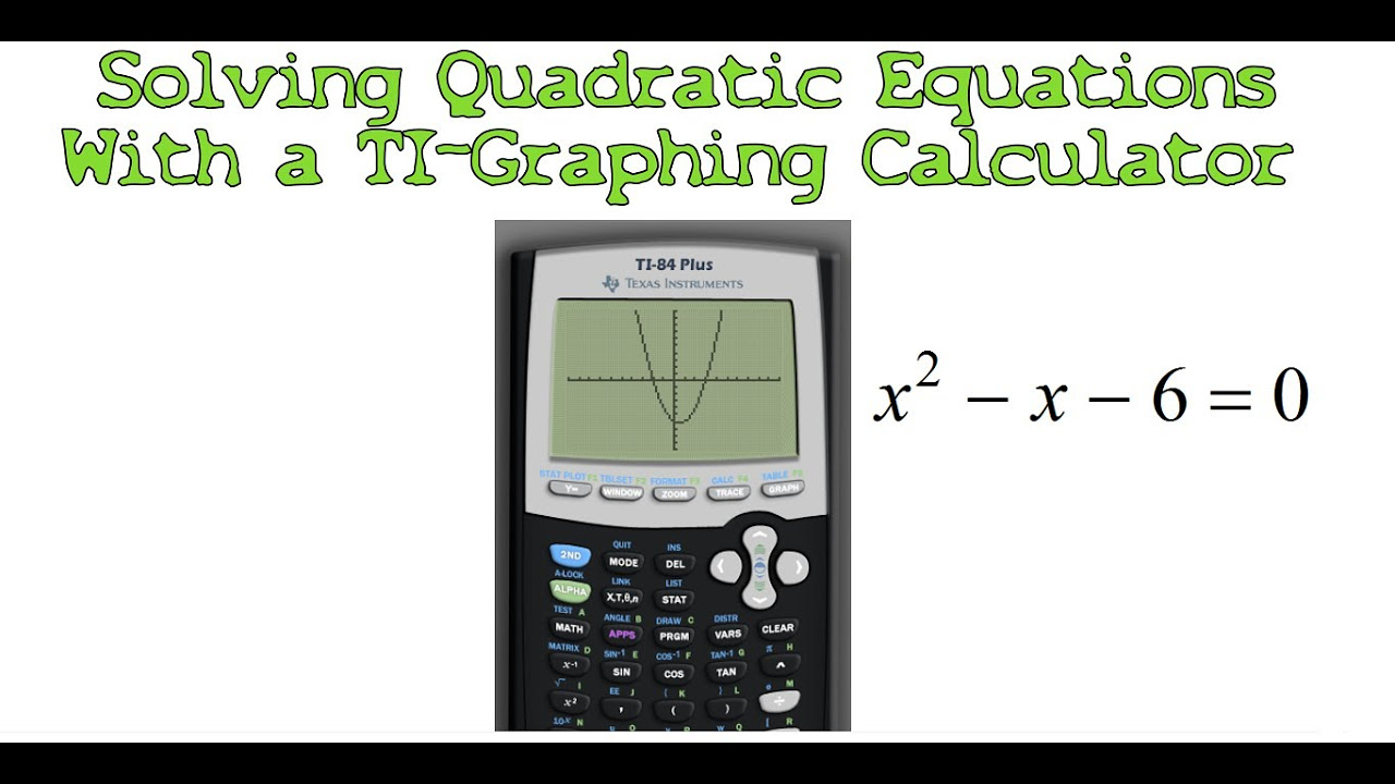
Solving Quadratic Equations with a TI-Graphing Calculator
5.0 / 5 (0 votes)
Thanks for rating: