🔸 Complete Graphic Design Course Explaining Psychology (MUST KNOW)
TLDRThe video explains how psychology influences graphic design and logo creation. It provides background on psychological theories like the Von Restorff effect and Gestalt principles. These theories explain how the human brain processes visual information, which graphic designers leverage in their work. The video advises designers to carefully choose colors, fonts, shapes in logos to elicit intended emotions and associations that reinforce the brand message. It stresses researching the target audience and brand when making design choices. Following psychological principles in graphic design grabs attention, conveys brand personality, and influences viewers.
Takeaways
- 😀 The Von Restorff effect states that when multiple objects are shown, the one that differs most from the rest is most likely to be remembered
- 🧠 Call to actions that stand out utilize the isolation effect to draw attention
- 🔍 Research is critical to understand your client and audience when designing logos and branding
- 👁️ The Von Restorff effect can steer attention but overusing it can harm information retention
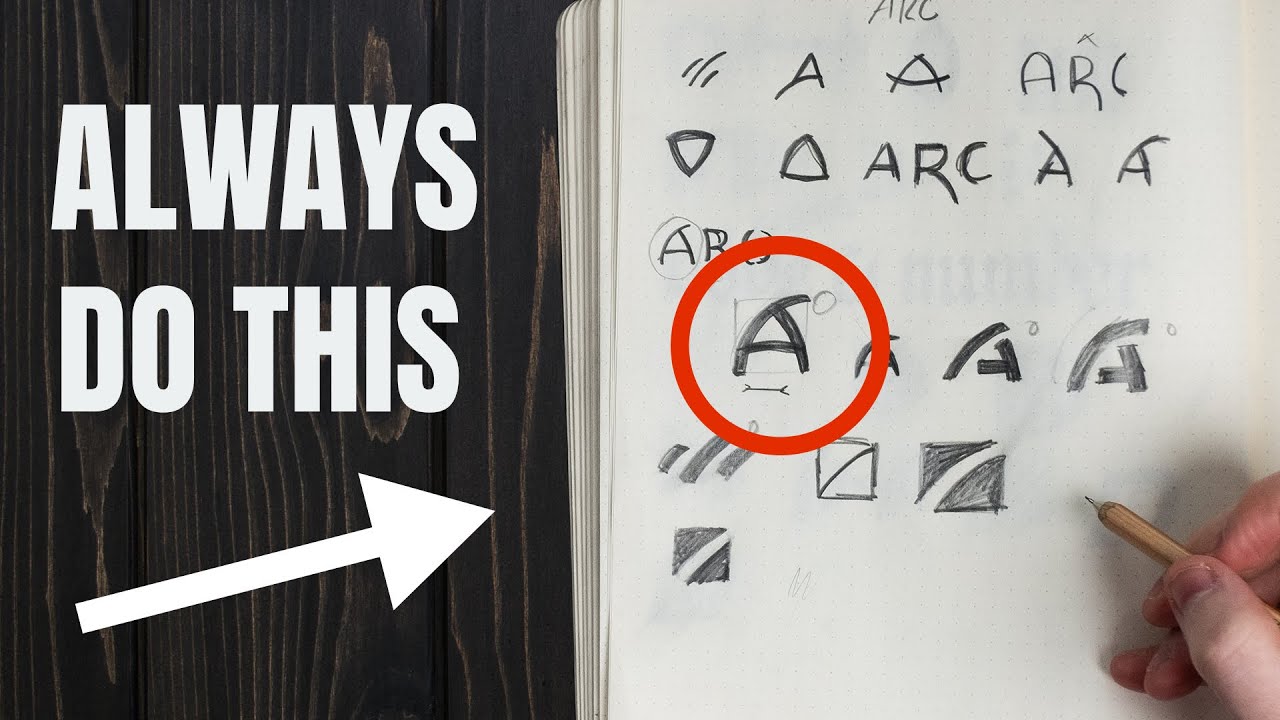
- ⚪ Circles and curved shapes feel welcoming, ovals suggest stability, squares feel powerful
- 🎨 Choose logo colors strategically based on brand keywords, target audience and location/culture
- 🔀 Gestalt theory describes how our brains subconsciously group visual elements by similarity
- 🖋 Typography has personality - choose fonts that match the desired brand emotion
- 📐 Use principles like proximity and continuation to lead the viewer’s eye across the design
- 🎯 Clever use of negative space allows hidden meanings and accomplishment when discovered
Q & A
How can the Von Restorff effect be used in graphic design?
-The Von Restorff effect can be used in graphic design in several ways, such as to draw attention to call-to-action buttons on websites, to make certain items on a list more memorable, and to add surprises and contrast to prevent boredom.
What is an example of a brand that uses the Von Restorff effect well?
-Snapchat is a good example, as they use a bold yellow color for their branding when most social media platforms use blue. This helps Snapchat stand out in people's minds.
What shapes tend to evoke which emotions?
-Circles evoke feelings of community and friendship, ovals suggest sturdiness and stability, squares and rectangles create perceptions of power and strength, and curved lines have a more feminine, free-flowing feel.
How can you determine the right color for a logo design?
-Research the brand and typical customer deeply to generate keywords and feelings the logo should convey. Match those up with colors and shapes that will appeal to the target audience.
What is an example of using color psychology effectively?
-Cadbury uses the color purple to appeal to women, evoke luxury, and seem more sophisticated, which matches well with their target demographic.
What is the theory behind the Gestalt continuation principle?
-The Gestalt continuation principle states that the human eye will naturally follow the path set out by design elements. Clever designers can exploit this to control where viewers look next.
How does the Gestalt principle of similarity work?
-Grouping similar elements together, even if spread apart across a design, causes the brain to perceive them as sharing a relationship and speeds up information processing.
What should you consider when choosing fonts?
-The personality and emotional impact of the font, and how well it matches the overall message, design style, and branding.
How did innocent smoothies use typography psychology effectively?
-They chose a playful, friendly font to match their natural, green brand image and promote a sense of health and goodness.
Why is understanding typography psychology important for designers?
-Because fonts can profoundly impact the audience's feelings and are often the first impression of a brand via logos and branding.
Outlines
🎨 How the Von Restorff effect is used in graphic design
This paragraph explains the Von Restorff effect, also known as the isolation effect, which states that when multiple objects are shown, the one that differs from the rest is most likely to be remembered. It discusses how this psychological theory can be utilized in graphic design, such as through the use of call-to-action buttons that stand out from other buttons on a website.
❗️ The potential downside of overusing the Von Restorff effect
This paragraph points out that while the Von Restorff effect draws attention to specific areas, overusing it can cause viewers to become overly focused on one part of a design, preventing them from taking in vital information elsewhere. It suggests using the effect judiciously as one tool among many.
🖼️ How Ready Mag helps designers understand their audience
This paragraph introduces Ready Mag, a tool that allows designers to create websites and presentations to better understand and appeal to their target audience. It highlights Ready Mag's easy drag-and-drop interface, built-in presets, and flexible pricing plans.
🎨 Color psychology and considerations when choosing logo colors
This paragraph provides an overview of color psychology and its application in logo design. It advises doing audience research to determine keywords and feelings to convey, then choosing appropriate colors, shapes, and typefaces accordingly. It uses Cadbury's purple branding targeting female customers as a strategic example.
🤔 Determining ideal color schemes and combinations for logos
This paragraph discusses guidelines around using single vs. multiple colors in logos, citing brands like Coca-Cola and Google. It notes that multiple colors can help stand out, but must be strategic. It emphasizes the importance of research to appeal to your specific demographic.
🎶 closing music
This closing paragraph simply denotes closing music for the video.
Mindmap
Keywords
💡psychology
💡Von Restorff effect
💡calls-to-action
💡negative space
💡UI design
💡logo design
💡typography
💡color psychology
💡Gestalt Theory
💡visual hierarchy
Highlights
The Von Restorff effect states that when multiple objects are shown, the one that differs from the rest is most likely to be remembered.
Using the isolation effect ensures that the call to action looks different from other action buttons, steering the viewer's attention.
As a designer you're ultimately controlling the emotional responses and intuition of the viewer with psychology.
The pricing technique draws the attention of the viewer towards the most popular and likely most profitable price option.
In branding, go against color trends in your sector to stand out, but choose a scheme that still works for the industry.
The downfall of the Von Restorff effect is that it can sap attention away from vital information if the contrast is too blatant.
Circular shapes in logos relate to community, friendship and love. Ovals suggest sturdiness and stability.
Squares and rectangles create perceptions of power and strength, while triangles suggest professionalism and efficiency.
Diagonal lines represent energy and motion. Horizontal lines project calmness and balance.
Understand your client and audience inside out to determine feelings and words for the logo to convey.
Fonts have personalities - study them visually to understand if they are playful, serious, loud etc.
Innocent Smoothies uses a playful, straightforward font that matches their fun and healthy brand persona.
Gestalt principle of continuation makes the eye follow a path on the design from one element to another.
Figure and ground theory explains how the brain makes sense of negative space in logos and branding.
Gestalt says a design should provide order and balance so the message is clear instead of confusing.
Transcripts
Browse More Related Video

Graphic Design Basics | FREE COURSE

Design Styles Across the Decades | Short Course

EVERY Logo Designer Should Do These Things In 2024! (Superior Career)

15 Niches to Pursue in Graphic Design
7 MIND BLOWING Logo Design Tips ✍

David Rudnick. Lecture "Crisis of Graphic Practices: Challenges of the Next Decades"
5.0 / 5 (0 votes)
Thanks for rating: