How to Create Bell Curve in Excel
TLDRIn this video, learn how to create a bell curve in Excel, also known as a normal distribution. The tutorial covers calculating the average and standard deviation, and using these to generate a normal distribution function. It explains the difference between population and sample standard deviation, and demonstrates how to create a bell curve using scatter charts. A practical example with student marks data highlights the steps, including sorting the data for a smooth curve. Stay tuned for more Excel tips in upcoming videos.
Takeaways
- 📈 The video is about creating a bell curve in Excel, which is a common type of distribution also known as a normal distribution.
- 📊 To create a bell curve, you need to calculate three things: distribution, average, and standard deviation.
- 🧮 The average of the data is calculated using the AVERAGE function in Excel.
- 📉 Standard deviation is calculated using either the STDEV.P (population) or STDEV.S (sample) function, with STDEV.S being more commonly used for sample data.
- 🔍 The video emphasizes that the smoothness of the bell curve depends on the even distribution of the data.
- 📚 The normal distribution function is used to calculate the probability of a data point falling within a certain range, using the formula with mean and standard deviation.
- 📈 The video demonstrates using the NORM.DIST function in Excel to create the bell curve, which is a probability mass function.
- 📊 The video suggests using a scatter chart to visualize the bell curve, with or without markers, depending on the preference.
- 🔢 The horizontal axis of the scatter chart represents the count of data points, showing the distribution across the curve.
- 📚 A practical example is given using the marks of 25 students, illustrating how to calculate the average and standard deviation, and then create the bell curve.
- 🔄 The video mentions the importance of organizing data in ascending order to ensure an even distribution and a smooth bell curve.
Q & A
What is a bell curve in the context of data distribution?
-A bell curve, also known as a normal distribution, is a type of distribution in statistics where data is symmetrically distributed around the mean, with the highest frequency at the mean and decreasing frequencies as you move away from the mean.
Why is the smoothness of a bell curve important?
-The smoothness of a bell curve is important as it indicates the even distribution of data. A smoother curve suggests better data distribution, which is crucial for accurate statistical analysis and interpretation.
What are the three elements needed to create a bell curve in Excel?
-To create a bell curve in Excel, you need three elements: distribution, average, and standard deviation. These elements help in defining the shape and characteristics of the bell curve.
How do you calculate the average in Excel?
-In Excel, you can calculate the average by using the AVERAGE function and selecting the range of data you want to analyze.
What is the difference between standard deviation for population and standard deviation for sample?
-Standard deviation for population is used when you have captured 100% of the data, while standard deviation for sample is used when you have selected a sample from the entire data set. The latter is more common in practical scenarios where full data capture is not possible.
Why might you choose to use standard deviation for sample over standard deviation for population?
-You would choose standard deviation for sample when you are working with a sample of the data rather than the entire population. This is common in research and testing scenarios where full data capture is not feasible.
What is the formula used to calculate the normal distribution in Excel?
-The formula used to calculate the normal distribution in Excel is the NORMSDIST function, which takes four arguments: X (the data point), mean (the average), standard deviation, and a logical value (TRUE for cumulative distribution function, FALSE for probability mass function).
How do you create a bell curve using a scatter chart in Excel?
-To create a bell curve using a scatter chart in Excel, you first calculate the normal distribution using the NORMSDIST function. Then, you go to the 'Insert' tab, select 'Scatter Chart', and choose the appropriate chart style. Adjust the data points and axis as needed.
Why is it important to organize data in ascending order when creating a bell curve?
-Organizing data in ascending order is important because it helps in accurately representing the distribution of data on the horizontal axis, which in turn affects the shape and smoothness of the bell curve.
What happens if the data is not evenly distributed when creating a bell curve?
-If the data is not evenly distributed, the resulting bell curve will not be smooth. This can lead to inaccuracies in the representation of the data distribution, affecting the reliability of any statistical analysis based on the curve.
Outlines
📊 Creating a Bell Curve in Excel
This paragraph introduces the concept of a bell curve, also known as a normal distribution, which is a common type of variable distribution. The speaker explains that to create a bell curve in Excel, you need to calculate three key elements: distribution, average, and standard deviation. They demonstrate how to use Excel functions such as AVERAGE and STDEV.S to calculate these values. The speaker also discusses the difference between using standard deviation for a population versus a sample, choosing STDEV.S for sample data. The process involves using the NORM.DIST function to calculate the normal distribution, with parameters for data (X), mean (average), standard deviation, and a cumulative distribution type (false for probability mass function). Finally, the speaker shows how to visualize the data by creating a scatter chart, emphasizing the importance of sorting the data in ascending order for a smooth curve.
🔚 Wrapping Up the Excel Tutorial
In the concluding paragraph, the speaker briefly summarizes the process of creating a bell curve in Excel and teases upcoming content. They mention that more Excel functions will be discussed in future videos, encouraging viewers to stay tuned. The speaker wraps up the tutorial with a reminder to subscribe to the channel for the latest videos and ends the session with a friendly sign-off, accompanied by background music.
Mindmap
Keywords
💡Bell Curve
💡Distribution
💡Average
💡Standard Deviation
💡Population
💡Sample
💡Normal Distribution Function
💡Cumulative Distribution Function
💡Probability Mass Function
💡Scatter Chart
💡Data Sorting
Highlights
Introduction to creating a bell curve in Excel
Bell curve is also known as a normal distribution
Smoothness of the bell curve is defined by the even distribution of data
Three apps needed: distribution, average, and standard deviation
Calculating the average of data using the AVERAGE function
Selecting the range for calculating the average
Using standard deviation for population vs. sample
Choosing standard deviation for sample when capturing a sample of data
Calculating the standard deviation using the STDEV.S function
Freezing values in Excel using the F4 function
Understanding the difference between accumulative distribution and probability mass function
Using the NORM.DIST function to calculate the normal distribution
Copying the formula to create the distribution function
Creating a bell curve using scatter charts in Excel
Adjusting the horizontal axis to show the count of data points
Practical example of creating a bell curve with student marks data
Organizing data in ascending order for a smooth bell curve
Sorting data to arrange the distribution automatically
The importance of even data distribution for a smooth bell curve
Conclusion and teaser for more Excel functions in the next video
Transcripts
Browse More Related Video
The Normal Distribution and the 68-95-99.7 Rule (5.2)
Normal Distribution EXPLAINED with Examples
Elementary Statistics - Chapter 6 Normal Probability Distributions Part 1
Empirical Rule 68-95-99.7 Rule to Find Percentile
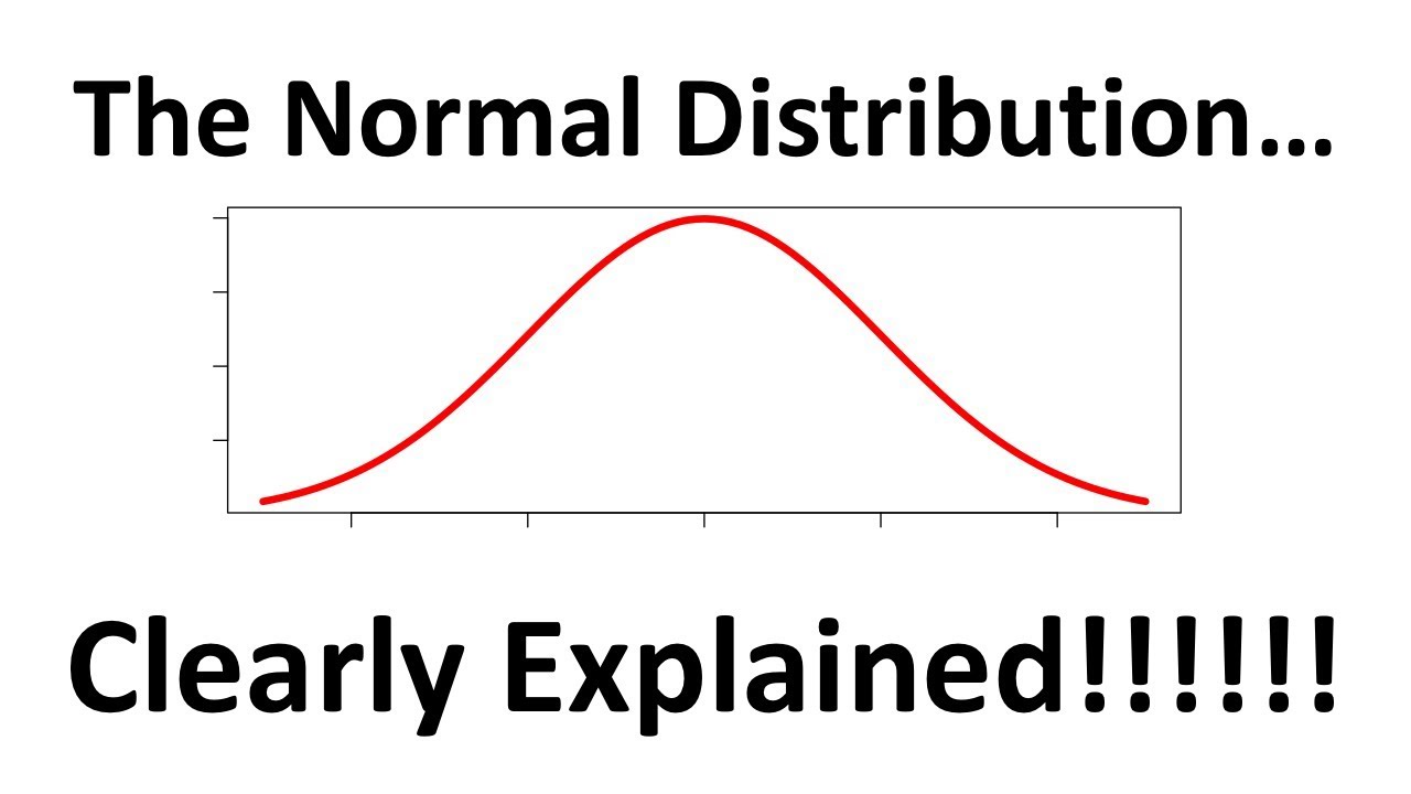
The Normal Distribution, Clearly Explained!!!
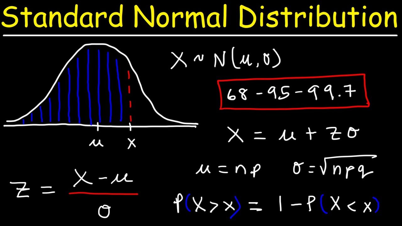
Standard Normal Distribution Tables, Z Scores, Probability & Empirical Rule - Stats
5.0 / 5 (0 votes)
Thanks for rating: