3.3.4 Measures of Relative Standing - Boxplots and Modified Boxplots
TLDRThis video covers Learning Outcome 4, focusing on constructing and interpreting box plots and modified box plots. It explains the five-number summary: minimum, first quartile, median, third quartile, and maximum. The video details how to visualize data distribution using box plots, highlighting the significance of the interquartile range and identifying skewness. Examples using real data, such as airport speeds and football coaches' salaries, illustrate how box plots reveal data spread and outliers. Modified box plots, which identify outliers with a specific method, are also discussed.
Takeaways
- 📊 Learning Outcome 4 focuses on constructing and interpreting box plots and modified box plots for given data sets.
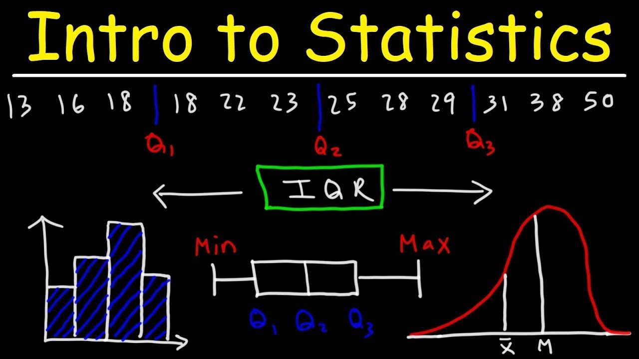
- 🔢 A five-number summary includes the minimum, first quartile (Q1), median (Q2), third quartile (Q3), and maximum values.
- 📏 Box plots visualize the five-number summary, showing the spread and distribution of data.
- 📉 The data between the minimum and Q1 represents the first 25% of the dataset, Q1 to Q2 the next 25%, Q2 to Q3 the following 25%, and Q3 to the maximum the final 25%.
- 📦 The box in a box plot highlights the middle 50% of the data, while the lines (whiskers) extend to the minimum and maximum values.
- 🔍 Box plots help identify the distribution of data, showing if it's symmetric or skewed, similar to histograms.
- 📝 The procedure for constructing a box plot includes finding the five-number summary, drawing a line from the minimum to the maximum, and constructing a box from Q1 to Q3 with a line at Q2.
- 📐 Modified box plots use the interquartile range (IQR) to identify outliers, plotting only values within Q1 - 1.5*IQR and Q3 + 1.5*IQR as normal.
- 🚩 Outliers are values beyond Q1 - 1.5*IQR or Q3 + 1.5*IQR and are indicated with points or asterisks in modified box plots.
- 📈 Box plots and modified box plots provide a clear visualization of data spread and outliers, making them useful for comparing different datasets.
Q & A
What is the main topic of Learning Outcome 4?
-The main topic of Learning Outcome 4 is constructing and interpreting box plots and modified box plots for given data sets.
What does the five-number summary consist of?
-The five-number summary consists of the minimum value, the first quartile (Q1), the second quartile (Q2 or median), the third quartile (Q3), and the maximum value.
How are the values in the data set distributed according to the five-number summary?
-The values are distributed as follows: the first 25% of values lie between the minimum and the first quartile, the next 25% lie between the first quartile and the second quartile, the next 25% lie between the second quartile and the third quartile, and the last 25% lie between the third quartile and the maximum value.
What is a box plot and what does it represent?
-A box plot, also known as a box and whisker diagram, is a graphical representation of the five-number summary. It consists of a line extending from the minimum to the maximum value, and a box that represents the interquartile range (IQR), with lines at the first quartile (Q1), second quartile (Q2), and third quartile (Q3).
What insights can a box plot provide about a data set?
-A box plot displays the spread and distribution of the data, showing how values are grouped and allowing for easy comparison of different data sets. It can also indicate skewness and highlight the presence of outliers.
What is skewness, and how can it be identified using a box plot?
-Skewness refers to the asymmetry in the distribution of data. It can be identified in a box plot if one tail is significantly longer than the other. For example, a long right tail indicates that the data is skewed to the right.
What is the procedure for constructing a box plot?
-The procedure for constructing a box plot involves finding the five-number summary, drawing a line segment from the minimum to the maximum, and then drawing a rectangle from the first quartile (Q1) to the third quartile (Q3) with a line at the second quartile (Q2).
How is a modified box plot different from a regular box plot?
-A modified box plot is constructed similarly to a regular box plot but includes additional steps to identify outliers. It graphs Q1 minus 1.5 times the interquartile range (IQR) instead of the minimum and Q3 plus 1.5 times the IQR instead of the maximum. Values beyond these points are marked as outliers.
What is the interquartile range (IQR), and how is it used in modified box plots?
-The interquartile range (IQR) is the range between the first quartile (Q1) and the third quartile (Q3). In modified box plots, it is used to determine outliers by multiplying the IQR by 1.5 and adding/subtracting this value from Q3/Q1 to set the boundaries for typical data values.
What is the benefit of using box plots for data analysis?
-Box plots provide a clear visualization of the distribution and spread of data, making it easier to compare different data sets, identify skewness, and detect outliers. They are a useful tool for summarizing large data sets and highlighting key statistical features.
Outlines
📊 Understanding Box Plots and Data Distribution
This paragraph introduces the concept of constructing and interpreting box plots, which are graphical representations of the five-number summary of a data set. The five-number summary includes the minimum, maximum, first quartile (Q1), second quartile (Q2, also the median), and third quartile (Q3). The paragraph explains how these values indicate the spread and distribution of data, with the box plot visually representing the data's range and distribution. The script uses the Verizon airport data speeds as an example to demonstrate the construction of a box plot, highlighting how the differences between quartiles can indicate the data's spread and concentration.
📈 Box Plots for Identifying Data Skewness and Outliers
The second paragraph delves into the use of box plots for identifying skewness in data distribution. It explains how a box plot can reveal if a data set is skewed to the right or left by observing the length of the 'whiskers' extending from the quartiles to the minimum and maximum values. The paragraph provides examples of box plots for women's heights and football coaches' salaries, illustrating how the box plot can indicate whether the data is normally distributed or skewed. It also introduces the concept of modified box plots, which exclude outliers by setting the minimum and maximum at Q1 - 1.5*IQR and Q3 + 1.5*IQR, respectively, where IQR is the interquartile range.
📉 Modified Box Plots and Outlier Identification
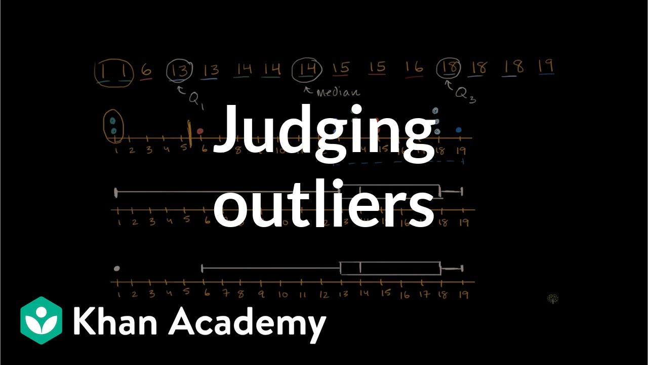
The final paragraph focuses on modified box plots, explaining their construction and how they are used to identify outliers in a data set. It describes the process of calculating the interquartile range and using it to determine the threshold for outliers. The paragraph provides an example of a modified box plot for female pulse rates, showing how outliers are identified and plotted separately. It emphasizes the modified box plot's ability to give a clear definition of what constitutes a high or low outlier in a data set, enhancing the understanding of data distribution and variability.
Mindmap
Keywords
💡Box Plot
💡Five-Number Summary
💡Quartiles
💡Skewness
💡Interquartile Range (IQR)
💡Outliers
💡Median
💡Data Distribution
💡Histogram
💡Modified Box Plot
Highlights
Constructing and interpreting box plots and modified box plots for data sets is discussed.
Box plots are a graphical representation of the five number summary, including maximum, minimum, and quartiles.
The five number summary provides insights into the range and distribution of data values.
Box plots display the spread and distribution of data, making them useful for comparing data sets.
Procedure for constructing a box plot involves finding the five number summary and then graphing it.
The Verizon airport data speeds are used as an example to demonstrate box plot construction.
Box plots can reveal the skewness of data, such as a long right tail indicating right-skewed distribution.
The heights of women example shows a symmetric distribution, suggesting normal distribution.
Football coaches' salaries example demonstrates a right-skewed distribution with a long tail of high salaries.
Modified box plots are introduced, which handle outliers by adjusting the minimum and maximum graphed values.
Interquartile range (IQR) is calculated and used to determine outliers in modified box plots.
Outliers are defined as values beyond 1.5 times the IQR from the quartiles in modified box plots.
Modified box plots provide a specific definition for what is considered a high or low outlier.
Pulse rates of females example illustrates the identification of outliers using a modified box plot.
Box plots offer a visual representation that is more insightful than a simple listing of summary numbers.
Understanding and interpreting box plots is essential for analyzing and comparing data distributions.
Transcripts
Browse More Related Video
Box and Whisker Plots Explained | Understanding Box and Whisker Plots (Box Plots) | Math with Mr. J
Boxplots in Statistics | Statistics Tutorial | MarinStatsLectures

How To Make Box and Whisker Plots
Math 119 Chapter 3 part 3
Introduction to Statistics
Judging outliers in a dataset | Summarizing quantitative data | AP Statistics | Khan Academy
5.0 / 5 (0 votes)
Thanks for rating: