Boxplots in Statistics | Statistics Tutorial | MarinStatsLectures
TLDRThe video script explains the concept of a boxplot, a statistical tool used to visualize the distribution of data. It describes how a boxplot displays the five-number summary: minimum, first quartile (Q1), median, third quartile (Q3), and maximum, and how to interpret these values in the context of a sample of 50 individuals' heights. The script also details how to identify outliers and calculate the upper and lower fences, which are not typically done by hand but are essential for understanding boxplot construction. Additionally, it mentions related plots like variable width boxplots and violin plots, enhancing the viewer's understanding of data visualization techniques.
Takeaways
- 📊 A boxplot is a visual tool used to represent the distribution of a dataset, such as the heights of 50 individuals in the given example.
- 🔢 The five-number summary (minimum, Q1, median, Q3, maximum) is graphically displayed in a boxplot, providing a quick overview of the data distribution.
- 🏆 The median (middle value) of the dataset is shown by the line inside the box, cutting the data into 50% below and 50% above.
- 📈 Q1 (first quartile) represents the value below which 25% of the data lies, while Q3 (third quartile) represents the value below which 75% of the data lies.
- 📊 The interquartile range (IQR) is the difference between Q3 and Q1, representing the range of the middle 50% of the data.
- 🚫 Outliers are data points that lie outside the range defined by the upper and lower fences, which are calculated using the IQR and quartiles.
- 📐 The upper fence is calculated as Q3 + 1.5 * IQR, and the lower fence as Q1 - 1.5 * IQR, helping to identify outliers.
- 🔍 Boxplots can help visualize the skewness of a distribution, indicating whether it is symmetric or skewed to the right or left.
- 📊 Variations of boxplots include variable width boxplots, where the width is proportional to the sample size, and notched boxplots with a notch at the median.
- 🎶 Violin plots combine the features of a boxplot with a density plot, providing a smooth representation of the data distribution.
- 📝 While the calculations for fences and outliers are typically done using software, understanding the process helps in comprehending how boxplots are produced.
Q & A
What is a boxplot and what does it represent?
-A boxplot is a graphical tool used to display the distribution of a dataset. It shows the median, quartiles, and the spread of the data, providing a visual representation of the data's shape, central tendency, and variability.
What are the five-number summary in the context of a boxplot?
-The five-number summary refers to the minimum, first quartile (Q1), median (Q2), third quartile (Q3), and maximum values of a dataset. These numbers are used to construct the boxplot.
How is the median represented in a boxplot?
-The median is represented by a line, or tick, inside the box of the boxplot. It divides the data into two equal halves, with 50% of the data points below and 50% above it.
What does the bottom of the boxplot indicate?
-The bottom of the boxplot indicates the first quartile (Q1), which is the value below which 25% of the data lies.
What is the significance of the top of the boxplot?
-The top of the boxplot represents the third quartile (Q3), which is the value below which 75% of the data lies.
What is the interquartile range (IQR) and how is it calculated?
-The interquartile range (IQR) is the range of the middle 50% of the data, calculated by subtracting the first quartile (Q1) from the third quartile (Q3).
How are outliers identified in a boxplot?
-Outliers are identified by drawing a 'fence' above and below the boxplot. The upper fence is calculated as Q3 + 1.5 * IQR and the lower fence as Q1 - 1.5 * IQR. Data points beyond these fences are considered outliers.
What is the purpose of the whiskers in a boxplot?
-The whiskers in a boxplot extend from the minimum and maximum values within the fences to the edges of the box. They show the range of data that is not considered an outlier.
How can the shape of a data distribution be determined using a boxplot?
-The shape of the data distribution can be determined by observing the symmetry of the boxplot. If the boxplot is symmetric, the distribution is roughly balanced. If one side extends more, the distribution is skewed towards that side.
What are variable width boxplots and when are they used?
-Variable width boxplots are used when comparing multiple datasets, such as the heights of males versus females. The width of each boxplot is proportional to the sample size, allowing for a visual comparison of the spread and central tendency of different groups.
What is a notched boxplot and how does it differ from a standard boxplot?
-A notched boxplot is a variation that includes a notch at the median, providing an additional visual cue for the central tendency of the data. It can also include a violin plot, which combines aspects of a boxplot with a density plot to show the distribution of the data more smoothly.
Outlines
📊 Understanding Boxplots and Their Components
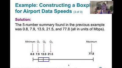
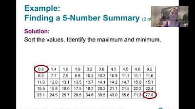
This paragraph introduces the concept of a boxplot, a graphical tool used to display the distribution of a dataset. It explains that the boxplot is a visual representation of the five-number summary: minimum, first quartile (Q1), median, third quartile (Q3), and maximum. The example uses a dataset of 50 individuals' heights and illustrates how the boxplot shows the median (middle value), the first and third quartiles (which divide the data into four equal parts), and the range of the middle 50% of the data (interquartile range, IQR). It also touches on how outliers are represented in the plot.
📈 Calculating Outliers and Boxplot Fences
The second paragraph delves into the methodology of identifying outliers and calculating the upper and lower fences of a boxplot. It explains how the upper fence is determined by adding one and a half times the interquartile range to the third quartile (Q3), and the lower fence is found by subtracting the same value from the first quartile (Q1). The paragraph clarifies that values within these fences are not considered outliers, while those beyond are. It also mentions alternative ways to define outliers and introduces other related plots such as variable width boxplots and violin plots, which provide additional insights into data distribution and density.
Mindmap
Keywords
💡Boxplot
💡Five-number summary
💡Median
💡Quartiles
💡Interquartile Range (IQR)
💡Outliers
💡Upper and Lower Fences
💡Skewness
💡Data Distribution
💡Variable Width Boxplots
💡Violin Plots
Highlights
A boxplot is a visual tool used to represent the distribution of a dataset, such as the heights of 50 individuals.
The boxplot graphically displays the five-number summary: minimum, first quartile (Q1), median, third quartile (Q3), and maximum.
The median, or middle value, is shown by the tick inside the box and in this example is approximately 66 inches.
The first quartile (Q1) represents the value below which 25% of the data lies, and in this case, it is around 63 inches.
The third quartile (Q3) indicates the value below which 75% of the data lies, here estimated at about 70 inches.
The interquartile range (IQR) is the difference between Q3 and Q1, representing the range of the middle 50% of the data.
The lines extending from the box (whiskers) show the minimum and maximum values excluding outliers.
Outliers are individual points that lie outside the whiskers and are identified by specific calculations.
An upper fence is calculated as Q3 + 1.5 * IQR, and any value above this is considered an outlier.
The lower fence is calculated as Q1 - 1.5 * IQR, defining the minimum value not considered an outlier.
Boxplots help visualize the shape of the data distribution, whether it is symmetric or skewed.
Other types of boxplots include variable width boxplots, which adjust the box size based on sample size.
Notched boxplots often have an indentation at the median, and violin plots combine boxplot and density plot features.
The process of identifying outliers and maximum values is typically done using software rather than by hand.
Understanding the boxplot production helps in discerning what is considered an outlier and what is the maximum non-outlier value.
Boxplots are a commonly used statistical tool for data visualization and analysis.
Transcripts
Browse More Related Video
3.3.4 Measures of Relative Standing - Boxplots and Modified Boxplots
Judging outliers in a dataset | Summarizing quantitative data | AP Statistics | Khan Academy
3.3.3 Measures of Relative Standing and Boxplots - Quartiles and the 5 Number Summary
Percentiles, Quantiles and Quartiles in Statistics | Statistics Tutorial | MarinStatsLectures

Statistics: Quartiles of Grouped Data

How To Make Box and Whisker Plots
5.0 / 5 (0 votes)
Thanks for rating: