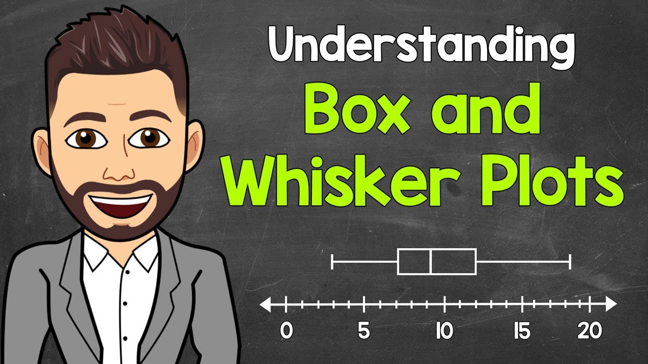
How To Make Box and Whisker Plots
TLDRThe video script provides a step-by-step guide on creating box and whisker plots, emphasizing the identification of five key data points: minimum, maximum, and the three quartiles (Q1, Q2, Q3). It explains how to arrange data, calculate quartiles, and determine outliers using the interquartile range (IQR). The process is illustrated with examples, showing how to plot the data on a number line, draw the box and whiskers, and represent outliers. The explanation is clear and methodical, making it accessible for viewers to understand and apply the concept.
Takeaways
- 📊 Understand the concept of box and whisker plots as a data visualization tool.
- 🔢 Identify five key data points: minimum, maximum, first quartile (Q1), second quartile (Q2), and third quartile (Q3).
- 🔄 Arrange the data set in ascending order before calculating quartiles.
- 📈 Q1 is the median of the lower half of the data, and Q3 is the median of the upper half.
- 🌟 Q2 represents the overall median (middle value) of the entire data set.
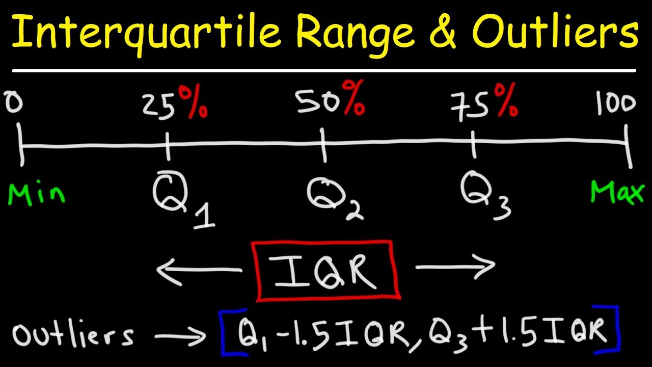
- 🚫 Check for outliers by determining the range (Q1 - 1.5 * IQR to Q3 + 1.5 * IQR) where data points should fall.
- 🧐 Outliers are data points that fall outside the defined range and are typically plotted separately.
- 📝 Calculate the Interquartile Range (IQR) as the difference between Q3 and Q1.
- 📊 Construct the box plot by drawing a box from Q1 to Q3 and whiskers from the box to the minimum and maximum (non-outlier) values.
- 📌 Plot outliers as individual points outside the whiskers on the box plot.
- 🎯 Box and whisker plots provide a clear visual representation of data distribution and central tendency.
Q & A
What are the five key data points used in a box and whisker plot?
-The five key data points in a box and whisker plot are the minimum, maximum, first quartile (Q1), second quartile (Q2, also the median), and third quartile (Q3).
How do you determine the first and third quartiles in a box and whisker plot?
-To determine the first and third quartiles, you first arrange the data in ascending order, then split the data into two equal halves. The median of the lower half is Q1, and the median of the upper half is Q3.
What is the interquartile range (IQR) in a box and whisker plot?
-The interquartile range (IQR) in a box and whisker plot is the difference between the third quartile (Q3) and the first quartile (Q1), representing the range within which the central 50% of the data lies.
How do you identify outliers in a box and whisker plot?
-Outliers are identified by determining a range for the data based on the IQR. Any data point that falls below Q1 - 1.5 * IQR or above Q3 + 1.5 * IQR is considered an outlier.
What is the purpose of excluding outliers from the box in a box and whisker plot?
-Outliers are excluded from the box in a box and whisker plot to focus on the central tendency and dispersion of the main body of the data, as outliers can significantly skew the representation of the data's distribution.
How do you plot the minimum and maximum values in a box and whisker plot?
-In a box and whisker plot, the minimum value is plotted at the lowest point within the defined range (not including outliers), and the maximum value is plotted at the highest point within the range (also not including outliers).
What is the significance of the second quartile (Q2) in a box and whisker plot?
-The second quartile (Q2), also known as the median, represents the middle value of the data set when arranged in ascending order. It divides the data set into two equal halves, providing insight into the central tendency of the data.
How do you calculate the median of a data set with an even number of observations?
-For a data set with an even number of observations, the median is calculated by taking the average of the two middle numbers after arranging the data in ascending order.
What is the whisker in a box and whisker plot and how is it determined?
-The whisker in a box and whisker plot represents the variability of the data. It extends from the box to the minimum and maximum values within the defined range (excluding outliers), indicating the spread of the data around the quartiles.
How do you handle outliers when drawing a box and whisker plot?
-Outliers are typically represented as individual points outside the whiskers on the box and whisker plot. They are not included within the box or whiskers but are plotted separately to indicate their deviation from the rest of the data.
What is the range within which most of the data points lie in a box and whisker plot?
-Most of the data points in a box and whisker plot lie within the range defined by the first quartile (Q1) to the third quartile (Q3), which represents the interquartile range (IQR).
Outlines
📊 Understanding Box and Whisker Plots
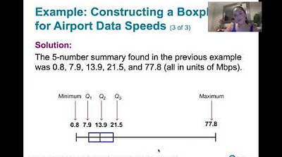
This paragraph introduces the concept of box and whisker plots, emphasizing the importance of identifying five key data points: the minimum, maximum, first quartile (Q1), second quartile (Q2), and third quartile (Q3). It explains the process of arranging data in ascending order, calculating quartiles, and plotting the data on a number line to create the box and whisker plot. The example given illustrates how to determine the quartiles and the median, and how to identify outliers by calculating the interquartile range (IQR) and setting a boundary for data points.
📈 Calculating and Plotting Quartiles
The second paragraph delves into the specifics of calculating the interquartile range and determining the boundaries for non-outlier data points. It explains how to use the IQR to establish the range within which data points should fall to be considered part of the box and whisker plot. The paragraph continues with a practical example, showing the steps to calculate Q1, Q2, and Q3, and how to identify and exclude outliers from the plot. It also describes the process of drawing the box and whisker plot, including the placement of the quartiles and the minimum and maximum values on a number line.
🚫 Handling Outliers in Box Plots
The final paragraph addresses the treatment of outliers in box and whisker plots. It provides a new set of data and demonstrates the process of arranging the data, calculating quartiles, and identifying the median. The paragraph explains how to calculate the IQR and determine the outlier range, leading to the identification of an outlier in the given data set. The example concludes with the plotting of the box and whisker plot, showing the placement of the quartiles, the minimum and maximum values, and the depiction of the outlier as a separate point outside the plot.
Mindmap
Keywords
💡Box and Whisker Plots
💡Five-Number Summary
💡Minimum and Maximum
💡Quartiles
💡Median
💡Interquartile Range (IQR)
💡Outliers
💡Data Arrangement
💡Number Line
💡Data Visualization
💡Statistical Analysis
Highlights
The video explains how to create box and whisker plots, a method for data visualization.
Five key data points are necessary for plotting: minimum, maximum, and the three quartiles (Q1, Q2, Q3).
The process begins by arranging the data set in ascending order.
The median (Q2) of the entire data set is calculated by eliminating the lowest and highest values and finding the middle number.
The first quartile (Q1) is found by taking the median of the lower half of the data set after removing the median.
The third quartile (Q3) is determined by taking the median of the upper half of the data set after removing the median.
The minimum and maximum values of the data set are identified, but they must be checked to ensure they are not outliers.
Outliers are values that fall outside the range of Q1 - 1.5 * IQR to Q3 + 1.5 * IQR and are not included within the box.
The interquartile range (IQR) is calculated as the difference between Q3 and Q1.
An example is provided with a step-by-step calculation of the quartiles and identification of outliers.
The video demonstrates how to plot the quartiles and minimum/maximum values on a number line to construct the box plot.
Outliers are plotted as individual points separate from the box plot.
The video provides a second example with a different data set and explains how to handle an outlier in the plot.
The second example illustrates the calculation of quartiles, the interquartile range, and the identification and plotting of an outlier.
The video concludes by summarizing the process of creating a box and whisker plot and how to represent outliers.
Transcripts
Browse More Related Video
How To Find The Interquartile Range & any Outliers - Descriptive Statistics
Box and Whisker Plots Explained | Understanding Box and Whisker Plots (Box Plots) | Math with Mr. J
3.3.3 Measures of Relative Standing and Boxplots - Quartiles and the 5 Number Summary
Judging outliers in a dataset | Summarizing quantitative data | AP Statistics | Khan Academy
3.3.4 Measures of Relative Standing - Boxplots and Modified Boxplots
Math 119 Chapter 3 part 3
5.0 / 5 (0 votes)
Thanks for rating: