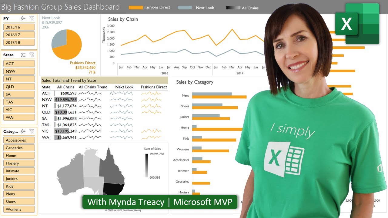
Excel Dashboard for Beginners | Interactive and Dynamic!
TLDRThis tutorial video by Rebecca guides beginners through creating a simple Excel dashboard in three easy steps. It emphasizes the importance of organizing data into an Excel table for clarity and suggests changing the workbook theme for a cohesive design. The video also highlights common mistakes to avoid, such as over-cluttering the dashboard and improper use of grid lines. Rebecca demonstrates useful features like slicers for interactivity and smart art for visually appealing data presentation, culminating in a streamlined dashboard that extracts valuable insights without overwhelming the user.
Takeaways
- 📊 Creating an Excel dashboard doesn't have to be complex; it can be simple and streamlined for beginners.
- 🔍 Organizing source data into an Excel table with headers provides context for the data and enables filtering.
- 🎨 Changing the workbook theme before adding elements ensures consistency in colors and fonts throughout the dashboard.
- 🚫 Avoid the common mistake of modifying individual elements' colors and fonts instead of setting them at the workbook level.
- 🖼️ Use a solid background color to create a 'canvas' for your dashboard, simplifying the design process.
- 📏 Hiding rows and columns outside the 'canvas' prevents accidental modifications and keeps the dashboard clean.
- 📈 Build all dashboard elements like charts and pivot tables on a separate worksheet before integrating them into the dashboard.
- 🔗 Utilize slicers for interactive elements that link and update multiple data elements simultaneously.
- 🖼️ Linked pictures in Excel can dynamically update to reflect changes in the source data.
- 📋 SmartArt can be used to present data in a visually appealing way, making numbers and summaries stand out.
- 📐 Ensure alignment and proper spacing of dashboard elements for a clean and professional look.
- 📝 Keep the dashboard minimalistic, including only essential elements to avoid overwhelming the user with data.
Q & A
What is the main purpose of creating an Excel dashboard according to the video?
-The main purpose of creating an Excel dashboard is to extract insights from data in a simple and streamlined manner, making it easier for beginners to understand and utilize the data without being overwhelmed.
Why should a dashboard not be a huge monster that takes hours to create?
-A dashboard should not be overly complex because sometimes more complex dashboards can clutter and obscure important information, making it difficult for users to extract necessary insights from the data.
What is the first step in creating an Excel dashboard as per the video?
-The first step is to look at your source data and ensure it is organized in columns and rows, then convert it into an Excel table to give Excel context for where your data is.
Why is it important to convert data into an Excel table?
-Converting data into an Excel table is important because it provides a special structure that helps Excel understand the context of the data, making it easier to manage and interact with.
What is the significance of changing the workbook theme when creating a dashboard?
-Changing the workbook theme is significant because it ensures consistency in colors and fonts across the dashboard, making it visually appealing and easier to read. It also helps avoid the mistake of changing elements individually.
What mistake do people often make when creating dashboards regarding the theme?
-A common mistake is leaving the default theme and changing colors and fonts of individual elements later, which can lead to inconsistency and a disjointed appearance.
Why should grid lines not be used to create boxes in a dashboard?
-Using grid lines to create boxes can be problematic because it requires careful alignment and can become a design nightmare. Instead, a canvas with a background should be used for better design control.
What is the recommended way to build elements for a dashboard?
-The recommended way is to build all elements on a separate worksheet first, such as charts, pivot tables, and summaries, ensuring that they are important and useful for the data users.
What is a slicer in Excel and how does it add interactivity to a dashboard?
-A slicer is an interactive element in Excel that allows users to filter data based on specific fields. It adds interactivity by linking multiple pivot tables or charts to the slicer, updating them dynamically when the slicer's selection changes.
How can you create a linked picture in Excel to show dynamic data on a dashboard?
-You can create a linked picture by copying a dynamic table or range, then pasting it as a linked picture using the 'Paste Special' option. This picture will update dynamically when the underlying data changes.
What is SmartArt and how can it be used to present data attractively on a dashboard?
-SmartArt is a feature in Excel that allows users to create various visual representations like lists, diagrams, and organization charts. It can be used to present data in an attractive and organized manner, making it easier for users to digest the information.
What is the final mistake people often make when designing their first dashboard?
-The final mistake is adding too many elements to the dashboard, which can overwhelm the user. Instead, a minimalist approach should be taken, focusing only on the essential elements needed to convey the necessary information.
Outlines
📊 Creating a Simple Excel Dashboard
Rebecca introduces the concept of an Excel dashboard, emphasizing its simplicity and importance for data insight extraction. She advises against complex dashboards that can obscure data, and instead, guides beginners through a three-step process to create a streamlined dashboard. Rebecca also points out common mistakes, such as using default themes and grid lines for design, which can complicate the dashboard. She encourages using Excel tables for organized data and changing the workbook theme to maintain consistency across elements.
🎨 Designing an Excel Dashboard Canvas
The paragraph focuses on the design aspect of an Excel dashboard. Rebecca suggests creating a canvas with a background color to avoid reliance on grid lines, which can lead to alignment issues. She demonstrates how to hide unnecessary rows and columns, ensuring that the dashboard remains clean and focused. Additionally, she highlights the importance of building all dashboard elements on a separate worksheet first, including charts, pivot tables, and summaries. Rebecca also shares tips on using slicers for interactivity and creating linked pictures for dynamic updates.
📈 Enhancing Dashboard with SmartArt and Linked Data
Rebecca continues with the dashboard design process by discussing how to use SmartArt to present data attractively. She shows how to convert SmartArt into individual shapes linked to specific data cells, allowing for dynamic updates. She also explains how to create visually appealing representations for numbers and totals, using SmartArt styles and colors to enhance the dashboard's appearance. The paragraph emphasizes the importance of aligning and formatting elements to ensure a clean and professional look.
🚀 Finalizing the Dashboard with Minimalism
In the final paragraph, Rebecca stresses the importance of minimalism in dashboard design. She advises against overcrowding the dashboard with too many elements, which can overwhelm users. Instead, she promotes a minimalist approach that includes only essential information and interactive elements like a slicer and a chart. Rebecca concludes by encouraging users to align all elements, add titles, and labels for clarity, and to keep the dashboard simple yet valuable for users.
Mindmap
Keywords
💡Excel Dashboard
💡Data Insights
💡Excel Table
💡Workbook Theme
💡Grid Lines
💡Pivot Table
💡Slicers
💡Linked Picture
💡SmartArt
💡Minimalist Design
💡Alignment
Highlights
Creating an Excel dashboard in three easy steps for beginners.
Dashboards should be simple and not overly complex to avoid cluttering important data.
Organizing source data into an Excel table for better context and structure.
Using the 'Insert Table' feature to convert data into a table with filter buttons.
Renaming the table to something descriptive for better data understanding.
Changing the workbook theme to enhance the dashboard's visual appeal.
Avoiding the mistake of using default themes and changing elements individually.
Creating a canvas with a background color for a clean dashboard layout.
Hiding rows and columns outside the dashboard canvas for a focused design.
Building all dashboard elements on a separate worksheet for organization.
Utilizing pivot tables and slicers for dynamic and interactive data representation.
Creating linked pictures from pivot tables for dynamic updates on the dashboard.
Using SmartArt for visually appealing presentation of single numbers or words.
Converting SmartArt to shapes for individual formatting and positioning.
Aligning and sizing dashboard elements for a clean and professional look.
Adding titles and labels for clarity and user-friendly dashboard navigation.
Avoiding the mistake of over-cluttering the dashboard with too many elements.
Emphasizing minimalism and focusing on essential data for user understanding.
Transcripts
Browse More Related Video

Excel Dynamic Search Box Tutorial | Find Anything | Multi-Column Search
Interactive Excel Dashboards & ONE CLICK Update!

Take Control of Your Finances in 2024 with Excel!

Templates and Custom Sensors in Home Assistant - How To TUTORIAL

Excel Module 2: Rivera Engineering

How to Create a Dashboard in Google Sheets (10 steps) - Query Formula
5.0 / 5 (0 votes)
Thanks for rating: