The 7 Quality Control (QC) Tools Explained with an Example!
TLDRIn this informative video, Andy from CQE Academy introduces the seven QC tools essential for quality improvement and problem-solving in the workplace. He guides viewers through each tool, from flowcharts to control charts, using a practical example of reducing defects in toasters. The session emphasizes the importance of data-driven decision-making and the Pareto principle, illustrating how to identify key issues, analyze root causes, and monitor process control over time.
Takeaways
- 📈 The Seven QC Tools are essential for problem-solving and process improvement in quality management.
- 🔍 The Flowchart is a visual tool to depict the sequence of a process, simplifying complex processes and fostering a common understanding.
- 📝 The Check Sheet is crucial for collecting, organizing, and analyzing data with attention to metadata for data integrity.
- 📊 The Pareto Chart helps to identify the vital few issues from the trivial many, focusing on the most significant problems affecting quality.
- 🐟 The Cause and Effect Diagram, also known as the Fishbone Diagram, structures the root cause analysis by considering various categories of potential causes.
- 🤔 The Scatter Diagram (XY Scatter Plot) is used to understand the relationship between two variables without assuming causality.
- 📚 The Histogram is a bar chart that shows the frequency of continuous data, helping to identify patterns and variations in a process.
- 🔑 The Pearson Correlation Coefficient quantifies the relationship between two variables, indicating the strength and direction of the correlation.
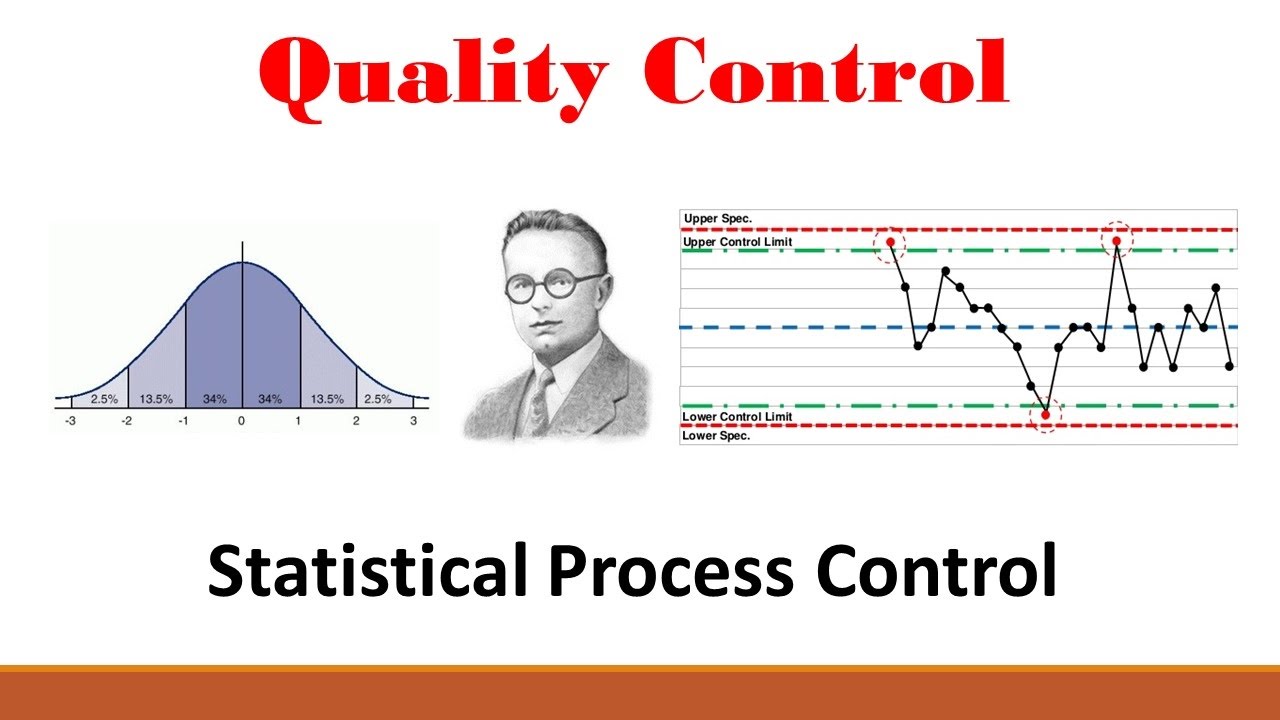
- 👁️ The Control Chart confirms that a process is in control by monitoring if data falls within control limits, indicating only normal variation.
- 🌡️ The script uses a case study of reducing defects in toasters by controlling relative humidity, demonstrating the practical application of the QC tools.
- 📚 The speaker emphasizes the importance of data-driven decision making and the structured approach provided by the QC tools in quality engineering.
Q & A
What is the main topic of the video by Andy from CQE Academy?
-The main topic of the video is the explanation and application of the seven QC (Quality Control) tools, which are essential for problem-solving and quality improvement in various professional settings.
Why are the seven QC tools important for someone preparing for a quality exam like the Green Belt or Black Belt exam?
-The seven QC tools are important because they are fundamental to quality management and problem-solving processes. Mastery of these tools is often required or beneficial for those taking exams like the Green Belt or Black Belt, as they are widely used in quality engineering and continuous improvement methodologies.
What does Andy suggest as the first step in using the seven QC tools to improve a process?
-The first step Andy suggests is to create a flowchart. A flowchart is a visual tool that helps depict the flow or sequence of a process, making complex processes simple and promoting a common understanding among team members.
What is the purpose of a check sheet in the context of the seven QC tools?
-A check sheet is a simple tool used for collecting, organizing, and analyzing data. It is essential for every problem-solving or improvement initiative, as it provides the necessary data to make informed decisions and to track progress.
Why is metadata important when creating a check sheet?
-Metadata, such as who collected the data, when, and where, is important because it ensures data integrity and accuracy. This information is crucial for making high-quality decisions based on the collected data.
What is the Pareto Principle, and how is it applied in the context of the seven QC tools?
-The Pareto Principle, often referred to as the 80/20 rule, states that roughly 80% of the effects come from 20% of the causes. In the context of the seven QC tools, a Pareto chart is used to apply this principle to identify the vital few issues that are causing the majority of problems, allowing for focused improvement efforts.
What is the cause and effect diagram, and how does it help in the problem-solving process?
-The cause and effect diagram, also known as the fishbone diagram or Ishikawa diagram, is a tool used to analyze potential causes of a problem or effect. It helps in the problem-solving process by structuring the analysis into different categories, such as the 8Ms (Man, Machine, Material, Method, Measurement, Mother Nature, Management, and Mindset), to identify and understand the root causes of issues.
What is the purpose of a scatter diagram in the seven QC tools?
-A scatter diagram, or an XY scatter plot, is used to understand the relationship between two variables. It helps to determine if there is a correlation between an independent variable (such as humidity) and a dependent variable (such as defects), which can be crucial for identifying causal relationships in a process.
How does a histogram help in analyzing process data?
-A histogram is a bar chart that graphs the frequency of occurrence of continuous data. It helps in analyzing process data by showing the pattern of variation within a process, allowing engineers and analysts to understand the behavior of the process and identify any non-random patterns or trends.
What is the role of a control chart in monitoring and controlling a process after improvements have been made?
-A control chart is a tool used to confirm that a process is in control, meaning it is only experiencing normal variation. It is used after improvements have been made to monitor the process over time and ensure that the changes have been effective, with data points falling within the established control limits.
How does Andy demonstrate the effectiveness of the seven QC tools in the video?
-Andy demonstrates the effectiveness of the seven QC tools by walking through a practical example of reducing defects in a toaster manufacturing process. He shows how each tool contributes to identifying, analyzing, and solving the problem, ultimately leading to a 25% reduction in defects by controlling for humidity.
Outlines
📈 Introduction to the Seven QC Tools
Andy from CQE Academy introduces the video's focus on the seven quality control (QC) tools, essential for improving work processes or preparing for quality-related exams like the Green Belt, Black Belt, or CQE. The agenda includes a brief introduction to the tools, their role in problem-solving, and a practical application to reduce defects in toasters. The importance of these tools is emphasized with a quote from Kaoru Ishikawa, highlighting their ability to solve up to 95% of quality problems. The video will guide viewers through the Plan-Do-Check-Act (PDCA) cycle or DMAIC process using a flowchart to understand and improve a process.
🔍 Utilizing the Flowchart and Check Sheet
The first tool discussed is the flowchart, a visual representation of a process's sequence, which simplifies complexity and fosters a common understanding. The importance of defining process boundaries and using brainstorming with post-it notes to map out process steps is highlighted. The check sheet is introduced as a fundamental tool for data collection, with an emphasis on including metadata for data integrity. The team uses a check sheet to identify the most frequent defects in the toaster's final testing phase, aiming to reduce the defect rate by 25% based on collected data.
📊 The Pareto Chart and Cause Analysis
The Pareto chart is introduced as a tool to apply the 80/20 rule, helping to identify the most significant issues affecting quality. The video demonstrates how to use the Pareto chart to pinpoint the primary defect causing in the toaster production. Following this, the cause and effect diagram, or Ishikawa diagram, is explained as a method for root cause analysis. The '8Ms' (Man, Machine, Material, etc.) are discussed as a structured approach to consider all potential causes. The video also touches on the importance of teamwork and brainstorming to uncover root causes, and the use of the '5 Whys' technique to delve deeper into the issues.
📈 Investigating the Relationship Between Humidity and Defects
The script describes an observation of a potential link between high humidity and increased defects. A scatter diagram is used to visualize the relationship between humidity levels and defect rates, highlighting the need to differentiate between correlation and causation. The Pearson correlation coefficient is mentioned as a statistical tool to quantify the relationship between variables. The discussion then moves to using a histogram to analyze the pattern of humidity variation over time within the facility, which is crucial for understanding and controlling the process.
📉 Implementing Process Control with Control Charts
The final QC tool presented is the control chart, which is used to confirm that a process is in control and only experiencing normal variation. The video illustrates how controlling for humidity levels led to a significant reduction in defects per day, achieving the target of a 25% decrease. The control chart is shown before and after the implementation of humidity control, demonstrating the effectiveness of the change and the tool's utility in monitoring process stability over time.
🎓 Conclusion and Further Learning Opportunities
The video concludes with a summary of the learning objectives and an invitation for viewers to engage with a free course offered by CQE Academy. The course covers the top 10 topics for the CQ exam and provides practice exams, encouraging those interested in becoming a Certified Quality Engineer (CQE) to take advantage of this resource.
Mindmap
Keywords
💡Seven QC Tools
💡Flow Chart
💡Check Sheet
💡Pareto Chart
💡Cause and Effect Diagram
💡Scatter Diagram
💡Histogram
💡Control Chart
💡Plan-Do-Check-Act (PDCA) Cycle
💡Defects
Highlights
Introduction to the seven QC tools and their importance in problem-solving and quality improvement.
The flowchart as a visual tool to depict the sequence of a process and promote common understanding.
The value of the flowchart in simplifying complex processes and its use in the planning phase of problem-solving.
The check sheet as a fundamental tool for data collection, organization, and analysis.
The importance of including metadata in check sheets for data integrity and accuracy.
The Pareto chart for identifying the most significant issues affecting a process based on the 80/20 rule.
The cause-and-effect diagram, also known as the Ishikawa diagram, for root cause analysis.
The structured approach of the 8Ms in the cause-and-effect diagram for comprehensive root cause analysis.
The use of the five whys technique to delve deeper into root causes.
The identification of high humidity as a potential root cause for increased defects during assembly.
The use of a scatter diagram to understand the relationship between humidity and defect rates.
The concept of correlation without causation and its importance in data analysis.
The Pearson correlation coefficient for quantifying the relationship between variables.
The use of a histogram to analyze the pattern of variation in a process.
Overlaying specification limits on a histogram to assess process capability.
The control chart as a tool to confirm that a process is in control and experiencing only normal variation.
The practical application of controlling humidity to reduce defects in a toaster manufacturing process.
The effectiveness of the seven QC tools demonstrated through a case study on reducing toaster defects.
A free course offered by CQE Academy for those serious about becoming a Certified Quality Engineer (CQE).
Transcripts
Browse More Related Video

Attribute Data Control Chart Examples!! How to select/create the P, NP, C and U Charts
CONTROL CHART BASICS and the X-BAR AND R CHART +++++ EXAMPLE
PROCESS CAPABILITY: Explaining Cp, Cpk, Pp, Ppk and HOW TO INTERPRET THOSE RESULTS
Making a Control Chart in Excel (with dynamic control lines!)
Quality (Part 2: Ishikawa Diagram)
Quality (Part 1: Statistical Process Control)
5.0 / 5 (0 votes)
Thanks for rating: