Contour plots | Multivariable calculus | Khan Academy
TLDRThe script explains the concept of a contour plot, a two-dimensional representation of a three-dimensional function. It describes how planes parallel to the x, y plane are used to create constant z-value slices, which are then projected onto the x, y plane as contour lines. These lines help visualize the function's output at different input points, with close spacing indicating steepness and concentric circles suggesting maxima or minima. The use of color to differentiate between output values further enhances the understanding of the function's behavior.
Takeaways
- 📊 A three-dimensional graph represents a function with a two-dimensional input and a one-dimensional output, often visualized using graphing software.
- 🖋️ Contour plots offer a two-dimensional representation of three-dimensional functions by 'slicing' the graph at various z-values and drawing lines where these slices intersect the graph.
- 🔪 The process involves 'squishing' the contour lines onto the x, y plane, creating a flat representation of the function's output values.
- 📈 Contour lines represent constant output values of the function, similar to how lines on a two-dimensional graph represent constant values.
- 📍 Each contour line corresponds to a specific output value of the function, which can be marked if necessary for clarity.
- 📉 The spacing between contour lines indicates the steepness of the function; closely packed lines suggest a steep gradient, while widely spaced lines indicate a gentler slope.
- 🔭 Contour plots can give a sense of the function's shape, allowing one to visualize how the graph might extend out of the page.
- 🌀 Concentric circles in a contour plot often suggest a maximum or minimum point of the function.
- 🎨 Coloring contour plots can enhance understanding by associating warmer colors with higher function values and cooler colors with lower values.
- 🌈 The use of color in contour plots helps to visually distinguish between different output values and can provide a quick reference for the function's range.
- 📝 Understanding contour plots is crucial for visualizing multi-dimensional functions on a two-dimensional surface, offering insights into the function's behavior across its input space.
Q & A
What is a three-dimensional graph representing?
-A three-dimensional graph represents a function with a two-dimensional input and a one-dimensional output, typically visualized as f(x, y) = some expression involving x's and y's.
Why are traditional three-dimensional graphs considered clunky to draw?
-Traditional three-dimensional graphs are clunky to draw because they usually require graphing software and cannot be easily scribbled down. Static images of them may not clearly convey the information.
What is a contour plot and how does it help in representing three-dimensional functions on a two-dimensional surface?
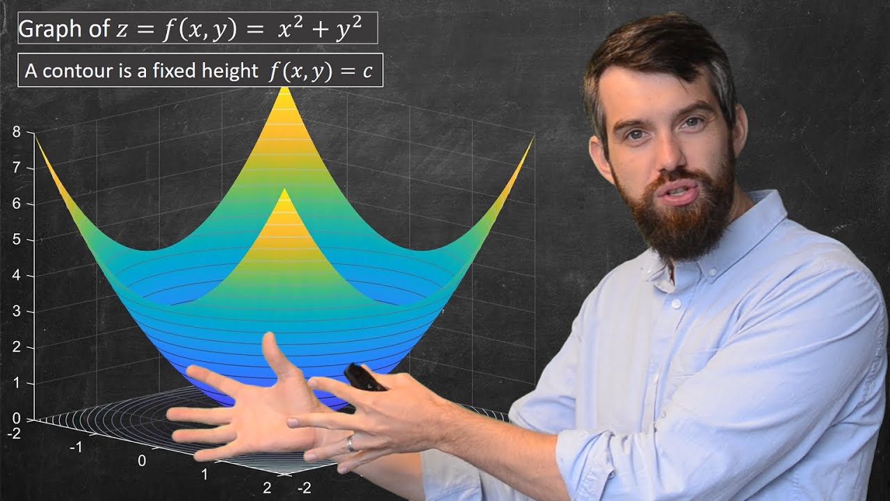
-A contour plot is a method to represent three-dimensional functions on a two-dimensional surface by slicing the graph with planes parallel to the x, y plane and drawing lines where these planes intersect the graph, then projecting these lines onto the x, y plane.
What do the planes in a contour plot represent?
-The planes in a contour plot represent constant values of z, with each plane corresponding to a different fixed value of z, allowing x and y to vary freely.
How are contour lines created in a contour plot?
-Contour lines are created by identifying the points where the planes slicing the graph intersect with it, and then projecting these points onto the x, y plane.
What is the significance of the spacing between contour lines in a plot?
-The spacing between contour lines indicates the steepness of the function. Closely spaced lines suggest a steep gradient, while widely spaced lines indicate a more gradual slope.
How can contour plots provide insight into the shape of a function?
-Contour plots can provide insight into the shape of a function by showing the areas of constant output values and indicating the steepness or shallowness of the function's slope.
What is the purpose of coloring contour lines in a plot?
-Coloring contour lines helps to visually distinguish between different levels of the function's output, with warmer colors typically representing higher values and cooler colors representing lower values.
Why might specific values be marked on contour lines in a plot?
-Specific values are marked on contour lines to provide clarity on the exact output values that each line represents, which is especially important when precise information is needed.
How can the concept of concentric circles in contour plots be interpreted?
-Concentric circles in contour plots often correspond to a maximum or minimum of the function, indicating areas where the function's output value is at its highest or lowest within the plotted region.
What is the main advantage of using contour plots over traditional three-dimensional graphs?
-The main advantage of using contour plots is that they allow for a two-dimensional representation of multi-dimensional functions, making it easier to visualize and understand the function's behavior without the need for complex graphing tools.
Outlines
📈 Introduction to 3D Graphs and Contour Plots
This paragraph introduces the concept of three-dimensional graphs, which represent functions with two-dimensional inputs and a one-dimensional output, such as f(x, y). The speaker explains the limitations of traditional graphing methods, which can be cumbersome and static. To overcome these limitations, the concept of a contour plot is introduced as a way to represent these functions on a two-dimensional plane. The process involves slicing the graph with planes parallel to the x, y plane at various z values, creating contour lines that represent constant output values of the function. These contour lines are then projected onto the x, y plane, providing a simplified yet informative representation of the function's behavior.
🌈 Understanding Contour Plots with Color Coding
The second paragraph delves into the use of color coding in contour plots to enhance the visualization of multi-dimensional functions. Warmer colors like orange are used to represent higher values of the function, while cooler colors like blue indicate lower values. The contour lines act as boundaries between different colors, effectively communicating the range of output values across the input space. This method not only aids in understanding the function's behavior but also provides a visual representation of gradients, with closely spaced lines indicating steepness and widely spaced lines suggesting a more gradual slope. The use of color in contour plots is a powerful tool for quickly grasping the essence of complex functions.
Mindmap
Keywords
💡Three-dimensional graph
💡Contour plot
💡Constant values
💡Function output
💡Slicing
💡Contour lines
💡X-Y plane
💡Steepness
💡Concentric circles
💡Coloring
Highlights
Three-dimensional graphs represent functions with a two-dimensional input and a one-dimensional output.
Contour plots are used to represent these functions two-dimensionally.
Contour plots are created by slicing the graph with planes parallel to the x, y plane.
Each slice represents a constant value of the function's output.
Contour lines are drawn where the slices cut into the graph.
These contour lines are then flattened onto the x, y plane.
Flattened contour plots provide a two-dimensional representation of the function's outputs.
Contour plots help visualize functions with a two-dimensional input and one-dimensional output.
Each contour line corresponds to a constant output value of the function.
The spacing of contour lines indicates the steepness of the function.
Closely spaced contour lines represent steep regions of the function.
Widely spaced contour lines represent shallow regions of the function.
Concentric circles in contour plots often indicate a maximum or minimum value.
Color-coding can be used to represent different output values in contour plots.
Contour plots with color provide a more intuitive understanding of multi-dimensional functions.
Transcripts
Browse More Related Video

Introduction to 3d graphs | Multivariable calculus | Khan Academy

Visualizing Multi-variable Functions with Contour Plots

Three-Dimensional Coordinates and the Right-Hand Rule

Parametric curves | Multivariable calculus | Khan Academy

Functions of Several Variables!

Basic Euclidean Geometry: Points, Lines, and Planes
5.0 / 5 (0 votes)
Thanks for rating: