Introduction to MAPS! [AP Human Geography Review—Unit 1 Topic 1]
TLDRSteve Heimler introduces AP Human Geography students to the crucial role of maps in understanding spatial patterns. He explains different types of spatial patterns, map features, and the importance of map scale and direction. Heimler distinguishes between reference and thematic maps, detailing five types of thematic maps, including choropleth, cartogram, graduated symbol, dot distribution, and isoline maps. He also addresses the inherent distortion in map projections, highlighting the Mercator, Peters, Goode's homolosine, polar, and Robinson projections, emphasizing the Robinson projection's balance of distortion.
Takeaways
- 🌏 The script introduces Steve Heimler, the instructor for an AP Human Geography course, which is likely new to many students.
- 📚 The course is described as challenging, but Heimler promises to break down complex concepts to make them more approachable.
- 🗺️ Maps are central to the study of human geography, serving as tools to depict spatial patterns and geographic features.
- 🔍 Spatial patterns include absolute distance, relative distance, absolute direction, relative direction, clustering, dispersal, and elevation.
- 📏 The script explains the importance of understanding map scales, which relate map distances to real-world distances, and the scale of the map, which indicates the level of detail and area covered.
- 🧭 Maps typically include features like a compass rose for direction and a map scale for distance representation.
- 🏞️ Reference maps display geographic locations, such as roads on a road map or boundaries on a political map.
- 📊 Thematic maps specialize in displaying geographic information, such as data allocations, and come in five types: choropleth, cartogram, graduated symbol, dot distribution, and isoline maps.
- 🌈 Choropleth maps use colors to represent data from specific geographic regions, with a legend to interpret the colors.
- 🌍 Cartograms distort the size of geographic shapes to show data differences, while graduated symbol maps use symbols that grow in proportion to the data they represent.
- 📉 Dot distribution maps use dots to show the location of data points, and isoline maps use lines to depict gradual changes in data, often elevation.
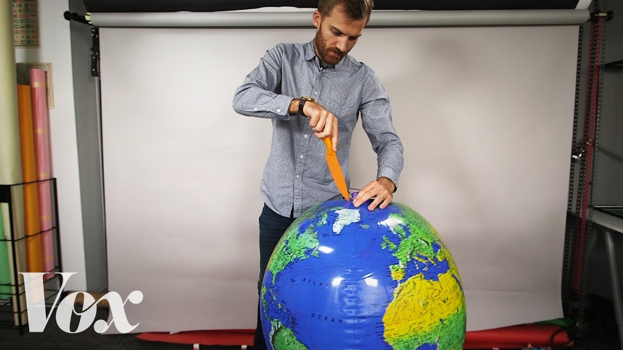
- 🔮 All maps are selective and distorted to some extent due to the challenge of representing a three-dimensional Earth on a two-dimensional surface.
- 🌐 The script discusses five types of map projections, each with its own strengths and distortions, including the Mercator, Peters, Goode's homolosine, polar, and Robinson projections.
Q & A
What is the main purpose of maps in the context of AP Human Geography?
-The main purpose of maps in AP Human Geography is to depict spatial patterns and to serve as tools for understanding how and where different geographic features occur on the Earth's surface.
What does the term 'spatial patterns' refer to in geography?
-Spatial patterns in geography refer to the study of how and where different geographic features are arranged on the Earth's surface, focusing on their distribution and organization.
What are the four distinct kinds of spatial patterns that can be represented on maps?
-The four distinct kinds of spatial patterns are absolute distance, relative distance, absolute direction, relative direction, clustering and dispersal, and elevation.
What is the difference between absolute distance and relative distance on maps?
-Absolute distance measures the physical distance between two points, such as in feet, miles, or kilometers. Relative distance, on the other hand, measures social, cultural, or political differences or similarities between two locations.
Can you explain the concept of 'absolute direction' on maps?
-Absolute direction on maps refers to the cardinal directions of north, south, east, and west, which is a fixed reference to the Earth's orientation.
What is a 'choropleth map' and how is it used in geography?
-A choropleth map is a type of thematic map that uses different colors to represent data from specific geographic regions, allowing for the visualization of data distribution across areas.
What is a 'cartogram' and how does it differ from a traditional map?
-A cartogram is a thematic map that distorts the size of geographic shapes to display differences in data, unlike traditional maps that maintain the actual size and shape of geographic areas.
What is the purpose of a 'graduated symbol map' or 'proportional map'?
-A graduated symbol map or proportional map uses symbols that grow in size proportionate to the data they represent, allowing for a visual representation of the magnitude of data points across a geographic area.
What is the significance of the 'dot distribution map' in the historical context of disease outbreaks?
-The dot distribution map was significant in the historical context of disease outbreaks as it helped in identifying spatial patterns of infections, such as the cholera outbreak in London, by plotting the locations of infections and revealing the source of the outbreak.
What is an 'isoline map' and what type of data is it commonly used to depict?
-An isoline map uses lines to depict changes in data, most commonly used to represent changes in elevation or other continuous data across a geographic area.
Why are all maps considered selective and distorted in some way?
-All maps are considered selective and distorted because they attempt to represent a three-dimensional Earth on a two-dimensional surface, which inherently involves some form of distortion or simplification of the actual geographic features.
What are the five map projections mentioned in the script, and what is the main distortion associated with each?
-The five map projections mentioned are the Mercator Projection (distorts size at higher latitudes), Peter's Projection (accurate land size but distorted shape), Goode Homolosine Projection (accurate land shape but broken oceans), Polar Projection (accurate near the center but distorted at the edges), and Robinson Projection (minimal distortion across the map).
Outlines
🌏 Introduction to AP Human Geography and the Importance of Maps
In this introductory paragraph, Steve Heimler presents himself as the instructor for the AP Human Geography course and likens the class to a daunting yet fascinating challenge. He emphasizes the central role of maps in human geography, explaining that they are essential tools for depicting spatial patterns on Earth's surface. Heimler introduces the concept of spatial patterns, which relate to the arrangement of geographic features, and distinguishes between absolute and relative distance, as well as absolute and relative direction. He also outlines the four types of spatial patterns: absolute distance, relative distance, absolute direction, relative direction, clustering, dispersal, and elevation. Heimler then discusses common map features such as scale, direction indicators, and the representation of the Earth's surface at various scales. The paragraph concludes with an introduction to two broad categories of maps: reference maps and thematic maps, setting the stage for a deeper exploration of these concepts in the course.
🗺️ Understanding Thematic Maps and Map Projections
The second paragraph delves into the specifics of thematic maps, which are designed to display geographic information through various visualization techniques. Heimler outlines five types of thematic maps: choropleth maps that use color to represent data from specific regions; cartograms that distort geographic shapes based on data differences; graduated symbol or proportional maps that use symbols scaled to represent data values; dot distribution maps that use dots to indicate data points, exemplified by John Snow's mapping of a cholera outbreak in London; and isoline maps that depict data changes through lines, often used for elevation changes. The instructor also addresses the inherent selectivity and distortion in maps due to the challenge of representing a three-dimensional Earth on a two-dimensional surface. He introduces five map projections: the Mercator Projection known for its directional accuracy but size distortion at the poles; the Peters Projection that aims for accurate landmass size but distorts shape; the Goode's Homolographic Projection that maintains landmass shape but disrupts ocean continuity; the Polar Projection that offers accurate directions and shapes near the center but distorts at the edges; and the Robinson Projection, a compromise that distributes distortion evenly across the map. Heimler wraps up by encouraging students to utilize his review guide for excelling in the course and exam.
Mindmap
Keywords
💡AP Human Geography
💡Spatial Patterns
💡Absolute Distance
💡Relative Distance
💡Absolute Direction
💡Relative Direction
💡Clustering and Dispersal
💡Elevation
💡Map Scale
💡Reference Maps
💡Thematic Maps
💡Map Projections
Highlights
Introduction to AP Human Geography and the importance of maps in understanding spatial patterns.
Explanation of spatial patterns as the arrangement of geographic features on Earth's surface.
Definition of absolute distance and its representation on maps.
Introduction of relative distance, which measures social, cultural, or political differences.
Description of absolute direction as cardinal directions on maps.
Concept of relative direction, which describes locations in reference to one another.
Explanation of clustering and dispersal as spatial patterns on maps.
Importance of elevation in maps to measure the height of geographic features.
Identification of common map features such as scale, direction, and representation of the Earth's surface.
Differentiation between reference maps and thematic maps.
Description of choropleth maps for visualizing data from specific geographic regions.
Introduction of cartograms that distort geographic shapes to display data differences.
Explanation of graduated symbol maps, also known as proportional maps, for representing data with symbols.
Use of dot distribution maps to visualize the location of data points, such as disease outbreaks.
Introduction of isoline maps for depicting changes in data, often used for elevation changes.
Discussion on the selectivity and distortion inherent in all maps due to the representation of a 3D object on a 2D surface.
Overview of different map projections, including Mercator, Peter's, Goode's Homolosine, Polar, and Robinson projections, and their respective distortions.
Final summary of the importance of understanding map projections and their distortions in geography.
Transcripts
Browse More Related Video


5.0 / 5 (0 votes)
Thanks for rating: