Visually assessing standard deviation | AP Statistics | Khan Academy
TLDRThe video script provides an educational explanation of standard deviation through the use of dot plots. It emphasizes that standard deviation is a measure of the typical distance of data points from the mean. The script guides viewers to order a series of dot plots from the largest to the smallest standard deviation. It clarifies that the largest standard deviation occurs when data points are further from the mean, while the smallest occurs when they are closer. The mean in the examples is centered, making the spread of the data points the key factor. The script also distinguishes between the concepts of moving data points closer to or further from the mean and how this affects the standard deviation. It concludes with an exercise where viewers are encouraged to order additional dot plots based on their standard deviation.
Takeaways
- 📊 **Dot Plots Comparison**: The task involves ordering dot plots from the largest to the smallest standard deviation.
- 📈 **Standard Deviation Definition**: Standard deviation is a measure of the typical distance of data points from the mean.
- 🔍 **Mean Position**: In the examples, the mean is assumed to be centered between 50 and 100, around 75.
- 📌 **Spread of Data Points**: The spread of data points around the mean determines the standard deviation; wider spread indicates a larger standard deviation.
- 🔄 **Data Point Movement**: Moving data points further from the mean increases the standard deviation, while moving them closer decreases it.
- 📉 **Largest Standard Deviation**: The dot plot with data points furthest from the mean will have the highest standard deviation.
- 📈 **Smallest Standard Deviation**: Conversely, the dot plot with data points closest to the mean will have the smallest standard deviation.
- 👀 **Visual Estimation**: Eyeballing the distance of data points from the mean can help in ordering the dot plots.
- ⚖️ **Mean Differences**: Even if the means are different, the relative distance of data points from their respective means is what matters for standard deviation.
- ✋ **Interactive Ordering**: On platforms like Khan Academy, one can interactively order the dot plots for better visualization.
- 🔢 **Data Points Count**: The number of data points away from the mean also contributes to the perception of standard deviation.
Q & A
What does a dot plot represent in the context of the provided transcript?
-A dot plot represents a different set of data, visually showing the distribution of data points.
What is the task given to the viewer in the video?
-The task is to order the dot plots from the largest standard deviation to the smallest standard deviation.
How is the standard deviation described in the video?
-The standard deviation is described as a measure of the typical distance from each of the data points to the mean.
What does the mean in the examples appear to be?
-In the examples provided, the mean appears to be right in the center, around 75.
How does the spread of data points relate to the standard deviation?
-The spread of data points relates to the standard deviation in that a larger spread indicates a higher standard deviation, while a smaller spread indicates a lower standard deviation.
What is the significance of the data points that are far from the mean?
-Data points that are far from the mean contribute to a higher standard deviation, indicating greater variability in the data set.
How does moving a data point closer to the mean affect the standard deviation?
-Moving a data point closer to the mean decreases the typical distance from the middle, thus reducing the standard deviation.
What is the difference between the two data points mentioned in the transcript?
-The difference is that moving one data point further away from the mean increases the standard deviation, while moving it closer decreases the standard deviation.
What is the strategy for ordering the dot plots in the second example?
-The strategy is to estimate the mean for each dot plot and then determine how far the typical data points are from their respective means to order them by standard deviation.
How does the viewer determine the largest standard deviation in the second set of dot plots?
-The viewer determines the largest standard deviation by identifying the dot plot where the typical data points appear furthest from the mean.
What is the final ordering of the dot plots in the second example according to the video?
-The final ordering is from largest to smallest standard deviation: the middle dot plot, the top dot plot, and the bottom dot plot.
Outlines
📊 Understanding Standard Deviation Through Dot Plots
The video script begins with an introduction to the concept of standard deviation using dot plots. The instructor asks viewers to order the provided dot plots from the largest to the smallest standard deviation. The standard deviation is explained as a measure of the typical distance of data points from the mean. The mean is identified as being centrally located in the range of 50 to 100, around 75. The first dot plot is analyzed, showing a spread of data points with some being far from the mean and others closer, indicating a higher standard deviation for this plot. The instructor emphasizes the importance of recognizing the difference between moving a data point closer to or further from the mean and its effect on the standard deviation.
Mindmap
Keywords
💡Dot Plot
💡Standard Deviation
💡Mean
💡Data Points
💡Spread
💡Typical Distance
💡Ordering
💡Eyeballing
💡Distance from the Mean
💡Data Set
💡Variation
Highlights
The task involves ordering dot plots from largest to smallest standard deviation.
Standard deviation is a measure of the typical distance of data points from the mean.
Largest standard deviation means data points are further from the mean.
Smallest standard deviation means data points are closer to the mean on average.
In the examples, the mean appears to be around 75 for all dot plots.
Spread of data points from the mean determines the standard deviation.
Dot plot 1 has data points spread far apart, indicating a higher standard deviation.
Moving data points further from the mean increases the standard deviation.
Dot plot 2 has the smallest standard deviation as data points are closer to the mean.
Different means among dot plots need to be considered when comparing standard deviations.
Dot plot 2 has the largest standard deviation as data points are furthest from the mean.
Moving data points closer to the mean decreases the standard deviation.
Dot plot 3 has the fewest data points away from the mean, so it has the smallest standard deviation.
Ordering involves comparing how data points would move towards or away from the mean.
Dot plot 1 has the largest standard deviation with data points spread the widest.
Dot plot 3 has the smallest standard deviation with data points closest to the mean.
Visual comparison of data point spread from the mean is key to ordering dot plots by standard deviation.
Understanding how moving data points affects standard deviation is crucial for solving the task.
The video provides a step-by-step guide to ordering dot plots based on standard deviation.
Transcripts
Browse More Related Video

Standard Deviation and Variance

What is Standard Deviation and Mean Absolute Deviation | Math, Statistics for data science, ML
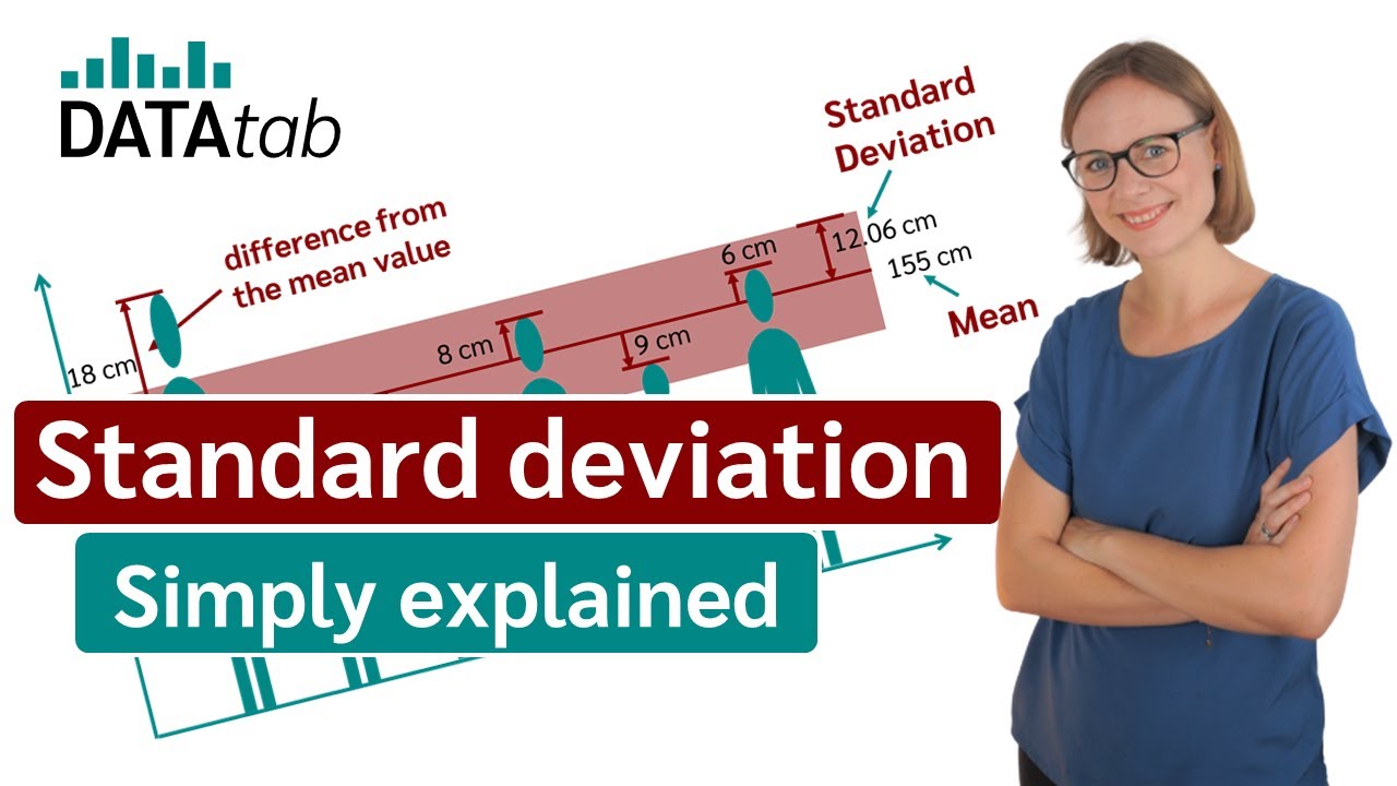
Standard deviation (simply explained)
Standard Deviation & Mean Absolute Deviation Explained - 6-8-19]
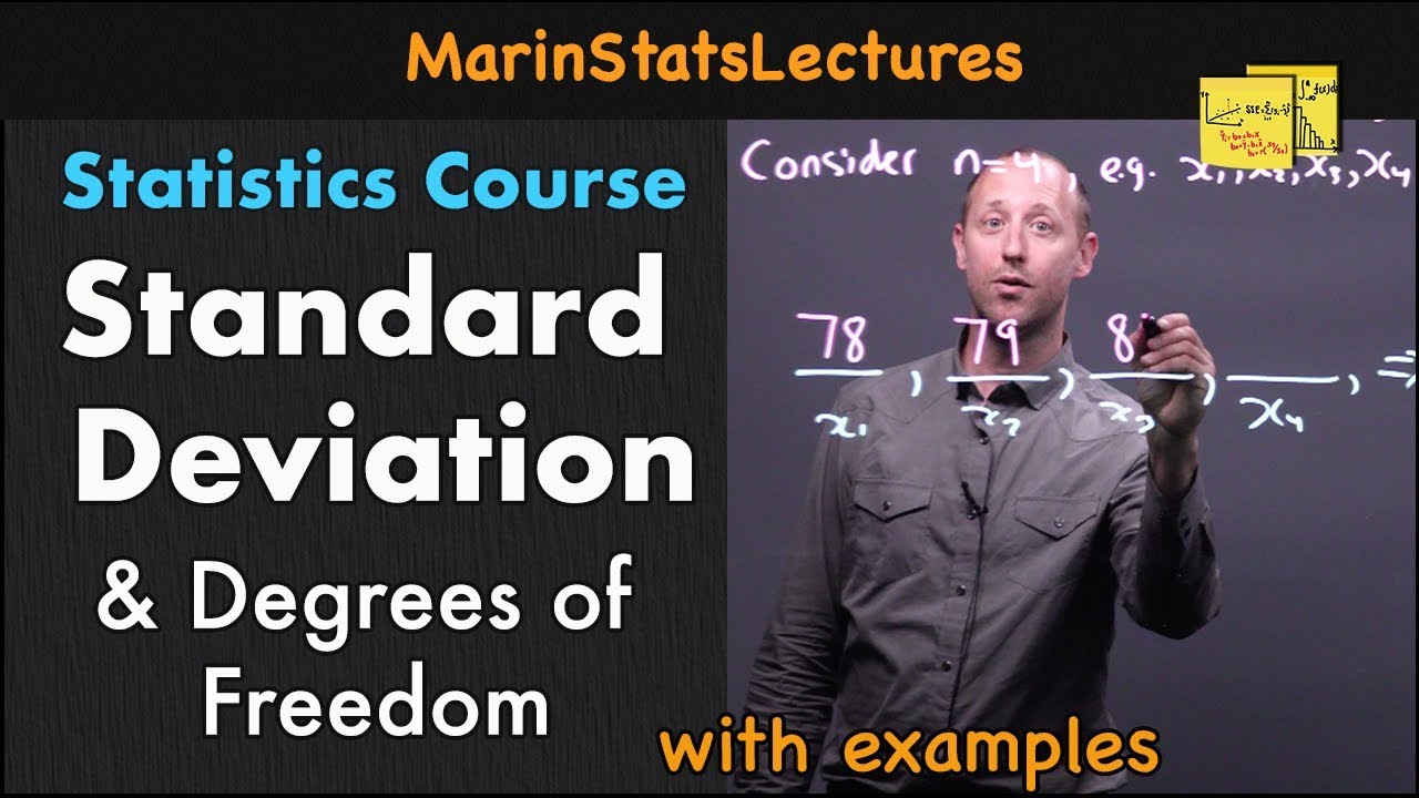
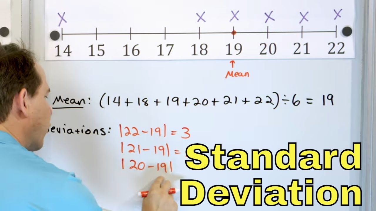
Standard Deviation & Degrees of Freedom Explained | Statistics Tutorial | MarinStatsLectures

Mean Absolute Deviation
5.0 / 5 (0 votes)
Thanks for rating: