✏️ How To Design A Modern Logo | Start To Finish
TLDRIn this engaging video, the designer takes viewers through the creative process of logo design, using a fictional company called 'Electro Mass' as an example. The company, based in the UK, is in the electricity meter reading business and desires a logo with a heritage feel. The video begins with brainstorming ideas, emphasizing the use of blue or green to convey a corporate image. Sketching is a key part of the process, where the designer explores various iterations of the letter 'E' and incorporates elements of electricity like zigzags and lightning. The designer then transitions to Adobe Illustrator to refine the sketches into digital concepts, focusing on simplicity and balance. Throughout the video, the emphasis is on generating a variety of ideas, experimenting with shapes, and finding a design that stands out while aligning with the company's identity. The video also highlights the importance of presenting multiple options to the client and the iterative nature of logo design. Finally, the designer shares resources for inspiration, such as the book 'Logo Modernism,' and encourages viewers to explore their own logo design skills. The video is sponsored by Squarespace, which is praised for its user-friendly website building platform, offering customizable templates and e-commerce capabilities.
Takeaways
- 🎨 The process of logo design involves brainstorming and sketching ideas quickly without focusing on precision to generate a variety of concepts.
- 🖥️ Transitioning from hand-drawn sketches to digital format using software like Adobe Illustrator is a crucial step for refining and experimenting with different logo variations.
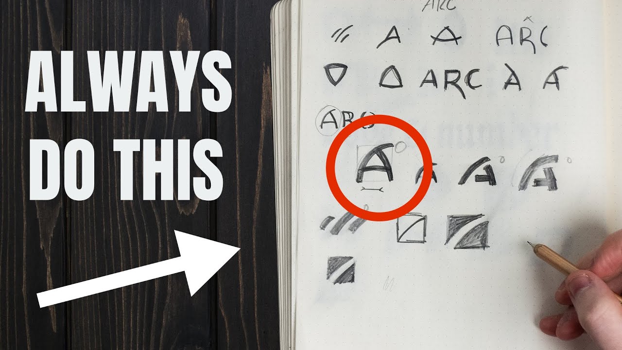
- 🌐 The importance of using a grid system in design to ensure alignment and balance of shapes within the logo.
- 🔵 The significance of color choice in logos, particularly for corporate branding, where blue and green are often associated with trust and the environment.
- ⚡️ The incorporation of thematic elements, such as electricity and lightning, to reflect the company's industry in the logo design.
- 👀 The value of seeking inspiration from existing logos and design principles, as demonstrated by the reference to the 'Logo Modernism' book.
- 🔍 The iterative nature of logo design, where multiple variations are created and evaluated before settling on a final design.
- 📝 The necessity of documenting the design process and ideas, both for the designer's reference and for client presentations.
- 🏛️ The desire to give the logo a heritage feel to reflect the company's longevity in business, even if it's a modern company.
- 🛠️ The designer's preference for a vintage style combined with modern and bold elements in logo design.
- 📈 The emphasis on simplicity in logo design, ensuring the logo is easily recognizable and memorable.
Q & A
What is the main topic of the video?
-The main topic of the video is the process behind creating logos, demonstrated through the design process for a fake company called Electro Mass.
What is the company Electro Mass supposed to represent?
-Electro Mass is a fictional electricity meter reading company or an electricity provider, with a desire for a heritage feel to their logo.
What is the first step the speaker takes in their logo design process?
-The first step is to write down ideas and notes on a notepad, considering the company's industry and desired style.
What color palette is suggested for the logo design?
-The suggested color palette includes blue and green, as they are considered corporate colors, and are also associated with electricity.
What does the speaker suggest for the final logo design structure?
-The speaker suggests a structure that includes an icon or mark, accompanied by some typeface, which will then be used for the branding.
What tool does the speaker use to sketch initial logo ideas?
-The speaker uses a dot grid sketchbook to sketch initial logo ideas.
How does the speaker approach the sketching of ideas?
-The speaker approaches sketching by playing around with different forms and shapes, focusing on getting ideas out quickly without worrying about precision.
What does the speaker recommend doing after sketching ideas?
-After sketching, the speaker recommends looking at some inspiration, such as a book on logo modernism, to gather ideas and refine the sketches.
What software does the speaker use to digitize and refine the logo designs?
-The speaker uses Adobe Illustrator to digitize and refine the logo designs.
What is the speaker's approach to creating variations of the logo?
-The speaker's approach involves creating different shapes and forms of the logo, exploring various options, and then selecting the ones that work best.
What is the significance of using a grid system in the design process?
-Using a grid system helps to ensure that the logo elements are aligned properly and that the design is balanced and symmetrical.
How does the speaker plan to present the logo ideas to the client?
-The speaker plans to present a few variations of the logo to the client, explaining the thought process and design choices behind each one.
What is the purpose of the video according to the speaker?
-The purpose of the video is to demonstrate the logo design process and to inspire viewers to create their own logo designs.
Why does the speaker mention Squarespace at the end of the video?
-The speaker mentions Squarespace because the video is sponsored by them, and they promote the platform for its ease of use in creating websites.
Outlines
🎨 Logo Design Process Introduction
The video begins with the host discussing their process for creating logos. They are going to demonstrate this by designing a logo for a fictional company called 'Electro Mass', which is a UK-based electricity meter reading company. The client wants a logo with a heritage feel. The host emphasizes the importance of brainstorming ideas on a notepad, considering color choices like blue or green for a corporate look, and sketching out various ideas quickly without focusing on precision. The aim is to explore different design options and play around with the letter 'E' to create an iconic logo that stands out.
🖥️ Transitioning to Digital Design
The host moves on to the next stage of the logo design process, which involves transferring the hand-drawn ideas into Adobe Illustrator on a computer. They discuss the value of generating many ideas, about 10 to 15, to explore various shapes and forms. The host selects a few sketches they like and starts to refine them digitally. They mention creating different variations of a simple logo, playing with shapes, and aiming for a design that looks decent and can be presented to a client for feedback. The process involves a lot of experimentation with shapes and forms to see what works best.
🎨 Exploring Color and Vintage Inspiration
The host talks about exploring different colors that could be used in the logo, specifically mentioning blue and green, which are associated with electricity. They proceed to manipulate the 'E' shape, adjusting it to fit into a square and create a vintage, bold look. The host also references a book called 'Logo Modernism' for inspiration, which features logos from the 1920s to the 1980s. They stress that this video is not a real client project but rather an exercise to explore logo design with a fake company. The host thanks the audience for watching, gives a shout-out to Squarespace for sponsoring the video, and encourages viewers to share their own logo designs.
Mindmap
Keywords
💡Logo Design Process
💡Squarespace
💡Electro Mass
💡Heritage Feel
💡Sketchbook
💡Adobe Illustrator
💡Corporate Colour
💡Icon and Typography
💡Zigzag and Lightning
💡Vintage Style
💡Grid System
Highlights
The speaker shares their process behind creating logos, using a hypothetical company called Electro Mass as an example.
Electro Mass is a UK-based company providing electricity services, seeking a logo with a heritage feel.
The importance of using a notepad to brainstorm ideas is emphasized, with the suggestion of using a dot grid sketchbook for precision.
Blue and green are suggested as primary colors for the logo due to their association with electricity and corporate branding.
The concept of a logo consisting of an icon and accompanying typography is introduced.
The speaker demonstrates the initial sketching process, emphasizing the need for rough and quick ideation.
Different variations of the letter 'E' are explored to symbolize electricity and the company name Electro.
The use of zigzags and lightning motifs to represent the electricity theme in the logo design.
The speaker discusses the importance of exploring different design options without feeling pressured for perfection.
The process of moving from hand-drawn sketches to digital refinement using Adobe Illustrator is described.
Creating multiple variations of the logo is highlighted as a key step in the design process.
The use of a grid system in Illustrator for aligning and refining logo shapes is explained.
The concept of keeping designs simple and focused is emphasized for effective logo communication.
The speaker shares their preference for vintage-style logos and how they draw inspiration from the book 'Logo Modernism'.
The importance of presenting the logo design process and ideas to the client is discussed, rather than just the final product.
The video is sponsored by Squarespace, which the speaker uses for their website and recommends for its ease of use and customization.
A call-to-action is made for viewers to share their logo designs and to try out the Squarespace platform.
The speaker clarifies that the logo design process shown is for a fictional company and is meant for educational purposes.
Transcripts
Browse More Related Video


5.0 / 5 (0 votes)
Thanks for rating: