ROC and AUC, Clearly Explained!
TLDRIn this StatQuest video, Josh Starmer explains the concepts of Receiver Operating Characteristic (ROC) and Area Under the Curve (AUC) using logistic regression as an example. The video clarifies how ROC graphs visually summarize the performance of a classification model across different thresholds, with the true positive rate on the y-axis and the false positive rate on the x-axis. AUC is introduced as a metric to easily compare different ROC curves, where a higher AUC indicates better model performance. The video also touches on the importance of selecting the right threshold based on the context, such as prioritizing true positives in critical classification scenarios like disease detection.
Takeaways
- 📊 The script introduces ROC (Receiver Operating Characteristic) and AUC (Area Under the Curve), key concepts in evaluating the performance of classification models like logistic regression.
- 🐭 The example used in the video is based on logistic regression and categorizes mice into 'obese' and 'not obese' based on their weight.
- 📈 The logistic regression model converts the Y-axis into the probability of a mouse being obese, allowing for probabilistic predictions.
- 🔼 A classification threshold, such as 0.5, is used to turn probabilities into classifications, with higher thresholds increasing specificity and lowering sensitivity.
- 📊 The effectiveness of the logistic regression model is tested using a confusion matrix, which separates true positives, false positives, true negatives, and false negatives.
- 💡 Sensitivity and specificity are calculated from the confusion matrix to evaluate the model, with sensitivity indicating the proportion of correctly classified obese samples and specificity indicating the proportion of correctly classified non-obese samples.
- 🎯 ROC graphs provide a visual summary of all possible thresholds, with the Y-axis showing the true positive rate (sensitivity) and the X-axis showing the false positive rate (1 - specificity).
- 🌐 The green diagonal line on the ROC graph represents the point where the true positive rate equals the false positive rate, indicating an equal proportion of correctly and incorrectly classified samples.
- 🔄 By plotting points on the ROC graph for different thresholds, one can compare the effectiveness of various thresholds without having to sort through multiple confusion matrices.
- 🏆 AUC is a metric that allows for easy comparison between different ROC curves, with a higher AUC indicating a better performing model.
- 🔍 Precision is introduced as an alternative metric to the false positive rate, especially useful when dealing with imbalanced datasets, such as rare diseases.
Q & A
What do ROC and AUC stand for?
-ROC stands for Receiver Operating Characteristic, and AUC stands for Area Under the Curve. They are metrics used to evaluate the performance of a binary classification model.
What is the significance of the confusion matrix in evaluating logistic regression?
-The confusion matrix is crucial in evaluating logistic regression because it summarizes the performance by showing the number of true positives, false positives, true negatives, and false negatives. This helps in calculating sensitivity and specificity, which are key to understanding the model's accuracy.
How does logistic regression convert the Y-axis in the context of the data provided?
-In the context of the data provided, logistic regression converts the Y-axis to represent the probability that a mouse is obese based on its weight.
What is the threshold used to classify mice as obese or not obese in the example?
-In the example, a threshold of 0.5 is used to classify mice as obese (if the probability of being obese is greater than 0.5) or not obese (if the probability is less than or equal to 0.5).
How does changing the classification threshold affect the number of false positives and false negatives?
-Lowering the threshold increases the number of true positives (correctly classified obese mice) but also increases the number of false positives (non-obese mice incorrectly classified as obese). Conversely, raising the threshold decreases false positives but can increase the number of false negatives (obese mice incorrectly classified as not obese).
What is the purpose of a ROC graph?
-A ROC graph provides a simple way to summarize the performance of a classification model across all possible thresholds. It plots the true positive rate against the false positive rate, allowing for easy comparison of different models or thresholds.
What does the AUC value represent?
-The AUC value represents the likelihood that the model will rank a randomly chosen positive instance higher than a randomly chosen negative instance. A higher AUC indicates better model performance, with 1 being perfect and 0.5 being equivalent to random guessing.
How can you determine the optimal threshold using the ROC graph?
-The optimal threshold can be determined by finding the point on the ROC graph where the true positive rate is maximized while the false positive rate is minimized. This is typically the point furthest from the diagonal line, indicating the best balance between correctly classifying positive and negative instances.
What is the difference between precision and the false positive rate?
-Precision is the proportion of positive results that were correctly classified, calculated as true positives divided by the sum of true positives and false positives. It focuses on the accuracy of positive predictions. The false positive rate, on the other hand, measures the proportion of negatives that were incorrectly classified as positives.
Why might precision be more useful than the false positive rate in certain situations?
-Precision might be more useful than the false positive rate when studying a rare condition or in situations where there are many more negative instances than positive ones. This is because precision does not include the number of true negatives in its calculation and is therefore less affected by the imbalance in the distribution of instances.
How does the ROC curve help in comparing different classification methods?
-The ROC curve allows for the comparison of different classification methods by plotting the true positive rate against the false positive rate for each method. A higher AUC value indicates a better performing method, as it suggests a greater ability to correctly classify instances across all thresholds.
Outlines
📊 Introduction to ROC and AUC
This paragraph introduces the concepts of Receiver Operating Characteristic (ROC) and Area Under the Curve (AUC). It explains that these metrics are built upon the foundation of the confusion matrix and the concepts of sensitivity and specificity. The paragraph sets the stage for a detailed discussion on ROC and AUC by using logistic regression as an example, emphasizing the importance of understanding the basics of these concepts.
🔍 Setting Classification Thresholds
The paragraph discusses the process of setting classification thresholds for logistic regression models. It explains how a threshold of 0.5 is used to classify mice as obese or not obese based on their weight. The paragraph also introduces the idea of adjusting the threshold to balance true positives and false positives, using different scenarios to illustrate the impact of threshold selection on classification outcomes.
📈 Understanding ROC Graphs
This section delves into the construction and interpretation of ROC graphs. It explains how the true positive rate (sensitivity) is plotted on the y-axis and the false positive rate (1 - specificity) on the x-axis. The paragraph uses the example data to demonstrate how varying thresholds affect the classification results and how these results are visualized on the ROC graph. It also introduces the concept of the green diagonal line, which represents a balance between true positive and false positive rates.
🏆 Evaluating Model Performance with AUC
The paragraph explains the significance of the Area Under the Curve (AUC) in evaluating the performance of classification models. It describes AUC as a metric that simplifies the comparison between different ROC curves, with a higher AUC indicating better model performance. The paragraph also touches on alternative metrics like precision, which may be more relevant in certain contexts, such as when studying rare diseases with imbalanced datasets.
🎉 Conclusion and Further Exploration
In the concluding paragraph, the video script summarizes the key points discussed about ROC curves and AUC. It emphasizes the practical application of these metrics in identifying the optimal threshold for classification decisions and in comparing different categorization methods. The paragraph ends with a call to action for viewers to subscribe for more content and offers ways to support the channel through merchandise and music purchases.
Mindmap
Keywords
💡ROC
💡AUC
💡Logistic Regression
💡Threshold
💡Confusion Matrix
💡Sensitivity
💡Specificity
💡True Positives
💡False Positives
💡Precision
💡Model Performance
Highlights
The video introduces ROC (Receiver Operating Characteristic) and AUC (Area Under the Curve), explaining their importance in evaluating the performance of classification models.
ROC and AUC are based on the confusion matrix, sensitivity, and specificity, which are fundamental concepts to understand before diving into ROC and AUC.
The example used in the video is based on logistic regression, but it's noted that ROC and AUC apply to more than just logistic regression models.
The data visualization shows two categories: obese and not obese mice, with weight as the predictor variable.
Logistic regression is used to convert the y-axis into the probability that a mouse is obese.
A classification threshold is set at 0.5 to determine if a mouse is obese or not based on its probability.
The effectiveness of logistic regression is tested with known obese and non-obese mice, resulting in a confusion matrix.
Sensitivity and specificity are calculated from the confusion matrix to evaluate the logistic regression model.
Changing the threshold for obesity classification affects the number of true positives, false positives, and false negatives.
ROC graphs provide a simple way to summarize all the information from different thresholds without overwhelming confusion matrices.
The true positive rate (sensitivity) is shown on the y-axis, and the false positive rate (1 - specificity) on the x-axis of the ROC graph.
The green diagonal line on the ROC graph represents where the true positive rate equals the false positive rate.
AUC allows for easy comparison between different ROC curves, with a higher AUC indicating a better model.
Precision can sometimes be used as an alternative to the false positive rate, especially when studying rare diseases with imbalanced datasets.
ROC curves and AUC help identify the best threshold for decision-making and determine which categorization method is superior.
The video concludes by emphasizing the practical applications of ROC and AUC in model evaluation and decision-making processes.
Transcripts
Browse More Related Video

The ROC Curve (Receiver-Operating Characteristic Curve) — Topic 84 of Machine Learning Foundations

ROC Curves

Finding the Area Under the ROC Curve — Topic 91 of Machine Learning Foundations
Machine Learning Fundamentals: Sensitivity and Specificity
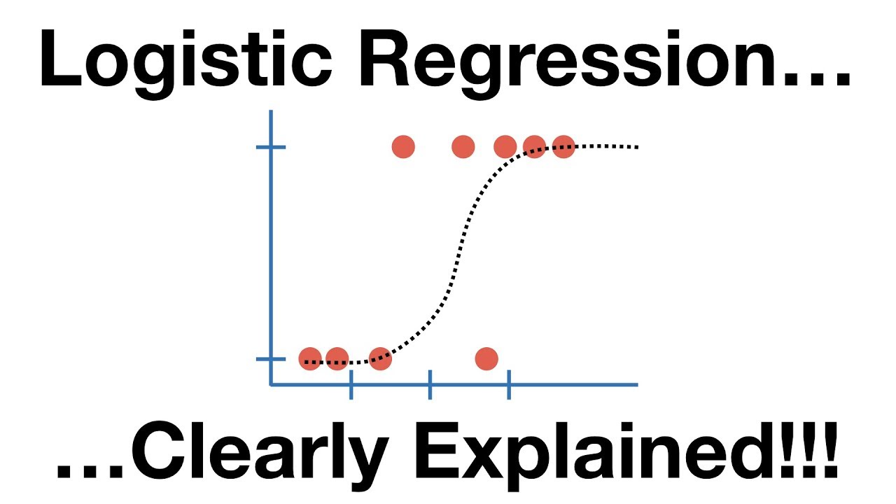
StatQuest: Logistic Regression

What Integral Calculus Is — Topic 85 of Machine Learning Foundations
5.0 / 5 (0 votes)
Thanks for rating: