Bar Chart, Pie Chart, Frequency Tables | Statistics Tutorial | MarinStatsLectures
TLDRThe transcript discusses methods for summarizing categorical variables, using a smoking status example with a sample size of 200. It highlights the use of frequency tables, proportions, and percentages to understand distribution. The importance of using bar charts and pie charts for visualization is emphasized, with a preference for 2D charts over 3D due to their potential to misrepresent data. The key takeaway is to count occurrences in each category and convert them into proportions or percentages for effective data summarization.
Takeaways
- 📊 To summarize a categorical variable, count the number of individuals in each category and then express these counts as frequencies, proportions, or percentages.
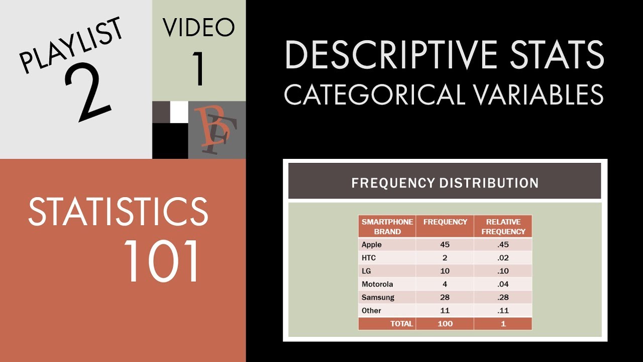
- 🔢 For a sample of 200 individuals, with 110 never smokers, 50 past smokers, and 40 current smokers, the proportions would be 0.55, 0.25, and 0.20 respectively, and the percentages would be 55%, 25%, and 20%.
- 📈 A frequency table, also known as a frequency distribution, is a useful tool to visualize the distribution of cases among the different levels of a categorical variable.
- 🎯 With larger sample sizes, reporting proportions or percentages is often more meaningful than frequencies, as it provides a clearer picture of the distribution.
- 📊 Bar charts and pie charts are common graphical representations for summarizing categorical data, with the x-axis typically representing the variable categories and the y-axis representing frequency, proportion, or percentage.
- 🔧 When creating a bar chart, the bars should be separated to clearly indicate that the categories are distinct and non-continuous.
- 🍕 A pie chart should have slices proportional to the percentage of the sample each category represents, providing a visual summary of the distribution.
- 🚫 Avoid 3D pie charts as they can visually distort the actual proportions, making some slices appear larger than they should be.
- 📊 For smaller sample sizes, reporting frequencies may be more meaningful and easier to interpret than percentages or proportions, which can be misleading.
- 💡 The key takeaway for summarizing categorical variables is to count the individuals in each category and convert these counts into proportions or percentages for easy understanding and comparison.
Q & A
How is a categorical variable summarized graphically and numerically?
-A categorical variable is summarized by counting the number of individuals in each category, and then representing this data using frequencies, relative frequencies (proportions), or percentages. Graphically, this data can be represented using bar charts or pie charts.
What is the significance of a frequency table in summarizing categorical data?
-A frequency table is crucial for summarizing categorical data as it displays the count of individuals in each category. This helps in understanding the distribution of the cases among the different levels or categories of the categorical variable.
How do you calculate the proportion or relative frequency for a categorical variable?
-To calculate the proportion or relative frequency, divide the number of individuals in a category by the total sample size and multiply by 100 to get a percentage. For example, if 110 out of 200 individuals are never smokers, the proportion is (110/200) * 100 = 55%.
Why is it important to consider sample size when reporting frequencies or percentages?
-Sample size is important because with larger samples, reporting proportions or percentages is more meaningful. With smaller samples, reporting frequencies can be more interpretable and less misleading than percentages or proportions, which might not accurately represent the distribution due to small numbers.
What are the differences between a bar chart and a pie chart in representing categorical data?
-A bar chart has categories along the x-axis and frequencies, proportions, or percentages along the y-axis, showing the distribution of categories. A pie chart represents the entire sample as a circle, with each category as a slice of the pie, sized proportionally to the percentage it represents in the sample.
Why is it recommended to avoid 3D pie charts?
-3D pie charts are often misleading because they can distort the perception of the size of the categories due to the added depth, making some slices appear larger than they actually are. This violates the principle of accurately representing data in a plot.
How does the distribution of a categorical variable affect the choice of graphical representation?
-The distribution of a categorical variable, or how cases are spread across categories, influences the choice of graphical representation. For instance, when there are many categories or large sample sizes, using a bar chart or pie chart can provide a clearer visual summary than a simple frequency table.
What is the role of the x-axis and y-axis in a bar chart?
-In a bar chart, the x-axis represents the different categories of the categorical variable, while the y-axis can represent the frequency, proportion, or percentage of individuals in each category, depending on what is being emphasized in the visualization.
How does the spacing of bars in a bar chart contribute to its interpretation?
-The spacing of bars in a bar chart helps to visually separate the categories, indicating that there is no continuity between them. This separation aids in understanding the distinct distribution of individuals across the different levels or categories of the categorical variable.
What are the key takeaways from the discussion on summarizing categorical variables?
-The key takeaways are to count individuals in each category, convert these counts to proportions or percentages, and choose an appropriate graphical representation like a bar chart or pie chart. It's also important to consider sample size and to avoid misleading visual representations, such as 3D pie charts.
How can the choice of graphical representation affect the interpretation of categorical data?
-The choice of graphical representation can significantly affect the interpretation of categorical data. For example, bar charts are good for comparing the distribution across categories, while pie charts provide a quick visual of the proportion of each category in the entire sample. However, certain representations like 3D pie charts can be misleading and distort the true proportions of the categories.
Outlines
📊 Summarizing Categorical Variables: Frequency, Proportion, and Percentage
This paragraph discusses the methods for summarizing categorical or qualitative variables both graphically and numerically. It uses the example of smoking status (never smoker, past smoker, and current smoker) in a sample size of 200 to illustrate the process. The paragraph explains the creation of a frequency table, the calculation of relative frequencies or proportions, and their conversion into percentages. It emphasizes the importance of understanding distribution and the choice between reporting frequencies or proportions depending on the sample size. The paragraph also introduces the concept of a bar chart as a visual representation of the distribution of categorical variables.
🍕 Pie Charts for Visual Representation: When and How to Use Them
This paragraph continues the discussion on visual representation of categorical data by introducing pie charts as an alternative to bar charts. It explains how pie charts work, with the entire circle representing the total sample and each slice representing a category's proportion of the sample. The paragraph provides a step-by-step guide on how to draw a pie chart and the importance of accurately representing proportions. It also cautions against the use of 3D pie charts as they can visually distort the actual proportions, making certain slices appear larger than they are. The paragraph concludes with a recommendation to stick to simple, 2D pie charts for clarity and accuracy.
Mindmap
Keywords
💡Categorical Variable
💡Frequency
💡Proportion
💡Percentage
💡Frequency Table
💡Bar Chart
💡Pie Chart
💡Distribution
💡Sample Size
💡Three-D Pie Charts
Highlights
Summarizing categorical or qualitative variables can be done both graphically and numerically.
For a categorical variable, counting the number of individuals in each category is the most relevant method of summarization.
A frequency table or distribution is used to record the number of occurrences for each category.
Proportions or relative frequencies can be calculated by dividing the count of each category by the total sample size.
Percentages are another way to summarize categorical data, obtained by multiplying the proportion by 100.
The distribution of cases among categories is a key concept in statistics.
Larger sample sizes benefit more from reporting proportions or percentages rather than raw frequencies.
Bar charts and pie charts are common graphical representations for categorical data.
In a bar chart, the x-axis represents the categories and the y-axis represents the frequency, proportion, or percentage.
Pie charts represent the entire sample as a circle, with each category as a slice proportional to its percentage.
3D pie charts can be visually appealing but may misrepresent the true proportions due to optical illusions.
The distribution of individuals among different levels of a categorical variable is crucial in understanding data.
For smaller sample sizes, reporting frequencies may be more meaningful than proportions or percentages.
Visual representations like bar charts and pie charts are useful for understanding large categories or complex data tables.
When creating pie charts, it's recommended to avoid 3D effects to prevent misleading interpretations of the data.
The essence of summarizing categorical variables is to count occurrences and convert them into proportions or percentages.
Transcripts
Browse More Related Video

Descriptive statistics and data visualisation. An introduction to statistics and working with data
Statistics 101: Describing a Categorical Variable
Charts Are Like Pasta - Data Visualization Part 1: Crash Course Statistics #5

Variables and Types of Variables | Statistics Tutorial | MarinStatsLectures
Bar Charts and Pie Charts in R | R Tutorial 2.1 | MarinStatsLectures

Elementary Stats Lesson 2
5.0 / 5 (0 votes)
Thanks for rating: