R programming for beginners – statistic with R (t-test and linear regression) and dplyr and ggplot
TLDRThis video tutorial introduces viewers to statistical analysis using R, a free programming language for statistical and quantitative analysis. The presenter guides through performing a t-test, linear regression, and interpreting results, emphasizing R's ease of use and cost-effectiveness. It also covers advanced data manipulation with the dplyr package and data visualization with ggplot2, demonstrating their application through the Gapminder dataset. The video promotes the University of Edinburgh's online masters programs, highlighting their comprehensive curriculum for learning data science and public health.
Takeaways
- 📊 Learning R for statistical analysis involves understanding how to apply functions to data objects and interpret the results.
- 🧠 Overcoming the initial fear of programming languages like R is crucial, as they are simple to use once you follow the step-by-step guide.
- 💻 R is a free and open-source software environment for statistical computing and graphics, with no hidden costs.
- 🔍 The Gapminder dataset is used for demonstration, allowing viewers to practice along with the tutorial.
- 📈 Functions like summary and attach can be applied to subsets of data or individual variables for analysis.
- 🎯 Data manipulation is made sophisticated with the dplyr package, which introduces new vocabulary and the pipe operator.
- 📊 Data visualization is enhanced with ggplot2, offering a variety of options to represent data graphically.
- 🧪 The t-test is introduced as a statistical method to determine if observed differences are statistically significant or due to chance.
- 📈 Linear regression is briefly touched upon, with an example using life expectancy as the response variable and GDP per capita as the explanatory variable.
- 🌐 The University of Edinburgh is highlighted for offering online distance learning masters programs, including those in public health and data science.
- 🔗 The video encourages further learning through additional resources and courses for those interested in statistical analysis and research methods.
Q & A
What statistical analysis methods are covered in the video?
-The video covers t-tests, linear regression, and data interpretation of results tables. It also introduces the use of dplyr for data manipulation and ggplot2 for data visualization.
What is R in the context of this video?
-R is a programming language used for statistical and quantitative analysis, which is the focus of the video's tutorial.
How does the video address the common perception of programming languages?
-The video acknowledges that programming languages might seem scary and intimidating, but it reassures viewers that R is actually easy and simple to use, especially with the step-by-step guide provided.
What is the significance of the Gapminder dataset used in the video?
-The Gapminder dataset is used as a practical example for teaching statistical analysis. It includes variables such as country, continent, year, life expectancy, population, and GDP per capita, allowing for various types of statistical tests and visualizations.
What is the role of the dplyr package in data analysis?
-The dplyr package is used for sophisticated data manipulation, enabling tasks such as selecting specific variables, filtering rows based on criteria, creating new variables, and summarizing data.
How does ggplot2 enhance data visualization in R?
-ggplot2 is a package for data visualization that allows users to create complex and rich graphical representations of data. It provides a variety of options for mapping variables to aesthetics, applying geometric transformations, and layering data for comprehensive visualizations.
What is the null hypothesis in the context of the t-test explained in the video?
-In the context of the t-test, the null hypothesis is the assumption that there is no difference in the average life expectancy between the populations being compared (e.g., South Africa and Ireland). The t-test is used to determine if the observed difference could be due to chance or if it is statistically significant.
What is the significance of the p-value in statistical testing?
-The p-value represents the probability that the null hypothesis is correct. A very small p-value (e.g., much less than 0.05) indicates that the observed results are unlikely to have occurred by chance, leading to the rejection of the null hypothesis in favor of the alternative hypothesis.
How does the video demonstrate the use of the pipe operator in dplyr?
-The video demonstrates the pipe operator (%) by showing how it allows for chaining commands together. It takes the output from one command (to the left of the pipe) and inputs it as the first argument of the next command (to the right of the pipe), streamlining the data manipulation process.
What is the purpose of the log transformation in data analysis?
-Log transformations are used to stabilize the variance and make the data more linear when dealing with skewed distributions. In the video, a log transformation is suggested for the GDP per capita data to improve the linearity of the relationship with life expectancy.
How does the video illustrate the concept of linear regression?
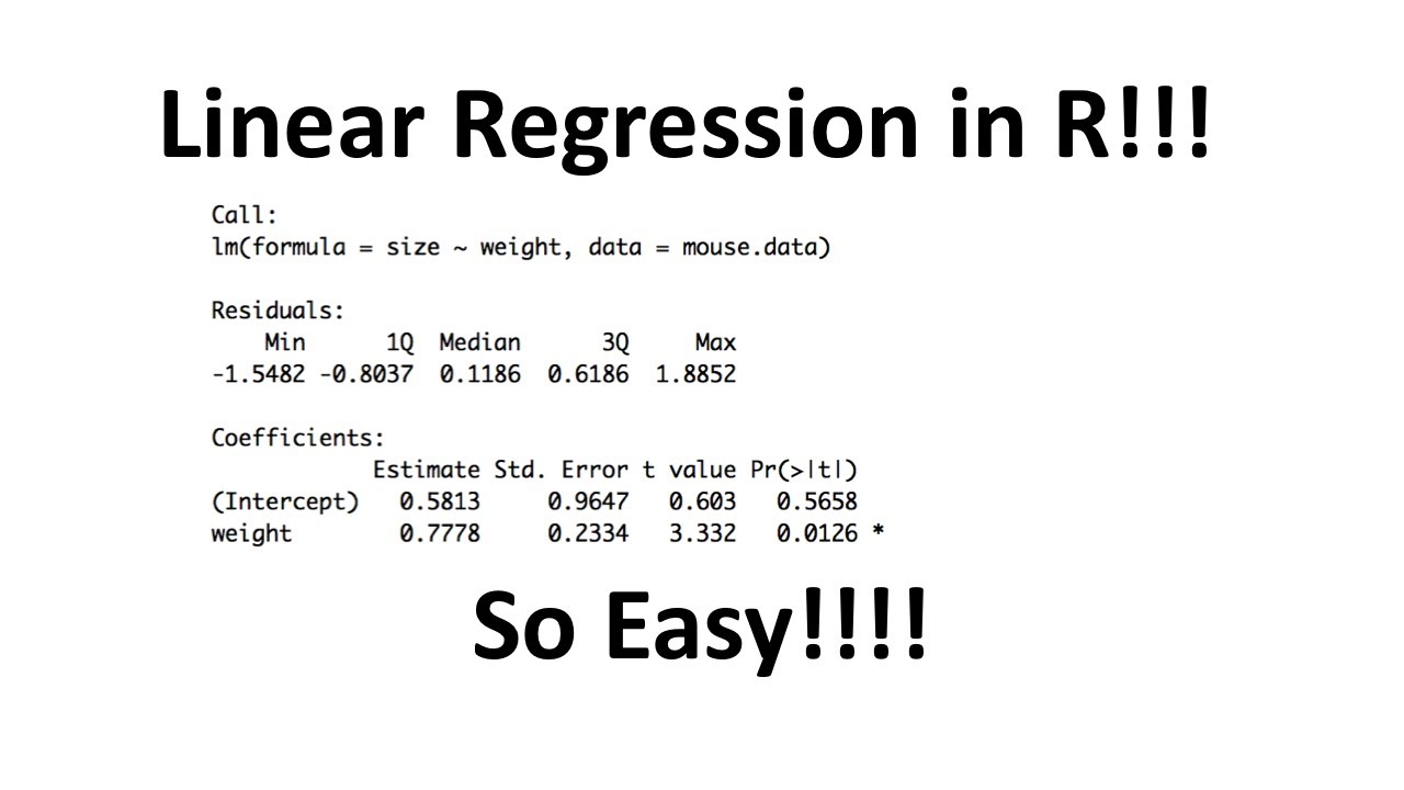
-The video provides a brief overview of linear regression by showing how to create a simple linear model with life expectancy as the response variable and GDP per capita as the explanatory variable. It then extends this to a multivariate analysis by adding additional explanatory variables like population size.
Outlines
📊 Introduction to Statistical Analysis with R
The video begins with an introduction to statistical analysis using the R programming language. The presenter plans to cover various statistical methods including t-tests, linear regression, and result interpretation. Additionally, the use of packages like dplyr for data manipulation and ggplot2 for data visualization is mentioned. The presenter also highlights the benefits of R, such as being free and easy to use, and invites viewers to follow along using a downloadable dataset. The video is sponsored by the University of Edinburgh, which is praised for its online distance learning masters programs, particularly in public health and data science.
🔍 Data Manipulation and Visualization with dplyr and ggplot2
In this section, the presenter delves into data manipulation using the dplyr package and data visualization with ggplot2. The process of installing and loading these packages is explained. The video demonstrates how to select specific variables and filter data based on criteria, such as calculating the average BMI for individuals with blue eyes. The use of the pipe operator for efficient data processing is showcased. The presenter also explains how to create summary statistics and perform a t-test to determine the statistical significance of observed differences, using the example of life expectancy between South Africa and Ireland.
📈 Advanced Data Visualization with ggplot2
The presenter continues with an advanced tutorial on data visualization using ggplot2. After installing the package, the video shows how to create a scatter plot with GDP per capita on the x-axis and life expectancy on the y-axis. The presenter then enhances the plot by adding different colors for continents, making points transparent, and sizing points proportionally to population size. A log transformation is applied to GDP per capita for a more linear representation. The video also demonstrates how to overlay a line of best fit and facet the plot by continent for clearer comparison. The presenter emphasizes the power of ggplot2 in creating rich, multi-variable visualizations.
🧠 Understanding Linear Regression and Further Analysis
The final paragraph focuses on linear regression analysis. The presenter explains the concept of a linear model, which aims to fit the best straight line through the data. A simple linear regression model is demonstrated using life expectancy as the response variable and GDP per capita as the explanatory variable. The summary function is used to interpret the model's output, highlighting the significance of the slope. The presenter also briefly touches on multivariate analysis by adding population as another explanatory variable. The video concludes with a call to action for viewers to explore more videos on research methods and data analysis, and thanks the University of Edinburgh for its support.
Mindmap
Keywords
💡Statistical Analysis
💡R Programming Language
💡t-test
💡Linear Regression
💡Data Visualization
💡ggplot2
💡Data Manipulation
💡dplyr
💡Confidence Interval
💡Null Hypothesis
💡P-value
Highlights
The video teaches statistical analysis using R, a programming language for statistical and quantitative analysis.
It covers t-tests, linear regression, and interpretation of results, providing a comprehensive guide for beginners.
The presenter uses the Gapminder dataset, which can be downloaded for practice along with the video.
R is highlighted as a free tool for statistical analysis, with no hidden costs, making it accessible to everyone.
The video acknowledges the support of the University of Edinburgh, offering online masters programs in public health and data science.
The basics of R are explained, including how to apply functions to objects and manipulate data.
The video introduces the 'dplyr' package for sophisticated data manipulation and the 'ggplot2' package for data visualization.
A step-by-step guide on how to perform a t-test to determine statistical significance is provided.
The concept of null hypothesis and p-values are explained in the context of comparing life expectancies between South Africa and Ireland.
The video demonstrates creating new objects and using the 'attach' function for easier variable reference.
Data visualization techniques, including histograms, box plots, and scatter plots, are discussed.
The use of the pipe operator in 'dplyr' is introduced for chaining commands together.
A practical example of calculating average life expectancy is given, comparing South Africa and Ireland.
The video showcases advanced data visualization with 'ggplot2', including color coding, transparency, and log transformations.
Linear and multivariate regression models are briefly explained, with an example using the Gapminder data.
The importance of data visualization in communicating findings is emphasized, highlighting the value of learning R and 'ggplot2'.
The video encourages further learning with additional resources on research methods and data analysis.
Transcripts
Browse More Related Video

Statistics & Regression on fx-991ES Plus - Calculator Tricks [2020]

R vs Python
Linear Regression in R, Step-by-Step
Independent Sample t-Test in SPSS Tutorial (SPSS Tutorial Video #13) - Comparing Two Groups

Paired t-Test in R with Examples | R Tutorial 4.7 | MarinStatsLectures

How to Install Packages in R | R Tutorial 1.13 | MarinStatsLectures
5.0 / 5 (0 votes)
Thanks for rating: